
In this Level, you will be introduced to the DAX Time Intelligence functions, beginning with the DATEADD() function. The Time Intelligence functions support the manipulation of data using time periods, including days, months, quarters, and years. These functions then enable you to build and compare calculations over those periods.
The DAX DATEADD() function, in essence, moves a given set of dates by a specified interval: It returns a table that houses a column of dates, each of which is shifted either forward or backwards in time by the specified number of intervals from the dates in the current context. DATEADD() comes in handy for comparing data across of range of differing timeframes – something like comparing current year sales with those of the prior year. But the true power of DATEADD() becomes obvious when you want to compare the value of a measure in a given time period to its value in any time period, be that time period quarter, months, days, or whatever the underlying data source will support.
The versatile DATEADD() function is not limited to the comparison of simple aggregations like total sales or total expenses, of course. It can operate upon practically any calculation you might want to analyze, such as cumulative values, rolling averages, differences / variances between periods, percentage change, and many other metrics. Once you’ve become acquainted with DATEADD(), you’ll find it to be one of the top members in your regularly used DAX collection.
DATEADD() affords you a convenient means for creating calculations that provide insight into other calculations – it allows you to flexibly support analysis beyond mere changes over time, for example, and generate rates of change over time. The objective in this Level is to introduce DATEADD() within the setting of relatively common business needs, but you will come across it again in various uses as you progress through the Stairway to DAX and Power BI. This will be particularly true in comparisons with other “period shifting” functions in use cases where other DAX functions are commonly found - situations with requirements that are a subset of everything that DATEADD() can handle.

Illustration 1: A Common Use: DATEADD() for Calculations at Different Date Hierarchy Levels
You’ll see, within this exploration of DATEADD(), how the function can be easily employed to support the comparison of values between periods, in meeting the requirements of clients or employers in the business environment. You’ll get an understanding of the purpose of the DATEADD() function, and gain hands-on insight into how it interacts with basic filters, via measures you’ll construct. Moreover, you will:
- Examine the syntax involved in exploiting the function;
- Undertake illustrative examples of the use of the function in a practice exercise;
- Review a discussion of the results you obtain in each of the steps of the practice example.
Preparation for the Practice Exercises in this Level
Assuming that you have installed Power BI Desktop (the illustrations in this Level reflect the May 2021 release), you are ready to download and open the sample Power BI Desktop file that you will use for hands-on practice with the concepts introduced in this Level.
NOTE: The latest version of Power BI is available for free download at www.powerbi.com.
Download Sample Power BI File (.pbix) for Use in this Level
The sample Power BI file you’ll be using contains fully imported data, and a few pre-existing calculations that might be helpful in general. You will add the calculations and visualizations that form the focus in this Level as you go. Using the sample dataset provided will ensure that the results you obtain in following the detailed steps of the exercises agree to the results obtained (and depicted) as you progress.
Once the sample .pbix file is downloaded, take the following steps to open it in Power BI Desktop.
- Open Power BI Desktop.
- Select File - Open other reports from the splash dialog that appears upon entry, as shown.
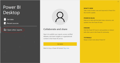
Illustration 2: Select Open Other Reports on the Splash Dialog that Appears
- Navigate to the file you have downloaded.
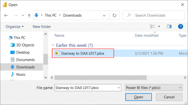
Illustration 3: Select the Downloaded Stairway to DAX File and Open …
- Click Open.
The .pbix file opens and you arrive within the Report view, which consists of a single tab containing a blank canvas. As you are likely aware, you can tell you are in the Report view because the current view (of the three views available in the upper left corner, Report, Data, and Model) is indicated by the yellow bar to the left of the icon.
- Click the Data and Relationship view icons along the left of Power BI Desktop, as desired, to become familiar with the sample model.
The DAX DATEADD() Function
Introduction
According to the Data Analysis Expressions (DAX) Reference, the DATEADD() function “returns a table that contains a column of dates, shifted either forward or backward in time by the specified number of intervals from the dates in the current context.”
You will examine the syntax for the DATEADD() function in this level, with a focus toward its use within simple visualizations. You’ll then undertake a practice example built around a hypothetical business need that illustrates typical uses for the function.
Discussion
Anytime you find yourself in a situation where you need to generate time comparisons over a range of periods (that is, differing time frames) the DATEADD() function is a great place to start. One way to look at DATEADD() is as a “generalist” period-shifting function. There may be other Time Intelligence functions which more specifically achieve your objectives – that is, which hard-code certain variables in the shifting involved – but starting with DATEADD() will likely offer more options with regard to variability. Investigate it first, as it may support measures that work not only in different periods (say from quarter to quarter), but that allow you to vary the levels of Date dimension (say month to quarter) automatically, via flexible parameterization and so forth.
As a simple illustration, assume you have a client (internally or externally) who has a date-related need: They wish to gain some exposure to period shifting for fairly common scenarios, and, having become aware, at a high level, that they can employ DAX to add time intelligence to their reports, they wish first to see how to do this from a flexible, single function.
For starters, they wish to create a simple table visualization that presents Sales totals summarized by year. To this, they want to add comparative values for the prior year. They next want to perform the same operation at the quarter level. Then, they would like to conclude with some exposure to performing another shift, at the month level.
Because the client wants to keep things simple, they specifically ask for one visualization each to demonstrate operation of DATEADD() at the year, quarter and month levels. A glimpse of the desired result appears below, to provide a preview for layout planning and so forth. You can get a glimpse of the straightforward approach to this need in a preview of our final table visualization display.

Illustration 4: Approaching the Need with DATEADD() …
Syntax
Syntactically, the parameters you provide are specified within the parentheses to the right of DATEADD() as shown:
DATEADD(<dates>,<number_of_intervals>,<interval>)
The three parameters are:
- Dates – A column containing dates. The Dates argument can be any of the following:
- A reference to a date/time column
- A table expression returning a single column of date/time values
- A Boolean expression defining a single-column table of date/time values
- Number_of_intervals – An integer specifying the number of intervals to add to, or subtract from, the dates (positive for dates moved forward, negative for dates moved back)
- Interval – The interval by which to shift the dates. The value for interval can be one of the following:
- YEAR
- QUARTER
- MONTH
- DAY
Return Value
DATEADD() returns a table containing a single column of date values.
Additional Considerations: Date Table Design Requirements
DAX time intelligence functions rely upon a properly formed Date table to operate effectively. Requirements of the Date table are as follows:
- The Date table must contain all days for each year involved.
- Calendar Years: Each year must begin on January 1 and end on December 31.
- Fiscal Years (only): Include all dates from the first to the last day of a fiscal year. Example: if the fiscal year 2021 starts on July 1, 2021, then the Date table must include all the days from July 1, 2021 to June 30, 2021.
- There needs to be a column (usually called Date) with a DateTime or Date data type containing unique values.
- The Date column is not required to define relationships with other tables, although it often is.
- The Date column must contain unique values.
- If the Date column contains a time part, the time part should not contain anything except a consistent placeholder – for example, the time would always be 12:00 AM
- The table must be marked as a date table in the model (via the Mark as Date Table setting) in case the relationship between the Date table and any other table is not based on the Date
- The Date column should be referenced within the enacted Mark as Date Table feature
Hands-on practice with DATEADD() in the next section will make its objective clearer.
Practice
It’s easier to understand the operation of DATEADD() once you see it in action on a small sample data set. To do this efficiently, you’ll put DATEADD() to work within the definition of three measures you add to a sample Power BI model within the Power BI Desktop. The intent, as in all the practice sessions of Stairway to DAX and Power BI, is to demonstrate the operation of the function under examination in a straightforward, memorable manner. You’ll begin with the Power BI Desktop model you downloaded earlier, as a platform within which to construct and execute the DAX you examine, and to view the results you obtain.
To restate the simple business reporting need, the requirement is to present Total Sales values over a given time in the Power BI model, alongside the values of prior periods. You examine the basic Power BI file the client team currently has, a sales model containing a small amount of data for retail merchandise over a few years, and determine upon a quick design to illustrate how you might meet this business need using the DATEADD() function. You will then use the “starter” model as it currently exists for the setup of a simple scenario that both meets the stated client need and demonstrates an approach within which DATEADD() can be used to make this happen. You’ll create working examples, using one table visualization each to contain the measures involved.
Practice Exercise: Illustrate the Operation of DATEADD() through Individual Measures You Create
It’s time to get some exposure to the DAX DATEADD() function. You’ll create a simple visualization as a template, starting with a table juxtaposing Year, Quarter and Month details with the associated sales values. To save time, once the first table is created, you’ll make two duplicates of the table, each of which, with some minor adjustments, will serve one of the additional two measures you create to easily isolate the respective variation of DATEADD() under examination.
Construct a Table Visualization “Template”
- In the sample Power BI model, click the cursor on the blank canvas.
- Click the table icon in the collection atop the Visualizations tab, to create a blank table on the canvas.
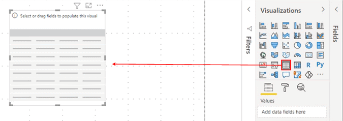
Illustration 5: Create a New Table on the Canvas
- Ensuring that the above table visualization is selected, add the following (from the Date table in the Fields pane) to the Values section of the Fields tab underneath the Visualizations collection:
- CalendarYear
- CalendarQuarter
- EnglishMonthName
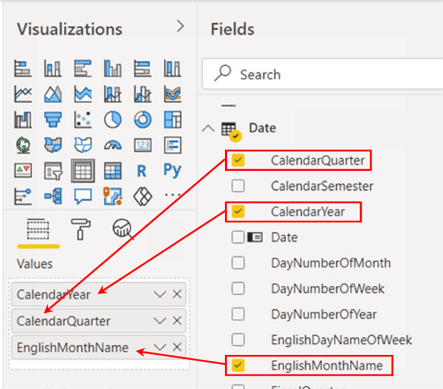
Illustration 6: Values Additions in the Fields Tab …
Create a table in which to home measures
Few that work regularly with Power BI would fail to see the value of organizing measures under a single folder, instead of simply creating them under any given table. Here, you’ll create a “home” for measures, although in this case you will be focused upon organizing only the measures we create in this Level.
Every measure should wind up in a table, although it is important to remember that the table is only a place to home the measure. Measures are really “citizens of the model,” and not of any given table, of course – measures work no matter which table they live in, for purposes of the model interface.
There are two general approaches for controlling the home of a measure. One approach is to simply home a measure under the table to which the measure is related from a business or other perspective. This can be done by associating the measure to a folder, via the Display folder setting within the Properties pane (accessible within the Model tab). While this is an easy way to “folderize” measures, the folder still resides within the original table. Many prefer a separate home for the measures of the model.
Another approach is to create one or more blank tables and then rehome measures within same. Moving a measure from one to another table is straightforward: In either of the Data or Report tabs, select the measure you wish to re-home, and then from the Measure tools tab under the toolbar, select the desired table within the Home table selector, as you’ll do in the following steps.
For purposes of preparing for the practice exercises of this Level, you will use the second approach, and create a table to contain the measures you create. While using a separate table to house your measures will be a great way to stay organized within this Level, it might not be the best strategy when you want to leverage Power BI Service features like Quick Insights and Q & A in the business environment. Homing measures in a stand-alone table – and not within the table with whose other residents the measure may interact operationally – may undermine the set of rules by which Q & A, as an example, resolves ambiguity (via the proximity of items within the model, among other criteria).
Since you will be creating a new measure upon which to base the measures you build using the DATEADD() function, you will first need to create an empty table in which to house it.
- Click the Home tab.
- Click the Enter data button in the toolbar.
- Leaving the table as it appears (adding no data), name the table “_Measure” in the bottom left corner.
“Measures,” is, of course, a reserved word. Moreover, the common practice of putting the underscore (“_”) in front of the new table name causes it to float to the top of the Fields pane.
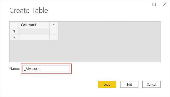
Illustration 7: Creating a Table to Home Measures …
- Click the Load button to create the table.
The new _Measure table appears, atop the Fields pane, containing the default column.
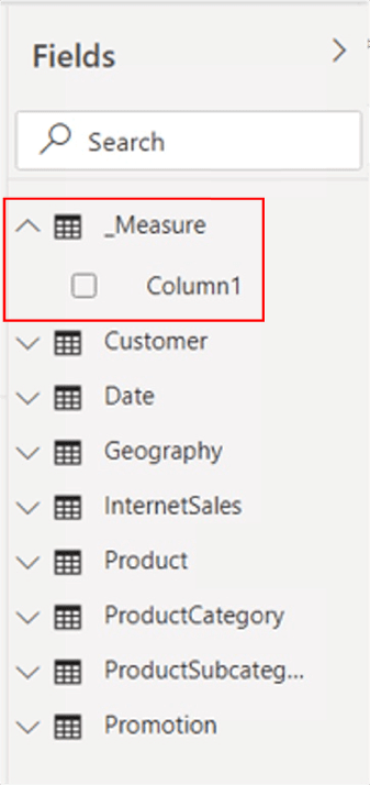
Illustration 8: The New Table Appears …
You’ll likely want the table icon to change to the calculator icon, to make obvious that the container does not reflect a table in the model, but serves as a home for measures in our model. To do this you need only create your first measure within the _Measure container, and to remove the default column – in that order.
You will create the Total Sales measure first, basing it upon the SalesAmount column in the InternetSales table.
- Right-click the new _Measure table, and select New measure from the context menu that appears, as shown.
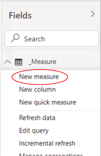
Illustration 9: Adding the First Measure …
- Type, or cut and paste, the following into the Formula bar for the new measure that appears:
Total Sales = SUM(InternetSales[SalesAmount])
- Click the check mark icon on the left side of the Formula bar to commit the new measure.

Illustration 10: Commit the New Measure …
You’ve created a measure to return “total sales,” which you will use within additional measures you will craft to practice with the DATEADD() function in the following section.
NOTE:
For an introduction to the DAX SUM() function, see Stairway to DAX and Power BI - Level 6: The DAX SUM() and SUMX() Functions.
The Total Sales measure appears within the _Measure table.
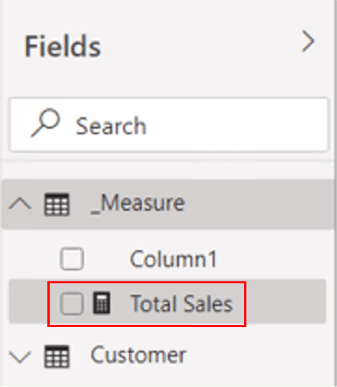
Illustration 11: The New Measure Appears …
The next step is to remove the unneeded Column1 that remains within the _Measure table.
- Right-click Column1 in the _Measure table, and select Delete from the context menu that appears, as shown.
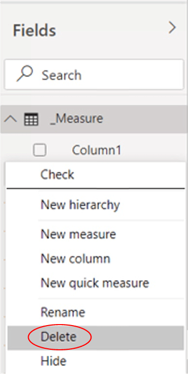
Illustration 12: Removing the Unneeded Default Column …
- Click Delete in the confirmation dialog box that appears next to continue.
The default column is deleted as the model updates. The new _Measure table retains the table icon, however. Closing / saving the model, and re-opening, usually refreshes the icon, as depicted.
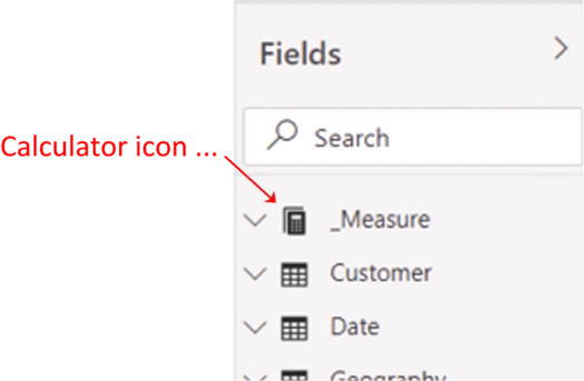
Illustration 13: The _Measure Collection …
- Reopen the new _Measure table and click the new Total Sales measure to select it.
- Ensuring that you are in the Measure tools tab of the toolbar, ascertain that Format is set to Currency, and the decimal places setting immediately underneath is set to “2.”
All that remains to get you to the DATEADD() practice steps is to add the new Total Sales measure to the table visualization, to modify the column and measure names to something a little more user-friendly, and, finally, to create a couple of clones of the existing table, as you’ll see in the next section.
Finish the Table Visualization “Template” and Replicate
- Click the table visualization you created earlier to select it.
- Add Total Sales (which you created within the _Measure group above) to the Values section, below the Date fields you’ve already added.
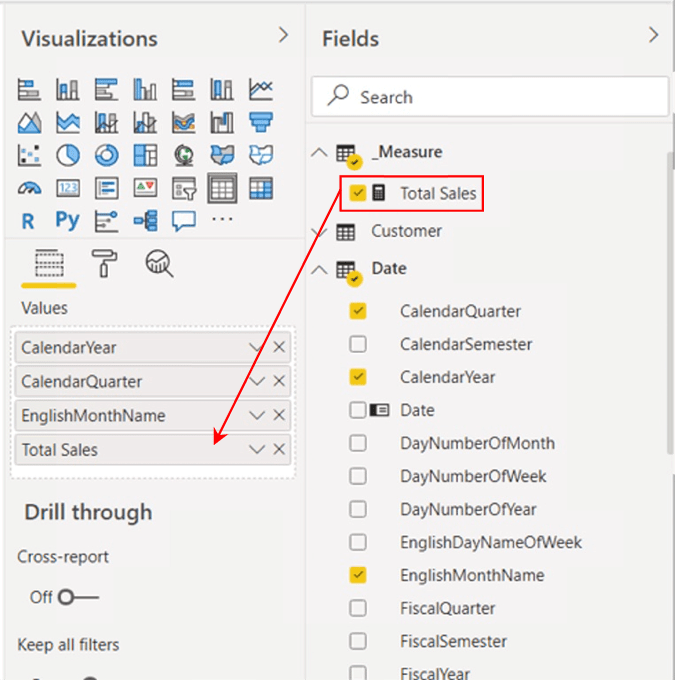
Illustration 14: Adding Total Sales to Values in the Fields Tab …
- On the Format tab, underneath the Visualization pane, turn Totals to ”Off.”
- Right-click and select, from the context menu that appears, Rename for this visual for each of the values we have added, respectively. Assign the following new values:
| Current Value | Rename to: |
| CalendarYear | Year |
| CalendarQuarter | Quarter |
| EnglishMonthName | Month |
| Total Sales | Sales |
The table and Values section of the model appear as depicted.
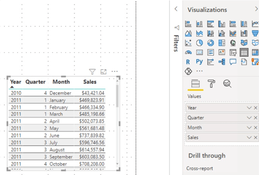
Illustration 15: The Table Visualization and Supporting Values
This is a good time to set up two more tables. The idea is that you’ll be using three to illustrate the use of DATEADD() in three separate measures, primarily to focus on the use of each without cluttering things up too much in a single table. This will support easy visual verification that the underlying functions are working as expected. (A single table can work, of course, to house all three, if you like that presentation better.)
- Move the table you have just created to the upper left half of the canvas to make room for two more tables.
- Right-click the table visualization, and select Copy - Copy visual, as shown.
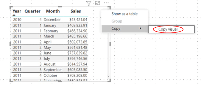
Illustration 16: Copying the Table Visualization to Generate a Template …
- Click a blank area on the canvas.
- Select CTRL + V twice to create two copies of the visual (which will lie atop each other).
- Rearrange the three visualizations on the canvas in a manner similar to that shown.
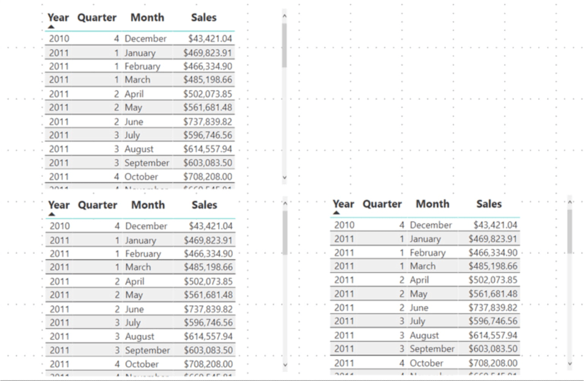
Illustration 17: Three Identical Tables for Measure Demonstration
Next, you’ll “trim” each table to show only the Sales value of the hierarchical level under examination for the respective measure we create.
Start with a “Sales by Year” table.
- Click the top left table to select it.
- Remove the following from the Values section of the Fields tab underneath the Visualizations collection (simply click the “x” to the right of each value):
- Quarter
- Month
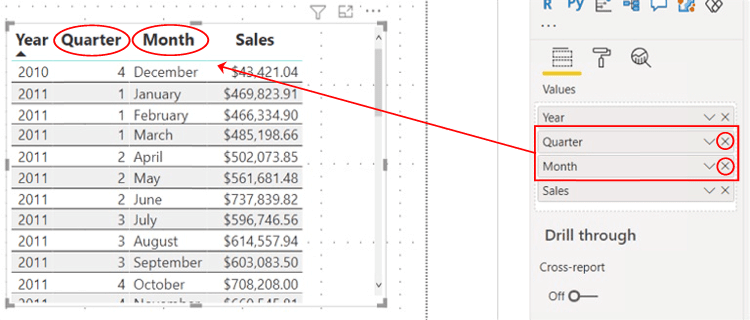
Illustration 18: Removing the Quarter and Month Values from the Table
The Quarter and Month columns disappear from the table, as depicted.
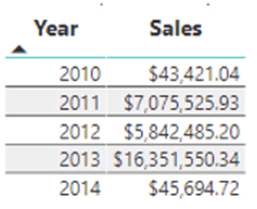
Illustration 19: Sales by Year
Next, customize the second table to display Year and Quarter details only.
- Click the one of the other two (identical clone) tables to select it.
- Remove Month from the Values section of the Fields tab underneath the Visualizations collection (again, simply click the “x” box to the right of Month, as shown).
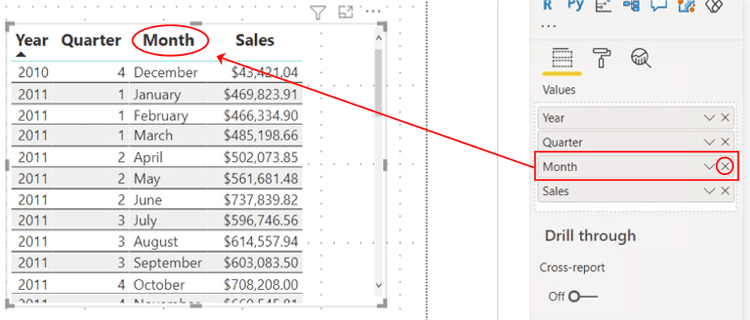
Illustration 20: Removing the Month Value from the Table
The Month column disappears from the table, leaving Year and Quarter, as depicted.
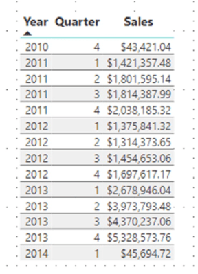
Illustration 21: Sales by Year and Quarter
You can leave the third table as it is already designed.
- Rearrange the tables, side-by-side, as shown
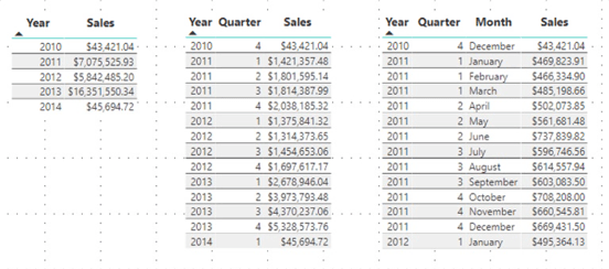
Illustration 22: The Three Tables at This Point in Preparation …
It’s time to gain some exposure to the DATEADD() function. You’ll create measures in the practice section that follows.
Create Measures to Support Explanation of the DATEADD() Function
You’ll create a few measures that demonstrate the use of the DATEADD() function in simple scenarios, one each within the tables you’ve constructed. You’ll be creating the measures in tables that already display a Sales value at the respective Date hierarchy level for a given point in time. Being able to conveniently see the value for a corresponding “prior period” date will support easy comparison of 1) the measure created to calculate the “prior period” value of the selected Sales value to 2) the value presented for the associated “prior period” value in history.
First, create a measure to generate the Sales Prior Year value.
- Click the ellipses (“…”) to the right of the _Measure table within the Fields pane.
- Click New Measure atop the context menu that appears, as depicted.
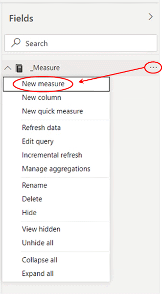
Illustration 23: Click New Measure to Begin Design …
- Type (or cut and paste) the following into the Formula bar for the new measure that appears:
Sales Prior Year =
CALCULATE(
[Total Sales], DATEADD('Date'[Date],-1, YEAR)
)
- Click the check mark icon on the left side of the Formula bar to commit the new measure.
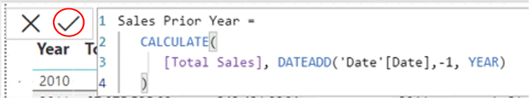
Illustration 24: Commit the New Measure …
Here you’re creating a measure to return “the total sales for the current (row context) year less a year (the negative 1).” You have specified that the date hierarchy level is “year.”
NOTE: For an introduction to the DAX CALCULATE() function, see Stairway to DAX and Power BI - Level 14: DAX CALCULATE() Function: The Basics .
- Ensuring that the new measure is still selected within the _Measure table, and within the Measure tools tab of the toolbar, format it as “Currency,” two (2) decimal places.
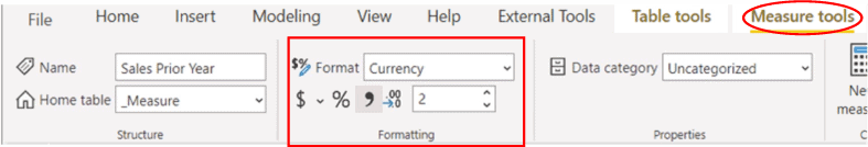
Illustration 25: Format the New Measure …
Now, pull the new measure into the table.
- Ensuring that the leftmost table visualization is selected (the table containing only the Year date level), add the new Sales Prior Year measure to the table via the related Values section (underneath the Total Sales measure), of the Fields tab of the Visualizations pane.
The leftmost table appears, with the Sales Prior Year measure added, as shown.
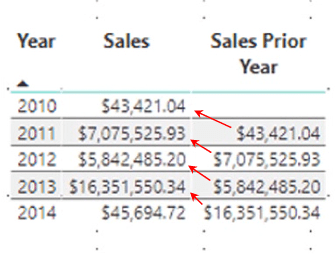
Illustration 26: Sales Prior Year – with Visual Self-Checking of Accuracy
It’s easy to see that the calculation within the Sales Prior Year measure is performing accurately with the years laid out on the rows as you have done.
Next, you’ll create a measure to use DATEADD() to generate the Sales Prior Quarter value.
- Right-click on the _Measure table within the Fields pane, once again.
- Select New Measure atop the context menu that appears.
- Type the following into the Formula bar that appears:
Sales Prior Quarter =
CALCULATE(
[Total Sales], DATEADD('Date'[Date],-1, QUARTER)
)
- Click the check mark icon on the left side of the Formula bar to commit the new measure.
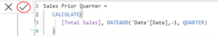
Illustration 27: Commit the New Measure …
With this calculation you’re creating a measure to return “the total sales for the current (row and column intersection) quarter less a quarter (the negative 1).” You have specified that the date hierarchy level is “quarter.”
- Ensuring that the new measure is still selected within the _Measure table, and within the Measure tools tab of the toolbar, format it as “Currency,” two decimal places, as you did with the first measure.
Next, insert the new measure into the second (middle) table visualization
- Ensuring that the middle table visualization is selected, add the new Sales Prior Quarter measure to the table via the related Values section (underneath the Total Sales measure), of the Fields tab of the Visualizations pane.
The middle table appears, with the Sales Prior Quarter measure added, as shown.
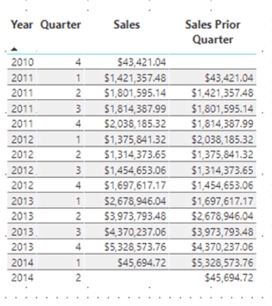
Illustration 28: Sales Prior Quarter – with Visual Self-Checking of Accuracy
It’s easy to see that the calculation within the Sales Prior Quarter measure is performing as desired, with the year-quarter combinations laid out on the rows as you have done.
Finally, you’ll create a measure that employs DATEADD() to generate a Sales Prior Month value.
- Right-click on the _Measure table within the Fields pane, once again.
- Select New Measure atop the context menu that appears.
- Type the following into the Formula bar for the new measure:
Sales Prior Month =
CALCULATE(
[Total Sales], DATEADD('Date'[Date],-1, MONTH)
)
- Click the check mark icon on the left side of the Formula bar to commit the new measure.
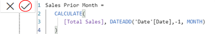
Illustration 29: Commit the New Measure …
With this calculation you’re creating a measure to return “the total sales for the current (row, columns intersection) month less a month (the negative 1).” You have specified that the date hierarchy level is “month.”
- Ensuring that the new measure is still selected within the _Measure table, and within the Measure tools tab of the toolbar, format it as “Currency,” two decimal places, as you did with the first two measures.
Next, pull the new measure into the third table visualization.
- Ensuring that the rightmost table visualization is selected, add the new Sales Prior Month measure to the table via the related Values section (underneath the Total Sales measure), of the Fields tab of the Visualizations pane.
The rightmost table appears, with the Sales Prior Month measure added, as shown.
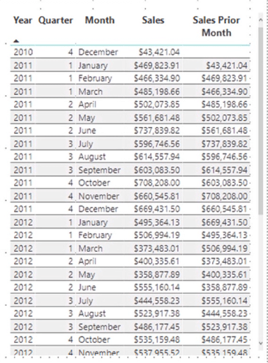
Illustration 30: Sales Prior Month – with Visual Self-Checking of Accuracy
A quick visual inspection of the values returned indicates success. The fact that the Sales Prior Month value for a given year-quarter-date agrees to the Total Sales value for the immediately prior year-quarter-date in each instance reveals that the calculation within the Sales Prior Month measure is performing as intended.
The three table visualizations appear, with the measures you’ve created over the practice exercises, as shown.
Illustration 31: Three Variations on the DATEADD() Function
You now have a sample visualization that can help information consumers begin to compare, side-by-side, sales over a given time period with the same value in the prior period. Constructing the three measures involved demonstrates how you can cast the same calculation over different levels in the Date hierarchy as a simple example of the kinds of solutions you can generate the flexible DAX DATEADD() function. From this straightforward beginning, it’s easy to see how similar measures can be parameterized via sliders, and extended via other approaches, with the integrated Power BI application.
Summary
In this Level of Stairway to DAX and Power BI, you gained an introduction to the DAX DATEADD() function. After reading a discussion of the general purpose and operation of DATEADD(), you focused upon putting it to work within the construction of measures that each demonstrated using DATEADD() to generate values at different levels of the Date hierarchy. As part of this introduction, you examined the syntax involved with using DATEADD(), and then constructed side-by-side, illustrative examples of the use of the function across three Date hierarchy levels in simple practice exercises. Finally, for each example you undertook, you explored the self-validating results datasets you obtained.
This article is part of the parent Stairway to DAX and Power BI.