
In Level 17: Time Intelligence Functions: The DAX DATEADD() Function, you were introduced to the DAX Time Intelligence functions, beginning with the DATEADD() function. You learned that Time Intelligence represents a subset of the DAX formula language that supports the generation of time-specific analysis and the manipulation of data using time periods, including days, months, quarters, and years. These functions enable you to build and compare calculations over those periods. In this level, you will meet the DATESBETWEEN(), DATESINPERIOD(), DATESMTD(), DATESQTD(), and DATESYTD() functions, each of which returns a specialized subset of what the DATEADD() function might return, as these functions, like other level-and interval- specific time intelligence functions, are “hardcoded” to support ease of use by authors and developers.
Much like the versatile DATEADD() function, the DATESBETWEEN(), DATESINPERIOD(), DATESMTD(), DATESQTD(), and DATESYTD() functions are not limited to the comparison of simple aggregations like total sales or total expenses. The functions can operate upon practically any calculation you might want to analyze, such as cumulative values, rolling averages, differences / variances between periods, percentage change, and many other metrics.
DATESBETWEEN(), DATESINPERIOD(), DATESMTD(), DATESQTD(), and DATESYTD(), like other time intelligence functions, afford you a convenient means for creating calculations that provide insight into other calculations – each of these functions allows you to flexibly support analysis beyond mere changes over time. The objective in this Level is to introduce each within the setting of relatively common business needs, but you will come across them again, particularly in various uses of a “periodicity / range / interval shifting” nature, as you progress through the Stairway to DAX and Power BI.
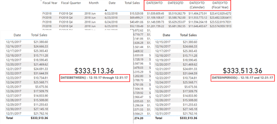
Illustration 1: Date Level- / Interval-specific Functions at Work
You’ll create various measures, as you work through the various functions in this Level, that demonstrate the use of each function in a simple scenario, one each within the tables you’ve constructed. You’ll save time, in one instance, by taking advantage of the highly useful “copy and paste” capability within Power BI, as you create visualizations to work with each function. You’ll also combine functions, in another instance, into one table to allow comparison and contrast. These approaches mean that the Time Intelligence functions can be grouped into logical Levels and multiple functions can, in many cases, be explored in a single level.
Additional Considerations for Time Intelligence Functions: Date Table Design Requirements
As a reminder that I like to include in any Level where we work with DAX time intelligence functions, it is important to remember that these functions rely upon a properly formed Date table to operate effectively. Requirements of the Date table are as follows:
- The Date table must contain all days for each year involved.
- Calendar Years: Each year must begin on January 1 and end on December 31.
- Fiscal Years (only): Include all dates from the first to the last day of a fiscal year. Example: if the fiscal year 2022 starts on July 1, 2022, then the Date table must include all the days from July 1, 2022 to June 30, 2023.
- There needs to be a column (usually called Date) with a DateTime or Date data type, containing unique values.
- The Datecolumn is not required to define relationships with other tables, although it often is.
- The Datecolumn must contain unique values.
- If the Datecolumn contains a time part, the time part should not contain anything except a consistent placeholder – for example, the time would always be 12:00 AM.
- The Datecolumn should be referenced within the enacted Mark as Date Table
NOTE: For details regarding marking a table as the Date table, see the following: https://docs.microsoft.com/en-us/power-bi/transform-model/desktop-date-tables
The table must be marked as a Date table in the model (via the Mark as Date Table setting), in case the relationship between the Date table and any other table is not based on the Date.
Hands-on practice with the DATESBETWEEN(), DATESINPERIOD(), DATESMTD(), DATESQTD(), and DATESYTD() functions in the next section will make their respective objectives and operations clearer. You’ll see, within the combined exploration of these functions, how each can be easily employed to aggregate, and otherwise manipulate, values between time ranges, in meeting the requirements of clients or employers in the business environment. You’ll get an understanding of the purpose of each function, and gain hands-on insight into how it interacts with basic filters, via measures you’ll construct. Moreover, you will:
- Examine the syntax involved in exploiting each function;
- Undertake an illustrative example of the use of each function in a practice exercise;
- Review a discussion of the results you obtain in each of the steps of the practice example.
Preparation for the Practice Exercises in this Level
Assuming that you have installed Power BI Desktop (the illustrations in this Level reflect the May 2022 release), you are ready to download and open the sample Power BI Desktop file that you will use for hands-on practice with the concepts introduced in this Level.
NOTE: The latest version of Power BI is available for free download at www.powerbi.com.
Download Sample Power BI File (.pbix) for Use in this Level
The sample Power BI file you’ll be using contains fully imported data, and a few pre-existing calculations that might be helpful in general. Calculations created in other Levels of the Time Intelligence subseries at the time of your download will also appear. You will add the calculations and visualizations that form the focus in this step-by-step Level as you go.
Using the sample dataset provided will ensure that the results you obtain in following the detailed steps of the exercises agree to the results obtained, and depicted, in the Level, as you progress.
Depending upon when you complete this Level, the function(s) under consideration might already have been added to the updated sample file. To complete the exercises in a given Level, I suggest that, working on a blank tab, you complete the steps, and then compare your results with those pre-existing in the sample. This approach will likely produce the best learning results.
Once the sample .pbix file is downloaded, take the following steps to open it in Power BI Desktop.
- Open Power BI Desktop.
- Select File -> Open other reports from the splash dialog that appears upon entry, as shown.
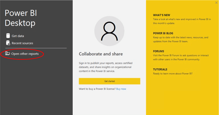
Illustration 2: Select Open Other Reports on the Splash Dialog that Appears
- Navigate to the file you have downloaded.
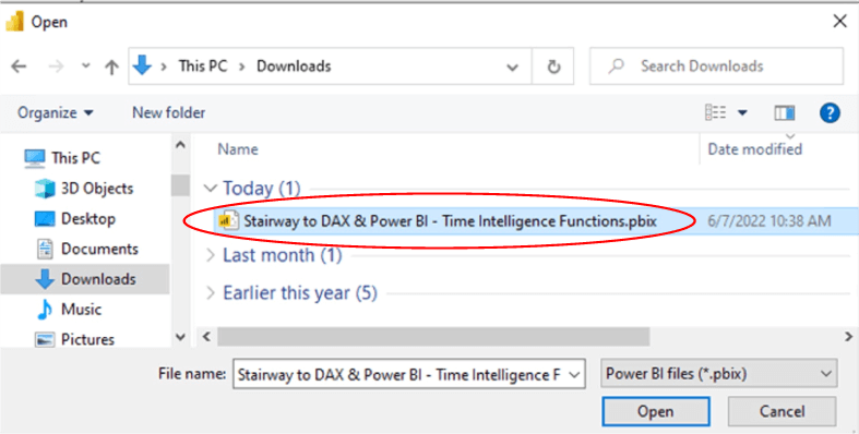
Illustration 3: Select the Downloaded Stairway to DAX File and Open …
- Select the file and click “Open.”The .pbix file opens and you arrive within the Report view, which consists of a several tabs (“EXERCISE
EXAMPLES
”) containing the solutions to the current Level, as well as solutions for past Time Intelligence subseries Levels, depending upon the date of your entering this Level. As you are likely aware, you can tell you are in the Report view because the current view (of the three views available in the upper left corner, Report, Data, and Model) is indicated by the yellow bar to the left of the icon. - Click the Data and Model view icons, as desired, along the left of Power BI Desktop, as desired, to become familiar with the sample model.
The DAX DATESBETWEEN() Function
According to the Data Analysis Expressions (DAX) Reference, the DATESBETWEEN() function “returns a table that contains a column of dates that begins with a specified start date and continues until a specified end date.”
You will examine the syntax for the DATESBETWEEN() function in this section, with a focus toward its use within simple visualizations. You’ll then undertake a practice example built around a hypothetical business need that illustrates a typical use for the function.
Discussion
Anytime you find yourself in a situation where you need to report values over multiple contiguous dates, the DAX DATESBETWEEN() function is a straightforward way to generate the dates axis, list of dates, etc. that your report requires. And while there may be other Time Intelligence functions that more specifically achieve your objectives – that is, which accomplish more involved effects than simply listing dates within a specific range – becoming familiar with the relatively basic DATESBETWEEN() function will offer a great introduction to meeting some basic requirements. Investigate it first, test your results for accuracy and completeness, and, if it assists in meeting the requirement at hand, you’ve added another tool to your DAX repertoire.
Syntax
Syntactically, the parameters you provide are specified within the parentheses to the right of DATESBETWEEN() as shown:
DATESBETWEEN(<dates>, <start_date>, <end_date>)
The three parameters are:
- Dates – A column containing date expression
- Start date – A date expression
- End date – A date expression
Additional Considerations
- This function is not supported for use in DirectQuery mode when used in calculated columns or row-level security (RLS) rules.
- In the most common use case,<dates> is a reference to the date column of a marked date table.
- If<start_date> is BLANK, then the <start_date> will be the earliest value in the Dates
- If<end_date> is BLANK, then <end_date> will be the latest value in the Dates
- Dates used as the<start_date> and <end_date> are inclusive.
- The returned table can only contain dates stored in the Dates
Return Value
DATESBETWEEN() returns a table containing a single column of date values.
Practice
You’ll understand the operation of DATESBETWEEN() better once you put it into action on a small sample data set. To do this efficiently, you’ll put DATESBETWEEN() to work within the definition of a simple measure you add to the sample Power BI Desktop you downloaded earlier, as a platform within which to construct and execute the DAX you examine, and to view the results you obtain via a “self-checking” visualization pair.
You’ll start with a simple reporting need: the requirement is to present Total Sales values by date, over a given time frame in the Power BI model. You understand that the client would like to be able to state reporting ranges for this report by specifying a beginning and ending date. (In this case, they wish to see the Total Sales per day for the last two weeks of the year, a heavy sales period for the company.) You have multiple ways of approaching this, but, as the need is a simple range-of-dates accumulation, you select the DATESBETWEEN() function. Once you create a simple table displaying the Total Sales for the individual dates in the target range (with the Total Sales grand total at bottom, by default), you can create, side-by-side with the table, an even simpler visualization that uses the measure you create to accumulate the ranged total.
As a simple illustration, assume you have a client (internally or externally) who has a date-related need: They wish to gain some exposure to period shifting for fairly common scenarios, and, having become aware, at a high level, that they can employ DAX to add time intelligence to their reports, they wish first to see how to do this from a flexible, single function.
It typically helps to envision the end result before you even get started. A glimpse of the desired result appears below, to provide a preview for layout planning and so forth.

Illustration 4: Approaching the Need with DATESBETWEEN() …
Practice Exercise: Illustrate the Operation of DATESBETWEEN() through an Individual Measure You Create
You’ll create a simple, two-column table to display Date and Total Sales amounts, filtered to approximate the timeframe of “last two weeks’ sales” (December 15 to December 31). This table will resemble the one depicted in Illustration 4.
NOTE: I have created a Practice Canvases section for practice tabs within the sample model (.pbix) you downloaded above. The Exercise Examples section to the right contains the finished examples that we create in the Practice Exercise section.
Construct a Table Visualization to Display Total Sales by Month
First, in the sample Power BI model, click the cursor on the blank canvas for PRACTICE CANVASES ---- > Page 1.
Next, click the table icon in the collection atop the Visualizations tab, to create a blank table on the canvas.

Illustration 5: Create a New Table on the Canvas
Ensuring that the above Table visualization is selected, add the following table.column pairs to the Columns section, underneath the Visualizations collection:
- Total Sales
- Date
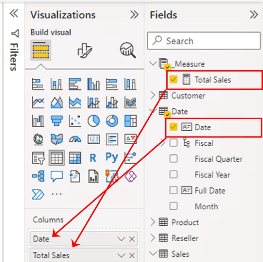
Illustration 6: Values Additions in the Fields Tab …
With the new table selected, click the Format (middle) button atop the Visualizations pane, as shown.
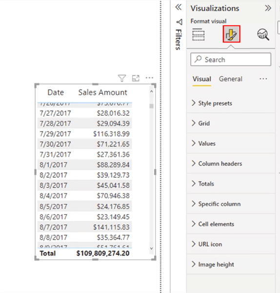
Illustration 7: Formatting the New Table
On the Visual tab of the Format pane that appears, I often set the following properties (you can, of course, do as you prefer, in most cases):
- Values > Values - Font size of 12 (I’ve always thought the default too small)
- Column headers > Text – Font – Font size of 14, Header Alignment at Center
The Values and Column headers sections of the Visual tab appear, with modifications, as depicted:
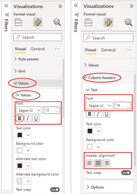
Illustration 8: Suggested Format Adjustments (for Readability)
Let’s rearrange the canvas a bit for purposes of the next section. Drag the newly populated table to the upper left corner of the canvas. Now you’re ready to gain some exposure to the DATESBETWEEN() function. You’ll create measures in the practice section that follows.
Create A Measure to Support the DATESBETWEEN() Function
You’ll create a measure that demonstrates the use of the DATESBETWEEN() function in a simple scenario, to be displayed in a Card visualization that generates a value. The value delivered by the Card can be compared, total-to-total, to the Table visualization that has already been put into place. to allow us to verify accuracy and completeness in the operation of the DATESBETWEEN() function in the associated exercise.
First, create a measure to generate the value of the total of sales over the range of dates you stipulate within the measure by taking the following steps.
Click the ellipses (“…”) to the right of the _Measure table within the Fields. Click New Measure atop the context menu that appears, as depicted.
NOTE: You will see solution measures in the _Measure table (their names are preceded by a “z_”). These measures are used within the EXERCISE EXAMPLES section to support visualization solutions. Ignore these for the time being, unless you want to use the DAX they contain, versus the test in this Level, for copying and pasting the code into the measures that you create throughout.

Illustration 9: Click New Measure to Begin Design …
Type (or cut and paste) the following into the Formula bar for the new measure that appears:
DATESBETWEEN() - 12-15-17 and 12-31-17 =
   CALCULATE(
      [Total Sales],
   DATESBETWEEN('Date'[Date], DATE(2017,12,15), DATE(2017,12,31)
      )
  )
Click the check mark icon on the left side of the Formula bar to commit the new measure, as shown.
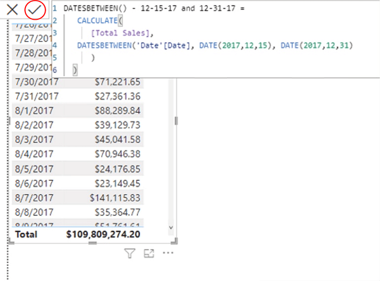
Illustration 10: Commit the New Measure …
Here you’re creating a measure to return “the Total Sales for the current (row context) for a corresponding column of dates that begins with a specified start date and continues until a specified end date.” In other words, you’re asking for the Total Sales amount for each of the days within the range that you specify. (It’s easy to see how you might parameterize the date range for the visual within Power BI and simply supply the start and end dates of the range at runtime.)
NOTE: For an introduction to the DAX CALCULATE() function, see Stairway to DAX and Power BI - Level 14: DAX CALCULATE() Function: The Basics .
Ensuring that the new measure is still selected within the _Measure table, and within the Measure tools tab of the toolbar, format it as “Currency,” two (2) decimal places.
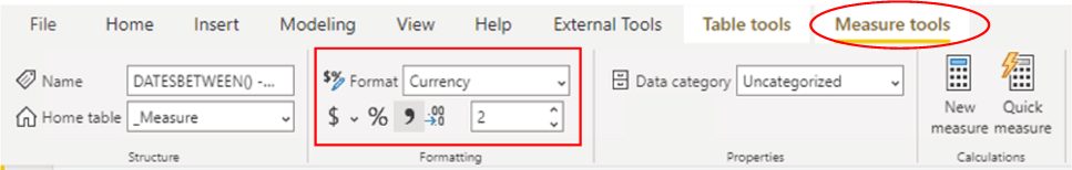
Illustration 11: Format the New Measure …
Construct a Card Visualization to Display Data for Verification Purposes
Now, you’re ready to add a Card visualization to the canvas to contain the new measure. Because you already have a Table in place that presents the monthly Total Sales value, you will now have an independent means of verifying accuracy and completeness in the operation of the new measure.
In the sample Power BI model, click the cursor on the blank canvas, to the right of the existing Table. Click the Card icon in the collection atop the Visualizations tab, to create a blank Card visualization on the canvas, as shown.
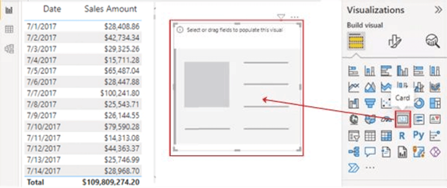
Illustration 12: Create a New Card on the Canvas
Move the Card visualization over to the right side of the existing Table, ensuring that the new Card visualization is selected, add the new DATESBETWEEN() - 12-15-17 and 12-31-17 measure (by checking the box to the left of the measure name) to the Fields section, underneath the Visualizations collection, as shown.
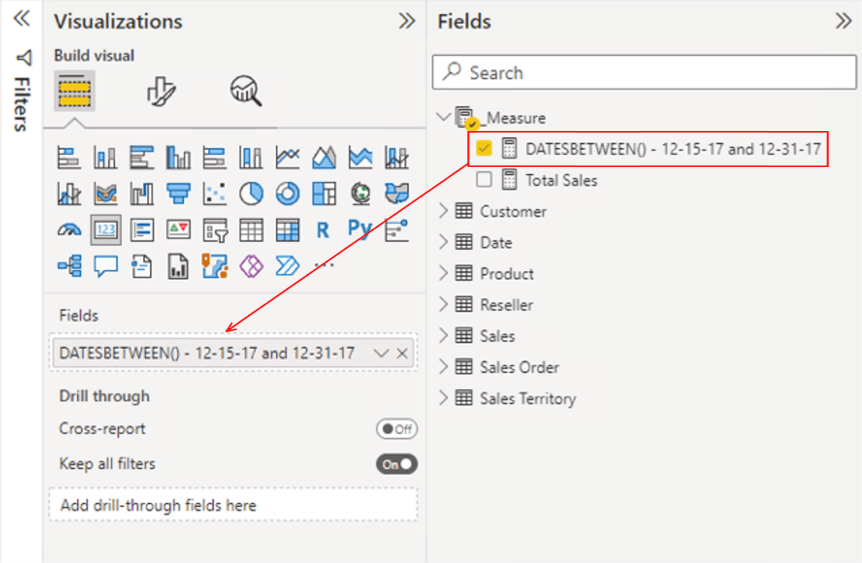
Illustration 13: Measure Addition to the Card Visualization
With the new Card selected, click the Format (middle) button atop the Visualizations pane, once again.
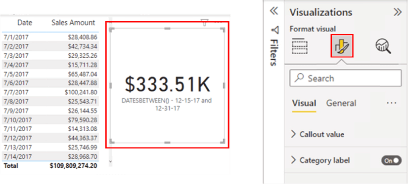
Illustration 14: Formatting the New Card Visualization …
On the Visual tab of the Format pane that appears, I have set the following properties and leave the rest at default (you can, again, do as you prefer, in most cases):
- Callout value> Font – Font size of 33, Display Units - “None”, Value decimal places - 2
- Category label > Font – Font size of 12, Bold - Enabled
The Callout Value and Category Label format sections of the Visual tab appear, with modifications, as depicted:

Illustration 15: Suggested Format Adjustments (for Readability)
The Table and Card visualizations appear, at this stage, as shown.
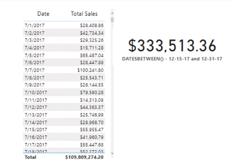
Illustration 16: Table and Chart Visualizations at this Stage …
Recall that the purpose of combining the two visualizations into the current presentation of data was to establish a “self-checking” capability. The total on the Table does not agree with the total displayed on the Card for obvious reasons – the Table data is unfiltered, displaying all dates in the model, while the value in the Card represents Total Sales within a DAX CALCULATE() function, whose date range is stipulated within the DAX DATESBETWEEN() function – effectively filtering the Total Sales value by stipulating a new context for the value.
To obtain the agreement of the two visualizations, you need to tweak the Table visual with a filter.
Verify the Accuracy and Completeness of the Newly Created Measure
Click the Table visualization to highlight it. The Filters pane for the Table, currently at default, appears as depicted.
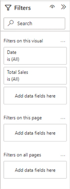
Illustration 17: Table Filter Settings at Default
Click the Date filter for the visual to expose the settings for the filter (now at “is All” ).
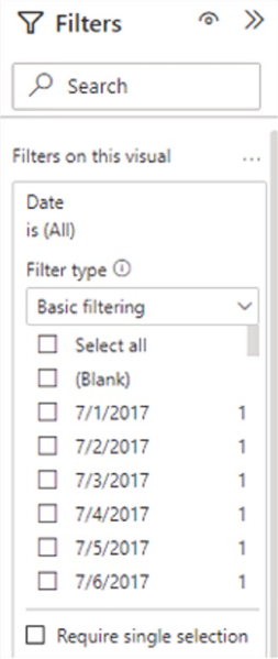
Illustration 18: Table Filter Settings at Default
Select Advanced Filtering from the dropdown list that appears.
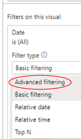
Illustration 19: Select Advanced Filtering …
Within the Filters pane, Advanced filtering settings for the Table, make the following settings (to match the range we have established in the new DATESBETWEEN() - 12-15-17 and 12-31-17 measure), under Show items when the value:
- Is on or after: 12/15/2017 (Leave time setting at default)
- And (click radio button)
- Is on or before: 12/31/2017 (Leave time setting at default)
The Filter settings appear as shown.
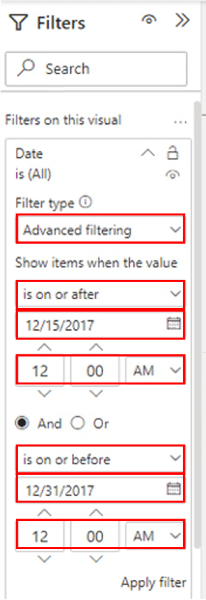
Illustration 20: Date Settings for the Filtered Table
Click Apply filter to update the Table visualization. The values in the visualizations agree, now that the Table has filters in place identical to those enforced within the new DATESBETWEEN() - 12-15-17 and 12-31-17 measure in the Card, as shown.
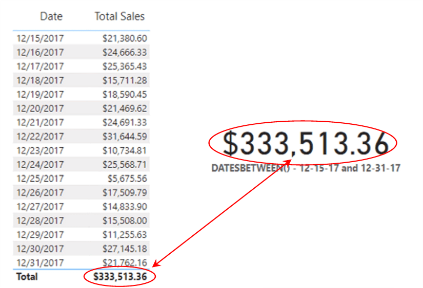
Illustration 21: The New Measure Tests Positive for Accuracy and Completeness
The filter in the table might, of course, be reopened as it was initially, or, for that matter, the Table depicting date-by-date Total Sales might be considered redundant and be removed, etc., depending upon the ultimate business need. The point here is to recognize – and leverage – capabilities within Power BI to “proof” / self-check the expected operation of a given measure before presenting same to the end information consumer(s).
Next, you’ll gain some exposure to the DATESINPERIOD() function, which works somewhat similarly to DATESBETWEEN(), but with important differences, both in operation and in the specific use cases to which it is more applicable.
The DAX DATESINPERIOD() Function
According to the Data Analysis Expressions (DAX) Reference, the DATESINPERIOD() function “returns a table that contains a column of dates that begins with a specified start date and continues for the specified number and type of date intervals.”
Discussion
As you saw was the case with the DATESBETWEEN() function, DATESINPERIOD() is a straightforward way to generate the dates axis, lists of dates, etc., that reports often require. DATESINPERIOD() is well-suited to pass as a filter to the CALCULATE() function. You can use it to filter an expression by standard date intervals such as days, months, quarters, or years, with flexibility inside those options. As with all DAX functions, once again, investigate it as a suitable item in a new DAX recipe, always testing your results for accuracy and completeness, and, if it assists in meeting the given business need, add it to your DAX toolkit.
Syntax
Syntactically, the parameters you provide are specified within the parentheses to the right of DATESINPERIOD() as shown:
DATESINPERIOD(<dates>, <start_date>, <number_of_intervals>, <interval>)
The four parameters are:
- Dates – A column containing date expression
- Start date – A date expression
- Number of Intervals – An integer that specifies the number of intervals to add to, or subtract from, the dates
- Interval – The interval by which to shift the dates. The value for interval can be one of the following: DAY, MONTH, QUARTER, and YEAR
Further Considerations
- This function is not supported for use in DirectQuery mode when used in calculated columns or row-level security (RLS) rules.
- In the most common use case,<dates> is a reference to the date column of a marked date table.
- The returned table can only contain dates stored in the Dates
- If the number specified for <number of intervals>is positive, dates are moved forward in time; if the number is negative, dates are shifted backward in time.
- The<interval> parameter is an enumeration, so values aren't passed in as strings. (Don't enclose them within quotation marks. Valid values are DAY, MONTH, QUARTER, and YEAR.
Return Value
DATESINPERIOD() returns a table containing a single column of date values.
Practice
Next, you’ll put DATESINPERIOD() into action on a small sample data set. As was the case with DATESBETWEEN() earlier, the line of approach will be via a straightforward measure you create in Power BI. As you’ve come to expect from the other Levels in the series, you’ll be able to ascertain that the practice measure is working correctly by viewing the results you obtain via a “self-checking” visualization pair.
You’ll begin with a simple reporting need- a need, in fact, identical to the need specified in the DATESBETWEEN() discussion earlier: the requirement is to present Total Sales values by date in the Power BI model. You understand that the client would like to be able to state reporting ranges for this report by specifying a beginning and ending date. (Once again, they wish to see the Total Sales per day for the last two weeks of the calendar year.)
This approach is an alternative to that of using the DATESBETWEEN() function that you used earlier – my hope is that doing so will help to at least partially illustrate the similarities and differences between the functions. The exercise will generate, using the DATESINPERIOD() function, results identical to those obtained in same requirement that you met with DATESBETWEEN() in the last section.
The results you obtained in your practice with DATESBETWEEN() above (Illustration 21) are, therefore, a preview of your destination in the following steps. The Exercise Examples section (to the right of the tab marked accordingly) in the sample .pbix you downloaded above contains all finished examples that we create in this Level, as well, and can also be used as a guide in crafting your own solution.
Practice Exercise: Illustrate the Operation of DATESINPERIOD() through an Individual Measure You Create
To prepare for some hands-on exposure to DATESINPERIOD(), you’ll install another simple, two-column Table to display Date and Total Sales amounts, filtered to approximate the timeframe of “last two weeks’ sales” (December 15 to December 31). This table will resemble the one depicted in Illustration 16 .
You’ll also install a Card visualization to display the measure you create to house the DATESINPERIOD() function.
Install Table and Card Visualizations to Display Total Sales by Month
In the sample Power BI model, go to the Exercise Samples section, and click the “L18_DATESBETWEEN()” tab (which corresponds to the DATESBETWEEN() section, above in this Level), as shown.
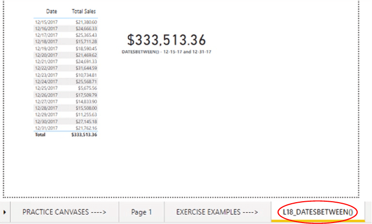
Illustration 22: EXERCISE EXAMPLES -à L18_DATESBETWEEN() Tab
Click the Table visualization on the left to highlight it, then, holding down the SHIFT key, click the Card visualization to the upper right. Both visualizations are selected, as depicted.
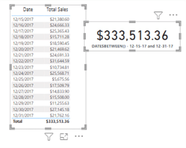
Illustration 23: Selecting Both the Table and Card Visualization on the Tab
With the visualizations selected, press SHIFT + C to copy both simultaneously. Create a new tab (to be moved to the left of the EXERCISE EXAMPLES section) via the “+” button at the far right of all tabs in the model (underneath the canvases). Move the tab (by dragging) to the PRACTICE CANVASES section of the model, and rename it to your preference.
Click the cursor on the canvas of the new tab, and press CTRL + V. The visualizations appear on the new tab.
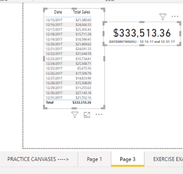
Illustration 23: Selecting Both the Table and Card Visualization on the Tab
We now have copies of the visualizations we created in our practice with DATESBETWEEN() in the earlier section of this Level. This will save us the steps of recreating the visualizations – we have only to create a new measure to demonstrate value to populate the Card visualization and to associate that new measure with the Card.
Recall that the newly pasted Table contains the following data …
- Date
- SalesAmount
… and that the Card houses the measure we created in the last section, and which contains the DATESBETWEEN() function. All you need to do with the Card is to swap a new measure, which you will create using DATESINPERIOD(), with the existing measure in the next section.
Create A Measure to Support the DATESINPERIOD() Function
You’ll again create a straightforward measure that demonstrates the use of a DAX function, this time the DATESINPERIOD() function, to be displayed in a Card visualization that generates a value. The value displayed by the Card can then be compared to the Table visualization that has already been put into place, to allow us to verify accuracy and completeness in the operation of the DATESINPERIOD() function in the associated exercise.
First, create a measure to generate the value of the total of sales over the range of dates you stipulate within the measure by taking the following steps.
Click the ellipses (“…”) to the right of the _Measure table within the Fields. Click New Measure atop the context menu that appears, as depicted.
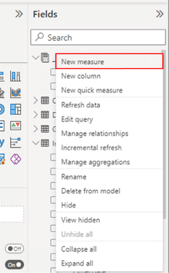
Illustration 24: Click New Measure to Begin Design …
Type (or cut and paste) the following into the Formula bar for the new measure that appears:
DATESINPERIOD() - 12-15-17 through 12-31-17 =
   CALCULATE(
      [Total Sales],
   DATESINPERIOD(  'Date'[Date], DATE(2017,12,15), 17, DAY)
  )
Note you are stipulating here for Power BI to accumulate Total Sales values, from the Date column of the source Date table for the dates within a period defined as “beginning with, and including, 12-15-2017, the seventeen intervals moving forward, with ‘Day’ as that interval.”
Click the check mark icon on the left side of the Formula bar to commit the new measure, as shown.
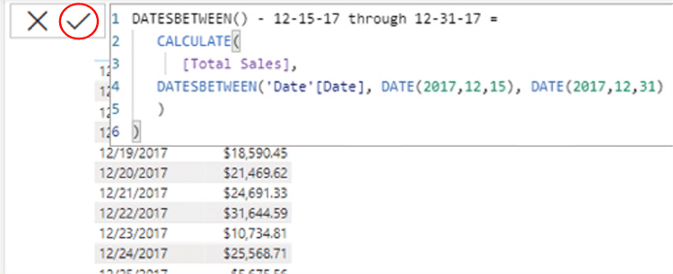
Illustration 25: Commit the New Measure …
As with the use of many of the Time Intelligence functions, the opportunities for parameterization within Power BI become apparent.
Ensuring that the new measure is still selected within the _Measure table, and within the Measure tools tab of the toolbar, format it as “Currency,” two (2) decimal places (as shown in the associated steps of the DATESBETWEEN() section).
Modify the Existing Card Visual to Display the New Measure
Now, you’re ready to exchange the new DATESINPERIOD() – 12-15-17 through 12-31-17 measure with the measure that came along with the copy of the Card used in the DATESBETWEEN() section. Recall again that, because you already have a table in place that presents the Total Sales value for a specified range, you have a means of easily verifying accuracy and completeness in the operation of the new measure.
Click the Card visualization that you pasted to the canvas earlier. Ensuring that the Card remains selected, exchange the new Measures DATESINPERIOD() - 12-15-17 and 12-31-17 measure for the existing measure in the Fields section, underneath the Visualizations collection, as shown.
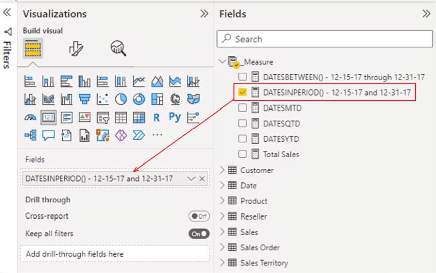
Illustration 26: Measure Addition to the Card Visualization
With the Card selected, click the Format (middle) button atop the Visualizations pane, once again.
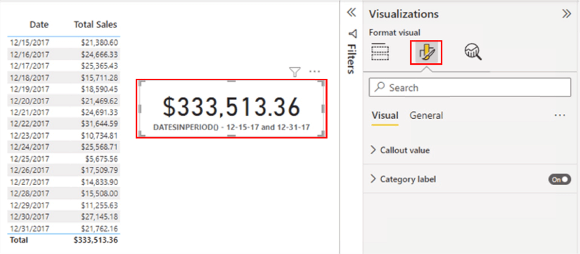
Illustration 27: Formatting the New Card Visualization …
On the Visual tab of the Format pane that appears, I often set the following properties and leave the rest at default (you can, of course, do as you prefer):
- Callout value> Font – Font size of 33 Value decimal places – 2
- Category label > Font – Font size of 12, Bold - Enabled
The Callout Value and Category Label format sections of the Visual tab appear, with modifications, as depicted:
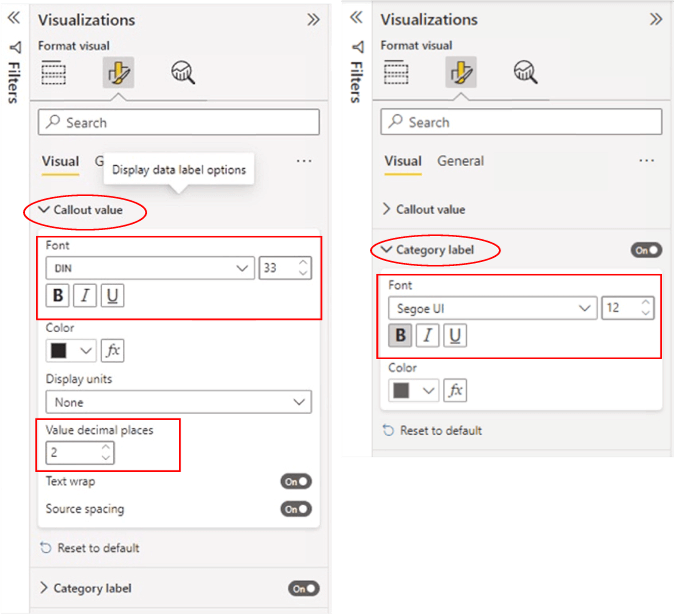
Illustration 28: Suggested Format Adjustments (for Readability)
The Table and Card visualizations appear, at this stage, as shown.
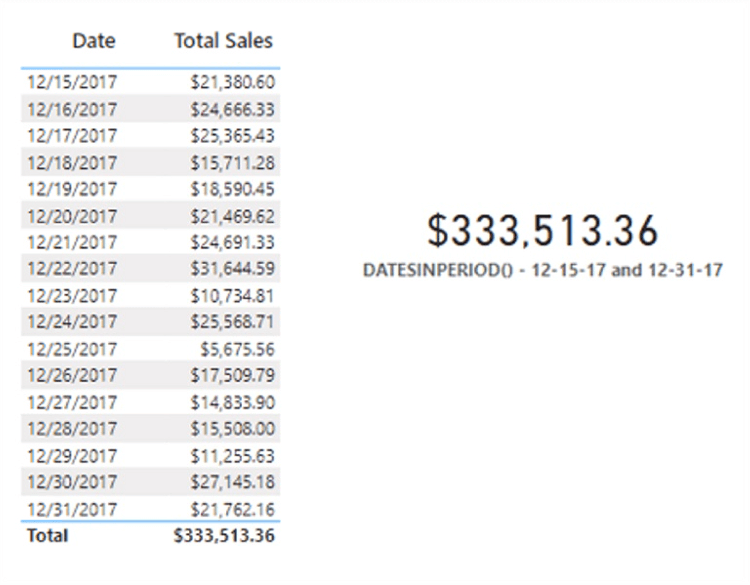
Illustration 29: Table and Chart Visualizations at this Stage …
Recall that the purpose of combining the two visualizations into the current presentation of data was to establish a “self-checking” capability. Keep in mind, too, that the Table already has a filter in place for the same date range (after all, it’s copied from the DATESBETWEEN() section above) that you added into the measure we crafted for the Card, using the DATESINPERIOD()function. You therefore obtain agreement between the two visualizations and accomplish the goal of testing accuracy and completeness in the action of the measure via DATESINPERIOD().
While there are multiple differences in the operation of the DATESBETWEEN() and DATESINPERIOD() functions, the primary qualifier for the correct choice is straightforward. DATESBETWEEN() is best used for a simple range between dates. DATESINPERIOD(), which is an easy pick for simple situations where you want a shorthand approach to asking for all the dates within a given month, year, etc., can also manage more sophisticated needs where we can direct it to do more involved, relative date crunching based upon where you are in a given point in time, etc. – not limited to ranges between individual dates Here’s a common example:
Revenue PY =
CALCULATE(
    SUM(Sales[Sales Amount]),
       DATESINPERIOD(
          'Date'[Date],
        MAX('Date'[Date]),
     -1,
   YEAR
)
Consider that the report is filtered by the month of June 2020. The MAX() function returns June 30, 2020. The DATESINPERIOD() function then returns a date range from July 1, 2019 until June 30, 2020. It's a year of date values starting from June 30, 2020 for the last year.
Next, you’ll gain some exposure to the DATESMTD(), DATESQTD(), and DATESYTD() functions, each of which returns data for the respective “period (month, quarter or year) to date.”
“Periods to Date:”: The DAX DATESMTD(), DATESQTD(), and DATESYTD() Functions
The operation, and many potential uses, of the DAX DATESMTD(), DATESQTD(), and DATESYTD() functions are very similar, except the periodicity of each (which is conveniently disclosed by their respective names). I therefore combine the explanation of the three, somewhat, in this section.
Discussion
The Dates “To Date” functions are identical in syntax – the “behind the scenes action” embedded in the operation of each, is indicated in the three letters following “DATES” in the name involved.
Syntax
Syntactically, the parameters you provide are specified within the parentheses to the right of each of the “DATES” in each of the functions discussed in this section as shown:
DATESMTD(<dates>)

DATESQTD(<dates>)

DATESYTD(<dates> [,<year_end_date>])
The single parameter for each function is:
- Dates – A column containing date expression
In addition, the DATESYTD() function contains an optional parameter [,<year_end_date>], which supports a literal string containing a date that defines the year-end date, as a way of accommodating fiscal calendars. The default is December 31, if this optional string is left out.
Further Considerations
- This function is not supported for use in DirectQuery mode when used in calculated columns or row-level security (RLS) rules.
- The datesargument can be any of the following:
- A reference to a date/time column,
- A table expression that returns a single column of date/time values,
- A Boolean expression that defines a single-column table of date/time values.
- Constraints on Boolean expressions
- The expression cannot reference a calculated field.
- The expression cannot use the CALCULATE()
- The expression cannot use any function that scans a table or returns a table, including aggregation functions.
- However, a Boolean expression can use any function that looks up a single value, or that calculates a scalar value.
- Constraints on Boolean expressions
- The year_end_dateparameter is a string literal of a date, in the same locale as the locale of the client where the workbook was created. The year portion of the date is ignored, as you’ll see in the final practice example.
Return Value
According to the Data Analysis Expressions (DAX) Reference, the DATESMTD(), DATESQTD(), and DATESYTD() functions each return “a table containing a single column of date values.”
Practice
Next, you’ll put the “To Date” functions into action, with a compact sample data set in the sample Power BI model. You will again work via simple measures you create in Power BI, and be able to gain confidence that the practice measures are working correctly through viewing the results you obtain via a “self-checking” scenario. As the three functions with which we are concerned in this section are virtually identical in operation, you will combine your practice efforts with the three into one Table visual.
You’ll begin with another simple reporting need, somewhat similar, but not identical, to the needs specified in the practice sections for the DATESBETWEEN() and DATESINPERIOD() functions earlier. The requirement is to present Total Sales values by date in the Power BI model. In this case, you’ll need to generate Total Sales per day for full calendar and fiscal years of 2020.
Once you have a Table in place for this purpose, you will add three measure to demonstrate the operation of each of the DAX DATESMTD(), DATESQTD(), and DATESYTD() functions. Again, adding these measures to the same Table will support instant visual verification that the functions deliver the appropriate aggregations in the manner that you expect.
Practice Exercise: Illustrate the Operation of DATESMTD(), DATESQTD(), and DATESYTD() through Individual Measures You Create
To prepare for some hands-on exposure to DATESMTD(), DATESQTD(), and DATESYTD(), you’ll install a simple, five-column Table, initially, this time to display Fiscal Year, Fiscal Quarter, Month, Date, and Total Sales amounts, filtered to approximate the timeframe of “the full 2021 Fiscal Year” (July 1, 2020 to June 30, 2021). This table will resemble the one partially depicted below.
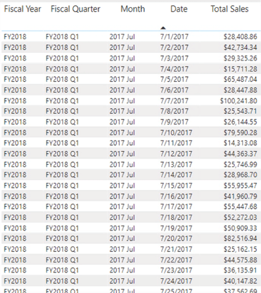
Illustration 30: Your Goal with the Practice Table …
Install Table Visualization to Display Total Sales by Month
In the sample Power BI model, create a new tab (via the “+” button to the right of the right-most tab underneath the Power BI design area), and click-drag the tab to the Practice Samples tabs section to the left of the Exercise Samples tabs, placing it in the location there of your choice.
Right-click the new tab, and rename the tab “(which corresponds to the DATESBETWEEN() section, above in this Level), as shown. (I called mine "To Dates" Functions, but name yours as you prefer.)
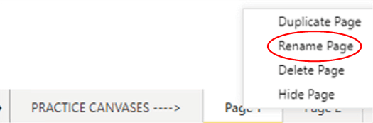
Illustration 31: Renaming the New “Practice Canvas” Tab …
Construct a Table Visualization to Display Total Sales by Month
Click the cursor on the new tab’s blank canvas. Click the table icon in the collection atop the Visualizations tab, to create a blank table on the canvas.
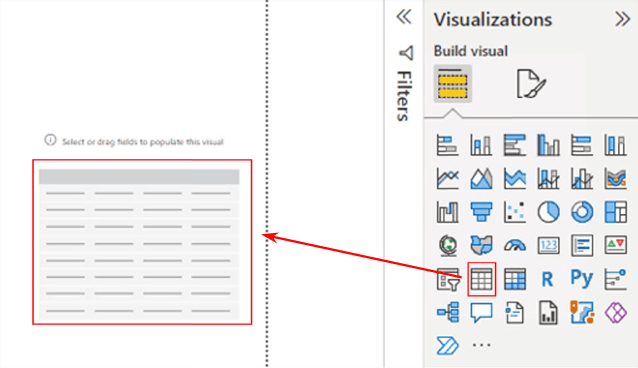
Illustration 32: Create a New Table on the Canvas
Ensuring that the above table visualization is selected, add the following table.column pairs to the Columns section, underneath the Visualizations collection:
- Fiscal Year
- Fiscal Quarter
- Month
- Date
- Total Sales
Your additions should appear, within the Fields tab - Columns section, as shown.
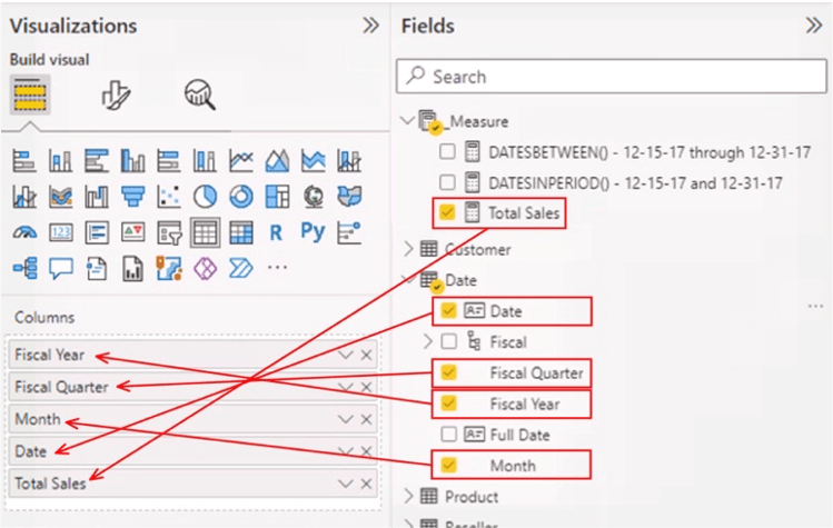
Illustration 33: Values Additions in the Fields Tab …
With the new table selected, click the Format (middle) button atop the Visualizations pane, as depicted.
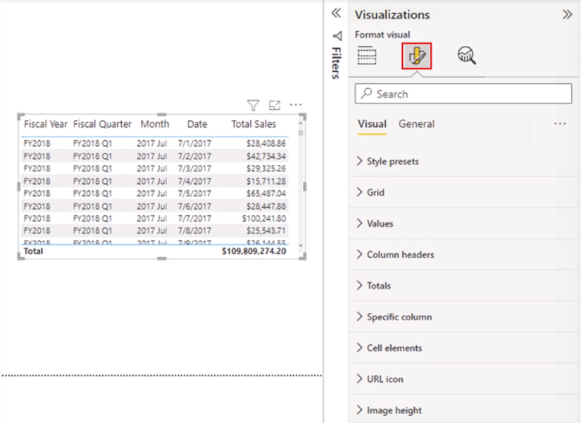
Illustration 34: Formatting the New Table
On the Visual tab of the Format pane that appears, set the following properties (and, again, you can do as you prefer):
- Values > Values - Font size of 12
- Column headers > Text – Font – Font size of 14, Header Alignment at Center
The Values and Column headers sections of the Visual tab appear, with modifications, as depicted:

Illustration 35: Suggested Format Adjustments (for Readability)
Next, you’ll gain some exposure to the DATESMTD(), DATESQTD(), and DATESYTD() functions. To do so, you’ll create measures in the practice section that follows.
Create Measures to Support the DATESMTD(), DATESQTD(), and DATESYTD() Functions
You’ll create a measure to demonstrate each of the DATESMTD(), DATESQTD(), and DATESYTD() functions in action, within the Table visualization you have created above. This will afford the benefit, once again, of creating “self-checking” measures within visualizations in Power BI – always a great way to create and test the calculations you need. The values delivered by the columns that contain your measures can be easily compared to the contents of the Table visualization that has already been put into place for this purpose, as you will see shortly.
MTD (Month-to-Date) Function
First, you’ll create a measure to generate the value of the Total Sales to date for the current Month. You’ll be able to note within the Date rows of the table, too, what the running total of sales is, and compare that total with the total generated by the new measure. The new measure uses the respective DAX “to-date” function to determine the relative place in the current (determined by context) Month for which the measure is calculated. You will see this by taking the following steps.
Click the ellipses (“…”) to the right of the _Measure table within the Fields. Click New Measure atop the context menu that appears, as depicted.
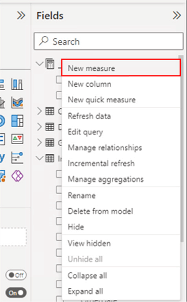
Illustration 36: Click New Measure to Begin Design …
Type (or cut and paste) the following into the Formula bar for the new measure that appears:
DATESMTD =
   CALCULATE (
      [Total Sales], DATESMTD ('Date' [Date])
   )
Click the check mark icon on the left side of the Formula bar to commit the new measure, as shown.
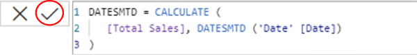
Illustration 37: Commit the New Measure …
With this data set, you’re creating a measure to return “the Total Sales at each date that corresponds to the month-to-date in the current row context (that is, “where you are” in the current month – which is dictated by the date row upon which the calculation is performed). In other words, you’re asking for the cumulative, month-to-date Total Sales amount at each of the days within the range that you specify.
Ensuring that the new measure is selected within the _Measure table, and within the Measure tools tab of the toolbar, format it as “Currency,” two (2) decimal places.
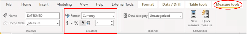
Illustration 38: Format the New Measure …
Add the new measure to the Table visualization by clicking the checkbox to the left of the measure in the Fields pane, as shown.
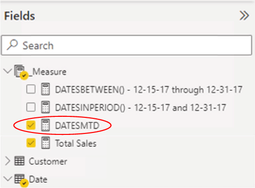
Illustration 39: Add the New Measure to the Table Visualization
The Table visualization appears, at this point, as shown (scrolled to show the top row, corresponding to the date of 7/1/2017).
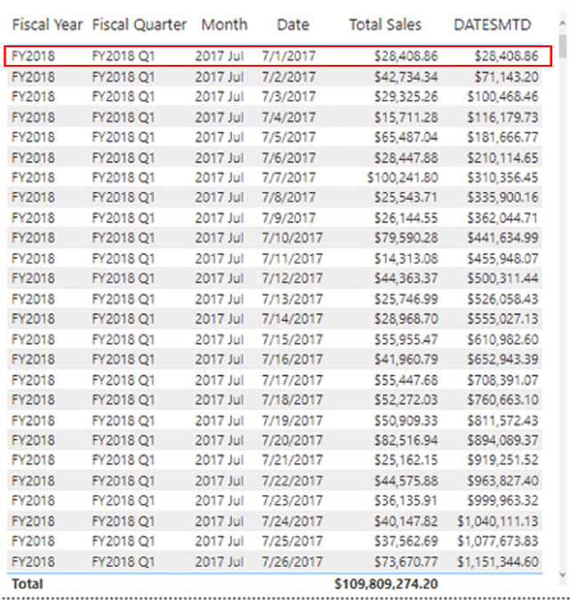
Illustration 40: Table Visualization at this Stage …
As you can see, the DATESMTD measure appears to be working as expected. For each date row, the month-to-date addition appears to be working correctly. Moreover, when we scroll to the month end of July, and focus upon the 8/1/2017 date row, the measure resets to reflect the Total Sales for the single day of the new month, as depicted and highlighted.
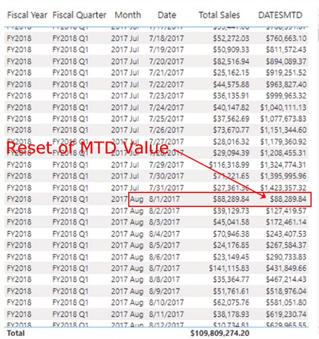
Illustration 41: MTD Reset Occurs at the Beginning of the New Month …
Next, you’ll gain some exposure to the DATESQTD() functions, and create a measure to contain the function and to deliver its output to the Table we have set up already. Many steps are the same, so I’ll be showing illustrations only where differences occur between this and the other “to date” functions.
DATESQTD() Function
Next, you’ll create a measure to generate the value of the total of sales to date for the current Quarter. The steps – and the results you can expect – mirror those of your experience with the DATESMTD() function above, only they will be from the perspective quarters versus months.
Click the ellipses (“…”) to the right of the _Measure table within the Fields. Click New Measure atop the context menu that appears. Type (or cut and paste) the following into the Formula bar for the new measure that appears:
DATESQTD =
   CALCULATE (
      [Total Sales], DATESQTD ('Date' [Date])
   )
Click the check mark icon on the left side of the Formula bar to commit the new measure.
With this data set, you’re creating a measure to return “the Total Sales at each date that corresponds to the quarter-to-date in the current row context (that is, where you are in the current quarter – which is dictated by the date row upon which the calculation is performed).
In other words, you’re asking for the cumulative, month-to-date Total Sales amount at each of the days within the range that you specify.
- Ensuring that the new DATESQTD measure is still selected within the _Measure table, and within the Measure tools tab of the toolbar, format it as “Currency,” two (2) decimal places.
- Add the new DATESQTD measure to the Table visualization by clicking the box to the left of the measure in the Fields pane, as you did with the DATESMTD
The Table visualization appears, at this point, as shown (again, scrolled to show the top row, corresponding to the date of 7/1/2017).
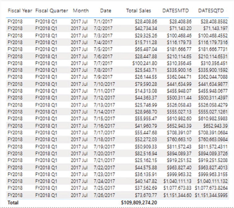
Illustration 42: Table Visualization at this Stage …
As you can see, the DATESQTD measure appears to be working as expected. We can see that, for each date row, the quarter-to-date addition appears to be working correctly – paralleling, for that matter, the DATESMTD measure until the change of the month at 8/1/2017, when the DATESMTD measure resets for the new month, but `DATESQTD continues to accumulate.
Moreover, when we scroll past the quarter end of FY2018 Q1, and focus upon the 10/1/2017 date row, the DATESQTD measure resets to reflect the Total Sales for the single day of the new month, as depicted and highlighted.
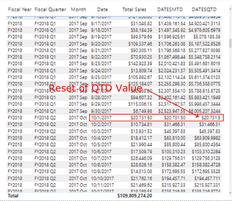
Illustration 43: QTD Reset Occurs at the Beginning of the New Quarter …
Next, you’ll gain some exposure to the DATESYTD() functions, and, once again, create a measure to contain the function and to deliver its output to the Table we have set up already. Many steps are the same, so I’ll be showing illustrations only where differences occur between this and the other “to date” functions.
DATESYTD() Function - DATESYTD() for a Calendar Year End
Finally, you’ll create a measure to accumulate the value of the total of sales to date for the current Year. The steps – and the results you can expect – mirror those of your experience with both the DATESMTD() and DATESQTD() functions above, only they will be from the perspective of years versus quarters or months.
Click the ellipses (“…”) to the right of the _Measure table within the Fields. Click New Measure atop the context menu that appears. Type (or cut and paste) the following into the Formula bar for the new measure that appears:
DATESYTD (Calendar) =
   CALCULATE (
      [Total Sales], DATESYTD ('Date' [Date])
   )
Click the check mark icon on the left side of the Formula bar to commit the new measure.
With this data set, you’re creating a measure to return “the Total Sales at each date that corresponds to the year-to-date in the current row context (that is, where you are in the current year – dictated, of course, by the date row upon which the calculation is performed).
In other words, you’re asking for the Total Sales cumulative year-to-date amount at each of the days within the range that you specify. The “accumulator,” as one would expect, continues to build with each date row until it encounters the first date in the next year, and resets, much as we have seen resets occur with the DATESMTD() and DATESQTD() functions.
Ensuring that the new DATESYTD (Calendar) measure is still selected within the _Measure table, and within the Measure tools tab of the toolbar, format it as “Currency,” two (2) decimal places.
Add the new DATESYTD (Calendar) measure to the Table visualization by clicking the box to the left of the measure in the Fields pane, as you did with earlier measures.
The Table visualization appears, at this point, as shown (again, scrolled to show the top row, corresponding to the date of 7/1/2017).
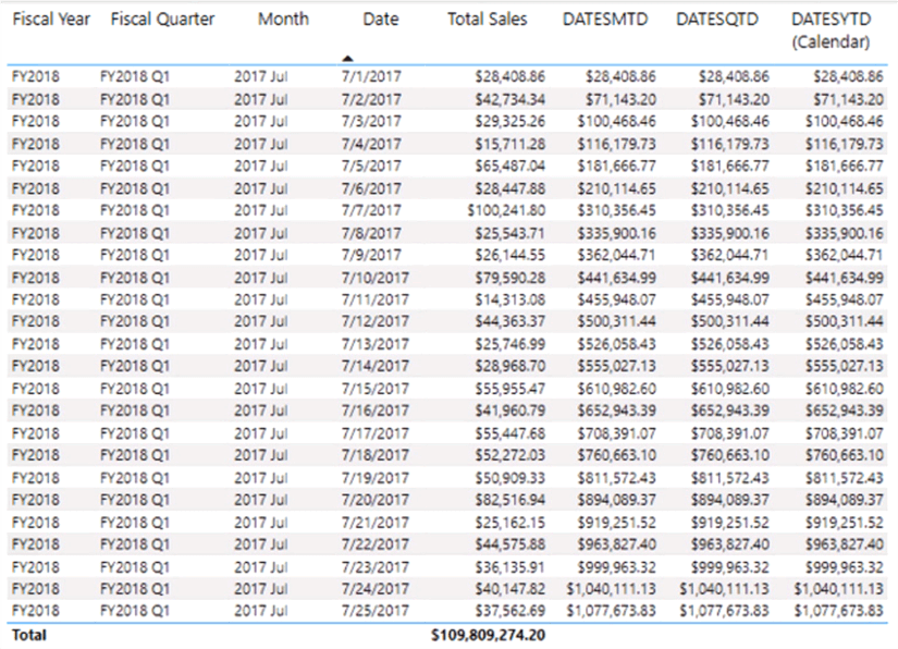
Illustration 44: Table Visualization at this Stage …
As you can see, the DATESYTD (Calendar) measure appears to be working as expected. We can see that, for each date row, the year-to-date accumulation appears to be working correctly, until we scroll to the calendar year end of 12/31/17, and focus upon the 1/1/2018 date row, where the DATESYTD (Calendar) measure resets to reflect the Total Sales for the single day of the new month, as depicted and highlighted.
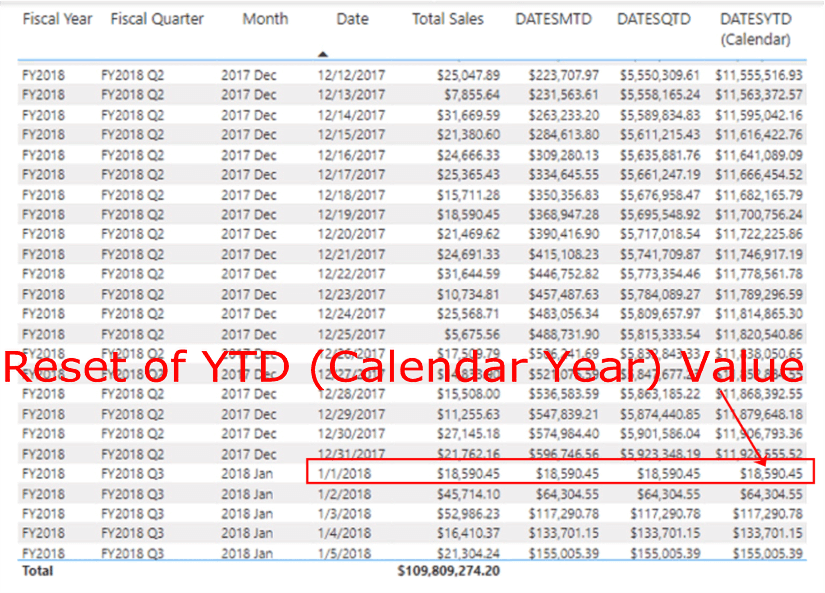
Illustration 45: YTD (Calendar Year) Reset Occurs at the Beginning of the New Calendar Year …
This is a great time to go one step further and examine the steps needed to use DATESYTD() for a fiscal year end. We’ll do so in the next section.
DATESYTD() for a Fiscal Year End
Adjusting the DATESYTD (Calendar) measure you have just created only requires a few steps to allow for handling fiscal year ends. You’ll walk through those steps now, using a copy of the existing measure, so as to retain the original for comparison purposes, perhaps.
Click DATESYTD (Calendar) within the _Measure table within the Fields pane, to expose the DAX, once again, in the Formula bar. Using the mouse, highlight the DAX and click CTRL + C to copy to copy to the clipboard.
Right-click the _Measure table within the Fields pane, and select New Measure from the context menu that appears, as shown.
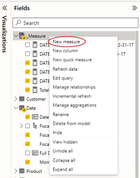
Illustration 46: Creating a New Measure to House the Copied DAX …
- Highlight the default text “Measure =” in the Formula bar that opens, and paste the DAX you just copied into the new measure formula space. Rename the measure DATESYTD (Fiscal Year)to reflect a calendar year by changing “(Calendar Year)” to “(Fiscal Year)” within the DAX.
Your formula should look like this:
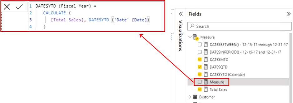
Illustration 47: Creating a New Measure - Via Modification …
Add the new measure to the Table visualization via the checkbox in the _Measure table of the Fields pane, as you have done with all the measures you’ve created do far.
The measure appears on the right of the Table, unsurprisingly displaying identical values to its predecessor DATESYTD measure, as all remans the same except the name at this point.
- Right-click the new measure in the Fields pane, to re-open the DAX in the formula space.
Within the DAX, you will add a comma after DATESYTD ('Date' [Date], to enable the <YearEndDate> parameter that we mentioned in the Syntax section above for the DATESYTD() function, and showed it in the pseudocode as part of the explanation.
DATESYTD(<dates> [,<year_end_date>])
Recall that I mentioned there that “the syntax contains an optional parameter [,<year_end_date>], which supports a literal string containing a date that defines the year-end date, as a way of accommodating fiscal calendars. The default is December 31, if this optional string is left out.” All you are doing now is leveraging that <YearEndDate> parameter.
Within the DATESYTD ('Date' [Date]) section of the DAX, insert a comma (“,”) between [Date] and the closing parenthesis (“)”) for the DATESYTD(). When you add the comma, the prompt for the [YearEndDate]option is triggered, as depicted.
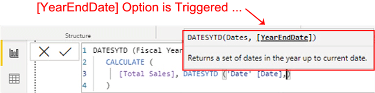
Illustration 48: Triggering the [YearEndDate] Option
Your objective is to have the cumulative annual totals to start in July and end in June the following year. You therefore need to add “30/6” (year end of June 30) after the comma to obtain the appropriate formula for your fiscal year ends.
Add “30/6” (including quotes) to the DATESYTD() function, after the comma you have added. The DAX expression for the new measure appears as shown:
DATESYTD (Fiscal Year) =
   CALCULATE (
      [Total Sales], DATESYTD ('Date' [Date],"30/6")
   )
Click the check mark icon on the left side of the Formula bar to commit the new measure, as depicted.
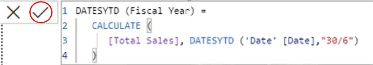
Illustration 49: DAX Expression for the New DATESYTD (Fiscal Year) Measure
Scroll to the Table row dated 7/1/2018 (the beginning a new fiscal year). The accumulation of the DATESYTD (Fiscal Year) measure resets on the beginning day of the new fiscal year, indicating that the DATESYTD() function is performing as expected, now that the [YearEndDate]option has been set as depicted.
Illustration 50: YTD (Calendar Year) Reset Occurs at the Beginning of the New Fiscal Year …
You now have a simple Table visualization that demonstrates the assembly and operation of the DAX “Periods to Date:” functions. Moreover, this visual contains an example of how to manage both Fiscal and Calendar years with one of the functions, DATESYTD(). And, as always, from this straightforward beginning, it’s easy to see how similar measures can be parameterized to afford run-time manipulation of these functions for extended flexibility.
Summary
This Level of the Stairway to DAX and Power BI is part of a DAX Time Intelligence subseries. Here I introduced multiple DAX functions – functions that were similar in operation in some ways, so as to condense explanations. After reading a discussion of the general purpose and operation of each of the DATESBETWEEN(), DATESINPERIOD(), DATESMTD(), DATESQTD(), and DATESYTD() functions, you focused upon putting the respective function to work within the construction of a measure that demonstrated using it as a frame for reporting at representative summary levels that you might encounter in the business environment.
As part of this introduction, you examined the syntax involved with each function, and then constructed an illustrative example of the use of the function in a simple practice exercise. Finally, for each example you undertook, you explored means of generating a self-validating results dataset to ensure accuracy and completeness of the results generated by the respective measure you constructed to contain the respective function.