This article explains how to manage recursive queries on SSRS report. We will see how to:
- implement Tablix and DocumentMap.
- manage calculation and formulas offered by the SSRS layer
- format properly the report
- manage conditional formatting
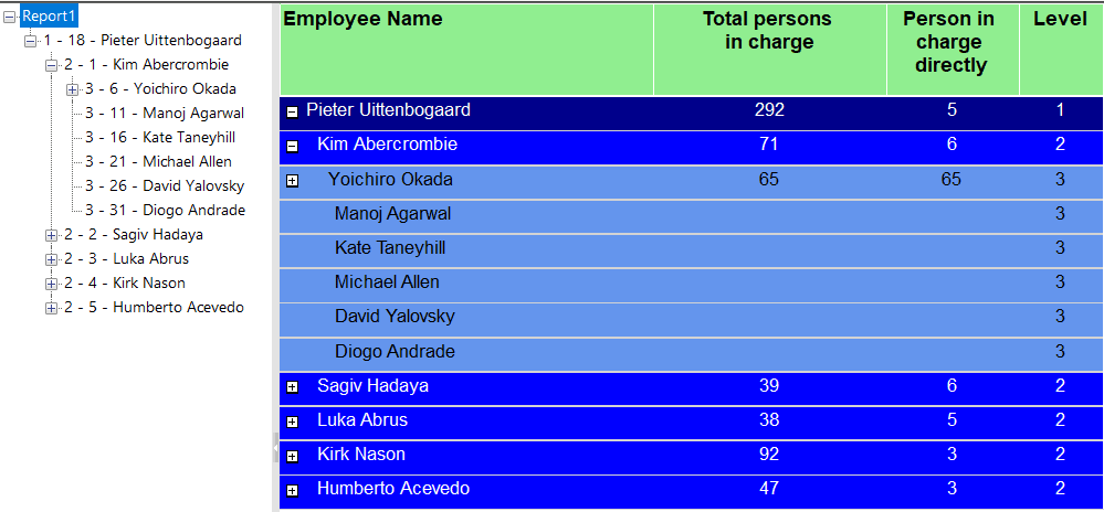
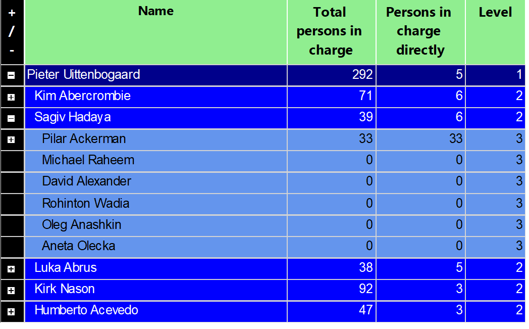
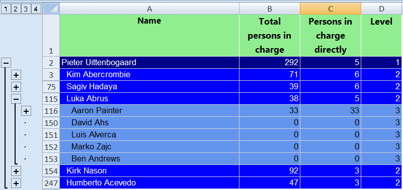
The final representation of the report will look like this:
The RDL report is attached here: Report1. You will need to change the SQL Server connection according to your environment.
Let's move to the first step!
Step 1 - The Table Employee
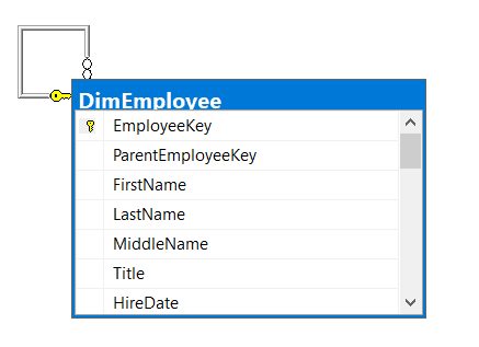
On this article we will use the table DimEmployee from the ContosoBIDemo (available to download here ):
We will use an analytics view to display only the columns we need for our report. The SQL code is:
CREATE VIEW [Analytics].[Employee]
AS
SELECT [EmployeeKey]
      ,[ParentEmployeeKey]
      ,[FirstName] + ' ' + [LastName] AS Name
  FROM [ContosoDW].[dbo].[DimEmployee]
GO
Now let's move to the SSRS part.
Step 2 - The Data Source
First we need to create a new Report Server Project. In SSDT, click on "New Project", then choose new "Project Report Server":

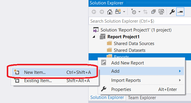
Go to the right pane "Solution Explorer" and right click on the "Report" folder:

Choose "New Item...":
Here you can choose a name for our new report. I will leave the default name. Then click the "Add" button: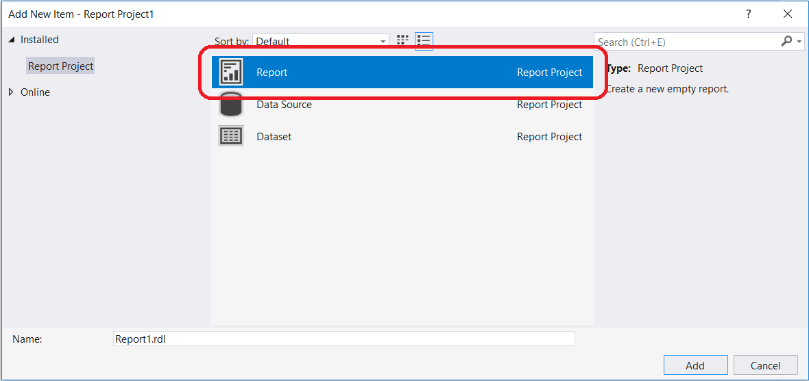
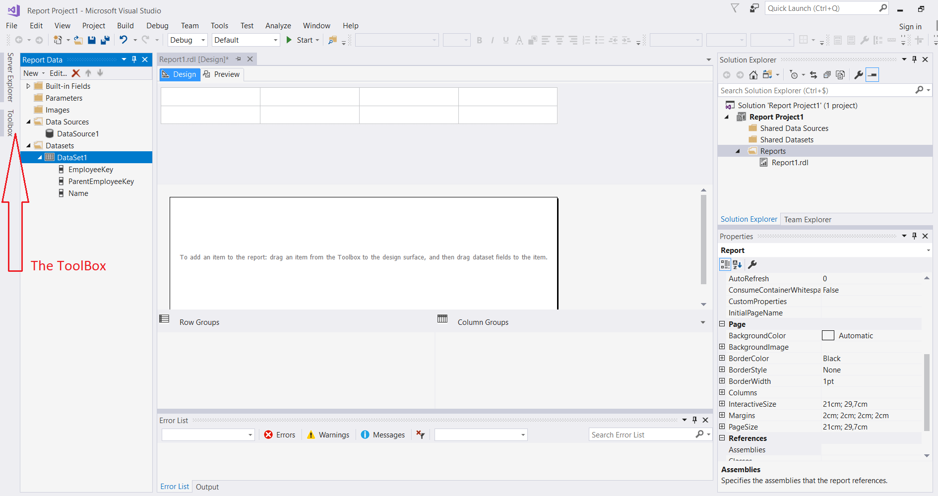
The "Report1.rdl" is created and listed below the "Report" folder in the "Solution Explorer" pane:
Next, we need to create a DataSet and a Data Source embedded in our report. In production, it is recommended to create a "Shared DataSource" to be used in multiple reports.
The Data Source
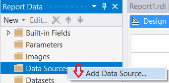
Go to the left pane, "Report Data", where the "Data Sources" folder is located. Right click on this folder and choose "Add Data Source...":
The data source creation dialog is opened:
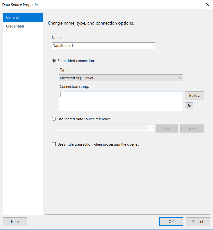
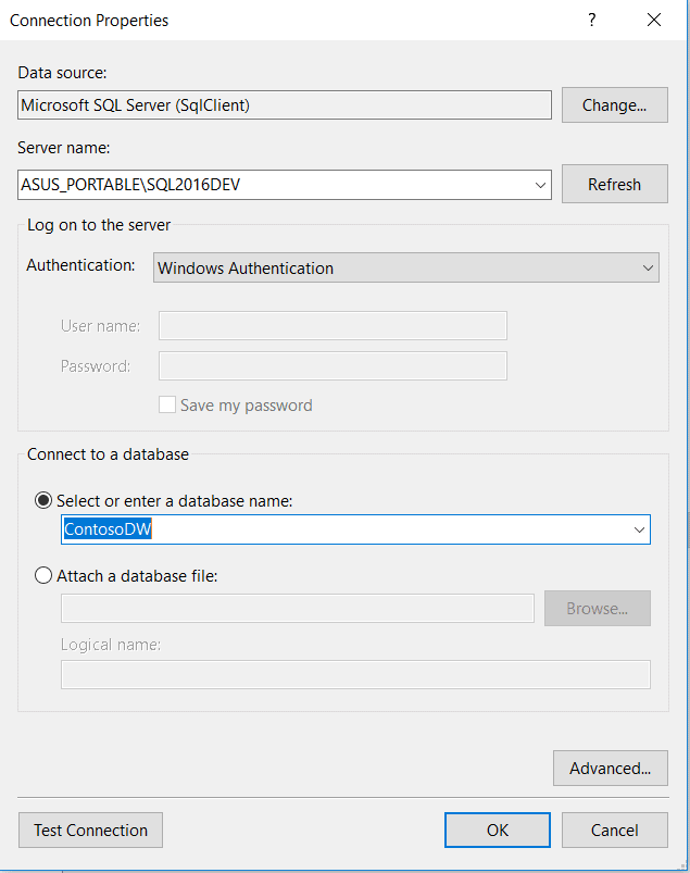
On this dialog, click on the "Build..." button and select the Server and the Database containing the DimEmployee table:
Then, click on the "OK" button twice to create the new Data Source:

After we've created the Data Source we need to create a new DataSet.
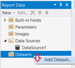
The DataSet
On the same pane, "Report Date", right click on the "DataSet" folder and choose "Add Dataset".
The Dataset assistant dialog opens:
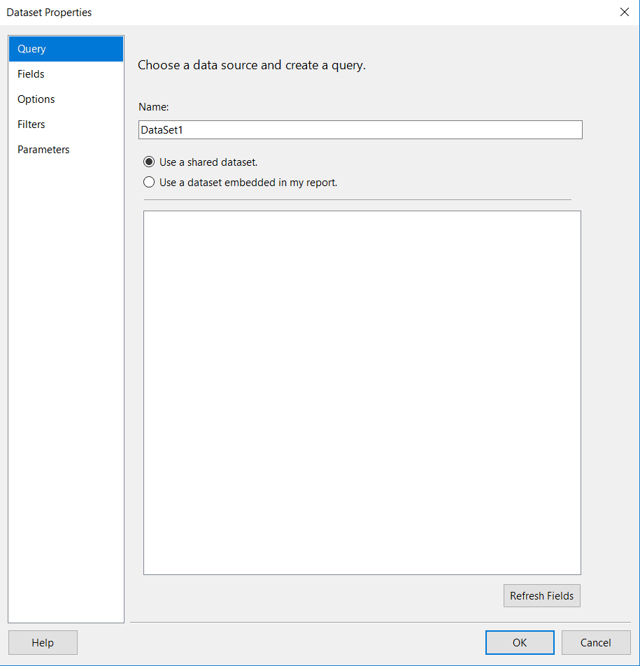
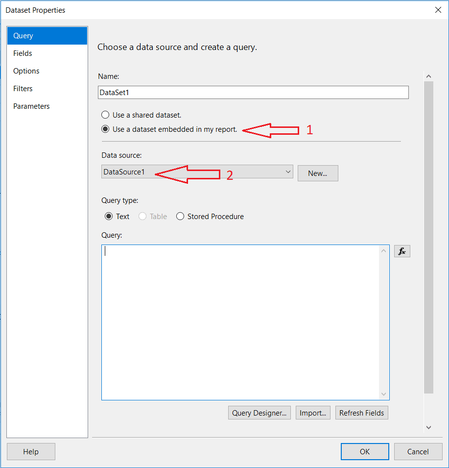
On this dialog, choose "Use a dataset embedded in my report" and select the Data Source created before:
Next, copy and paste the SQL code below into the "Query" textbox:
SELECT
  Analytics.Employee.EmployeeKey
  ,Analytics.Employee.ParentEmployeeKey
  ,Analytics.Employee.Name
FROM
  Analytics.Employee
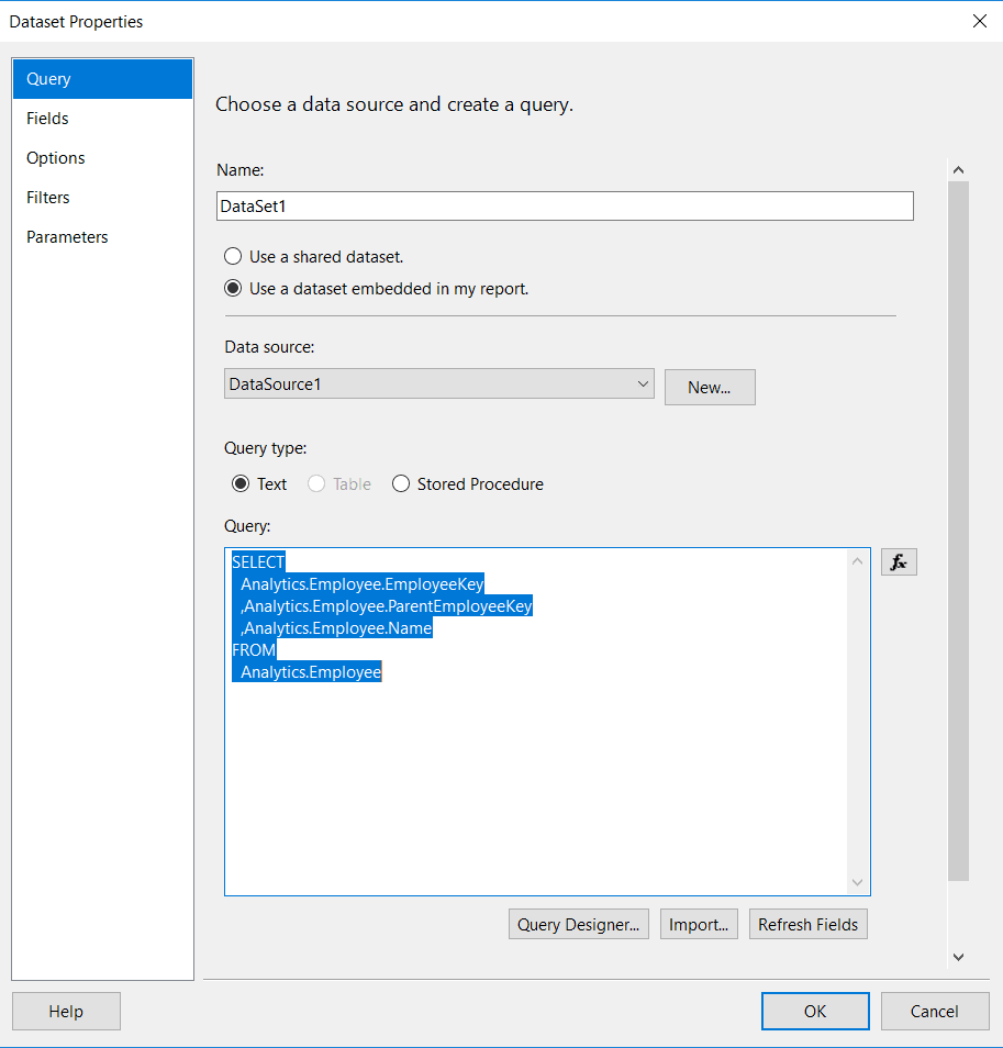
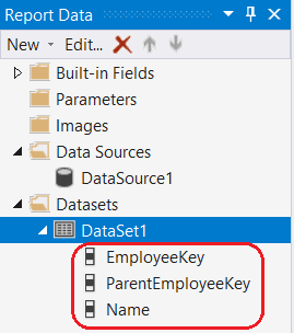
Finally, click the "OK" button to validate the query against the dataset. The three fields, "EmployeeKey", "ParentEmployeeKey", and "Name", are displayed below the dataset:
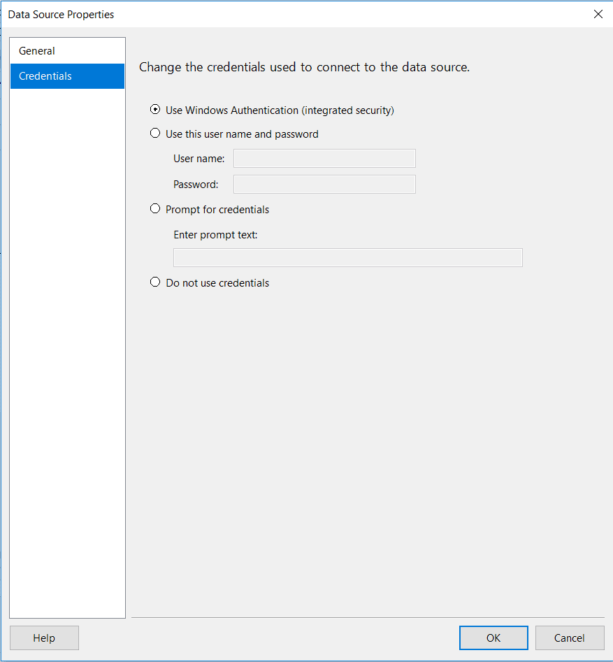
If you meet an error here, it is due to an incorrect credential. To solve this you need to go back to the "Data Source Properties" dialog and enter the right credentials:
Let's move to next step to configure the layout of our report.
Step3 - The Tablix Component
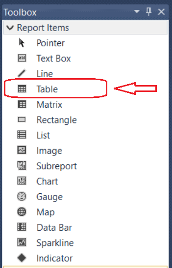
On the left pane of SSDT or the Report Builder, click on the "Toolbox":
This will open the toolbox. In here, choose the "Table" component:
Double click on the "Table" component, the table is added automatically in the report layout:
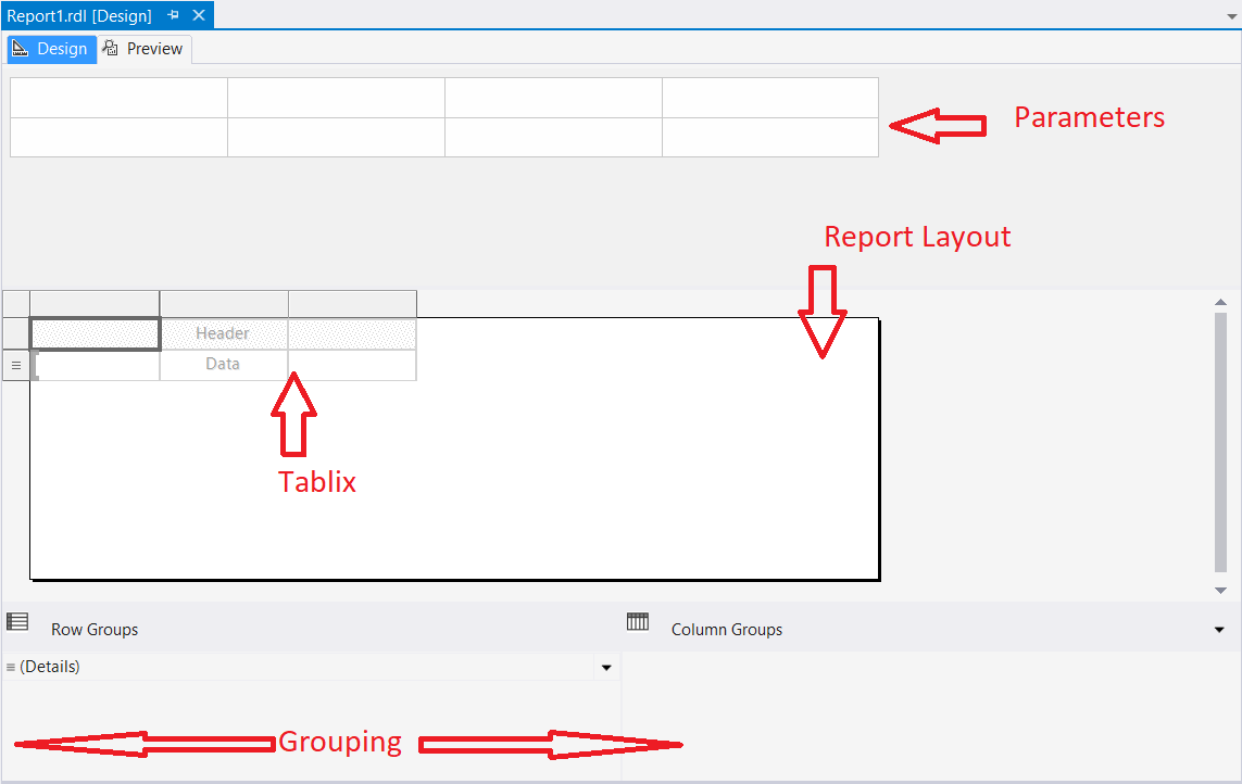
As you can see, the report is divided into four main panes, which are described below:
- Grouping Pane: where we can add row group and column group
- Parameters Pane: add parameters and dynamic filter to the report (since 2016 it is possible to move parameters in a more flexible way)
- Report Layout: where we can add all the visualization component we need
- Tablix (component): one a many component available from the reporting services toolbox
This article focuses on the report layout and the grouping pane.
The Report Layout
First, we need to drag and drop our fields into the tablix in order to display our data as a simple table. To do this, just drag and drop dataset fields on the "Data" region:
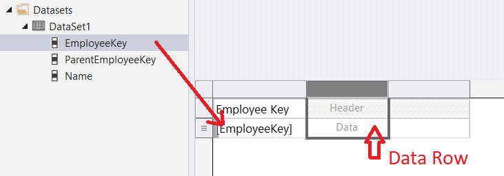
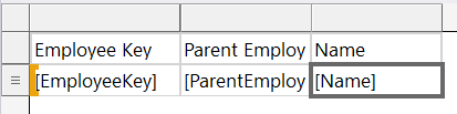
The 3 fields are connected to the table row data:
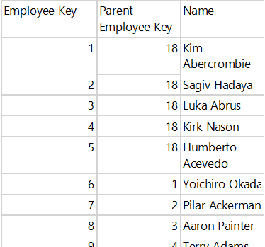
When you preview the report, you should see each employee line by line with no hierarchy structure:
Now that we have our data correctly displayed in the table, we can add the recursive group.
The Grouping Pane
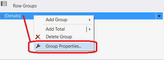
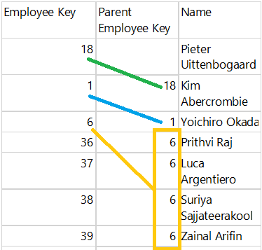
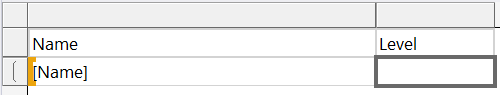
To do that, go on the Grouping Pane below and right click on the "Detail" group then choose "Group Properties":
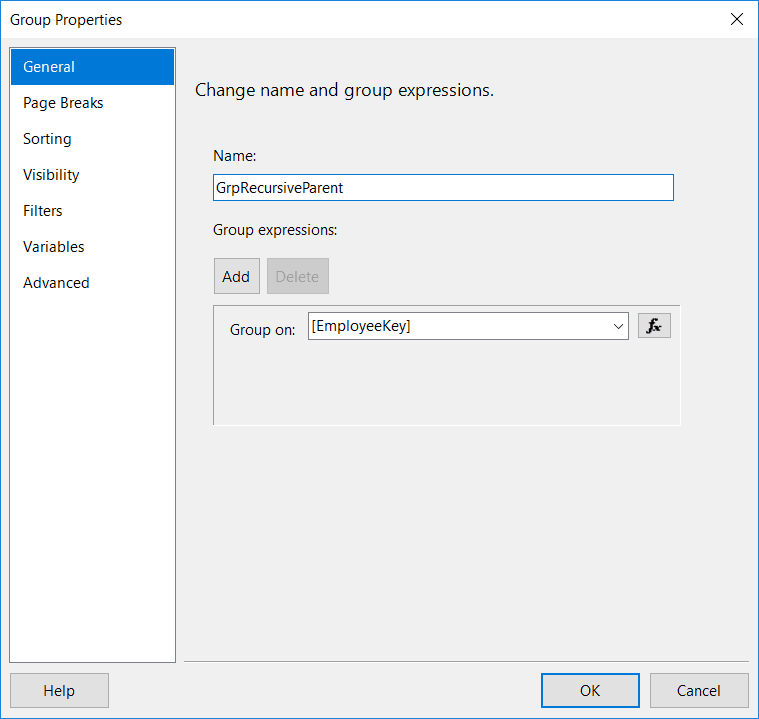
On the "Group Properties" dialog, change the default name to "GrpRecursiveParent" and add the field "EmployeeKey" to the grouping fields:
On the same dialog box, go to the "Advanced section" and choose the field "ParentEmployeeKey" as the recursive parent:
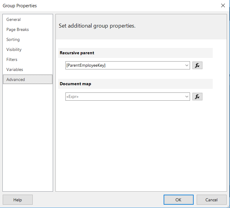
Leave the Document Map blank, we will discuss this on step 6.
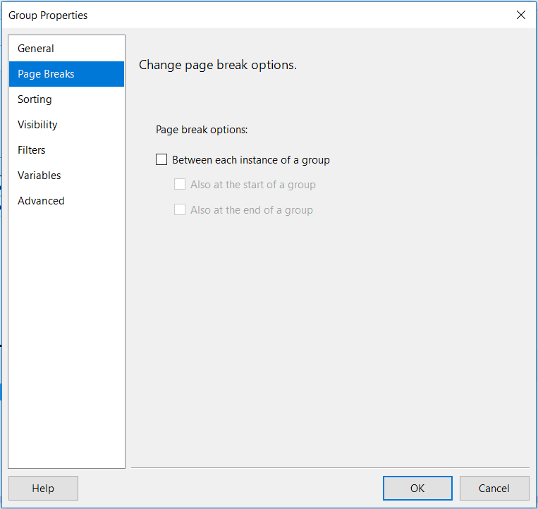
On the same dialog again, go to the section "Page Breaks" and unchecked all the options like this:
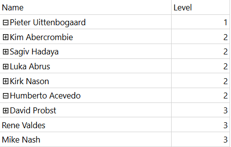
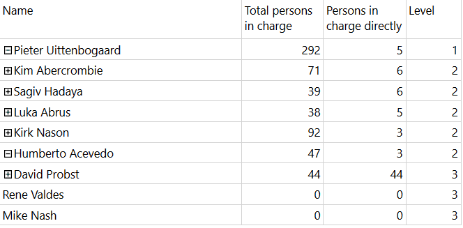
Now, when you preview the report, it should be ordered from top manager to employee:
Still, the report is not user friendly. To improve that, we will add a toggle item.This will help hide and display the subsequent level of the hierarchy.
The Toggle Item
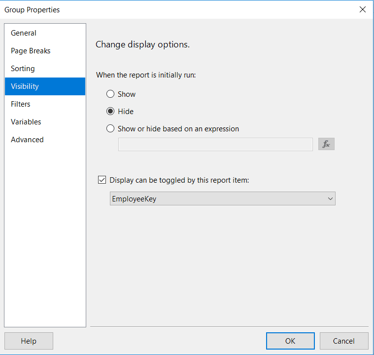
To do that, go back to the "Grouping Properties" dialog of the group "GrpRecursiveParent". In the "Visibility" section, choose "Hide" and "choose EmployeeKey" as toggle item:
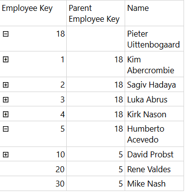
Now, when you preview the report, a "+/- " is added before the Employee Key:
Let's move to the next 2 steps to see how we can improve the visibility of our report.
Step 4 - Calculations
Before we add calculations, we need to reorganize the table.
On the tablix:
- delete the 2 columns "ParentEmployeeKey" and "Name".
- rename the header of the "EmployeeKey" to "Name".
- change the value of the textbox to the expression below:
=Fields!Name.Value
Finally, change the size of the textbox in order to display full name of the employee.
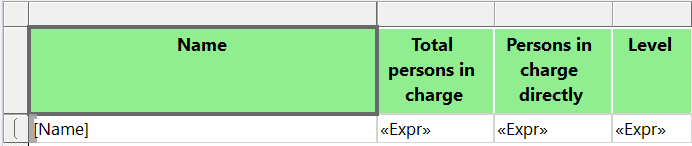
The tablix should look like this:
Next, we will add the level of the hierarchy.
The Level Calculation
To do this, add a column on the left and name it "Level":
Then, copy paste the expression below into the expression value of the textbox:
=Level()+1
When we preview our report, we can see the level of the hierarchy and the full name:
Let's add two more calculations. The first one will count all the employees in charge by the manager. The second one will count all the employees directly in charge by the manager.
Counting the Total Employees in Charge
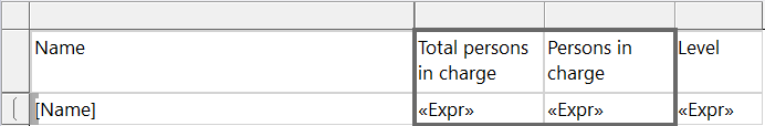
To add the counting of all employees in charge, add a new column between Name and Level. Name the header as "Total persons in charge". On the expression field copy paste the code below:
=CountRows("GrpRecursiveParent",Recursive)-1Rename the textbox to "txtNbTotalInCharge".
Counting the Total Employees Directly in Charge
To add the counting of direct employee in charge, it is a little bit difficult. We need to use the LookupSet function and get all the employee where the "ParentEmployeeKey" equals the current employee key displayed by the report. We need to use embedded code in the report to calculate the length of the list.
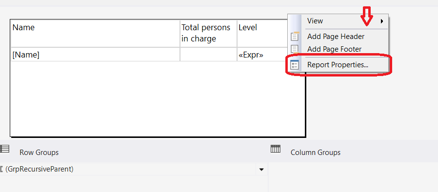
First, right click on the report pane and choose "Report Properties...":
Then, choose "Code" and copy paste the code below:
Function Length(ByVal items as Object()) as Integer
   If items is Nothing Then
      Return 0
   End If
   Return items.Length
End Function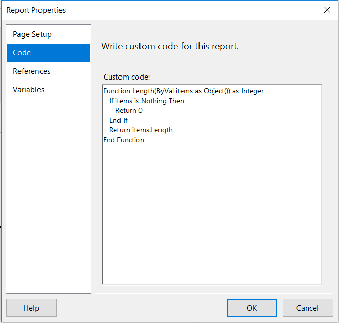
Go back to the textbox of the calculation and copy paste the code below to the expression:
=Code.Length( LookupSet( Fields!EmployeeKey.Value, Fields!ParentEmployeeKey.Value, Fields!EmployeeKey.Value , "DataSet1" ) )
The layout of our report should look like this:
Rename the textbox to "txtNbInCharge".
When you preview the report, now it displays the counting:
Let's go to the next step to format the report, hiding the zero value, indenting and coloring.
Step 5 - Formatting
In this step, we will add some nice formatting on the tablix component. These are just examples of formatting so you are free to change at your preference.
The Header
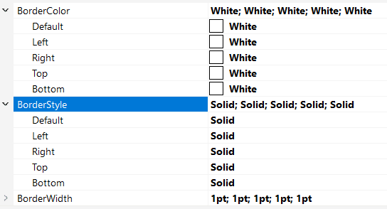
On the header of the table, change the border color and the border style to these values:
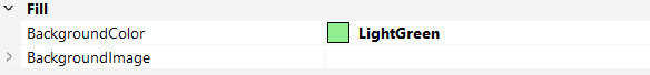
Then change the background color to this:
Change the font to this:
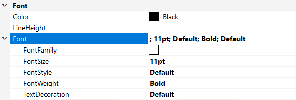
Change the alignment to this:
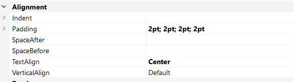
The header should look like this:
Formatting Row Data
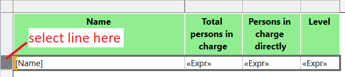
Here, we will do a conditional formatting by changing the background color of the row data depending on the Level() value. Select the row data line:
Then click the background color properties and choose "Expression...":
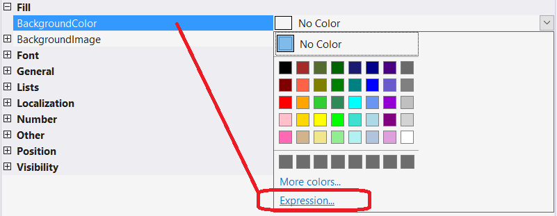
Copy paste the code below into the expression textbox:
=Choose( Level()+1, "DarkBlue", "Blue", "CornflowerBlue", "LightSteelBlue" )
This will change the background color depending on the level value. Do the same for the Font Color expression and copy paste the code below:
=IIf( Level() < 2, "White", "Black" )
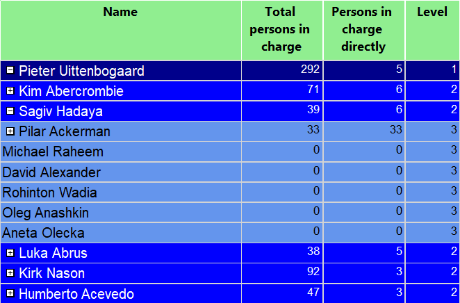
When we preview our report, this should loo like this:
Space Indentation
To improve the visibility of the hierarchy, we will add space indenting into the Name textbox. To do that, go to the Name textbox and right click "Expression:". Then copy paste the code below:
=Space( Level() * IIf( ReportItems!txtNbInCharge.Value = 0, 5, 2 ) ) & Fields!Name.Value
The expression checks if level exists below the current line by getting the value of the field "Person in charge directly". See Step4 for more details. I do that to avoid using twice the CountRows() function.
"ReportItems!<textbox>" references a value from an existing textbox into the report layout. If the value of "ReportItems!txtNbInCharge.Value" equals "0" this means subsequent level below does not exist. This means we are at the leaf level.
Now the preview report should look like this:
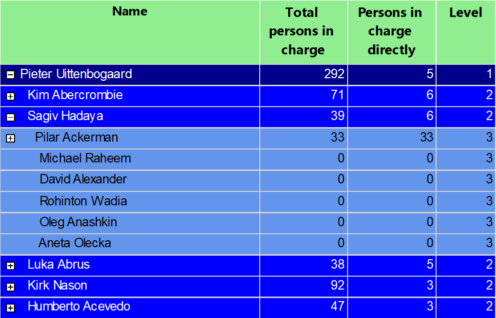
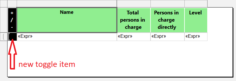
Thought the indenting is not aligned correctly. The problem here is the "+/-" toggle. It breaks the indenting. To avoid this we will move the toggle item to a new column and move the "Visibility" property to this new column.
New Toggle Item
First, we add the new column and we name it "txtToggleItem":
Then, go back to the "Visibility" property of the row data and change toggle item from "EmployeeKey" to "txtToggleItem":
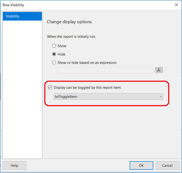
Here, change the expression in the "Name" field to this:
=Space( Level() * 2 ) & Fields!Name.Value
In this expression, we don't need to detect if there is "+/-" preceding the name of the employee because we moved the toggle item.
Now the report looks better:
To hide the non significant "0" values in the calculation of the "Total", just copy paste the format code below into the format property:
#,0;(#,0);''
The next step will show you how to add more interactivity to the report.
Step 6 - Document Map
The document map in reporting services is a very good way to browse the report faster. It adds bookmark navigation. In our report, we will add the document map reflecting the hierarchy of the table.
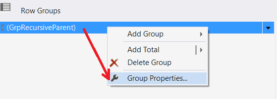
To achieve that, go to the property of the group "GrpRecursiveParent" then right clicking on it and choose "Group Properties...":
Then, go to the "Advanced" section:
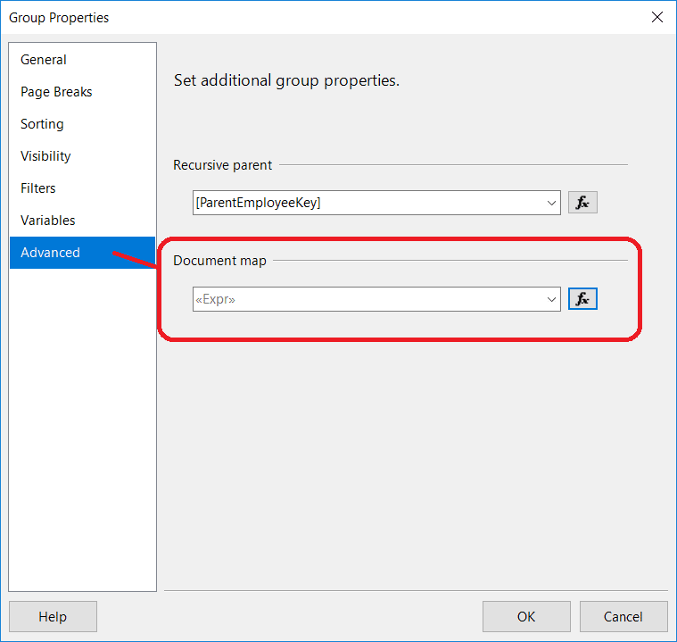
Next to Document map, click the button "Fx" and copy paste the code below:
= ( Level() + 1 ).ToString() & " - " & Fields!EmployeeKey.Value & " - " & Fields!Name.Value
The expression will display the concatenation of "<Level> - <EmployeeKey> - <Employee Name>".
When you run the report, the document map is displayed on the left of the report:
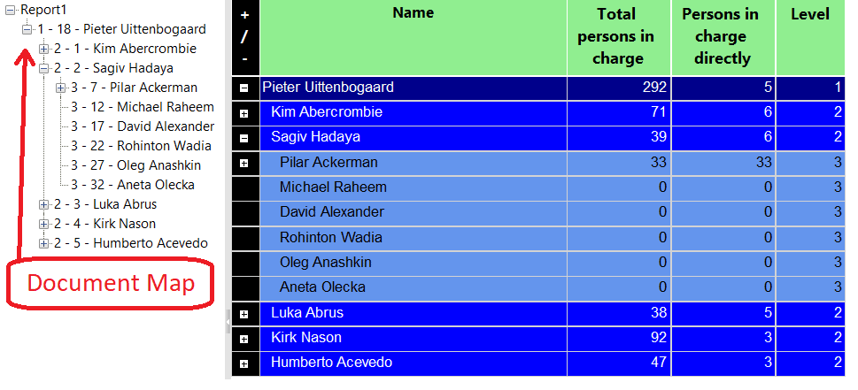
To activate the bookmark jump, we have to deactivate the toggle item in the table. The final step will show you how to adapt the output of the report depending on the format.
Step 7 - Conditional Export to Excel
In this Step we will see how to export our report correctly into Excel. The report we have created contains a Document Map and a table with a hierarchy. When you export the report in Excel, we have two sheets. The first one contains the Document Map:
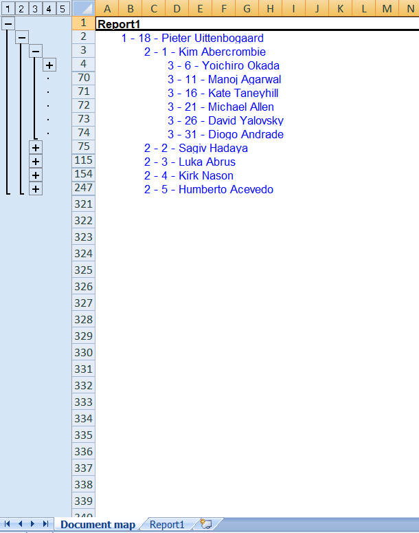
The second one contains the table:
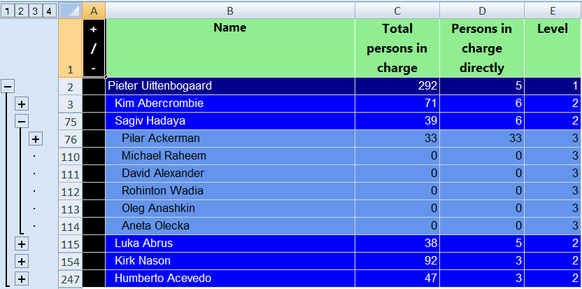
As you can see, the "+/-" is automatically managed by Excel. We need to hide the black column.
To do that go back to Report Builder or Visual Studio, right click on the header of the column "+/-" and choose "Column Visibility...":
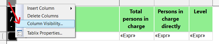
Then, on the property dialog, choose "Show or hide based on an expression " and copy paste the code below:
=(Globals!RenderFormat.Name="EXCELOPENXML" or Globals!RenderFormat.Name="EXCEL")
Now, when exporting to Excel (XLS or XLSX), the toggle item is hidden:
Conclusion
We have seen how to implement interactivity and conditional formatting when dealing with recursive table and grouping in Reporting Services.
I hope this will help you create better report.