As a data professional, I have some fun with data in my life. I like numbers, and I like tracking things. I've written posts about my year in numbers, and recently noted the states I've visited. Like many of you, I've sometimes used this data to practice a skill, maybe learn to ETL or query data. One of the classic applications that was popular when I was a young professional was a catalog of CDs. I never did that, but I have captured other numbers.
I do a lot of traveling, both for work and fun. This year (2023) has been a little crazy, and I wondered if it were really that bad. I decided to use Power BI to do a little analysis of my data and show I built a report that I can use to compare how my life is going. I was inspired by Tjay Belt, who has done some presentations on how he's analyzed data about his life. He's also inspired me to use Daylio this past year, and I'll be adding that data once I export it and add it to my system.
This post looks at how I built a Power BI report and then a little data analysis about my travels.
Data Gathering
I've used a few different processes to grab data about my travels. I have a lot of travel data from United, which I've downloaded and put in a database. I've also tracked my speaking sessions, and those are there as well. However, I knew that wasn't all. I have taken flights on other airlines, so I combined some data extracts from different systems as well as some manual entry. I took some downtime from work when I needed a break or was waiting for meetings to start, and spent a few minutes on the weekend with a cup of coffee cleaning up trips. I've gotten from late 2017 to the present entered.
In general, I used these sources for my data:
- United Airlines flight activity - You can download from your profile
- Southwest Activity - searched GMail for confirms
- Frontier Activity - searched Gmail for confirm
- My speaking CV - It's in text here, but I have a spreadsheet of the entries
- Google Timeline - I filled in some gaps here
This gave me a number of trips, however, this didn't give me the times I was at home. Fortunately, I had a quick query that would fix this. I put this on my blog. Essentially I needed to fill calendar gaps with dates at home. I loaded my trips and then filled the spaces with time at home.
A note on data quality: I hope this is accurate, but I accept there might be problems. Fortunately, I can fix these over time when I find them.
The data model I chose was simple here. I wanted to track where I was on a date when I was away from home. Since I can be at home in the morning and in another place at night, or vice versa, I decided to track those days as away from home. This consistently tells me when I've been gone for some type of event.
I also categorized the type of trip. For me, this was one of a few choices: work, home, volleyball, horses, vacation. These are the types of travel I have for now. The reasons aren't denormalized because this is a reporting system, and ultimately I don't worry about load or concurrency if I need to update a bunch of rows. If this were something where lots of people were entering data, I'd put this in a separate table, but probably include this in PowerBI in the same table.
I didn't include a date table because my main fact table has all relevant dates.
Loading the data into Power BI
I first exported all data to an Excel sheet. I'd loaded it into a database to add the home times, but for working with Power BI, I like it in an XLS. I can easily update the XLS and then update Power BI. Since I'm not always in a place where I can access the database, I didn't want to directly query from Power BI. I've written in the past how you can link Power BI to Google Sheets, and I might do that at some point since friends and family might like to see this data.
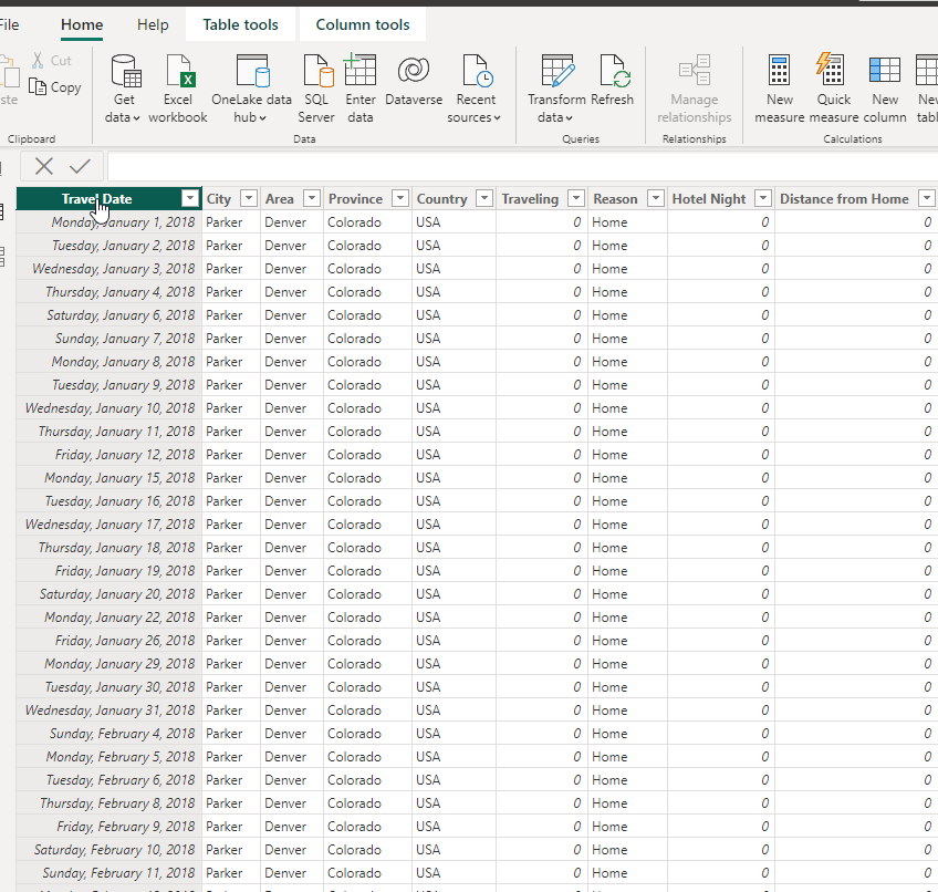
Opening a new Power BI Desktop report, I clicked Get Data and then selected my XLS. From there, I loaded the entire single sheet into Power BI. I had preset the columns in my XLS and Power BI detected the first row were the column headers. This gave me a data set that looked like this:
I added one column to this. I did this later, but since I'm writing about the data, I'll include this year. I wanted to have a map of my travels. The map visual works well with names, but sometimes has issues. In my case, when looking at the results, I noticed a point in Australia at some years when I knew I hadn't been there. It turns out that there is a Keystone, Australia, which takes precedence over Keystone, CO. To clean this up, I added this formula for a new computed column to my dataset:
Location = CONCATENATE([City], CONCATENATE(", " , CONCATENATE(Travels[Province] , CONCATENATE("," , Travels[Country]))))The CONCATENATE function in Power BI takes only 2 arguments, so I needed a few of them to combine things. This gave me one more column, that looks like this:
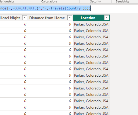
This fixed my Keystone Australia issue.
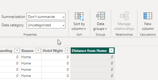
I also made one other change. In the properties for the Distance from Home, I set this to not summarize. When this summarizes, it doesn't behave well for my plotting purposes.
Building a Report
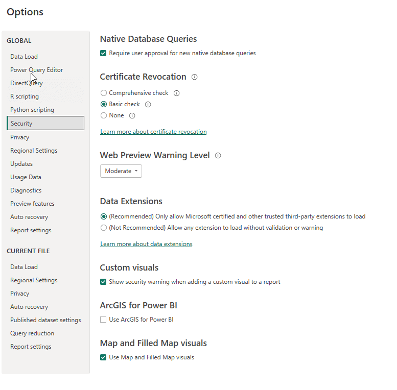
My report was fairly simple, but I did a few things that helped me analyze data. First, I added a map visual. I had to enable this in the options to work. In File -> Options and Settings -> Options, select the Security item. Then select the Map and Filled Visuals checkbox near the bottom. You can see that here.
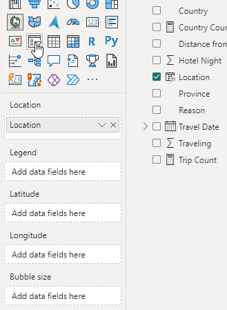
Next, I clicked the map visual and added it to the report. I dropped in my computed column as the data, which you can see in the properties below:
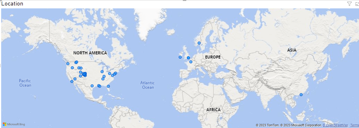
This gave me a nice map of my travels. Not that useful for analysis, but it is nice to see the spread of travels.
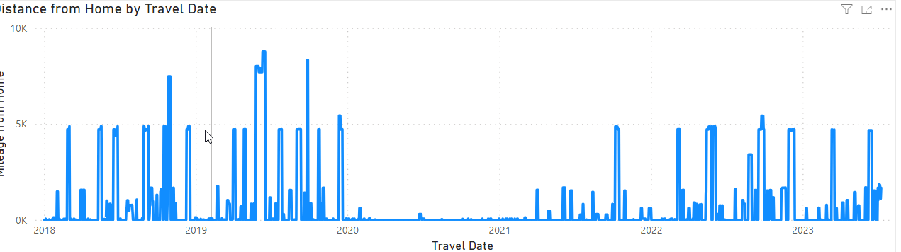
Next I wanted to see how often I'd been traveling. I chose a line chart since my initial view was when am I home and when am I gone. The line covers time, with dates along the x axis. The distinace is what I'd plot on the line, which lets me see trips (somewhat) as well as the scale of those trips. How far am I traveling, which often relates to time. Not always, but often.
My line chart properties are shown here. I put the travel date on the X-axis and set this as a date, not a hierarchy. I then added the distance from home and used sum. Since each date is plotted and there is only one row per date, this works well.
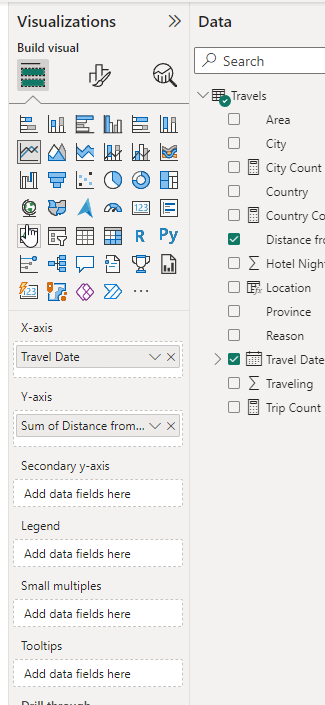
My line chart then looks nice across time.
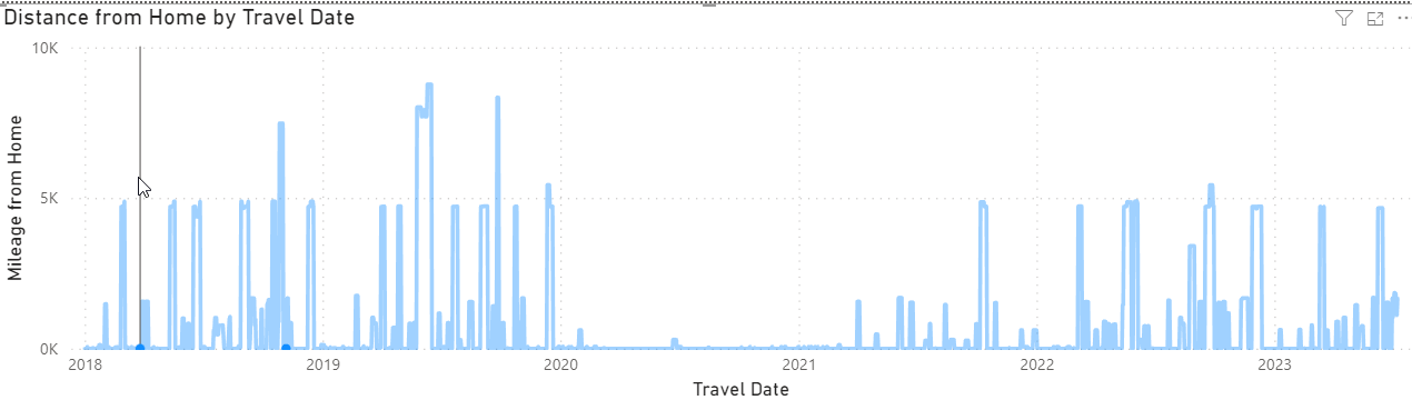
I did change the title and the axis to make them easier. The Y-axis is in the Visual properties. I expanded out the Y-axis section and changed the title.
The chart title is in middle icon at the top. Select that and you can change the text as shown here:
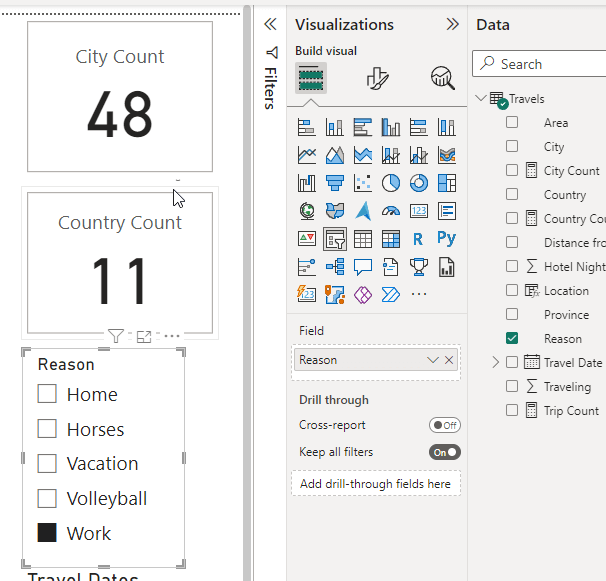
There were two other things I wanted to add: cards and slicers.
Cards
I added a card, configured it and added a second one. They looked like this:
I was confused. I hadn't done anything other than put a data field in the properties and I spent a bunch of time looking through properties. Then I deleted one and went to re-add it. That's when I realized that none of the icons for visuals mean anything to me and I often hover over some to figure out what they are. I saw a tooltip on this icon:
I couldn't capture it in a screen shot, but it says "Card (New)". The icon that is slightly highlighted in the 4th row on the right is the old Card icon. There are two types. Once I switched both to the New one, they looked the same.
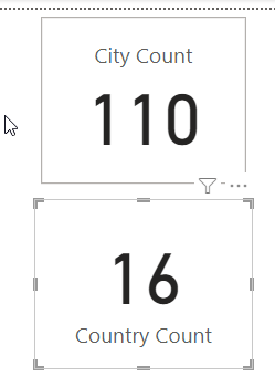
For both these cards, I created measures. These were to count the values in the columns. Here's the code for the country and city counts:
Country Count = DISTINCTCOUNT(Travels[Country])

City Count = DISTINCTCOUNT(Travels[City])
This was to count the number of places I'd been. I could have used count but that would give me duplicates since I have the city in multiple rows.
This is a little bit of a strange measure for me. Really I want to count to different groups of cities. For example, I got to Cambridge a few times a year. If I go three times, each for a week, count would give me 21 cities and distinct count gives me 1. What I really want is 3.
Something to enhance over time.
Slicers
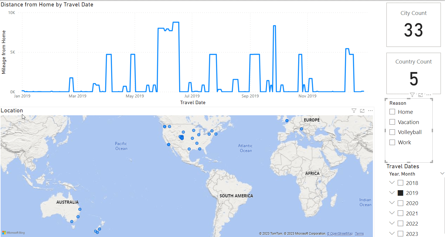
One of the handiest things about using Power BI for quick analysis, for me, is that I can change filters quickly. I tend to use slicers do this. These allow me to select one or more items and have my visual reflect my choices. For example, in the distance chart above, nothing is selected, so I see my travel history from 2018.
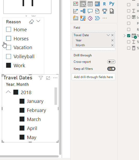
I added two slicers to my report. The first was the reason filter. I added this and put the Reason field in the data element. By default, Power BI then gives me a set of checkboxes for the different data elements it finds. If I get more reasons, I'll need to shrink these fonts.
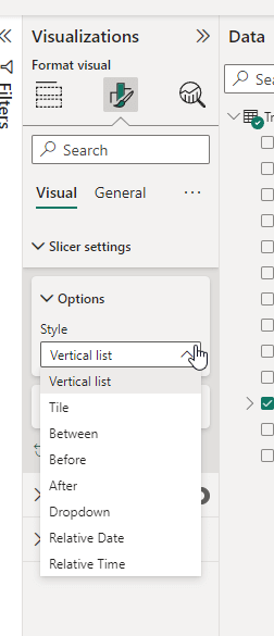
The second one was for dates. My primary analysis is for travel, and I want to be able to change dates quickly. The default is for a slider, which I hate. This is a between choice.
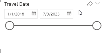
Instead, I go into the visual properties and select a vertical list.
This now shows me dates, but I don't want days.
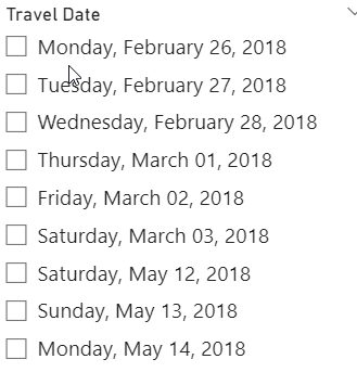
I go back to the main visual properties, where my date hierarchy has been included by default. I delete the quarter and days, since those aren't critical for my purposes. Then I see the year and months below, since I may want to compare year over year month travel.
That's really it. Here's the full report with 2019 selected.
Data Analysis
The main purpose for this report was to answer a question a few friends have asked: am I traveling too much in 2023? If I look at 2023, I see this:
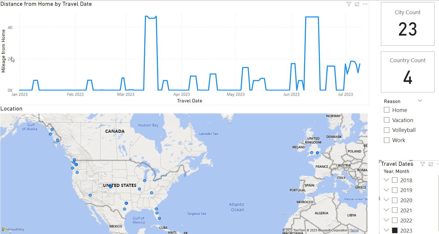
There are really 14 trips out of town. A few small bumps are local volleyball tournaments, but I captured those just for my own fun. Really I care about anything that is longer than a day.
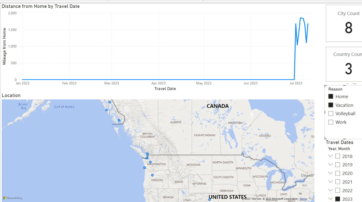
What's the split of work v vacation? If I look at that, then I see 11 trips for work (first image) and no vacation trips (second image). The vacation is for my July cruise.
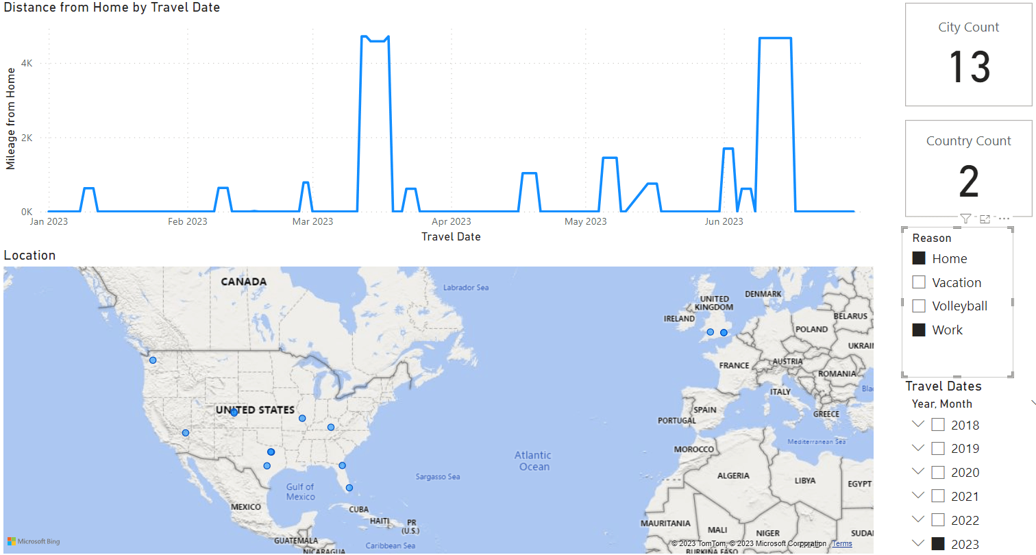
That is in line with my wife complaining we haven't had vacation. She's come with my on a few work trips and we've done something around work, and we have had a few volleyball trips, one of which we extended for a day of vacation, but that wasn't really captured.
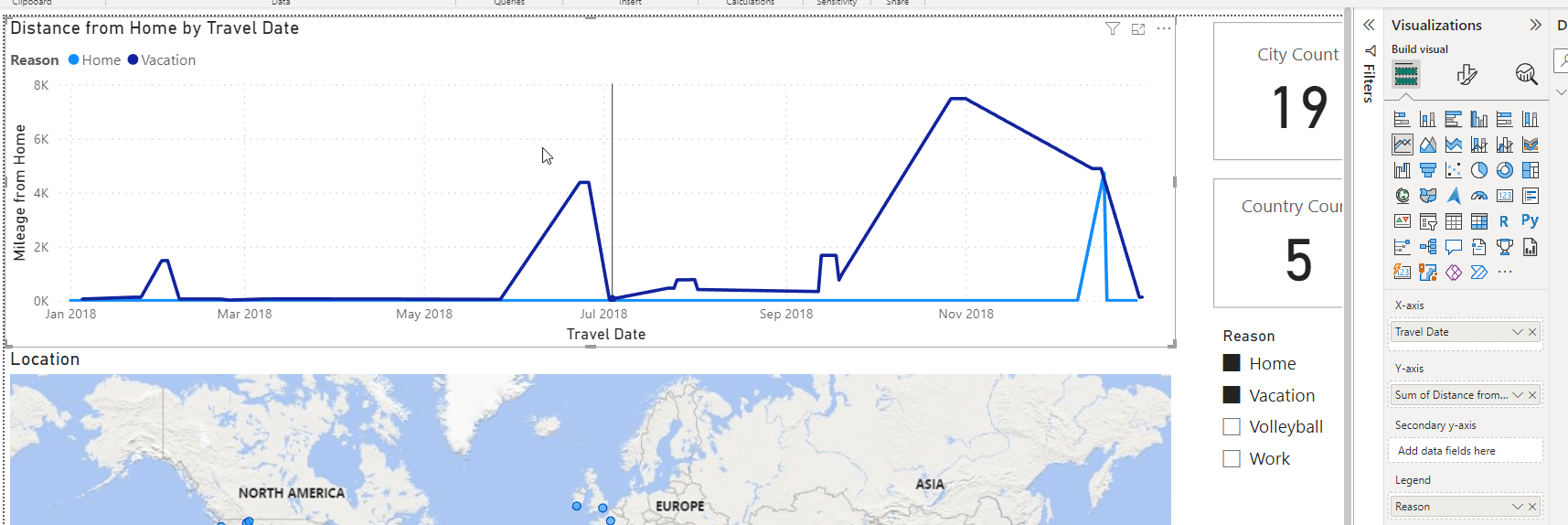
If I look back at 2022, I see for the first six months these totals:
- Work: 6 trips
- Vacation: 3 trips
2019, a point of comparison is:
- Work: 7 trips
- Vacation: 3 trips
That shows me I've been working more this year. Lots of short trips, but still more work. However, if I add in the second half of 2022, things are better. We had:
- Work: 7 trips
- Vacation: 7 trips
We had a lot of vacation last year, and this analysis doesn't include the work trips where my wife was with me and we got to do some sort of tourist thing.
Conclusion
I'm working a bit too much this year. I've also got a bunch more things planned for work, but I am going to bring my wife more (she's only had 3 trips with me the first half of 2023), and that should help. Building this report is a neat way of me being able to keep an eye on my travel load, and the balance with life. I've built a Power BI report that I can maintain with easy data entry and loads, and I can slice data to analyze things on the fly.
However, there are issues here. I can't easily see when I've transitioned from work to vacation or vice versa. In 2018 I combined both on a trip, but I don't see a good way to represent these. I tried adding the reason as a Legend, but that messed everything up.
I also have the issue of not counting trips to cities. While I like knowing uniqueness, I might like to know how many trips. I worked on a few DAX calculations, but none of these worked as I expected. I don't want to add a "trip" counter to my data, but I might need to. For example, I was in Las Vegas on May 14 this year and then flew home. I was in Denver for about 8 hours before I flew to Austin. I've had a few turnarounds like that and they look like one trip if I don't remember the travel plans. I remember 2023, but I struggle with 2018 for sure.
I'd also like to see the vacation, volleyball, and work represented as different colors. I'm not sure how to do that, but perhaps I'll get some hints from you Power BI experts. Or maybe I'll see if Adam and Patrick can help me out on one of their shows.
In any case, I thought this was an interesting data analysis exercise for me. I'll keep enhancing this over time and load older information when I can. I'm also looking to improve the visuals here and then use this regularly to keep an eye on how much I'm traveling, and if I'm getting to the place I want. Two cool things I learned. My totals for all the data I've loaded: 16 countries since 2018 (including the US) and the travel look for the entire report. The pandemic stands out.