

Introduction
In this article, we will use K-Means applied to SQL Server using Python. We will learn what is the K-Means algorithm, how to use Python to create charts, and how to connect to SQL Server. The data in SQL Server will be segmented in clusters using the K-Means algorithm.

Requirements
- First, you will need Python installed.
- Secondly, a code editor. In this article, we will use Visual Studio Code, but you can use any other tool of your preference.
- Thirdly, you will need SQL Server installed.
- Finally, you will need to have the Adventureworks2019DW database which contains the data to be analyzed.
What is K-Means?
K-Means is a famous Cluster Algorithm used to group data. This algorithm requires to specify the number of clusters to use. A cluster is a group of data points with similar characteristics.
With K-Means you can find patterns in the data. This algorithm works with a predefined number of clusters. It works with centroids and squared distances between data points.
The SQL Server data
For this example, we will use the vtargetmail view. It contains bike buyers’ information like yearly income and age. Here you have the query used to check the data.
SELECT
  Age,
  Yearlyincome,
  BikeBuyer
FROM dbo.vTargetMail;
The result of the query is the following:
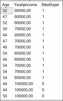
Where BikeBuyer is 1 if the customer is a bike buyer and 0 means that the customer is not a bike buyer.
Finding the number of nodes for K-means
You need to calculate the number of clusters necessary. The following Python code shows how to find the number of clusters required using the elbow method:
import pandas as pd
import pyodbc
from sklearn.cluster import KMeans
import matplotlib.pyplot as plt

# SQL Server Connection to the localhost and the adventureworksdw2019
server = '.'
database = 'AdventureWorksDW2019'

# Windows authentication connection
connection = pyodbc.connect(
f'DRIVER={{SQL Server}};SERVER={server};DATABASE={database};Trusted_Connection=yes;')

# Query to access the vTargetMail view of the Adventureworks2019DW database
Myquery = 'SELECT Age, YearlyIncome, BikeBuyer FROM dbo.vTargetMail'

# Load the data into a Pandas DataFrame and filter for BikeBuyer = 1
df = pd.read_sql(Myquery, connection)
df = df[df['BikeBuyer'] == 1]

# Prepare data for clustering
data = df[['Age', 'YearlyIncome']]
# Find the number of clusters required with the elbow method
inertia_values = []
possible_cluster_values = range(1, 11)
for k in possible_cluster_values:
  km = KMeans(n_clusters=k, random_state=42)

km.fit(data)
inertia_values.append(km.inertia_)

# Plotting the elbow method
plt.plot(possible_cluster_values, inertia_values, marker='o')
plt.xlabel('Number of Clusters')
plt.ylabel('Inertia')
plt.title('Elbow Method to detect the # of Clusters')
plt.show()

# Close your database connection
connection.close()
Explanation of the elbow method
The elbow method is used to calculate the number of clusters. It requires running the K-Means using different values of k and plotting the sum of squared distances (which is called inertia) between data points and their assigned centroids. A centroid is the center point of a cluster. Which is basically the mean position of all the data points in the cluster, and it is used as a central point for that group.
We first invoke the libraries to use:
import pandas as pd
import pyodbc
from sklearn.cluster import KMeans
import matplotlib.pyplot as plt
First, Pyodbc is used to connect to SQL Server to the dbo.vTargetMail view and get the data. Secondly, Pandas will be used to get the data in a Data Frame. Thirdly, Sklearn.cluster is the library for the k-means algorithm and will be used to classify the data in clusters. Finally, the matplotlib is used to graph the data.
Next, we have the connection information:
# SQL Server Connection to the localhost and the adventureworksdw2019
server = '.'
database = 'AdventureWorksDW2019'

# Windows authentication connection
connection = pyodbc.connect(
f'DRIVER={{SQL Server}};SERVER={server};DATABASE={database};Trusted_Connection=yes;')
First, we have the SQL Server name which is the local server which is a “.”. You can also write the SQL Server name. Secondly, we have the database name. In this case, it is the AdventureWorksDW2019. Finally, we use the Windows authentication (trusted_connection=yes) to connect
The next section is doing a query and applying a filter:
# Query to access the vTargetMail view of the Adventureworks2019DW database
Myquery = 'SELECT Age, YearlyIncome, BikeBuyer FROM dbo.vTargetMail'

# Load the data into a Pandas DataFrame and filter for BikeBuyer = 1
df = pd.read_sql(Myquery, connection)
df = df[df['BikeBuyer'] == 1]
Myquery is a simple query to the dbo.vTargetMail view. This view is included in the AdventureworksDW2019 database. We are then applying a filter to analyze only the customer who bought a bike (bikebuyer==1). Also, we will find the required clusters, we will analyze 1 to 11 clusters, and graph them using the K-Means algorithm.
# Find the number of clusters required with the elbow method
inertia_values = []
possible_cluster_values = range(1, 11)

for k in possible_cluster_values:
   km = KMeans(n_clusters=k, random_state=42)

km.fit(data)
inertia_values.append(km.inertia_)
Finally, we will create the chart:
# Plotting the elbow method
plt.plot(possible_cluster_values, inertia_values, marker='o')
plt.xlabel('Number of Clusters')
plt.ylabel('Inertia')
plt.title('Elbow Method to detect the # of Clusters')
plt.show()
The chart created is the following:
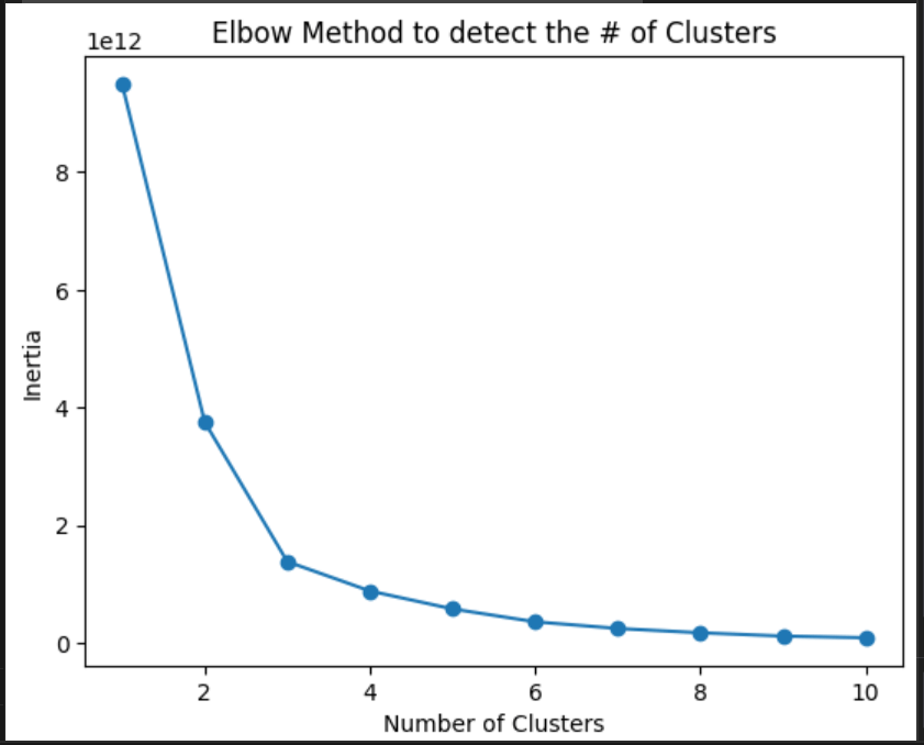
As you can see, the inertia is lower after 3 clusters. Then, 3 is the ideal number of clusters.
K-Means applied to SQL Server data
Previously, we found that the ideal number of clusters is 3, after that, the inertia is low. The following code shows how to classify the data in clusters:
import pandas as pd
import pyodbc
from sklearn.cluster import KMeans as km
import matplotlib.pyplot as plt

# SQL Server Connection
server = '.'
database = 'AdventureWorksDW2019'
connection = pyodbc.connect(
f'DRIVER={{SQL Server}};SERVER={server};DATABASE={database};Trusted_Connection=yes;')

# Query to access the vTargetMail view of the Adventureworks2019DW database
Myquery = 'SELECT Age, YearlyIncome, BikeBuyer FROM dbo.vTargetMail'

# Load the data into a Pandas DataFrame and filter for BikeBuyer = 1
df = pd.read_sql(Myquery, connection)
df = df[df['BikeBuyer'] == 1]

# Prepare data for clustering
data = df[['Age', 'YearlyIncome']]

# Apply K-Means using 3 clusters according to the Elbow method
kmeans = km(n_clusters=3, random_state=42)
kmeans.fit(data)

# Scatter plot chart
# add titles, labels x and y
plt.scatter(df['Age'], df['YearlyIncome'], c=kmeans.labels_, cmap='viridis')
plt.xlabel('Age')
plt.ylabel('YearlyIncome')
plt.title('Scatter plot of Age vs YearlyIncome (Clustered)')
plt.show()

# Close your SQL Server database connection
connection.close()
The code is similar to the elbow method. We invoke libraries, connect to the SQL Server view and filter the data where bikeBuyer is 1. Also, we will use 3 clusters based on the elbow method applied previously:
kmeans = km(n_clusters=3, random_state=42)
kmeans.fit(data)
The random_state=42 can be any number. It is an internal seed. The random_state=42 can be any number. It is an internal seed.
Analyzing K-Means applied to SQL Server data
The chart generated by the Python code is the following:
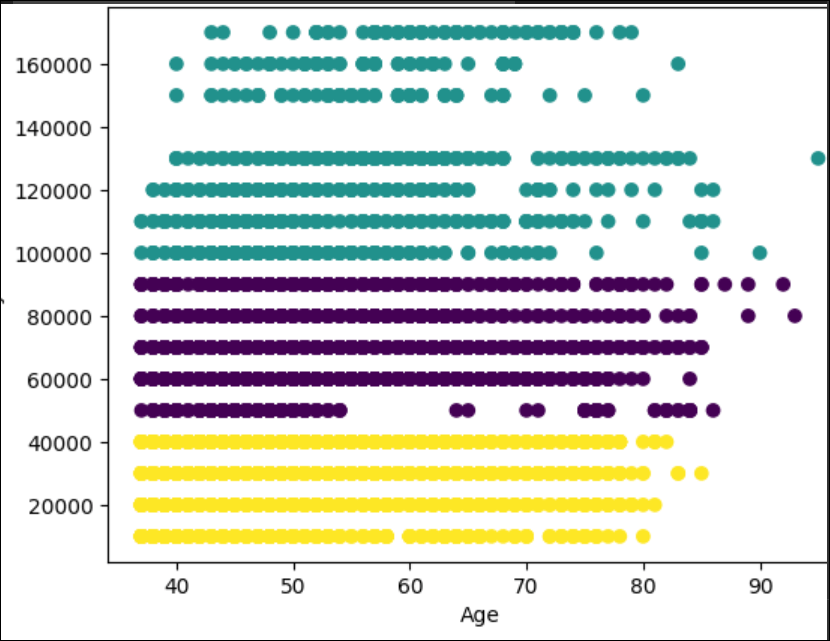
First, we have the yellow cluster with a yearly income from 0 to 40000. These customers buy the bikes until they are 80 years old. After that, they do not buy too much.
Secondly, we have the cluster from 50000 until 90000. The customers that earn 5000 are regular customers until they are 55 years old. After that age, the number of customers is lower. From 60000 until 90000 the customers are regular until 80-85 years old.
Finally, the last cluster is customers with a yearly income from 100000 to 170000. This group is special. For example, there are no customers with a salary of 140000. These customers are irregular users when they are 65 years old.
Conclusion
In this article, we used the K-Means algorithm to classify the data in clusters. First, we used the Elbow method to determine the number of clusters and then we created the code to divide the data using 3 clusters. K-means is a nice algorithm used to analyze data. You can find nice patterns with this algorithm that in many cases the human cannot detect.
Images
Some images were created in Bing.