

Introduction
This is the 3rd part of the topic of how to visualize Python charts in Power BI. In the previous article, we learned how to work with histograms, 3D charts, and trigonometric plots. In this chapter we will learn the following topics:
- First, we will learn how to create the violin plot.
- Secondly, we will learn how to create a Box plot.
- Finally, we will learn to create an Hexbin plot.
Requirements
First, I am assuming that you already read part 1 and is already connected to the SQL Server AdventureworksDW sample database and the vTargetMail view.
How to visualize Python charts in Power BI with the Violin Plot
The violin plot is used to display the probability density. It is similar to a histogram but more precise. Let’s take a look at an example.
First, make sure to have the YearlyIncome field in the Values in Power BI.
Secondly, add the following code to the Python Visual in the Python script editor.
import matplotlib.pyplot as p

values = dataset["YearlyIncome"]

## Assign values to plot
data_to_plot = [values]

# Create an instance of the figure
fig = p.figure()
axes = fig.add_axes([0,0,1,1])

#create the violin plot
bp = axes.violinplot(data_to_plot)
p.show()
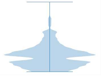
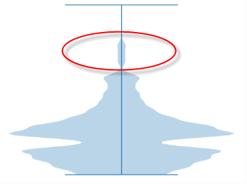
The code creates a violin plot using the Yearly Income field of the vTargetMail view of the AdventureworksDW database.

As you can see in the violin plot, most of the salaries are at the bottom of the plot. That means that most of the customers have a low salary.
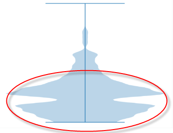
Also, we can conclude that a very small sample of the customers has high salaries. Just a few customers have a high yearly income.
Now, let’s take a look at the code.
Violin Plot code
First, we import the matplotlib library.
import matplotlib.pyplot as p
Secondly, we assign the YearlyIncome field of the dataset as a value that will be used for the chart.
values = dataset["YearlyIncome"]
Thirdly, we assign the value to the plot.
data_to_plot = [values]
Also, we create an instance of the figure.
fig = p.figure()
In addition, we add axes to the plot.
axes = fig.add_axes([0,0,1,1])
Finally, we use the violinplot function to create the plot and use the show function to show the plot.
bp = axes.violinplot(data_to_plot)

p.show()
How to visualize Python charts in Power BI with the Box Plot
The box plot has a similar concept to the violin plot. This method groups numerical data based on quartiles. Also, it has whiskers which are lines that show the variability outside the upper and lower quantities. In addition, if you have outliers with a significant difference from other values, they will be plotted as individual points.
Let’s take a look at an example.
Box Plot Python code
First, we have the following code.
import matplotlib.pyplot as p

# adding data
data = dataset["YearlyIncome"]
fig = p.figure(figsize =(10, 7))

# Create the plot
p.boxplot(data)

# show data
p.show()
Secondly, let’s take a look at the box plot generated.
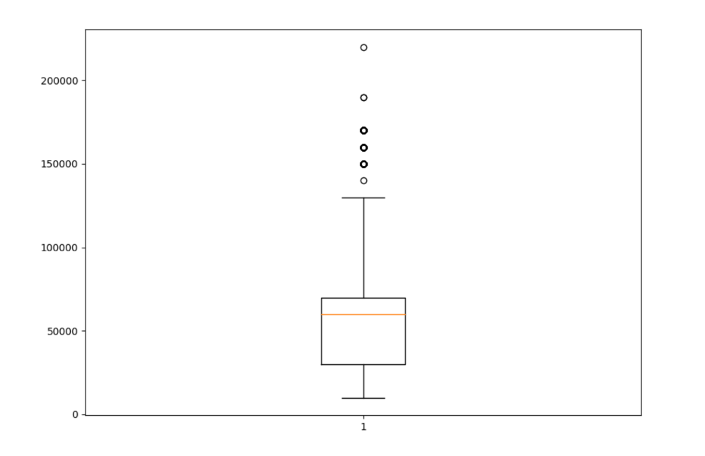
Most of the yearly incomes are between 25000 and 65000 approximately. That is the main box.

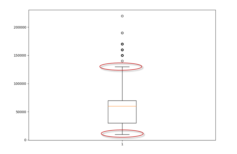
In addition, we have the whiskers with the maximum and minimum values.
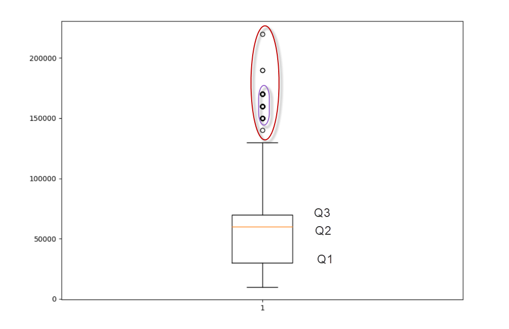
I forget to mention the quartiles. Our box is based on Quartiles. There are 3 quartiles.
- The second quartile (Q2) is the median of a data set.
- The first quartile (Q1) is the median from the minimum value until Q2.
- And the third quartile (Q3) is the median from Q2 until the maximum value.

Finally, we have some dots. These values represent a small portion of customers with high yearly incomes. Note that some dots have a different width. More customers will show wider borders. These dots are called outliers. They differ a lot from the rest of the dataset.
Explanation of the code to visualize Python charts in Power BI using box plots
The code is similar to the previous example at the beginning.
First, we import the matplotlib library. Also, we use the YearlyIncome column from the vtargetmail view.
import matplotlib.pyplot as p

# adding data
data = dataset["YearlyIncome"]
Secondly, we create an instance of the figure specifying the size.
fig = p.figure(figsize =(10, 7))
Finally, we create the boxplot and show the data.
p.boxplot(data)

# show data
p.show()
Visualize Python charts in Power BI using hexagonal binning plots
Finally, we have the hexbin function which basically creates hexagonal binning plots with nice colors to show the density of the data. This plot requires x and y-axis. Please include the YearlyIncome and the NumberOfChildrenAtHome fields in the Power BI Visualizations.
Let me show you the code.
import matplotlib.pyplot as p

# assign datasets to x and y axis
x = dataset["NumberChildrenAtHome"]
y = dataset["YearlyIncome"]

#add labels and a title to the chart
p.ylabel("YearlyIncome")
p.xlabel("Number of children")
p.title("Histogram of Yearly income per children")

# Assign colors
p.hexbin(x, y, gridsize=(27,27), cmap='inferno')
p.show()
The plot generated is the following.
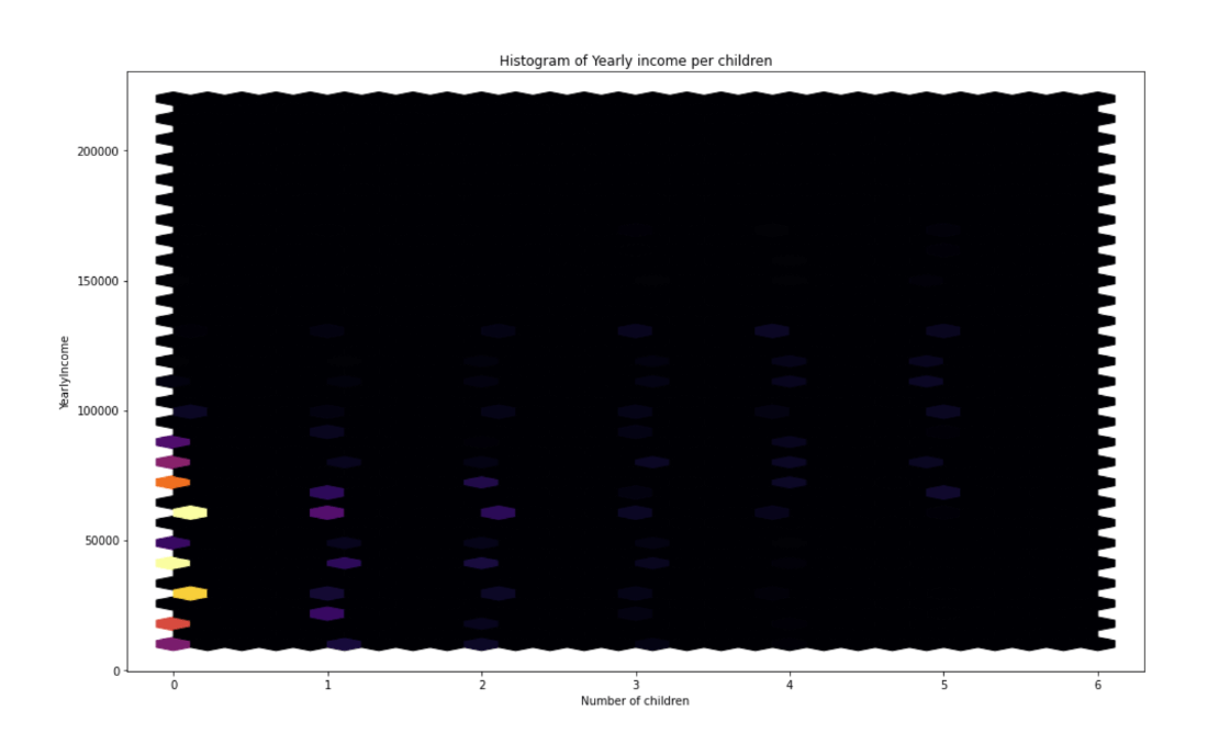
The plot shows that most of the customers have 0 children and the number of customers decreases according to the number of children.
Basically, most of them have 0-2 children. Nobody has 6 children.

Explanation of the code
First, we import the matplotlib library and assign the Number of children at home for the x-axis and the yearly income for the y-axis. Make sure to have the NumberOfChildrenAtHome field in Power BI.
import matplotlib.pyplot as p

# assign datasets to x and y axis
x = dataset["NumberChildrenAtHome"]
y = dataset["YearlyIncome"]
Secondly, we add labels for the y-axis, x-axis, and a title for the plot.
p.ylabel("YearlyIncome")
p.xlabel("Number of children")
p.title("Histogram of Yearly income per children")
Finally, we use the hexbin function and set the grid size and the colors.
p.hexbin(x, y, gridsize=(27,27), cmap='inferno')
p.show()
Conclusion
In this article, we learned 3 things:
- First, we learned how to create the violin plot.
- Secondly, we learned how to create the box plot.
- Finally, we used the hexbin to create a plot with hexagonal binning plots.