

Introduction
In this article, we will learn how to visualize data using Python in Power BI Desktop. Python is an extremely popular programming language and it includes several libraries that can be used for charts.
In other words, if you do not know how to use the Python visual, this article is for you.
If you know how to use it, do not waste your time here. The article is for newbies, but I promise to have more complex charts in the future.
Requirements
- First, we need to have SQL Server installed (we could work without SQL Server, but the site name is sqlservercentral and we love SQL Server here).
- Secondly, we will use the AdventureworksDW sample database.
- And last, but not least, Power BI installed.
Connection to SQL Server
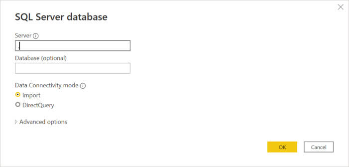
First, we need to connect to SQL Server using the Get Data>SQL Server option in Power BI.

Secondly, we need to enter the SQL Server name. Optionally, we could enter the database name. We can import the data or do a direct query to the database and press OK.
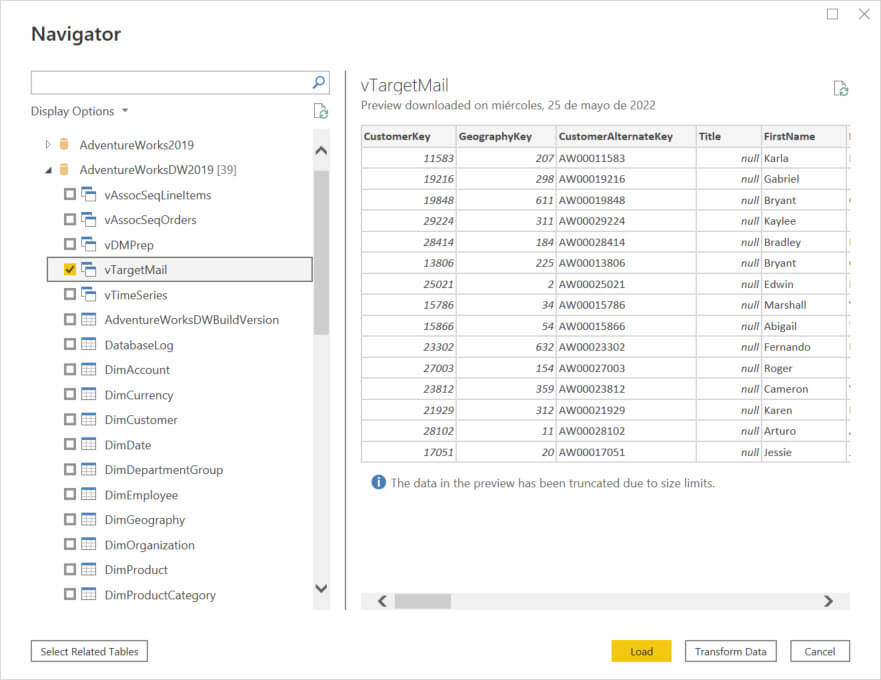
Finally, select the vTargetMail view and press the Load button.
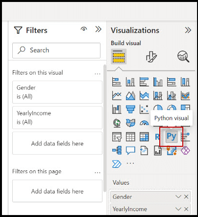
First example of Power BI and Python visualization
First, in Power BI, press the Python Visual.
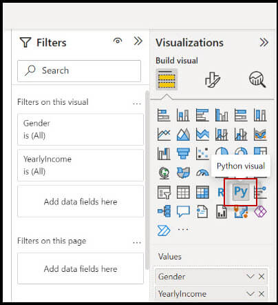
Secondly, in Values drag and drop the Gender and YearlyIncome fields.
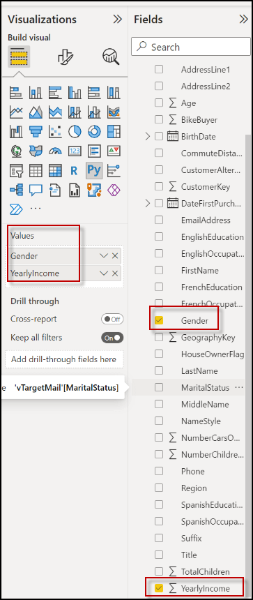
You will be able to see the Python Script editor.
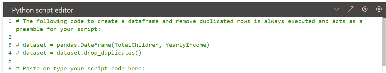
The # is used to comment on the code. The commented code is green.
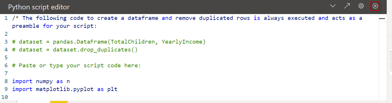
The following code will use the matphotlib.pyplot which is a famous Python library used to visualize graphical data in Python. It is a free open source used as an alternative of Mathlab.
import matplotlib.pyplot as plt

dataset.plot(kind='bar', x='Gender', y='YearlyIncome', color='red')

plt.show()
Let’s explain the code lines. First, we import the matphotlib.pyplot as plt. Basically, we are invoking the library to use it later.
The next line is creating a bar chart. We are including the Gender and the YearlyIncome of the vTargetMail view. And finally, the color of the bar chart is red.
dataset.plot(kind='bar', x='Gender', y='YearlyIncome', color='red')
Finally, we show the data
plt.show()
Once you have the code ready, press the play button to visualize the chart.
Now, you can visualize the chart.

In this chart you can see the Male (M) and Female (F) yearly income. As you can see, the yearly income for men is slightly higher than the yearly income of the girls.
Power BI and Python visualization of blue lines
The next example is similar to the previous one, but this time we are using a line for the charts and the color of the line is blue. To do that kind will be equal to a line. And the color will be equal to blue.
import matplotlib.pyplot as plt

dataset.plot(kind='line', x='Gender', y='YearlyIncome', color='blue')

plt.show()
If we visualize the data, we will see the following chart.

Adding labels in Power BI and Python visualization
The following code is similar to the first code with red bar charts, but we will add the label in the x-axis and y-axis.
To do that, we will use the following code:
import matplotlib.pyplot as plt

dataset.plot(kind='bar', x='Gender', y='YearlyIncome', color='red')

plt.xlabel("Gender")

plt.ylabel("Yearly income")

plt.show()
For the x-axis, we use the plt.xlabel(“Gender”) to add a label. For the y-axis, we use the plt.ylabel function to add a label for the Yearly income. The result displayed will be the following:

Python charts in Power BI with grids in the chart
Sometimes we need to add grids to have a better visualization of the sizes of the bar charts. The following example is similar to the previous one, but now it is including grids.
import matplotlib.pyplot as plt

dataset.plot(kind='bar', x='Gender', y='YearlyIncome', color='red')

plt.xlabel("Gender")

plt.ylabel("Yearly income")

plt.grid()

plt.show()
The function plt.grid() displays grids in the chart.
Finally, we can see the chart created.

Note that now, we have some grids.
How to visualize Python visualization with eventplot
And last, but not least, we will use the eventplot function of the matphotlib.pyplot.
The eventplot function plots identical parallel lines at given positions. The following code shows how the eventplot code works.
import numpy as n
import matplotlib.pyplot as plt

spike = 50*n.random.random(50)
plt.eventplot(spike,
orientation = 'vertical',
linelengths = 0.6,
color ='r')
The chart displayed by this code is the following:

Let’s analyze the code.
import numpy as n
import matplotlib.pyplot as plt
First, we import the numpy library which will be used to generate random values.
Secondly, we import the matplotlib.pyplot library. This library was explained before in this article.
Thirdly, we generate random values from 1 to 50. These random values will be the y-axis position of the lines.
spike = 50*n.random.random(50)
Finally, we have the plt.eventplot. Spike is the position that contains the random values generated for the vertical red lines. The orientation can be horizontal or vertical. In this example the lines are vertical. We can specify the line lengths and the colors. In this example red (r)
plt.eventplot(spike,
orientation = 'vertical',
linelengths = 0.6,
color ='r')
Conclusion
In this article, we learn how to integrate Python code to visualize data in Power BI. Secondly, we learned that Power BI includes a Python visualization and we can work with the existing data and use Python libraries to generate special charts.
Also, we learned that Python includes a wide variety of libraries to generate special charts not included in Power BI by default. However, the main problem, is that you need to learn how to code. So, if you do not like to code, you may need someone else to help to integrate Python.
I hope you enjoy this new article.