What is this about
This article will be about Power BI and PowerPoint collaborating. Both tools are well-known to anyone, particularly to those who are presenting data, charts and visualizations. Without a doubt, these are powerful tools for communicating and visually transmitting information. We can use them to hand over complex information in a simple, easy-to-understand way. Presenting them should be not only easy on the eyes but also easy to understand and digest, by the audience.
Nowadays, slides are an integral part of any company meeting. Most conferences, interviews, or even exams should have a few slides. Presentations are often made using templates and colourful graphs, animated or static charts. While PowerPoint offers many appealing features, it does not provide the capability to showcase data in a more dynamic manner. Other Microsoft tools can handle the use of dynamically changing visualization. I mean Power BI which is a powerful tool for business intelligence. Power BI can handle large data sets from any source and assist in creating optimal visuals. With only one click, we can easily transform charts from one view to another. Additionally, we can get descriptions for all fields in our visualizations. Furthermore, we can navigate between visuals without having to switch pages.
This is all about two Powers
How to get this to work
Before we get started we need to prepare the environment. Firstly we should update the Power BI tool to the latest version. Information about the version of Power BI Desktop and the download link can be found here.
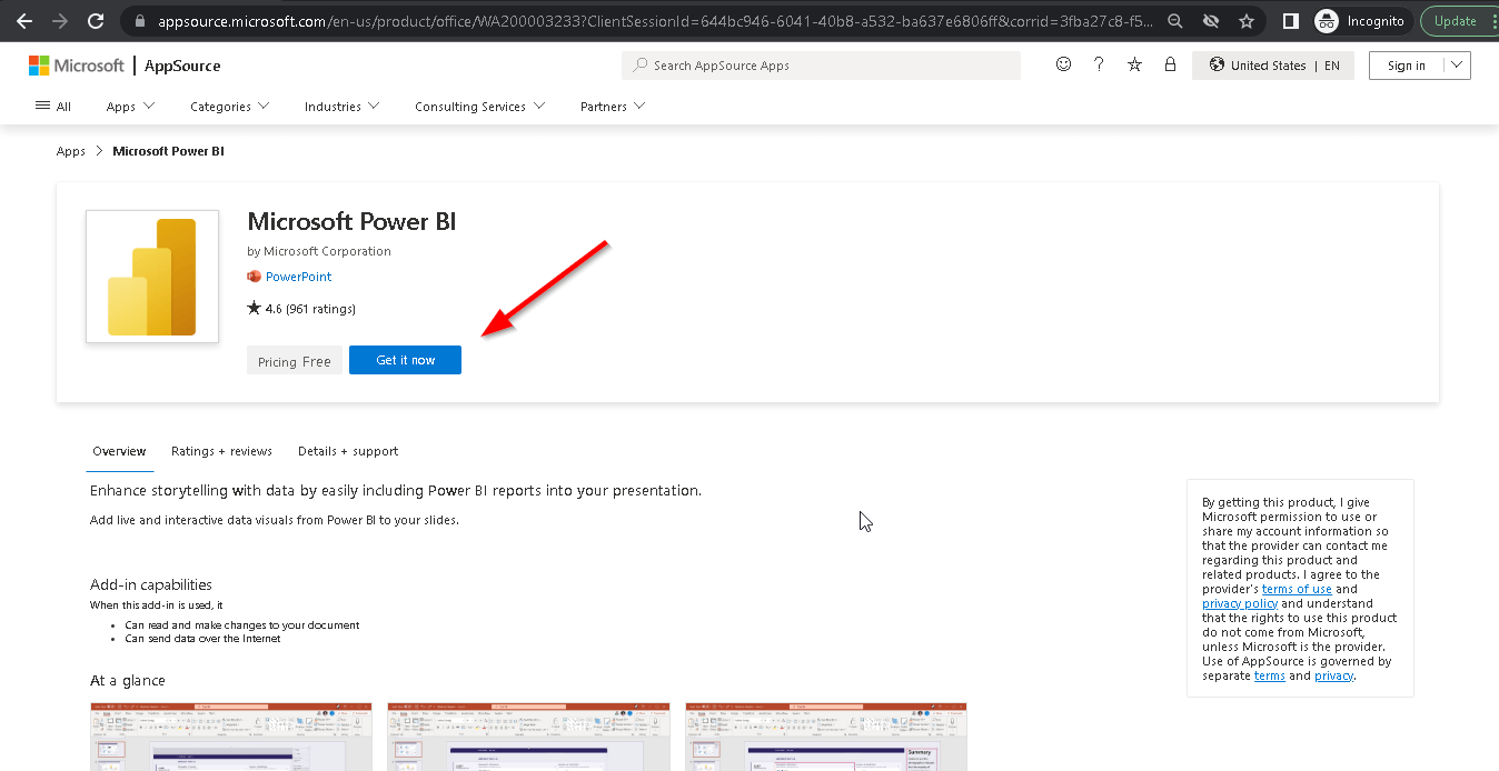
Secondly, for PowerPoint, it is necessary to download the Power BI for PowerPoint add-in from the Microsoft AppSource. Open the link to Microsoft AppStore and then click "Get it now".
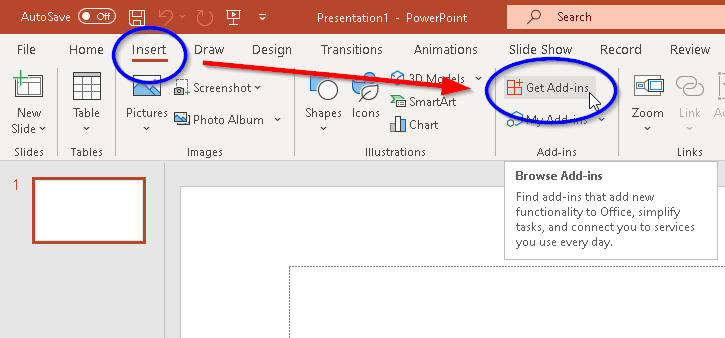
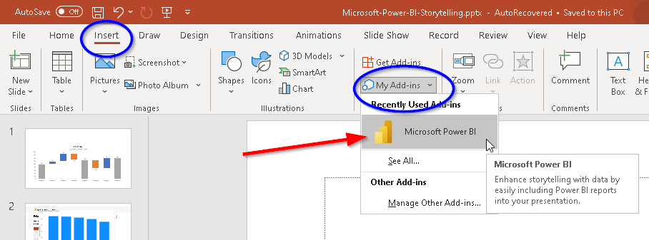
Alternatively, we can download this add-in directly in PowerPoint. To do that we can go to the "Insert" tab and choose the option "Get Add-ins".
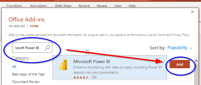
Then we will get the new window with Office Add-ins. In a search bar, we need to type Microsoft Power BI. In the results, we receive the Microsoft Power BI tile. Now we can click the "Add" button.
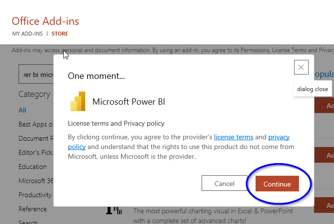
To proceed with the installation, we need to click the "Continue" button to accept the License terms and Privacy policy. The add-in will then be installed.
After installation of the add-in, in PowerPoint, we can go to the "Insert" tab then to the "My Add-ins" and choose the Microsoft Power BI icon.
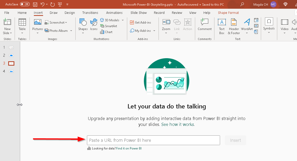
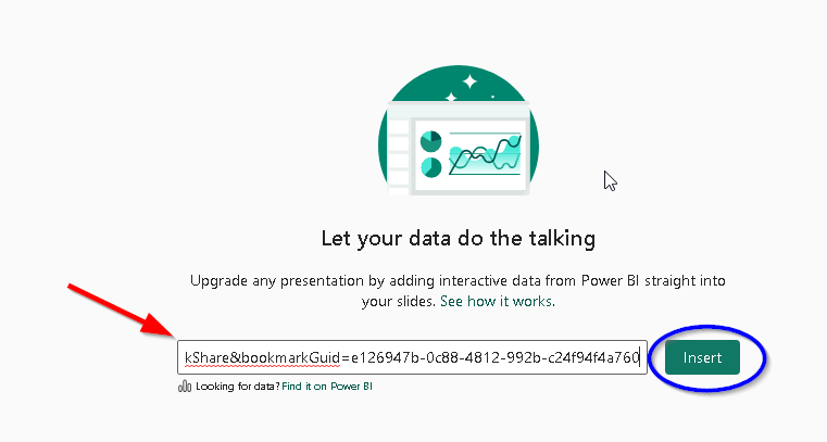
By clicking the Microsoft Power BI icon, we will activate a window displaying the text: "Let your data do the talking." Below, we will find a bar where we can paste the URL to the Power BI report. This process will connect our presentation with Power BI.
How to get the URL
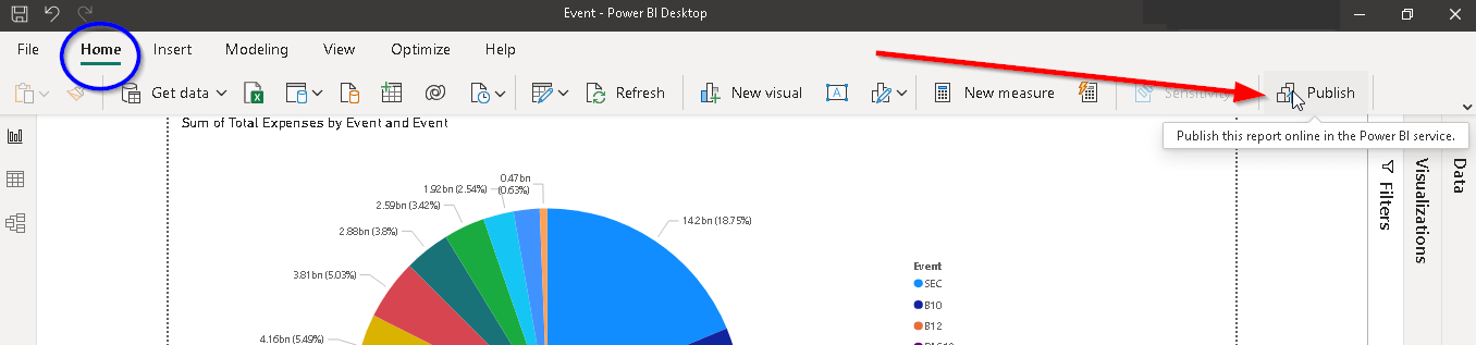
Having the URL enables us to view interactive visualizations directly in our presentation. However, to have something to show, we must first create a visual, such as a chart, map, graph, or table, in Power BI. Afterward, we need to publish it. In Power BI Desktop, navigate to the "Home" tab and click "Publish."
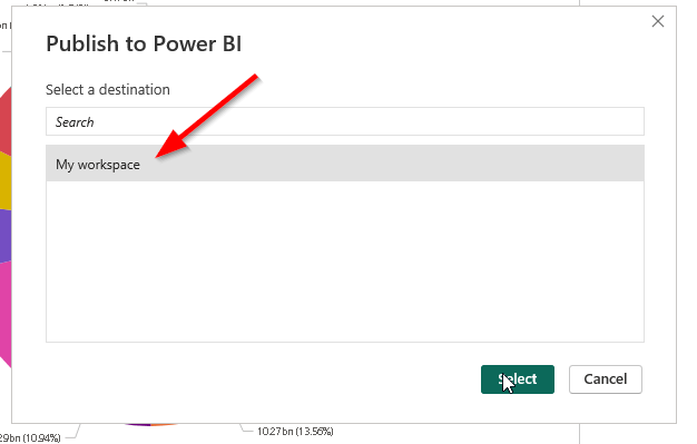
This will open the window to select the destination "My workspace".
After selecting a destination, we will receive confirmation of successful publishing. We can then open the report in Power BI, which will display our dashboard in the browser.
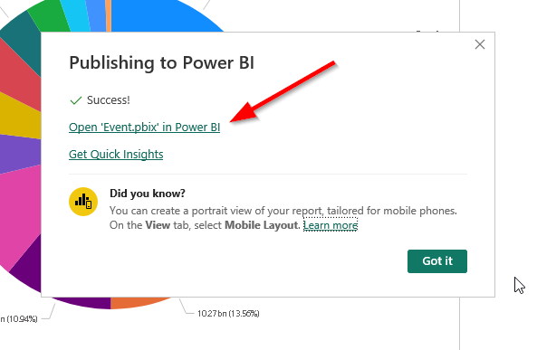
Finally, we can see our chart in the Power BI service in the browser. 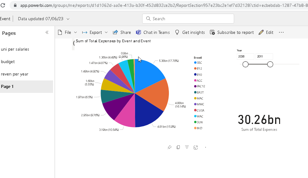
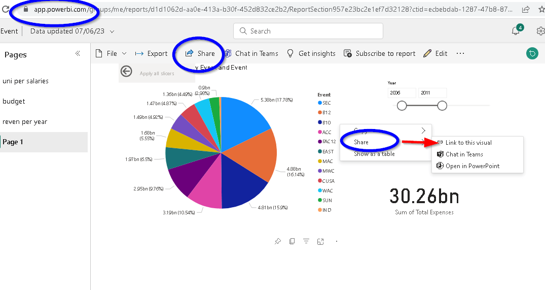
There are three ways how to get the URL:
- From the browser's address bar.
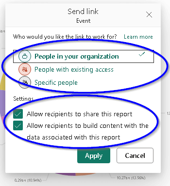
- Through the "Share" option located on the toolbar.
- To share a specific chart, right-click on it and select "Share," then choose "Link to the visual." This option will only allow us to share individual charts rather than the entire dashboard.

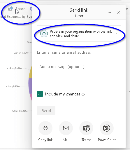
We can select the permissions that we wish to grant and specify the recipients to whom we want to grant them. More details about sharing and permissions can be found here.
At this point, we are aware of where to locate the URL containing the Power BI report. We can paste it directly into the PowerPoint add-in window and click the "Insert" button. This action will open the chart within PowerPoint for us to utilize.
Open in PowerPoint option
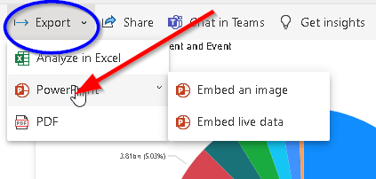
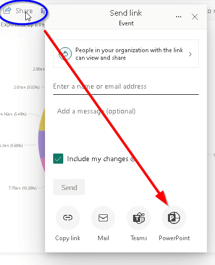
The URL is not always required as there are alternative methods to open reports directly in PowerPoint from the Power BI service on the browser. There are three available options for accomplishing this.
- Through the "Export" option located on the toolbar and then choose the option PowerPoint.
- Through the "Share" option located on the toolbar and then on the right-bottom choose the option PowerPoint.
- Right-click on the chart and choose "Share".

This will display a window "Embed live data in PowerPoint". To open a chart directly in PowerPoint, we need to click the "Open in PowerPoint" button. 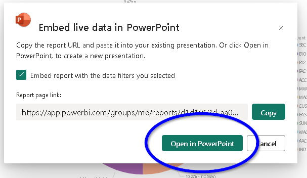
Ready to work
Once the chart is visible in PowerPoint, we can customize it to our preferences. This involves applying filters, adjusting formatting, and adding data insights for a concise dashboard summary. To modify the slide, look for options at the bottom-right corner. While chart-specific options are usually found at the top or bottom right of the chart.
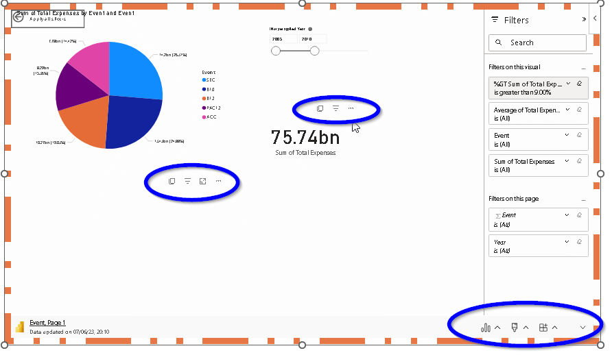
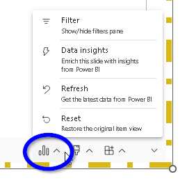
The "data option" on the slide's toolbar grants access to the filter pane, enabling us to add data insights, refresh the chart (F5 key also works), and reset the view if necessary.
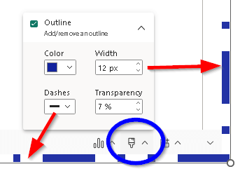
With the "style option" on the slide's toolbar, we can change the borderline of the slide.
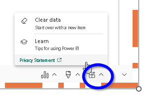
The "add-in option" on the slide's toolbar, will clear our slide and return the add-in window so we will be able to paste the URL link again.
Whereas with options placed on the chart, we can eg. "Copy as image with caption." This feature allows us to conveniently copy the chart as an image, including its associated caption. Later, we can paste the image whenever the need arises.

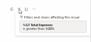
Furthermore, we can see what filter has been applied.
Also, we can turn on "focus mode" - this is applied to individual report visuals or dashboard tiles. It enlarges the tile or visual along with filters, menus, and navigation panes.

Last but not least, don't forget to hover over the ellipsis and explore the "more options" menu.
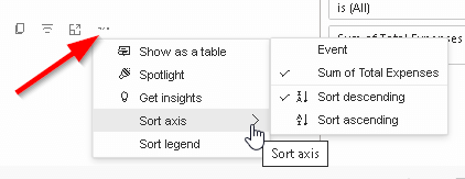
Under that option, we can not only sort our axis or legend but also we can display our data as a table.
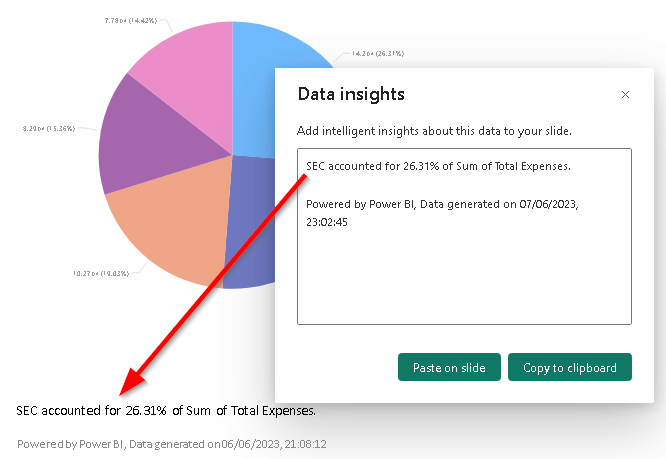
Along with "more options", we can generate data insights. Data insights are giving us the possibility to explore and find insights like anomalies or trends in our data. We can easily create and paste these insights directly into our slide.
Conclusion
This combination of PowerPoint and Power BI is simple and clever. It allows us to create more engaging, smart-looking, and informative presentations. Besides, the dynamic and data-driven, this might make a big impact on our audience. Because this will be easy to understand and remember. After all, this combination of Power BI and PowerPoint will let our presentation talk and be live.