

Typically, Min-Max normalization or scaling is used as a preprocessing technique used in data engineering. Min-Max normalization is a rescaling method used to rescale original values to a new range mostly, 0-1 or 1-10 or 1-5. The following is the formula for calculating the Min-Max normalization
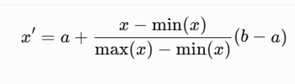
Where a and b are the range values. If the range is 0-1 then a is 0 and b is 1.
One of the primary uses of Min-Max Normalization is to transform values with different units and scales into a common range. For example, a logistics company may monitor revenue (USD), customer complaints (count), and average delivery time (hours). Because these measures have different ranges and units, comparing them directly is challenging. Min-Max Normalization rescales each measure to a consistent range such as 1 to 10, enabling meaningful comparisons, weighted scoring, KPI dashboards, and performance analysis.
Another common application of Min-Max Normalization is in educational dashboards. Suppose students are evaluated through a Presentation (10 marks), an Assignment (20 marks), and a Research Paper (70 marks). Because each assessment has a different maximum score, the raw marks cannot be compared directly. By normalizing each assessment to a common 1–10 scale, Power BI can present consistent visualizations, compare performance across assessments, and support the creation of overall student performance dashboards.
Implementing Min-Max in Power BI
Once Power BI is opened, move to the Table View. Data is inserted to the Table manually by selecting the Enter Data option. Please note that the Enter Data option is used for the demonstration purposes, and you can import any other data from sources such as an Excel sheet, CSV, Google Doc, etc.
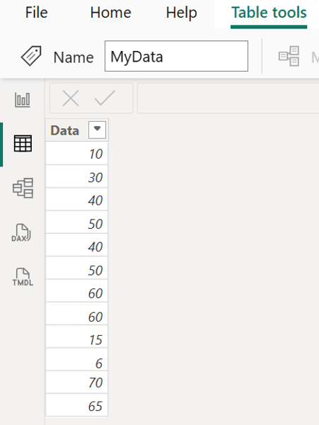
You can add a new column to the table, named Normalized using following formula. The following DAX query will convert the above scale into 1 - 5.
Normalized = 1 + (MyData[Data] - MIN(MyData[Data])) * 4 / (MAX(MyData[Data]) - MIN(MyData[Data]))
You can see the new Normalized column in the Table View.
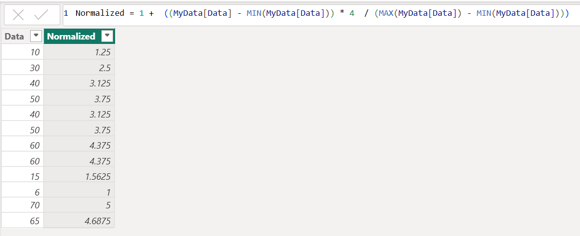
However, the common case would be to use Power Query, which is shown below.
1 + (([Data] - List.Min(#"Changed Type"[Data])) * 4 / (List.Max(#"Changed Type"[Data]) - List.Min(#"Changed Type"[Data])))
This Power Query formula performs Min-Max normalization of the Data values to a scale from 1 to 5: #"Changed Type"[Data] refers to the entire Data column from the Changed Type step, List.Min(...) finds the minimum value (6), and List.Max(...) finds the maximum value (70); [Data] represents the current row's value, so [Data] - minimum measures how far the current value is above the minimum, while dividing by (maximum - minimum) scales it between 0 and 1. Multiplying by 4 changes the range from 0–1 to 0–4, and adding 1 shifts the final range to 1–5.
Following figure shows how to enter the above power query in the custom column option.
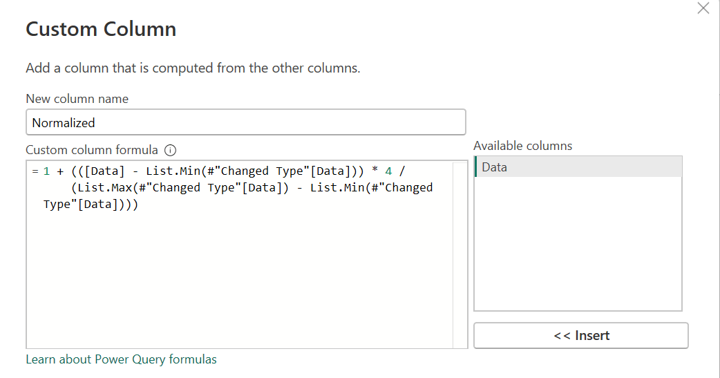
Once the new column is created, following screen will appear with new normalized column.
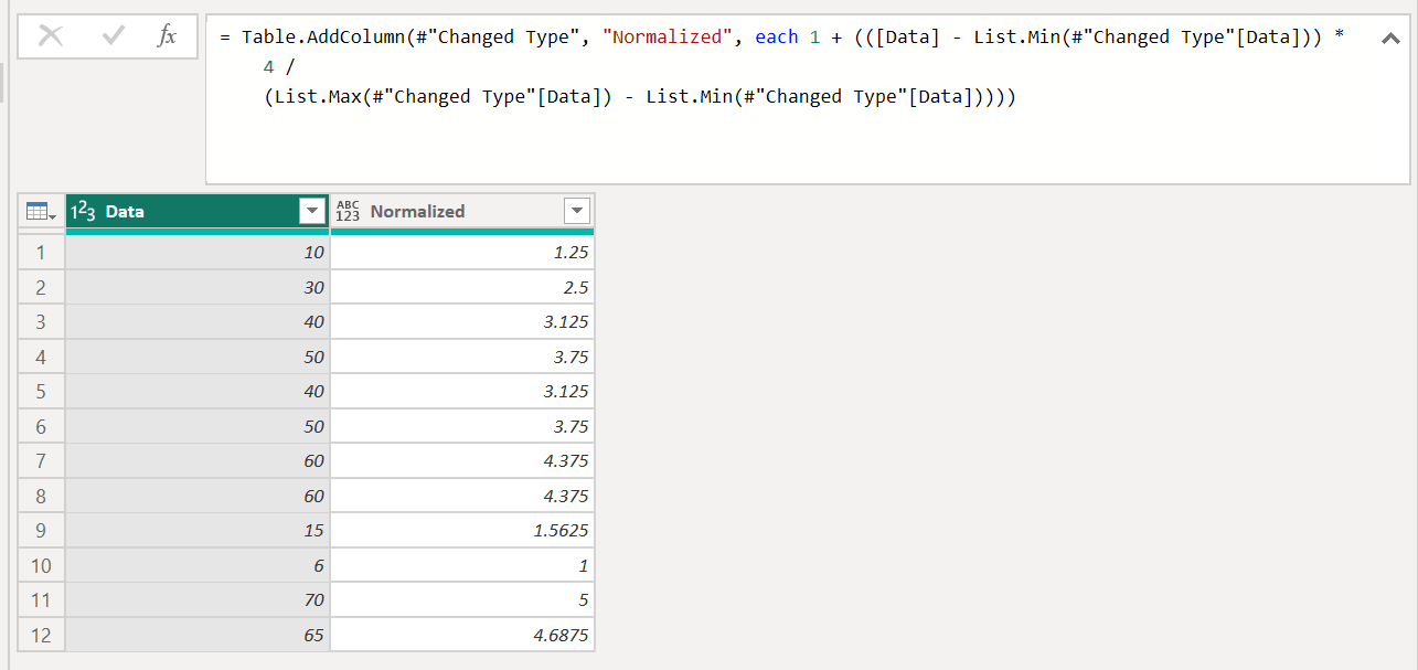
In case you wish to change the scale to a different scale, you can change the starting value (which 1 in the above example) and the range (4 in the above example) and match accordingly.
Min-Max value can be incorporated with a gauge visual as shown below.
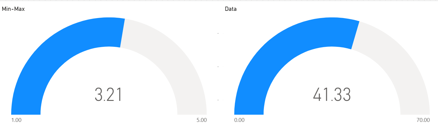
When there are multiple metrics such as Sales, Customer Satisfaction, Attendance, and Productivity, they often have different units and value ranges, making direct comparison difficult. Min-Max normalization converts these metrics to a common scale, such as 1–5, allowing them to be compared consistently. The normalized values can then be presented using gauge visuals in Power BI, making it easier to identify performance levels across different metrics and quickly understand which areas are performing well or require improvement.
Min-Max normalization transforms values with different units and ranges into a common scale, making them easier to compare and analyze. In Power BI, it can be implemented using DAX or Power Query to create normalized values suitable for KPIs, rankings, and gauge visuals. This is particularly useful when comparing metrics such as Sales, Customer Satisfaction, Attendance, and Productivity on a consistent 1–5 scale.