

Introduction
This is the 4th part of the topic of how to visualize Python charts in Power BI (part one, two, and three). Previously, we talked about violin plots, box plots, and hexagonal binning plots. In this chapter, we will cover the following topics:
- First, we will talk about Error bars.
- Secondly, we will use Heatmaps.
- Finally, we will show how to use Boxen plots.
Prerequisites
I am assuming that you are already connected to the vTargetMail view in the SQL Server view explained in part 1.
Error bars to visualize Python charts
The error bars represent the variability of the data used. It shows uncertainty. Let’s take a look at an example to see the errorbar function in action.
Also, make sure to include the NumbersCarsOwned and the NumberChildrenAtHome fields from the vTargetMail dataset.

First, add the following code:
import matplotlib.pyplot as p

p.style.use('dark_background')
x = dataset["NumberChildrenAtHome"]
y = dataset["NumberCarsOwned"]
yerr = 0.3

fig, ax = p.subplots()
ax.errorbar(x, y, yerr, fmt='o', linewidth=2, capsize=5)

p.show()
The plot shows the number of children at home in the x-axis and the Number of Cars Owned on the y-axis. Let’s take a look at the plot.
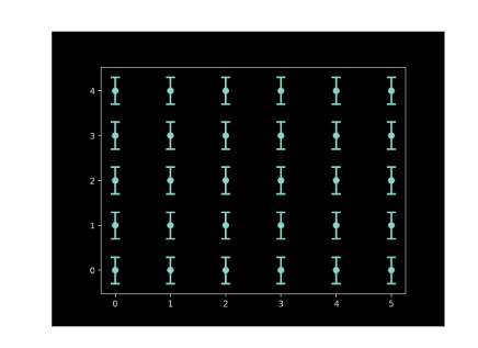
As you can see, the values contain the error plot. In addition, we can see the number of children at home and the cars owned.
Let’s explain the code. First, we import the matplotlib.pyplot library and use dark_backgroud style. You can see a list of styles here.
import matplotlib.pyplot as p

p.style.use('dark_background')
As we said before, the x-axis is for the Number of children at home and the y-axis is for the Number of cars owned.
x = dataset["NumberChildrenAtHome"]
y = dataset["NumberCarsOwned"]
Also, Yerr is used to define variability. The Yerr value is numeric and we will use it later by the errorbar function. In this example, the variability is 0.3.
yerr = 0.3
Also, we need to define an instance of the figure and create the subplot.
fig, ax = p.subplots()
Finally, we have the most important part. We use the errorbar, define the format, and use the yerr variable used before. We then specify the line width and capsize is for the length of the errorbar caps in points.
ax.errorbar(x, y, yerr, fmt='o', linewidth=2, capsize=5)
Heatmap to Visualize Python Charts
I like the heatmap function. This function uses the seaborn Python library, which is a popular Python library for data visualization. The matplotlib and the seaborn used to work together. As we can see in the following example.
import matplotlib.pyplot as p
import seaborn as s

data = s.load_dataset("flights")
data = data.pivot("year", "month", "passengers")
ax = s.heatmap(data,cmap='PuBuGn')
p.title("Heatmap sample with flights")

p.show()
The code shows how to create a Heatmap of flights. The chart is the following:
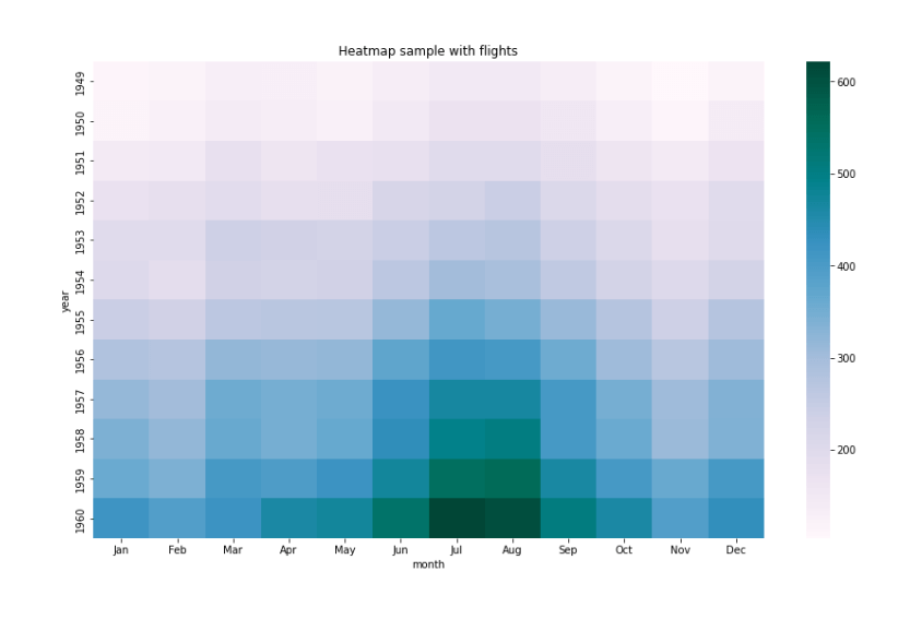
The plot shows that in July and August of 1960, we had more flights (around 600). During the years starting in 1949, the number of flights increased and in vacations (July-August) is where we have more flights.
In this example, we are using matplotlib.pyplot library and the seaborn library:
import matplotlib.pyplot as p
import seaborn as s
Also, we are using the load_dataset to load the flights' example. The flight example is a sample of data with flight information.
data = s.load_dataset("flights")
In addition, the data.pivot allows selecting data on the y-axis (years), the x-axis (months), and the number of passengers which are marked by colors. The darker it is the plot, the higher number of passengers that you have.
data = data.pivot("year", "month", "passengers")
Next, we use the heatmap to create the plot using the data pivoted. The cmap provides the colors. For more information about colors click here.
ax = s.heatmap(data,cmap='PuBuGn')
Finally, we add a title to the plow and show the plot.
p.title("Heatmap sample with flights")

p.show()
Boxenplot Function
The boxenplot is similar to the boxplot explained in the previous article. However, the division of the data is not in quartiles and the representation of the data is more precise for large numbers to include more groups.
Let’s take a look at the code.
import seaborn as sns
import matplotlib.pyplot as plt

data = dataset[["YearlyIncome","EnglishEducation"]]
sns.boxenplot(x = "EnglishEducation", y = "YearlyIncome",
data = data)

plt.show()
The code will provide the following plot.

As you can see, we have education and yearly income. In addition, bachelors, in general, have a better yearly income than people with a graduate degree. Also, people with a graduate degree have better incomes than people with high school. Moreover, the people who accomplished high school have better yearly incomes than people from partial college and finally, the lowest yearly income comes from people from partial high school.
The code is simple, we first import the mathplotlib and seaborn libraries, and then we create a dataset with the Yearlyincome and Englisheducation columns.
import seaborn as sns
import matplotlib.pyplot as plt

data = dataset[["YearlyIncome","EnglishEducation"]]
Finally, we invoke the boxenplot function and send information for the x-axis with the EnglishEducation filed, the y-axis with the YearlyIncome filed and finally, we send the data.
sns.boxenplot(x = "EnglishEducation", y = "YearlyIncome",data = data)

plt.show()
Conclusion
To conclude, we can say that it is simple to create some charts in Python if you have some programming knowledge.
Python is an intuitive tool for programmers and you can add nice custom plots here.