Overview
Power View is the new data visualization tool built by Microsoft, which is part of the Power BI suite of tools. It allows end-users to explore and analyze data in an adhoc fashion and produce presentation-ready reports and visualizations without any IT involvement. As such, it brings the vision of self-service BI closer to reality.
In this article, I’ll provide an overview of Power View and some of its features including how to get started. By the end of this article you will be able to begin using Power View to create stunning visualizations, if you have Excel 2013 (and some data to play around with). This is because starting with Office 2013, Power View is baked into Excel itself; in fact with Excel 2013, it is a built-in feature inside of excel requiring no additional downloads or add-ins.
Including Power View inside of Excel, in my opinion, was a brilliant strategy on Microsoft’s part. It not only gives them access to the huge excel user-base, but it also makes Power View much more approachable to end-users because they are already familiar with Excel. This is not how PowerView started though; initially it was offered through SSRS 2012 installed in Sharepoint Integrated mode and was accessible via a browser with the Silverlight add-in. Whether accessed from a browser or through excel, the experience is very similar though.
Data Preparation
In order to start exploring Power View, you will need to prepare a data set. In this article, we will simply use an Excel Sheet as our data source. It is relatively easy to use other data sources such as PowerPivot, SSAS Tabular, SSAS Multi-dimensional or SQL Server.
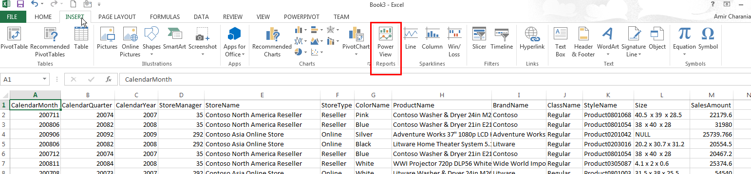
For the purpose of this article, I wrote a simple SELECT statement to fetch data from the Contoso Retail DW sample provided by Microsoft and simply pasted the data in an Excel Sheet (see below). Feel free to use any data set you desire.
USE ContosoRetailDW
GO
SELECT D.CalendarMonth,D.CalendarQuarter,D.CalendarYear,
       S.StoreManager,S.StoreName,S.StoreType,P.ColorName, P.ProductName ,
       P.BrandName ,P.ClassName ,P.StyleName ,PS.ProductSubcategoryName,PC.ProductCategoryName,P.Size, F.SalesAmount, F.ReturnAmount, F.TotalCost, F.UnitPrice
 FROM dbo.FactSales F
 INNER JOIN dbo.DimDate D
   ON D.Datekey = F.DateKey
 INNER JOIN dbo.DimStore S
   ON S.StoreKey = F.StoreKey
 INNER JOIN dbo.DimProduct P
   ON P.ProductKey = F.ProductKey
 INNER JOIN dbo.DimProductSubcategory PS
   ON PS.ProductSubcategoryKey = P.ProductSubcategoryKey
 INNER JOIN dbo.DimProductCategory PC
   ON PC.ProductCategoryKey = PS.ProductCategoryKey
 --the filter conditions below help to limit the amount of data in the excel sheet.
 WHERE P.ClassID=2
 AND D.CalendarYear BETWEEN 2007 AND 2010
 AND SalesAmount>20000
Here is the Excel data sheet

Getting Started
In order to start using Power View in Excel 2013, ensure you are in the Excel sheet with the data you want to explore and click on the Insert tab on the ribbon and then click Power View.
The first time this action is performed, Power View will indicate that it is initializing, and the action will take a couple of minutes. Once Power View is initialized, it is ready for use.
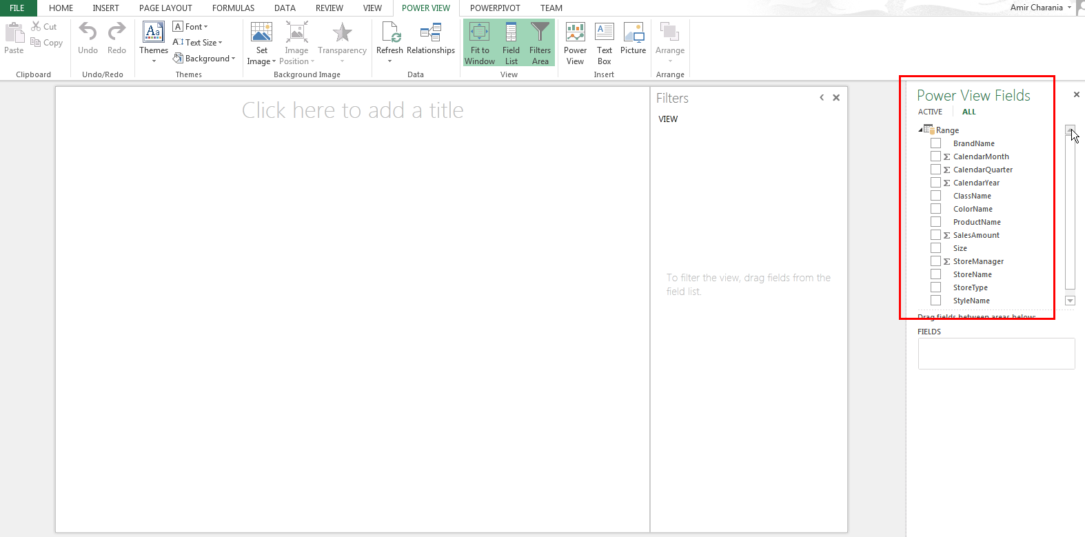
Excel creates a new Sheet called Power View 1, and I get my list of fields from the Excel sheet on the right pane as shown below. Now, I am ready to start using Power View for my data exploration and analysis! Using the Excel sheet data as the source may not be too attractive to SQL/BI developers, however, this capability shows how easy it is to start using Power View for data exploration.
You do not need SQL Server, SSRS, SharePoint, SSAS or PowerPivot. Just an Excel sheet with good data will suffice! The use case for this scenario is a small businessman (let’s say a restaurant or jewelry store owner) who tracks all his sales data in Excel and does not use a database.
You will notice, however, that by default Power View decided to summarize columns CalendarMonth, CalendarQuarter and CalendarYear, which is not correct. In the absence of a data model layer (such as the one provided by PowerPivot or SSAS), where you can specify how each column should be treated, Power View decides to summarize any column that appears numeric.
Working with Power View
Working with Power View is relatively simple. In order to start exploring your data, you simply click on a measure field, like Sales Amount. Power View automatically SUMs the field to show you the aggregate Sales Amount in your dataset.
Looking at data across categories can be accomplished in a variety of ways. One of the more visual ways of accomplishing this is by using Tiles. Simply right click on a field such as Color and select “Add as Tile By”. The result is displayed in the figure below. The tiles are interactive and clicking on different tiles will filter the data set and dynamically change the results.

Multiple Power View Sheets
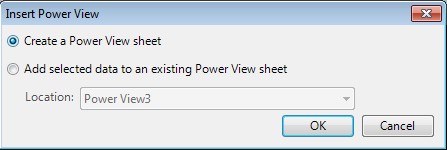
A Power View sheet looks very much like a Power Point slide. Just like you have multiple slides in a Power Point deck, you can have multiple Power View sheets in a single Power View Report or Excel File. In order to create a new Power View sheet, go back to the original Excel sheet with the data, and click Insert, Power View. A dialog box will confirm whether you want to create a new Power View sheet or add data to an existing sheet. Click OK to create a new Power View sheet.
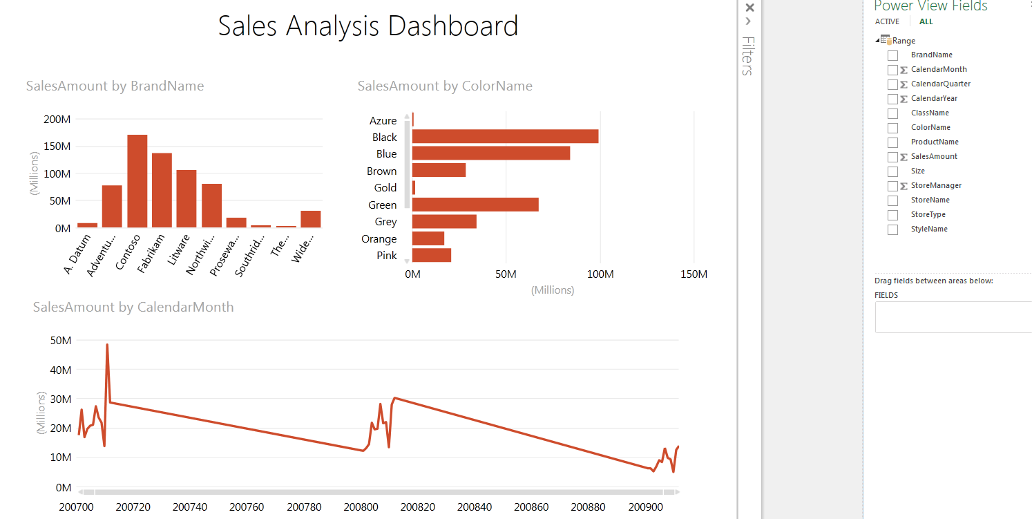
Bar and Line Charts
Power View offers users the ability to create a variety of different charts. In order to create the dashboard below, click on Sales Amount and Brand Name. Then click Column chart and Clustered Column. Next click on an empty area in the sheet and repeat the same process with the same measure but a different categorization like Color Name and choose Bar Chart and Clustered Bar. Finally, repeat the same process and choose a time field such as Quarter and choose Other Chart, Line chart. Finally, give the sheet a title such as “Sales Analysis Dashboard”.
Interactivity
The charts created above are all interactive and allow dynamic filtering. Clicking on any bar in the figure above will change the other two charts and reflect the selection. It is thus possible to analyze how Black product sales of various brands perform over time by simply clicking the Black bar and watching how the other graphs change.
Scatter plot with play-axis
One of the most talked about features of Power View is the Scatter plot with the play-axis. With this feature, it is possible to literally bring your graph to life and animate performance over time. This is accomplished by simply choosing the Scatter plot from the “Other Charts” menu after you have clicked a measure like Sales Amount.
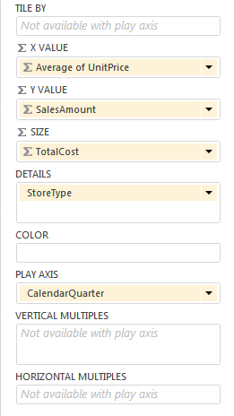
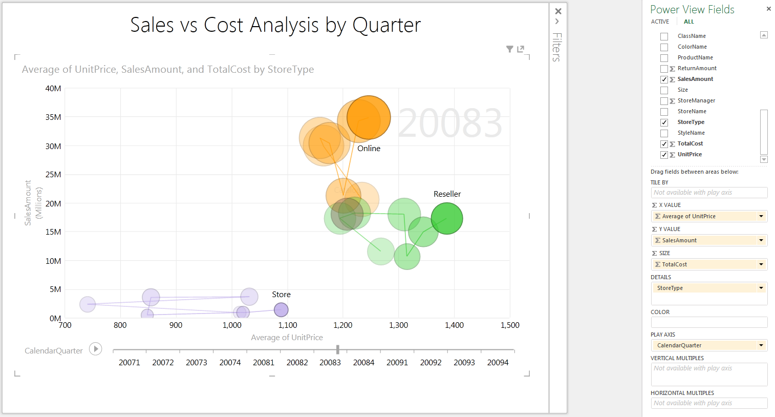
The figure above shows the various options that are available in the Scatter plot chart. As you can see you have options for choosing various measures to represent the X & Y axes, but also measures for Size, Color and the Play-Axis. The figure below shows a sample scatter plot created using the options from the figure above. When the play button on the lower left corner is clicked, this graph display the performance of various Store types over time. The play-button changes to pause, allowing you to pause the animation at any time. You may also go backward or forward to any point in time by dragging the pointer on the X-axis.

Note: Clicking on one of the circles displays the path that item traversed over the given time period as shown in the figure below.
Filters
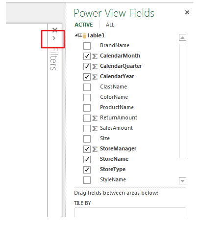
Finally, Power View allows you to specify Filters so you can look at just the data you are interested in. The Filter pane is hidden by default. In order open the Filter pane, click on the right arrow highlighted below.
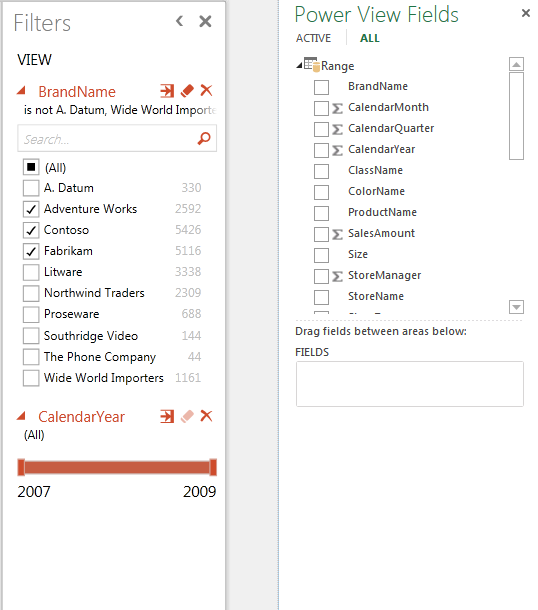
Now, you can right click on any field, such as Brand Name or Year and click “Add to View filter”. This will add the fields to the Filter pane as shown below and allow you to filter the data displayed on the sheet.
Other Data Sources
Power View within Excel can analyze data from practically any data source. As long as you can create a Data Connection to it, you can use Power View to analyze any data source. For example, I took the query we used above, created a view in SQL Server using the query and then created a connection to SQL Server in Excel by clicking Data and “From Other Sources”. Now, I can click Data, “Existing Connections” to see my connection.
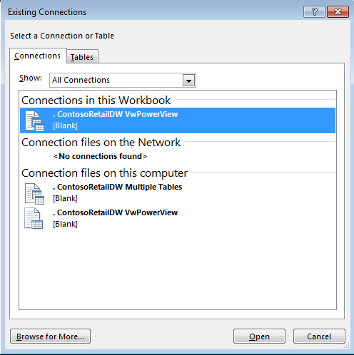
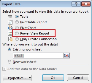
When I select my connection and click Open, excel gives me the option to analyze the data in Power View as shown below.
Conclusion
Power View is an excellent tool for data visualization that puts the end-user in the drivers seat. Without any technical knowledge, users can create beautiful presentations with live data and interactivity. It fills in the gap that currently exists in the Microsoft BI suite and brings the promise of self-service BI more closer to reality. Of course, the true power of Power View is only realized when its used along with a strong data access layer such as PowerPivot or SSAS!