This article will focus on how you can start to use Power Pivot for powerful self-service BI capabilities. I will provide ample screen shots so you can follow along and have a working Power Pivot model that can produce stunning graphs, reports and charts.
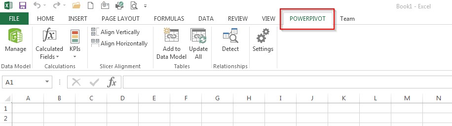
I will assume that you have Excel 2013 and have enabled the Power Pivot add-in. If not, click here and follow the simple instructions. You should now see the Power Pivot tab in the Excel ribbon as shown below:
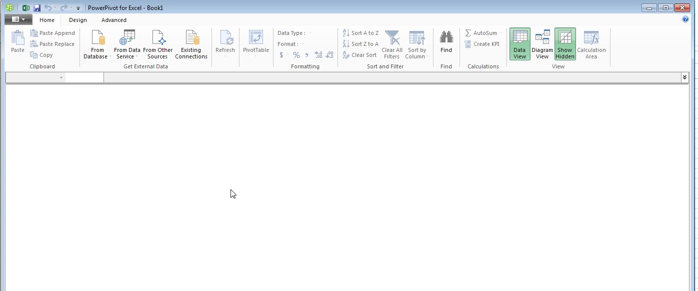
Click the leftmost green Manage button. This will take you to Power Pivot as shown below:
Importing Data
The first step in using Power Pivot is to import the data you want to model and analyze. For the purposes of this article, we will use data from Contosso Retail DW database.
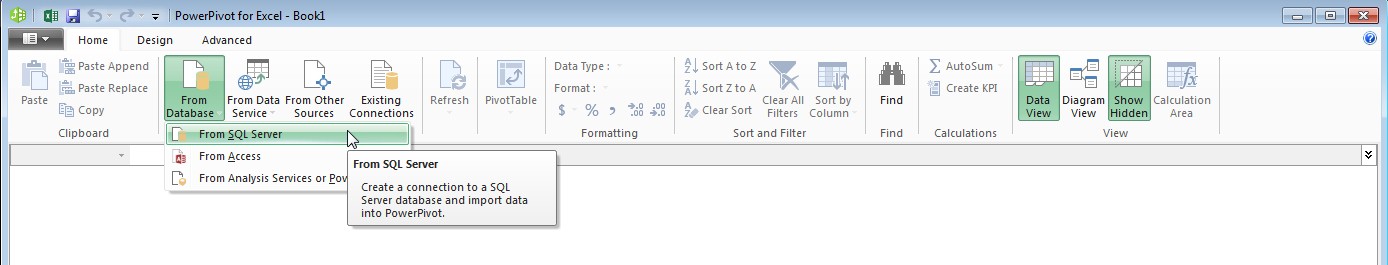
Since our data is in SQL Server, click From Database followed by From SQL Server.
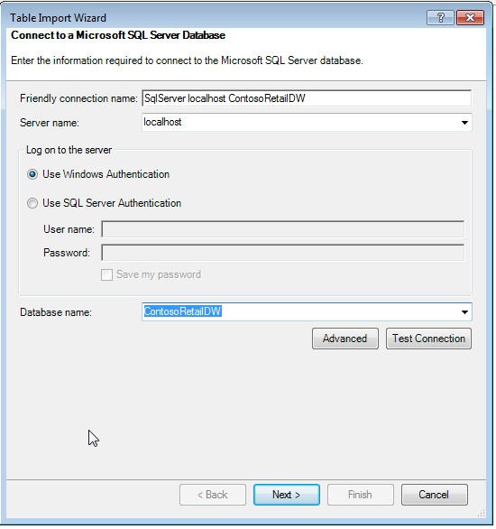
Specify the name of your source database server where the DB is located.
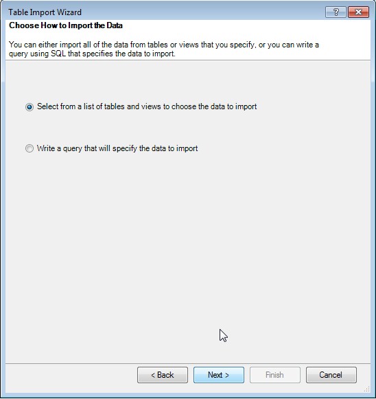
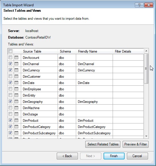
In this case, we will simply choose tables from the DB, rather than write queries.
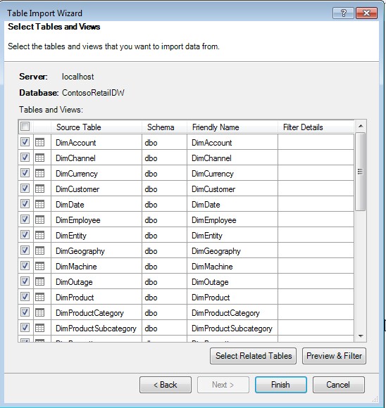
We initially choose all tables to import into Power Pivot.
As you will see, below, this results in the following error.
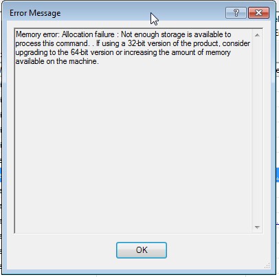
We also see this in the Table Import Wizard.
In this case, I was running this demo on a machine with 32-bit version of Excel. Although my machine itself is 64-bit, and I have 16GB of memory, Excel is only able to use 2 GB of memory due to the Excel version being 32-bit. The reason why I highlighted this error, as it can be a source of frustration when working with Power Pivot. You will quickly realize that you need to work with 64-bit version of Excel if you want to do serious analysis and processing.
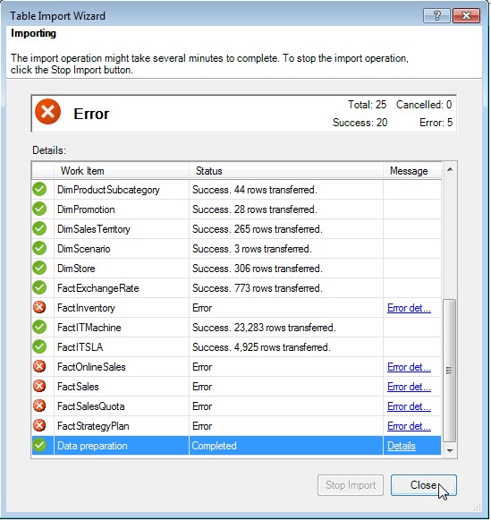
The other option is to consider Analysis Services Tabular which essentially has the same engine as Power Pivot, but runs on a server and provides enterprise features like security which are lacking in PowerPivot. For now, we simply reduce the number of tables selected, create views on two of the Fact tables we want to analyze (in order to restrict the rowset) and continue.
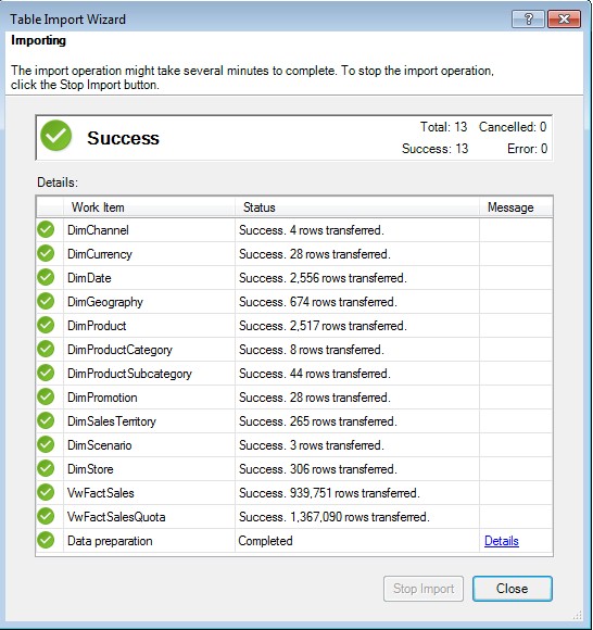
The Wizard now succeeds as shown below.
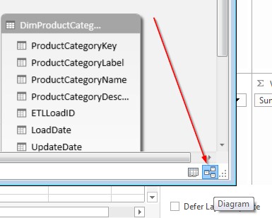
Once the tables have been imported, click the Diagram view either from the the icon on the lower right corner of the screen as show below:
We can also view the diagram from the ribbon as shown by the arrow in the image below:

Relationships between tables
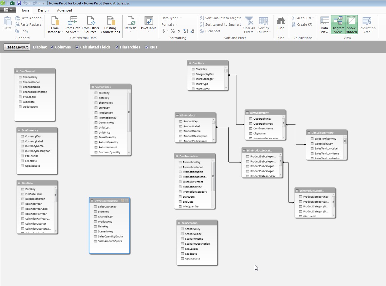
You will see all the imported tables in your diagram. The arrows between some of the tables are Relationships that are automatically detected by Power Pivot. These are detected based on Foreign Key relationships between those tables in the database. Since we imported views for Fact tables, many of the relationships do not exists and we must create them in Power Pivot.
Let’s first create a relationship between the DateKey column in VwFactSales and DimDate. In order to do that, simply drag the column from the VwFactSales table and drop it on the same column in DimDate.
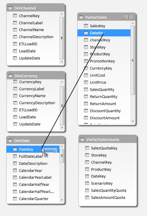
This will create a relationship between those two tables as illustrated below. These relationships are the key to making Power Pivot do its magic.
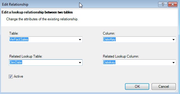
When you double-click on the Relationship line, you will see the details of that relationship as shown below:
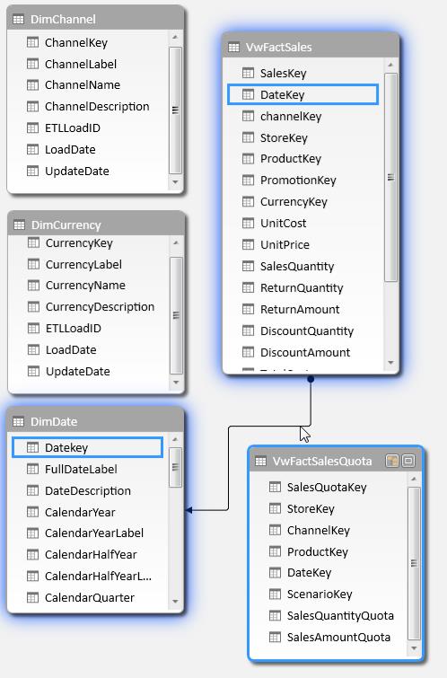
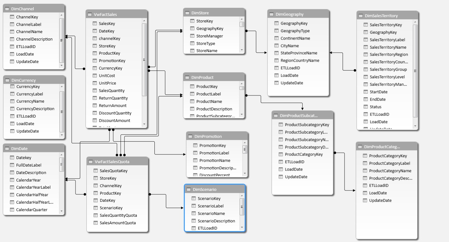
Go ahead and create the relationships between the rest of the dimension tables and the Fact table as shown above. The fact table views have columns that end in “Key” that point to the respective dimension table’s Primary Key. Once all the relationships are created, your diagram view will look similar to the image below:
Note: You can only have one active relationship between two tables. If however, your business requires you to join a Fact table to the same dimension table (e.g. DimDate) using different keys (e.g. OrderDate and ShipDate), you can create multiple relationships between those two tables and only one of them will remain active. Marco Russo's article explains how you can then use Data Analysis Expressions (DAX) to use the inactive relationship.
Viewing Data
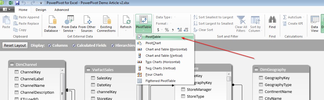
Once the Relationships are created, you are ready to do Reporting! Click on PivotTable followed by PivotTable from the top ribbon as shown below:
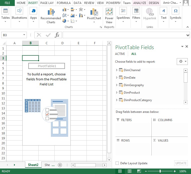
You will be taken to Excel and a default Pivot table will be created for you. All the tables and fields from the Power Pivot model are now visible to you on the right hand side as shown below:
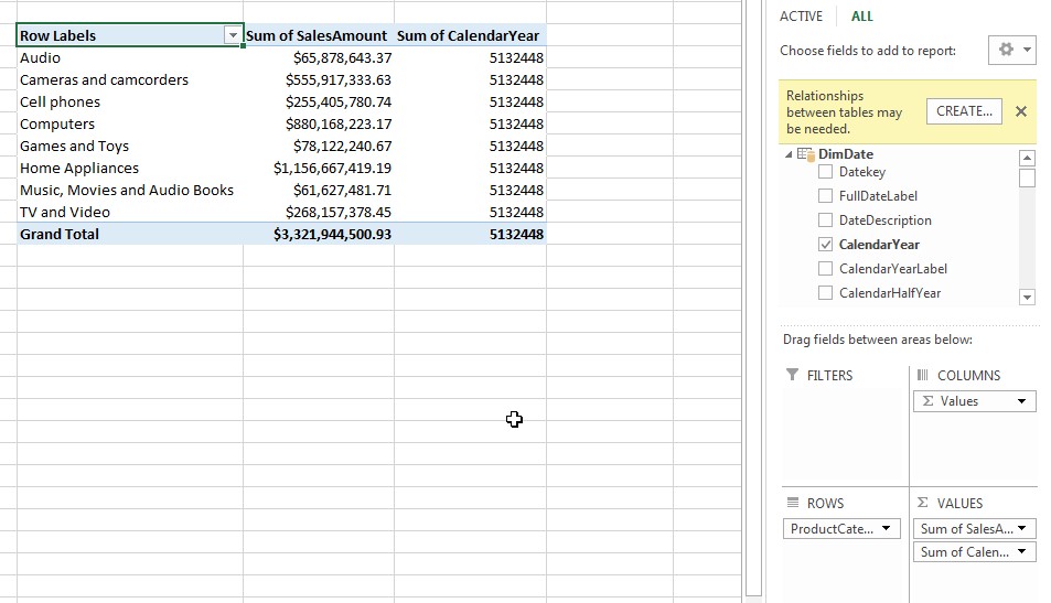
You will notice that Power Pivot gives you a warning stating, “Relationships between tables may be needed”. You are right! You have already defined relationships. It is out of the scope of this article to get into the details of how to work around this warning, however, this article provides an explanation. Check it out when you have a moment.
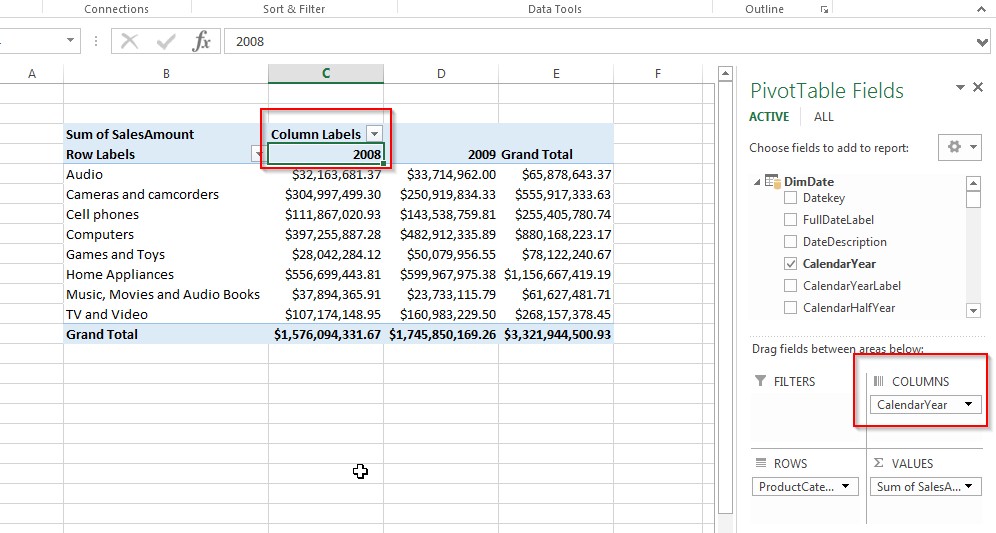
Click and select ProductCategoryName from DimProductCategory, SalesAmount from VwFactSales and CalendarYear from DimDate. When you select these columns, you will see the Pivot table below. Note: PowerPivot decides to create a “SUM” for CalendarYear. This is because, we have not instructed PowerPivot to treat DimDate as a date table. So, let’s first do that.
Working With Date Table
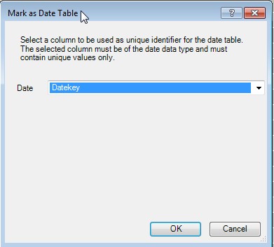
Click on the Design tab at the top when you are in the DimDate table and Click Mark as Date Table, followed by Mark as Date Table.
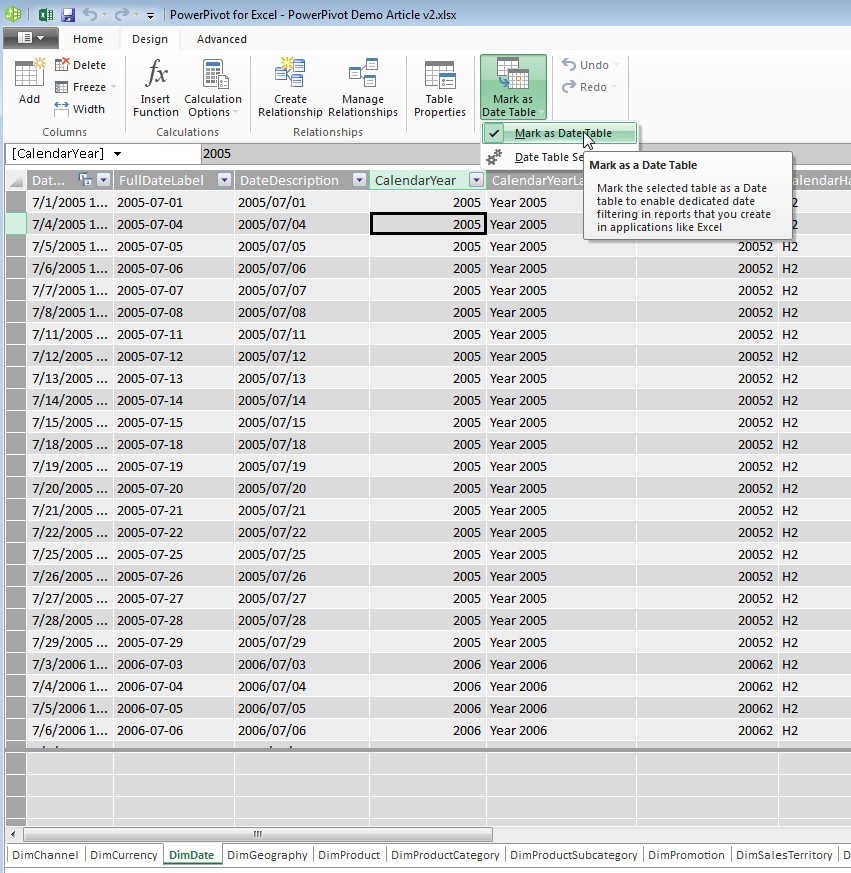
You will be prompted to choose the field that represents the Primary key or unique key of the date table. In our case, it is Datekey. Choose Datekey from the drop down and click OK as shown below:
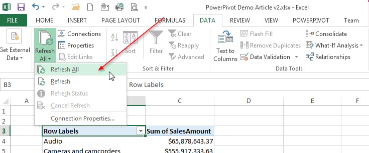
Once this is done, go back to the Excel sheet and refresh the Data connection by clicking Data, Refresh All followed by Refresh All as shown by arrow below:
You will see that the Calendar Year now appears as Column Labels instead of an aggregate field as shown below:
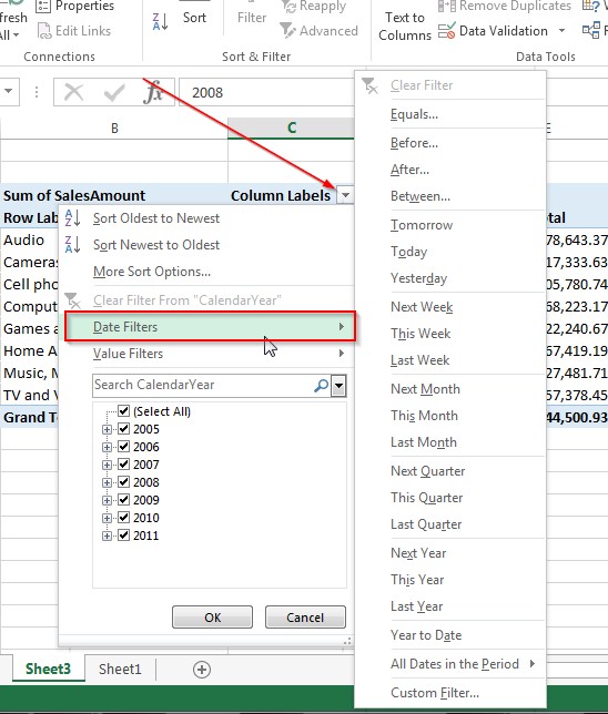
Additionally, Power Pivot will now expose features such as Date Filters as shown below that will allow you work with dates more effectively.
Let’s look at how you can now configure Power Pivot further to make it perform in some real-world scenarios.
Aggregations
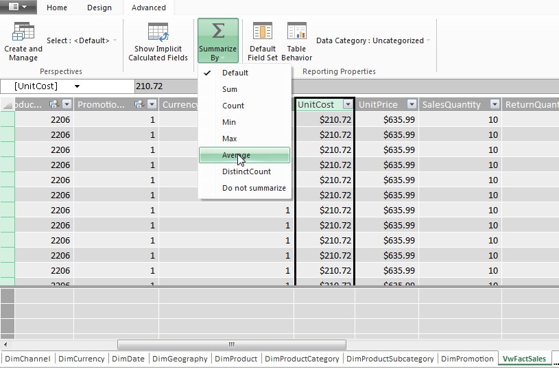
By default, all numeric columns are aggregated as SUM. In our case, we have a field like UnitCost and we may want Power Pivot to display the Average cost instead of the Total cost. In order to do this, make sure you are in the VwFactSales table, select the UnitCost column and then click Advanced Tab at the top ribbon. Click theSummarize By drop-down and choose Average as shown below. Note, you have a number of different aggregations to choose from including, DistinctCount.
Distinct Count is one of those aggregation types that caused SSAS Multi-dimensional Developers a lot of performance and other issues. Microsoft wrote an entire white paper dedicated to optimizing these types of measures. With Power Pivot, as with SSAS Tabular, you have the ability to simply choose this aggregation type with virtually no performance issues. In fact, using Power Pivot or Tabular is one of the ways to overcome this SSAS Multi-dimensional limitation as explained by Daniel Calbimonte here. In my consulting experience, when it comes to product selection, I have seen a single feature has the potential to seal-the-deal for that product. As such, Distinct Count measures can certainly be an important reason to consider Power Pivot.
Calculated Columns & Data Analysis Expressions (DAX)
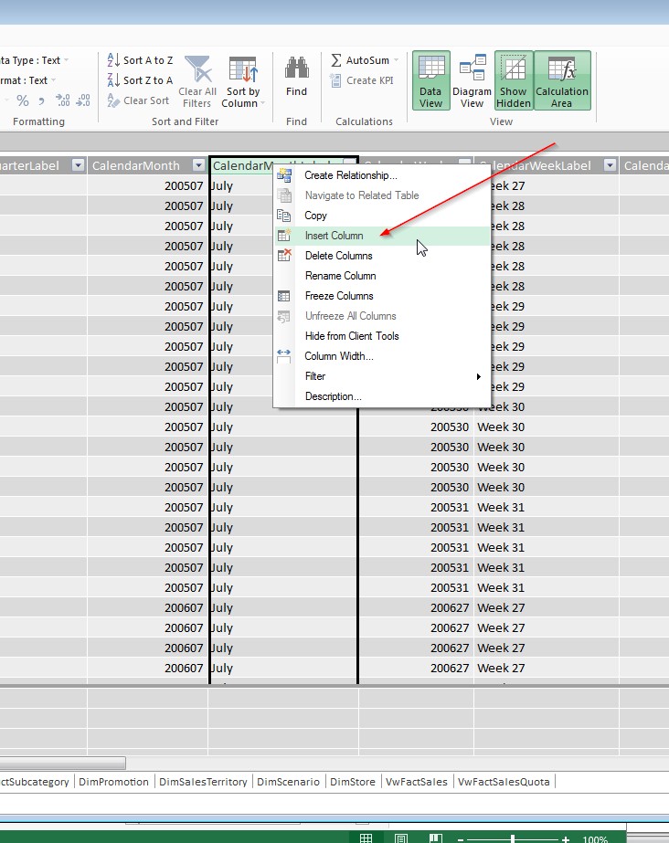
Another common real-world scenario is ensuring data is sorted correctly. For e.g. When you analyze data by Months, you want to ensure that the months are sorted from Jan-Dec and not alphabetically. In order to this, you will create a calculated column based on the CalendarMonth column. In order to create a calculated column, simply select a column like CalendarMonth and then right click and select Insert Column as shown below.
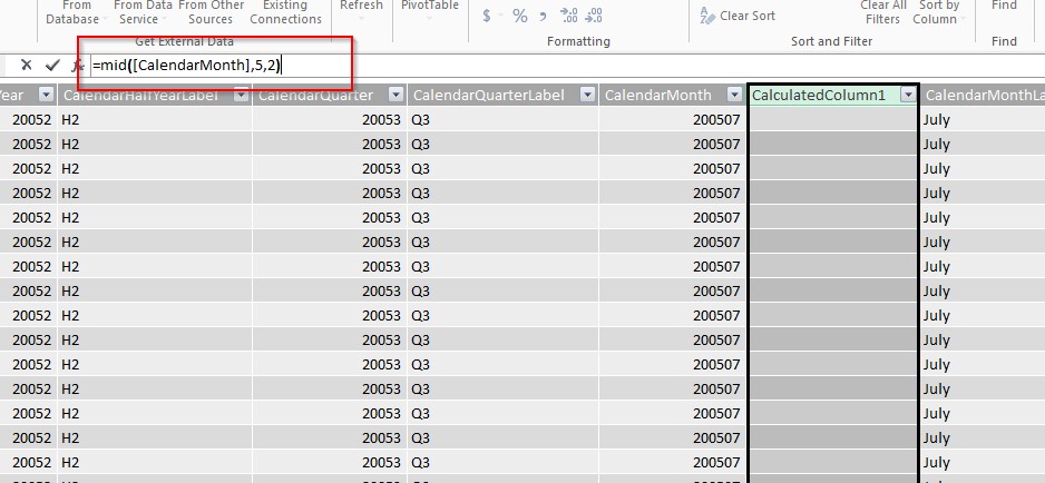
Creating a calculated column in Power Pivot is very similar to creating one in Excel. The formula for Power Pivot calculated columns also starts with “=”. Type the formula, “=mid([CalendarMonth],5,2) in the formula field above and hit enter.
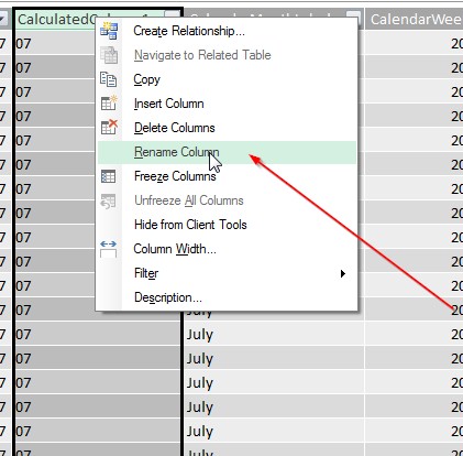
Power Pivot creates the calculated column and names it “CalculatedColumn1”. Right click the column and Rename it to “CalendarMonthNumber” as shown above. Note: Calculated columns are stored in Power Pivot just like regular columns. They occupy the same amount of space and perform equally well.
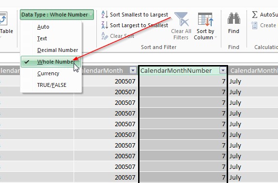
Next choose the data type of “Whole Number” from the Home Tab and Format drop-down as shown below:
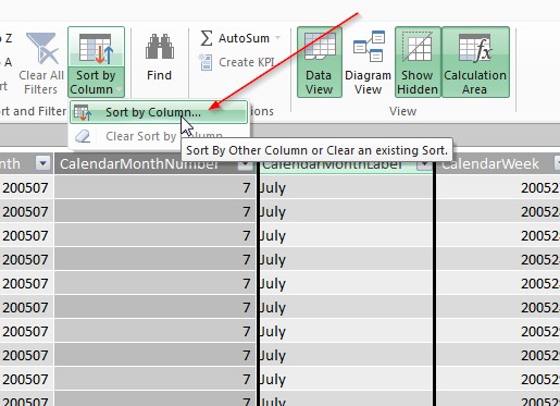
On the Home Tab, click Sort by Column as shown below.
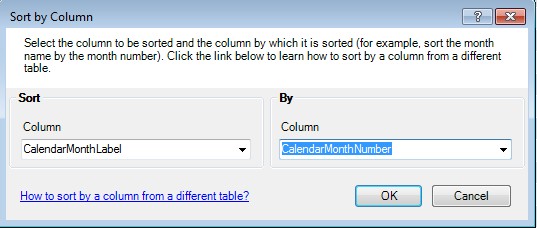
On the following screen, choose CalendarMonthLabel as the Sort Column and CalendarMonthNumber (the new calculated column we just created) as the Sort By Column.
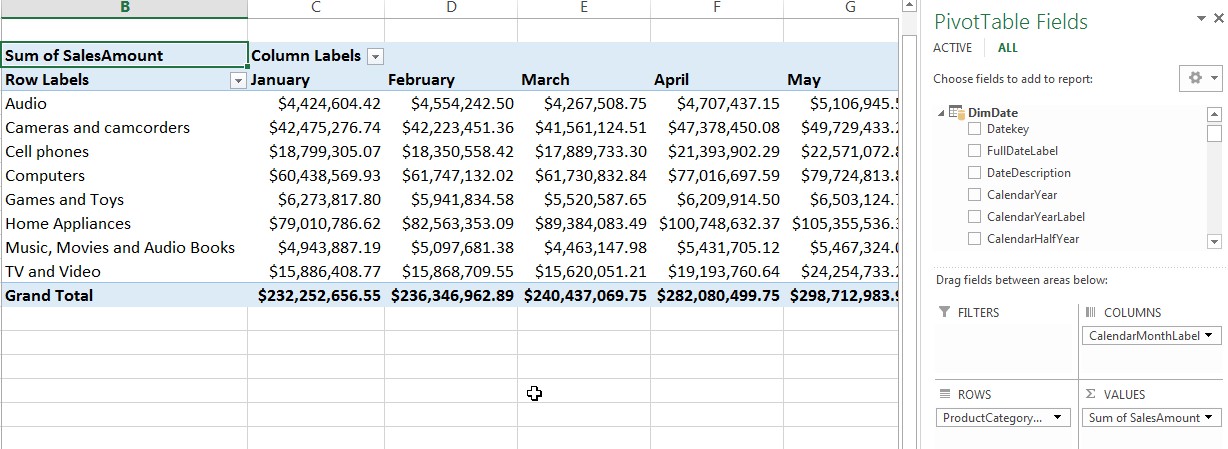
Once this is done, any time the CalendarMonthLabel field is chosen, it will be sorted based on the MonthNumber as shown below.
Hierarchies
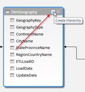
Another, excellent feature of Power Pivot that makes reporting user-friendly is Hierarchies. Hierarchies allow users to drill-down and up data in an intuitive manner and perform data analysis. In order to create a hierarchy, switch to the Diagram View. On the DimGeography field click the Create Hierarchy button as shown below. The first step is to give the Hierarchy a meaningful name. We call it Geography Hierarchy.
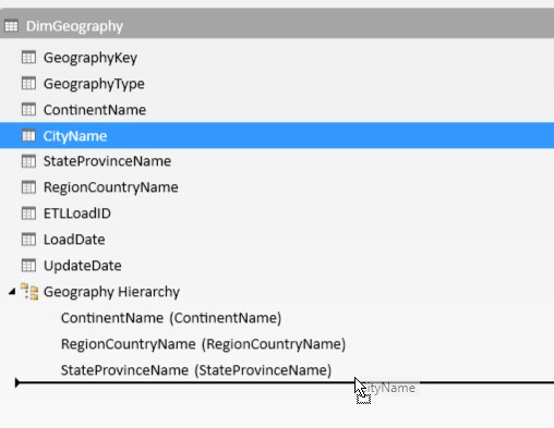
Next, start to drag the fields below the hierarchy name beginning with the top-level field as shown below.
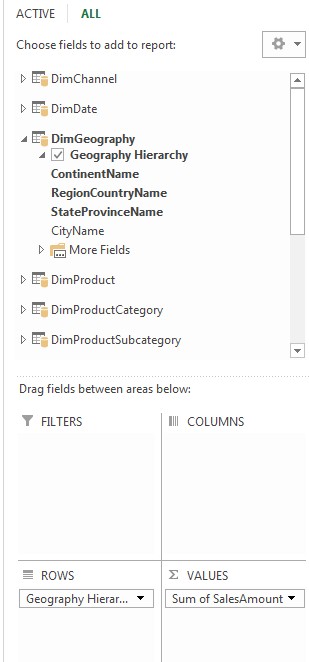
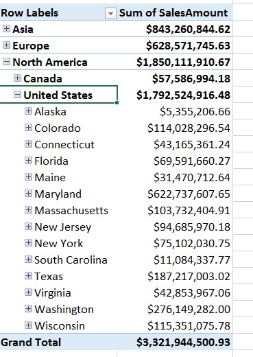
Once the hierarchy is created, and you save the model, you can view the hierarchy and start to analyze data using that hierarchy as shown below.
You can only create hierarchies between columns of the same table. If you would like to create a hierarchy across tables, take a look at this article by Dattatrey Sindol.
Summary
These are some of the basics on how to get started with Power Pivot. Once you are done setting up your model, you must then explore your data with Power View. Create Stunning visualizations with Power View in 20 minutes or less! is a great way to get started with Power View.
I hope you enjoyed this article and I hope that it encourages you to get started with Power Pivot!