

Introduction
In other chapters, we created different models like Clusters, Neural Networks, Naive and Decision Trees.
In this new chapter we will analyze which model is the more accurate one, and we will verify the accuracy for this model using different Microsoft Data Mining options. For this purpose, we will use the Mining Accuracy Chart.
Requirements
- SQL Server Installed (2005 or later).
- SQL Server Analysis Services.
- The SQL Server Data Tools (SSDT) or the Business Intelligence Development Studio.
- The AdventureworksDW database installed.
- A Data Mining model with the Desicion tree, the cluster, the neural network and the Naive algorithm already created.
Getting Started
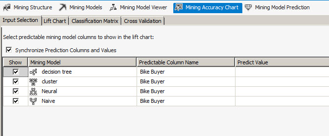
I am assuming that you already have the requirements completed, especially the Data Mining Structure with different algorithms created. In SSDT, open your Data Mining project, open the Data Mining Structure, and go to the Mining Accuracy Chart. Click the checkbox for all the models and then press the Lift Chart tab.
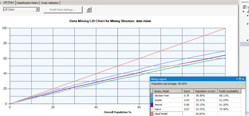
The Lift Chart shows the accuracy of the model. With this graph, you can easily detect which model is the most accurate. The Ideal model is a perfect model and the other lines are the data mining models. The model that is closer to the ideal model is the best model.
In this example, the best model is the desicion tree. The score is used to show which model is better. In this scenario, the score of decision tree is 0.75. In second place, it is the neural network with a score of 0.68 followed by Naive (0.67) and finally, the worst model is the cluster algorithm with a score of 0.64. These results may be very different for each company depending on the input values used to create these models.
Now, let's talk about the population correct. It shows how much population was correctly predicted in this model. The ideal model has 50%. The closest model is decision tree (38.58%), then neural network (35.13%) followed by Naive (33.72%) and the last one is the cluster (32.41%).
The predict probability shows the probability need to capture the target population.
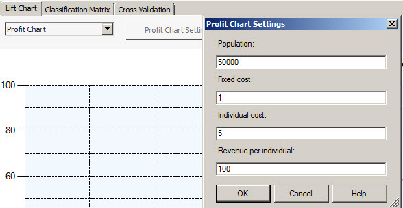
Now select the Profit Chart in the combobox. The profit chart is used to measure the profits with each model. The Profit Chart Settings Windows has the following fields:
- Population: Is the number of customers to be used. In this example, there are target emails of the customers. In this example, the population used is 50000.
- Fixed cost: Is a total cost for to send information to all the population.
- Individual cost: Is the cost to send each email.
- Revenue per individual: Is the revenue if the customer buys our products.
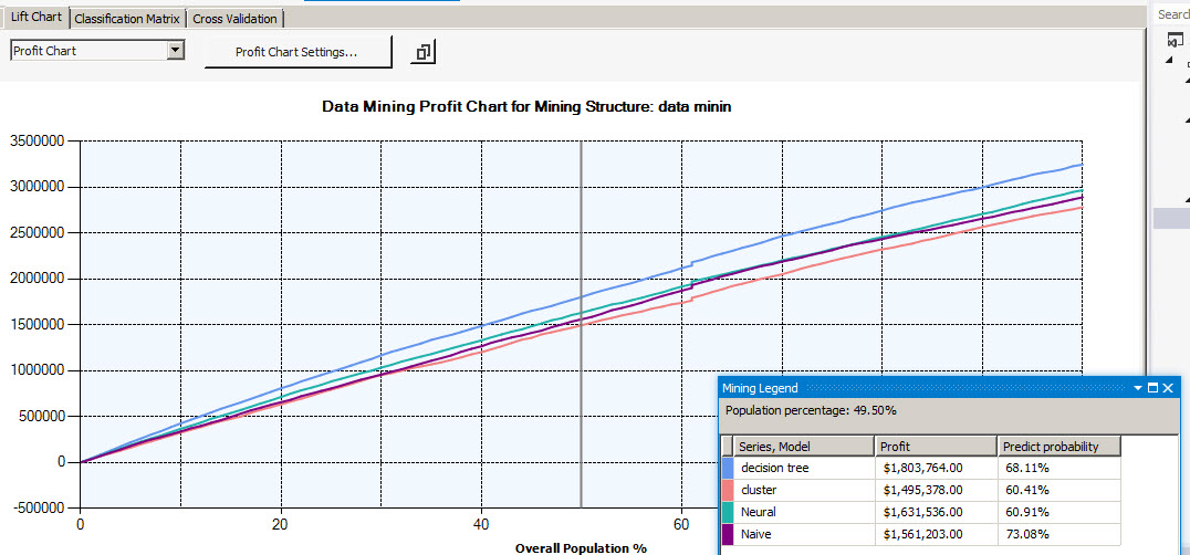
The profit chart will show the estimated revenue according to the information specified in the step 3. As you can see, the decision tree generates more profit and the neural network is in second place followed by Naive and finally the cluster algorithm. This means that we will earn more money using the decision tree in this specific scenario.
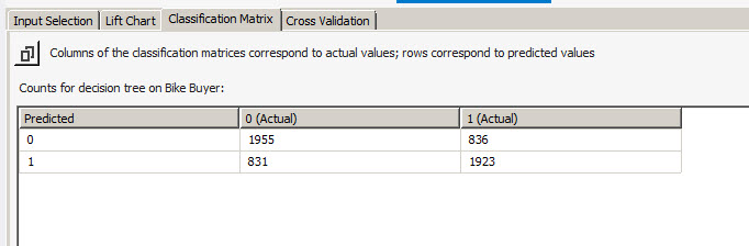
The classification Matrix tab is used to detect how many values were predicted and how many failed. The value 0 means that the customer did not buy the procuct, and 1 means that the customer bought the product.
In the example, 1955 customers did not buy the product and the decistion tree could successfully predict this value. By the other hand, 836 were not predicted. It means that the model failed with 836 values.
The same for the bought products (with the value of 1). 831 values were not predicted and 1924 values were predicted.
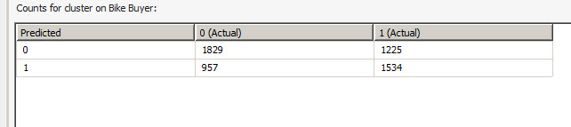
If we compare the decision trees with the clusters, you will notice that the cluster is less accurate (1829 values predicted vs 1955). It is clear that the decision tree is more accurate.
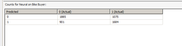
The Neural Network is better than the cluster, but worse than the decision tree (1885 vs 1955 from decision trees).
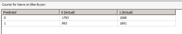
The last one is the Naive algorithm. 1793 values predicted and 1068 failed.
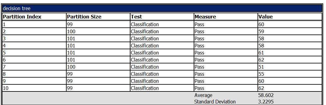
The last tab is the Cross validation. In this section, you verify the quality of the data using different statistics like the measure, the average, the standard deviation and other measures.
For example, let's check the decision tree report. The model is divived in 10 groups of 100 members each one. The number of values that passes is 58% approx.
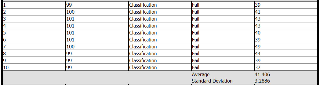
By the other hand, we have the values that failed from 100:
The log score, is the logarithm of the actual probability for each case, summed, and then divided by the number fo rows in the input dataset, exluding rows that have missing values for the target attribute.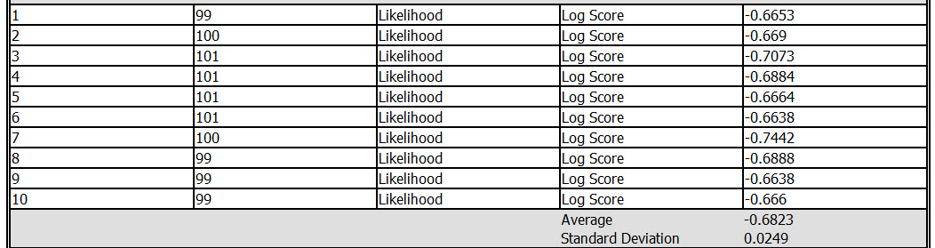
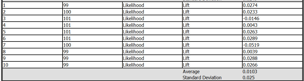
The lift is the probability of the target outcome improves when the model is used.
Conclusion
As you can see, Microsoft Data Mining has the tools to analyze the accuracy of your model with the lift chart, the cross validation, the profit chart if you want to analyze the profits using the model. You also have the classification matrix to verify how many rows failed and passed.
These tools are very useful to test and see the accuracy of your Mining models to model your business.
The cross validation was the last validation test. It requires more statistical knowledge, but it has more information that can be useful for you. For more information about this formula, verify our references.