

I am not a fan of PowerBI's R visuals. They feel clunky - your users end up waiting for the R code to execute and the results to return to the visualisation. And has anyone else had problems with rendering these in a PowerBI.com dashboard? I find that they usually end up poorly sized, they sometimes appear "broken" and then miraculously fix themselves. Even worse, you are limited to a pretty vanilla-flavoured library of R packages up on PowerBI.com. In my opinion, PowerBI's native visuals really shine in comparison.
Sometimes though I want to do something with the data goes beyond basic summarisation. It turns out that PowerBI can load data via an R script. This means I can do all the wrangling, clustering, sentiment analysis and prediction that I like before the data is loaded into PowerBI. Then I can use PowerBI's native visuals to display the results. Love it! Here's an example.
Quick Exploration
For our example, we are going to use the Air Foil dataset from UCI. It's a nice small, experimental dataset which includes a variety of test results from a wind tunnel. Noise pollution from air traffic is a serious environmental and urban planning problem, as described by Lau, Lopez and Onate (2005). NASA collected this dataset with the intention of using simple test results from wind tunnels to predict the level of noise (in decibels) for a given air foil design. It's a great little dataset for our example.
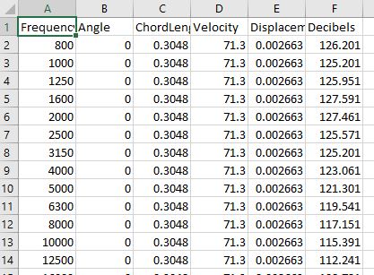
I've downloaded the air foil dataset and quickly opened it in Excel, here's a screenshot of the first dozen or so rows:
For our example, we are going to try to predict the Decibel level using the other features. To begin with, I've loaded this CSV file into PowerBI as per usual and explored it with some very basic visualisations. For example, below I have plotted the Decibel level against Velocity, aggregated by Frequency using a Scatter Plot:
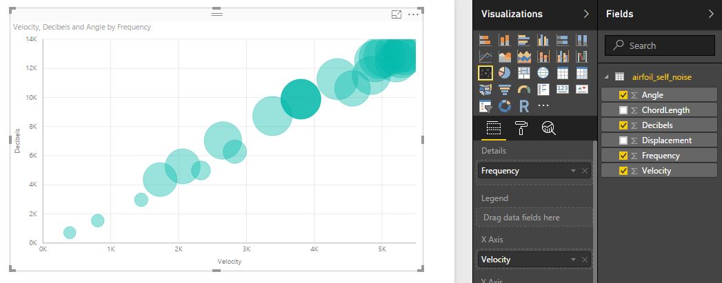
There is a very clear linear relationship between Decibels and these other three metrics (x-axis = Velocity, Details = Frequency, Size = Angle). From a predictive perspective we should be able to exploit this very clear trend. We'd expect our predictions to come out quite accurate.
The only other thing I want to note at this point, is that there are no IDs for the observations in our dataset. Technically, this isn't an issue. Each row is one observation. But, for PowerBI this is frustrating, because PowerBI will aggregate everything unless you tell it otherwise. This is why we added the Frequency column to the details attribute. Try removing it and notice what happens! To get around this later, we're going to add a FoilID column to the dataset when we load it via R.
Loading Data Using an R script
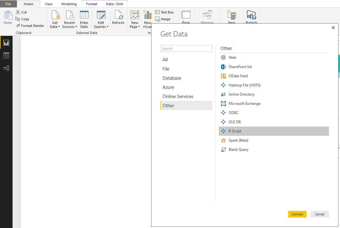
There's nothing wrong with using R visuals to wrangle the data and to create really interesting graphs. But, we can also load data via an R script, which opens up the opportunity to do all sorts of interesting transformations or analyses before the data loads into PowerBI. Here, we're going to use an R Script to predict the decibel level and to 'unpivot' the dataset. To load, click on the "Get Data" icon in PowerBI desktop, navigate to the "Other" option and find the R Script icon:
Making Predictions
A small script window will open up when you click on Connect. We're going to load the following script:
library(data.table)
library(randomForest)

# read Air Foil dataset from UCI
air <- fread("https://archive.ics.uci.edu/ml/machine-learning-databases/00291/airfoil_self_noise.dat")
colnames(air) <- c("Frequency", "Angle", "ChordLength", "Velocity", "Displacement", "Decibels")

# Performs 10-fold cross validation
#  - divides the dataset into 10 partitions,
#  - selects 9 for training, leaves the 10th for testing
#  - runs 10 times, so that each partition is used for testing once
#  - predictions are made on the leave one out partition

cvprediction <- function (dataset) {

    folds <- sample(rep(1:10, length.out = nrow(dataset)))

    # add a FoilID column, to avoid the annoying aggregation problems in PowerBI
    dataset[, FoilID := 1:nrow(dataset)]

    # initialise the Prediction and Residuals columns
    # this step isn't strictly necessary, but it makes our process explicit
    dataset[, Prediction := 0]
    dataset[, Residuals := 0]

    for (k in 1:10) {
        train <- folds != k
        test <- folds == k

        rf <- randomForest(Decibels ~ ., data = dataset[train])
        predictions <-  predict(rf, dataset[test])
        dataset[test, Prediction := predictions]
        dataset[test, Residuals := Decibels - predictions]
    }

    return (dataset)
}

air <- cvprediction(air)
air <- melt(air, id.vars = c("FoilID", "Decibels"))
The code itself is well annotated with comments so that you can follow along. But there are a couple of points I wanted to highlight:
- We will predict the decidel level using a random forest. The randomForest library is really easy to use and generally, pretty quick to train
- We are also going to perform 10-fold cross validation. The predictions will always be made on the leave-on-out partition (i.e. train on 9 folds, predict on the 10th)
- We've used the data.table library - which is amazing! If you're still working with data frames, I highly recommend checking out data.table
- The final line of code "unpivots" our data. It spins the dataset around to give us four new columns: {FoiID, Decibels, variable, value}.
- FoilID and Decibels are the two "id" columns and all of the other columns (Angle, ChordLength, Displacement, Frequency, Velocity, Prediction and Residuals), have been rotated into two columns. I will show you what this looks like in PowerBI shortly.
So, copy and paste this script into your R Script window and hit OK. It will connect to R, run your script and pop up the following Navigator window. Select the "air" dataset to preview the data:
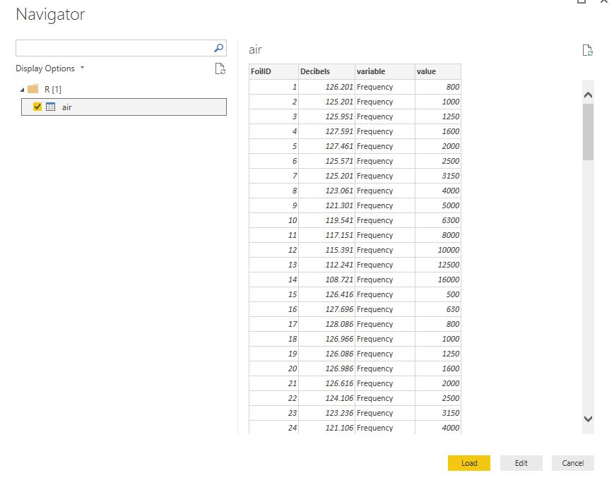
Above, you can see the rotated Air Foil dataset. notice we now have only four columns. For me, the preview pane is only showing the rows for Frequency, but the rest will load into PowerBI when you click on Load. Once your dataset has loaded, we can look at it in detail by going to the Data tab (the table icon on the far left):
On the far right, you will see that we have the original CSV file we loaded. But now, we also have the air dataset which we loaded via the R Script. If you select this in the Data tab, you will see the full table (as above) and you can scroll through this to confirm that you do have all of the data you'd expect.
Visualising the Results
Finally, we get to the good part - visualising your results. And this is why we have unpivoted the data... Unpivoting a dataset in this way has become a favourite trick of mine. It used to frustrate me that there was no easy way to toggle between different metrics (columns in your dataset) in the same visualisation. You either had to drag and drop the new column into your visual or create a myriad of visualisations to compare all the metrics. Then someone showed me this neat trick. By unpivoting the data, we can add a slicer on the "variable" column and we can easily toggle between the metrics.
For the final dashboard, we are going to keep the original exploratory visual and create two new visuals. The first visual will display the residual prediction errors for each air foil. For the second, we will plot our predicted decibels against the real decibels. Our final dashboard will look like this:
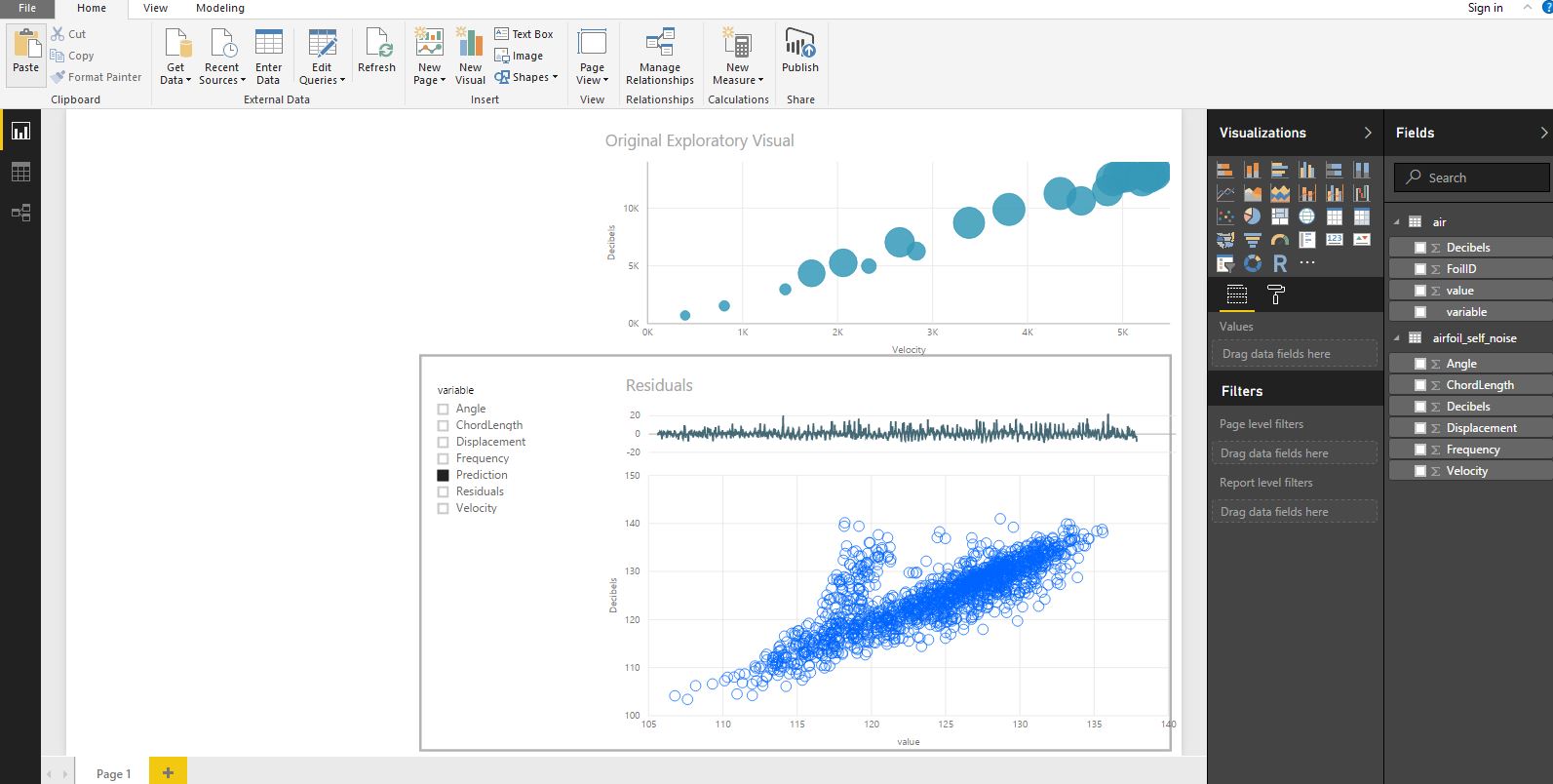
For anyone who is following along, these additional two visuals are explained in more detail below.
Residual plot: residual errors are the difference between our predicted values and the known values. Theoretically, residuals should follow a normal distribution, with mean zero and constant variance, which our residuals do. This is a good indication that our model (a random forest) has done a good job of modelling the underlying patterns in this dataset. To produce the residual plot:
- Select a line chart from PowerBI's visualisation panel
- Drag the FoilID (from our newly created air dataset) onto the Axis attribute
- Drag the value column (from the air dataset) onto the Values attribute (for the visualisation)
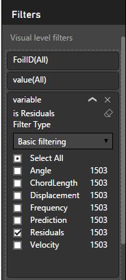
- Finally, you need to filter the values so that we are only displaying the residuals. To do this, drag the variable column from your dataset into the filters section and select the Residuals option as shown in the screenshot below:
Prediction Plot: We are going to also use our new, unpivoted air dataset to plot the predictions. Begin by i) selecting a scatterplot from the visualisation pane. Then ii) drag the "value" column on the X-axis, the Decibel column onto the y-axis and the FoilID into the Details attribute for the visualisation. You will get a scatterplot, with a point for each FoilID as shown below:
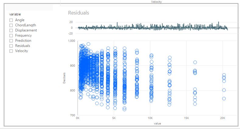
This scatterplot isn't quite right yet, we need to filter it to show only the predicted values (it is currently showing the sum (default aggregation) of all values per FoilID). To do this, create a slicer and drag the "variable" column from the air dataset onto the slicer. Our users may then use this slicer to compare any of these variables with the Decibel level. Selecting the "Prediction" variable results in the plot we want:
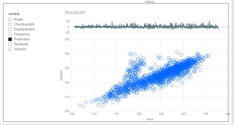
Based on the residual plot and the scatterplot above, our predictions are pretty good overall. There is a strong correlation between our predictions and the Decibels column. There are, however, a series of points between 120 - 140 Decibels where the predictions are noticeably off. We should definitely explore these further and try to understand why these points are problematic.
Final thoughts
PowerBI gives us two options for using R to apply more advanced analytics. The first is through the use of R visuals. The second is via an R Script. R visuals allow us to tap into R's great visualisation libraries, such as GGPLOT2, and produce very rich custom visualisations. R visuals can also be useful for performing advanced analytics 'on the fly'. For example, they could be used to make predictions (as we have done here), or to perform an association analysis or cluster analysis etc.. However, I haven't had great experiences using R visuals within PowerBI so far. In my experience, they have been a little clunky and not as seamless as native PowerBI visuals. Specifically and depending on how complex the underlying R code is, R visuals can take a long time to refresh in response to user interactions. I also find that R visuals don't render consistently in PowerBI dashboards, where they are prone to changing size. Finally, R visuals don't support the same range of interactive features that native PowerBI visuals do.
I am sure that the PowerBI team are working hard to improve the functionality of R visuals. But in the meantime, the ability to load data into PowerBI using R Scripts is a great solution. Using the R Script option, we can perform quite complex analyses before the data is loaded into PowerBI and we can the take advantage of PowerBI's native visualisations.
