Introduction
SandDance sounds like sand dancing. The name may be related to the scattered plots that look like sand dancing. When I look at the tool, I loved it. It is like Power BI. Easy to use, easy to learn, nice charts. The tool is what a Microsoft user likes. Something intuitive, simple, and free.
 SandDance vote demo
SandDance is a web application that can be used as a plug-in in Azure Data Studio. In this article, we will do the following:
- Show the default charts created by the Azure Data Studio.
- Create a graph based on a SQL Server table source.
- Isolate data
- Use filters
- Get the graph in 3D
- Download some cool examples
- Connect to a tsv file and get a chart.
- Learn how to get the nice image displayed at the beginning of the article.
Getting Started
By default, there is a chart option in Azure Data Studio, to get a chart of the data.
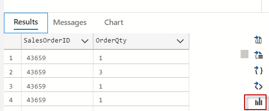
However, this option is not nice. The charts have a few options to customize, visualize and filter data.
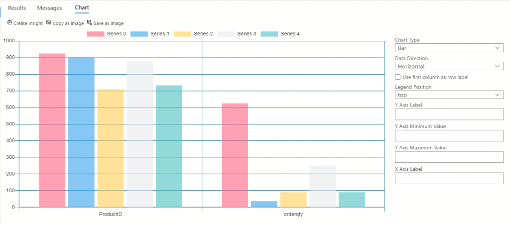 The chart option in ADS
Fortunately, we have the SandDance for Azure Data Studio. This is a cool extension that will help us to visualize our data in a professional way.
Installing SandDance for Azure Data Studio
Firstly, go to the Extensions section and search for the Extension. When you find it, click it and then click "Install".
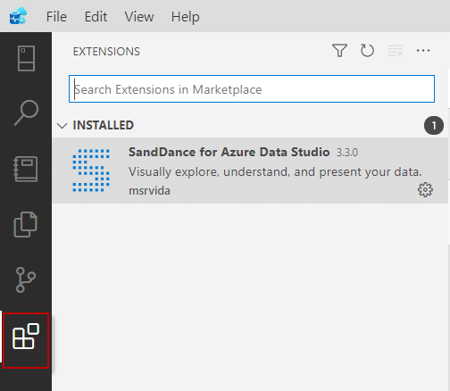 SandDance installation
What is SandDance?
This is a Web application used to visualize data in an easy way. You can start from summarized data to individual data. It is very easy to find anomalies in the data. This is currently an Open Source project that you can find on Github here: Official GitHub site
SandDance can be used not only on Azure Data Studio but also in Power BI or as a VSCode extension. You can also use it in JavaScript or 3rd party apps like Observable, Jupyter widget, and HASH Core IDE.
Demo
In this example, I am going to visualize the data from the AdventureworksDW2019 database. I will use the dbo.prospectiveBuyer table to analyze possible buyers. In Azure Data Studio, connect to the AdventureworksDW and run this query:
SELECT  [ProspectiveBuyerKey]

      ,[ProspectAlternateKey]

      ,[FirstName]

      ,[MiddleName]

      ,[LastName]

      ,[BirthDate]

      ,[MaritalStatus]

      ,[Gender]

      ,[EmailAddress]

      ,[YearlyIncome]

      ,[TotalChildren]

      ,[NumberChildrenAtHome]

      ,[Education]

      ,[Occupation]

      ,[HouseOwnerFlag]

      ,[NumberCarsOwned]

      ,[AddressLine1]

      ,[AddressLine2]

      ,[City]

      ,[StateProvinceCode]

      ,[PostalCode]

      ,[Phone]

      ,[Salutation]

      ,[Unknown]

  FROM [AdventureWorksDW2019].[dbo].[ProspectiveBuyer]
Firstly, note there is a visualizer option. Click on it.
Secondly, you will be able to see the information of the prospective buyers per occupation.
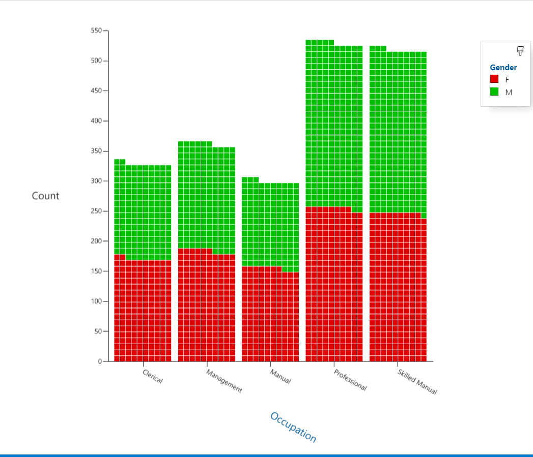 Occupation buyers
Thirdly, we will select the Male Gender. Select the M for males and select the Isolate option and then we will see only the data related to male customers.
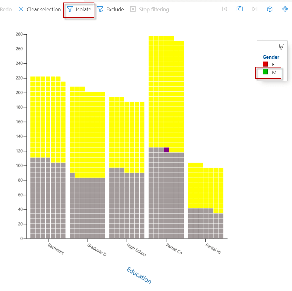 Isolate option SandDance
In addition, we will analyze only the male customers with High School education. We will select those and click on isolate.
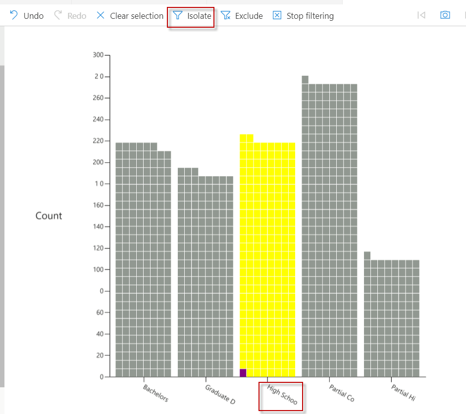 isolate per education
Also, you can search for information and add your filters and expressions. In this example, we are filtering users with the Occupation equal to Management.
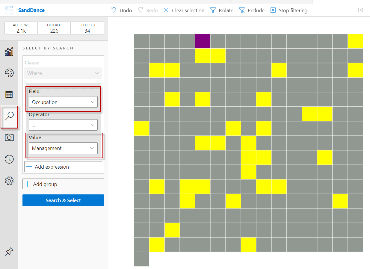 ADS filter
Finally, there is also a 3D option to visualize your data in 3D.
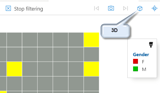 3D option
In this example, we used the YearlyIncome as the Z-Axis in the 3D chart.
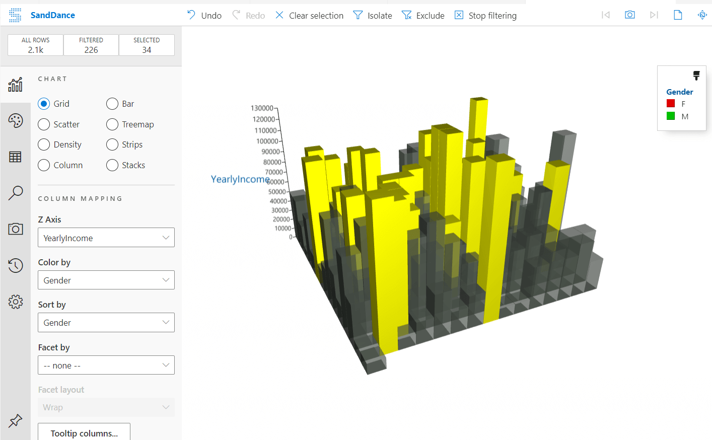 Adventureworks chart 3D
More examples about SandDance
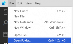
There are 2 classic samples for SandDance. One is the US election votes and another is the Titanic data. You can find and download the data here: Samples of data. Once downloaded, in ADS go to File>Open Folder and select the folder with the tsv files download.
 Open folder Azure Data Studio
Secondly, right-click the demovote.tsv file and select View in SandDance option
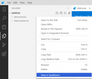 Visualize demovote data
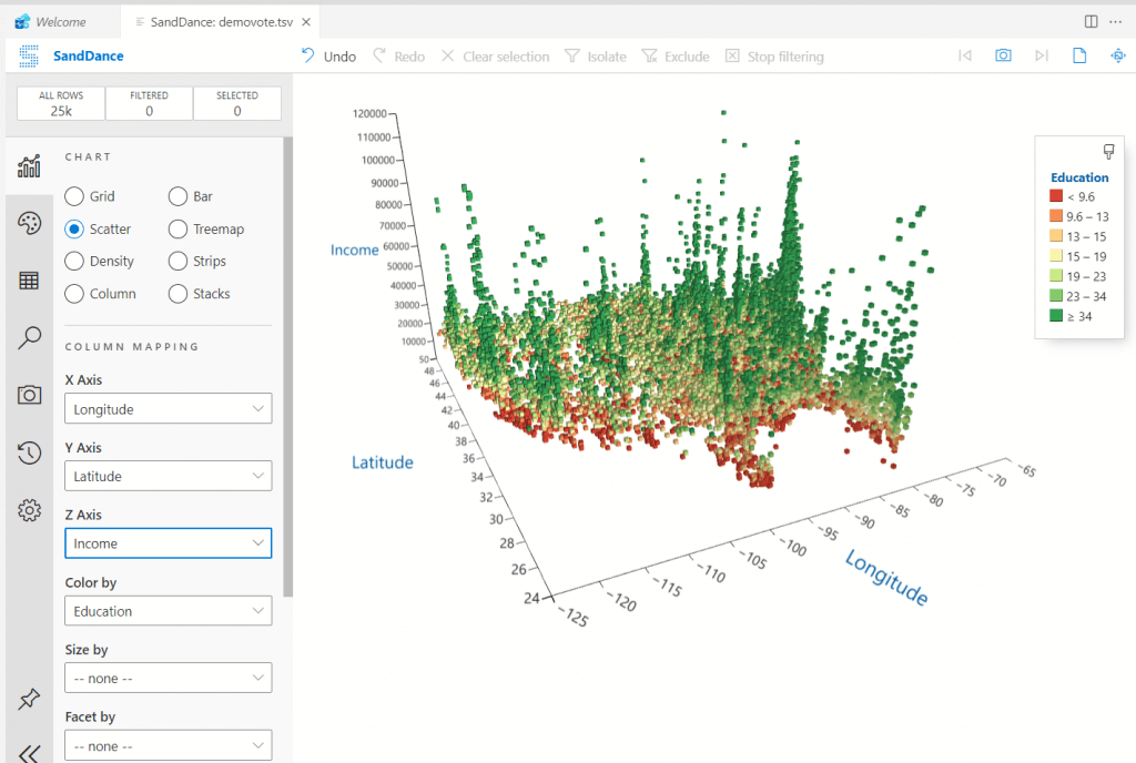
As you can see, a nice chart is created with the USA votes information. You can play with the 3d option and use the income as de Z-Axis.
 USA 3d votes
Conclusion
To conclude, we can say that this tool is amazing. We can visualize csv files, tsv files, big data information, SQL Server information, or other files with this tool.
The tool was designed to handle big data, handle data in Azure or on-premises. The tool is free now, but PowerBI was free at the beginning, so enjoy this moment.
References