SSC Forum Updates
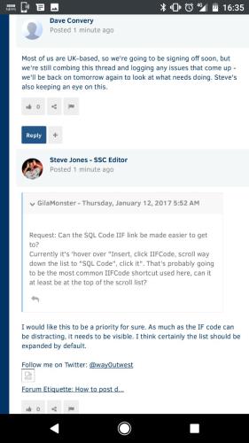
- GilaMonster - Thursday, January 12, 2017 5:52 AM
I would like this to be a priority for sure. As much as the IF code can be distracting, it needs to be visible. I think certainly the list should be expanded by default.
-
I feel like I'm browbeating the site now, I really don't mean to (I do like the new design).
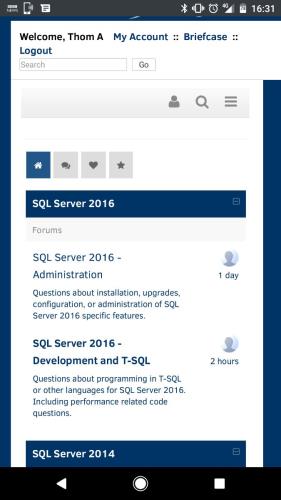
Has anyone tried using the site on a handheld device? I know that the site isn't probably aimed at it, but you lose the navigation menu on the left, and you can't see any details of the forum apart from the avatar of the last person that posted. No details of what the Last topic was, etc. Not a fan

On the plus side, viewing Topics works well 🙂Thom~
Excuse my typos and sometimes awful grammar. My fingers work faster than my brain does.
Larnu.uk -
Mobile is much better, but it does seem like there are some issues. Keep noting them here, but it would be good to test them a bit and note post ASAP since sometimes you'll find a workaround or the item that you didn't see at first.
- Thom A - Thursday, January 12, 2017 9:38 AM
Mobile is very much a work in progress. We felt like this was better than what was there before, but in order to really do proper development on the mobile and tablet side of things, the underlying structure of the entire site needs some modernisation. If there are things that are genuinely broken (as opposed to just not being ideal) we can look at them, but for now the plan is to revisit the forums on mobile at a time when the overall site is better able to support it.
And genuinely, feel free to keep adding issues - all feedback is useful, and we're going to keep fixing things where we can.
- Dave Convery - Thursday, January 12, 2017 9:58 AM
I would suggest that the site menu missing is an issue then, otherwise your only way out is touching the SSC logo and then navigating from the home page. The remainder, however, is definitely a "nice" to have, as it does look more pleasing to the eye on mobile than it did, and posts fit the smaller screen way better (I don't have to scroll right to find the quote button anymore!).
Thom~
Excuse my typos and sometimes awful grammar. My fingers work faster than my brain does.
Larnu.uk - Jeff Moden - Thursday, January 12, 2017 8:54 AM
The Pencil icon, top-right (next to the number)
Gail Shaw
Microsoft Certified Master: SQL Server, MVP, M.Sc (Comp Sci)
SQL In The Wild: Discussions on DB performance with occasional diversions into recoverabilityWe walk in the dark places no others will enter
We stand on the bridge and no one may pass - J Livingston SQL - Thursday, January 12, 2017 7:29 AM
That's probably down to the anti-spam checks that now happen as you post (previously they happened in the background). Managing forum spam was a big problem for us, so we're hoping this change will improve the site overall. There is a user reputation threshold beyond which the spam checks are no longer carried out, so we'll keep an eye on that to see if we can find a better trade-off that keeps things quick for regular users yet still keeps the spam down.
- Thom A - Thursday, January 12, 2017 10:01 AM
I looked into this earlier in the week. Our aim was to move the list items in the left-hand navigation panel into the existing Forums navigation menu, but it was all a bit too complex and gnarly. In the end, we settled for just removing the panel and relying on a combination of the basic forums nav menu and the top-left link back to the main site. I'm very aware that this isn't ideal, and it's pretty high on my list of things I'd like to revisit soon. Please bear with us.
- Dave Convery - Thursday, January 12, 2017 4:02 AM
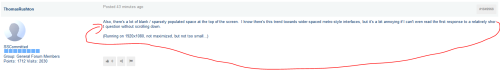
I mean mainly the first page of the forums where we can select which one(s) we wish to visit.
And in way, but that may be just me giving further attention to it, the posts themselves in terms of word wrapping, colour perhaps, also seem to make me take more time to read and see what is important.
-
I think it's going to take some time to get used to the new look. I admit that some of the things bother me, but it's more that the interface, icons, and small things aren't familiar. I suspect in a few days some things will be fine and some will be annoying. The latter is what I'll try to report and work on.
-
In the old format, when I was in Forums, there was a My Posts link at the top. Does that exist now? If so where is it?
-SQLBill
- Dave Convery - Thursday, January 12, 2017 9:10 AM
Very cool. Thanks for the feedback, Dave.
--Jeff Moden
RBAR is pronounced "ree-bar" and is a "Modenism" for Row-By-Agonizing-Row.
First step towards the paradigm shift of writing Set Based code:
________Stop thinking about what you want to do to a ROW... think, instead, of what you want to do to a COLUMN.Change is inevitable... Change for the better is not.
Helpful Links:
How to post code problems
How to Post Performance Problems
Create a Tally Function (fnTally) -
I've been having some issues posting code. In the past, I'd drop the correct IFCode on the post, copy and paste from SSMS into the IFCode and done. Now it asks if I want to "clean" my formatted code and when I click on "OK", it seems to make a single line mess of things. When I hit "Cancel" instead, the formatting has a lot of space between lines. I've seen other folks' posts and they don't seem to have that problem. Is there some trick I'm missing?
I also agree with Gail Shaw that it's going to be one of the most heavily used IFCodes and it would be great if an icon could be added to the format bar to make life a lot easier for frequent posters and newbies alike.
BTW.... Love what you've done with the place so far. Looks great. Thank you folks for all the hard work you put into this and for the improvements that you're making on top of that!
--Jeff Moden
RBAR is pronounced "ree-bar" and is a "Modenism" for Row-By-Agonizing-Row.
First step towards the paradigm shift of writing Set Based code:
________Stop thinking about what you want to do to a ROW... think, instead, of what you want to do to a COLUMN.Change is inevitable... Change for the better is not.
Helpful Links:
How to post code problems
How to Post Performance Problems
Create a Tally Function (fnTally) -
I like it thus far!
-
Formatted SQL code that is wider than the display box does not wrap. There are scroll bars, but they only seem to work if you highlight text and keep going. It would be nice to be able to click on the scrollbar arrows, or drag the scrollbar indicator.
See this post
http://www.sqlservercentral.com/Forums/FindPost1843170.aspx
Viewing 15 posts - 91 through 105 (of 223 total)
You must be logged in to reply to this topic. Login to reply