

Summary
In this article, we will be looking at some of the useful techniques on how to reduce dimensionality in our datasets. When we talk about dimensionality, we are referring to the number of columns in our dataset assuming that we are working on a tidy and a clean dataset. When we have many columns in our dataset, for example, more than ten, then the data is considered high dimensional. If we are new to the dataset, then it becomes extremely difficult to find the patterns within that dataset due to the complexity that comes with the high dimensional datasets. To overcome this, we can reduce the number of columns in the dataset using dimensionality reduction techniques. However, these techniques can also be very useful for low dimensional (having fewer number of columns) dataset as well. In this article, we will look at three of the most commonly used dimensionality reduction techniques.
Principal Component Analysis (PCA)
The true purpose of PCA is mainly to decrease the complexity of the model. It is to simplify the model while maintaining the relevance and performance of the model. PCA reduces dimensions(features) in the dataset by looking at the correlation between different features. Sometimes we can have datasets with hundreds of features, so in that case we just want to extract much fewer independent variables that can explain the most variance in the dataset.
In the below section, we will look at step by step approach to apply the PCA technique to reduce the features from a sample high dimensional dataset.
Below is the sample 'Beer' dataset, which we will be using to demonstrate all the three different dimensionality reduction techniques (PCA, LDA and Kernel - PCA). This dataset has columns such as these:
- Alcohol
- Malic_Acid
- Ash
- Ash_Alcanity
- Magnesium
- Total_Phenols
- Flavanoids
- Nonflavanoid_Phenols
- Proanthocyanins
- Color_Intensity
- Hue
- OD280
- Proline
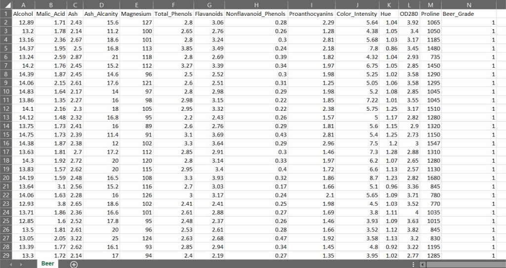
These columns explain the properties of the Beer also called as the independent variables (also called as the input features). The column named Beer Grade is the dependent variable (what we want to predict) as it explains the quality of the beer as to which grade it falls in 1, 2 or 3 grade.
The independent variables are the input data that we have, with which we want to predict something and that something is the dependent variable.
First we import the necessary Python Modules into the IDE (Integrated Development Environment). Here we are using Jupyter Lab of Anaconda Distribution.
# Importing the libraries
import numpy as np
import matplotlib.pyplot as plt
import pandas as pd
Next, we import the file named 'BeerDataset.csv' in the below step.
# Importing the dataset
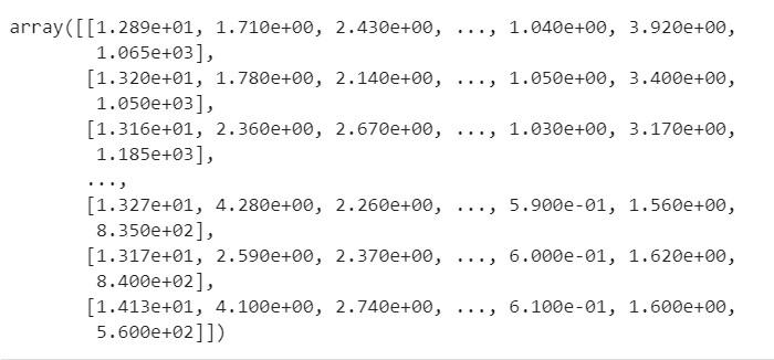
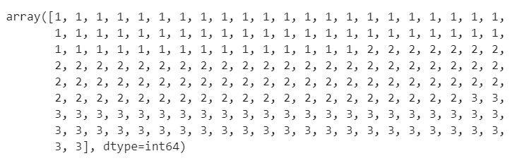
dataset = pd.read_csv('BeerDataset.csv')In the below code snippet, we read the columns from the 1st to the 12th of this 'BeerDataset' (the independent variables of this dataset) and assign it to 'X', which is a numpy array. Similarly we parse the result column of the dataset, which is the 'Beer_Grade' (the dependent variable) and assign it to 'Y', which is also a numpy array. Then we print the output and the type of variables 'X' and 'Y' as shown below.
# Assigning the Independent Variables to "X" and Dependent Variable Column to "y"

X = dataset.iloc[:, 0:13].values
y = dataset.iloc[:, 13].values
'iloc' locates the column by its index. In other words, using 'iloc' allows us to take columns by just taking their indices.
# Printing the variable X to confirm if the columns have been correctly assigned

X
# Printing the variable y to confirm if the columns have been correctly assigned

y
# Valdiating the type of variable X and y

type(X)
type(y)
![]()
Numpy arrays are the most convenient format to work with when we want to do data preprocessing and build our Machine Learning models. We create two separate arrays, one that contains our independent variables (input features) and the other array that contains our dependent variable.
The next step would be divide the dataset into the training set and the test set. The training set is a subset of our data on which our model will learn how to predict the dependent variable with the independent variables. The test set is the complimentary subset from the training set, on which we will evaluate our model to see if it manages to predict correctly the dependent variable with the independent variables.
# Splitting the dataset into the Training set and Test set

from sklearn.model_selection import train_test_split
X_train, X_test, y_train, y_test = train_test_split(X, y, test_size = 0.2, random_state = 0)
We also want to split on our dependent variables (y_train and y_test) because we want to have well distributed values of the dependent variable in the training and test set. For instance, if we only had the same value of the dependent variable in the training set, our model wouldn’t be able to learn any correlation between the independent and dependent variables.
Now, we have to apply feature scaling on our dataset. Feature Scaling techniques like normalization and standardization are used to normalize the range of independent variables or features of our dataset in order to avoid the results being skewed (biased) when dealing with multiple features spanning varying degrees of magnitude, range, and units. Generally we can choose to normalize (normalization) when the data is normally distributed, and scale (standardization) when the data is not normally distributed. When in doubt, what is commonly done is that the two scaling methods are tested and the performance is compared for the best results as a few machine learning algorithms are highly sensitive to these features.
In this code snippet, we have imported the sklearn library to use the StandardScaler function. Set 'sc' to the StandardScaler() function.
# Feature Scaling

from sklearn.preprocessing import StandardScaler
sc = StandardScaler()
Further, we use fit_transform() along with the assigned object 'sc' to transform the data and standardize it. Standardization is only applicable on the data values that follow a Normal Distribution.
# Apply the function onto the dataset using the fit_transform() method.

X_train = sc.fit_transform(X_train)
X_test = sc.transform(X_test)
Next, we will apply PCA on our training and test datasets.
# Applying PCA on a liner problem and calculating the confusion matrix thereafter.

from sklearn.decomposition import PCA
pca = PCA(n_components = 2)
X_train = pca.fit_transform(X_train)
X_test = pca.transform(X_test)
PCA is a feature extraction technique so the components are not one ones of the original independent variables. These are new ones, like some sort of transformations of the original ones. Only with feature selection will you end up with ones of the original independent variables, like with Backward Elimination. The new variables are the directions where there is the most variance, that is the directions where the data is most spread out.
In the above code snippet, we are applying fit_transform to the training set and only transform to the test set because in the fit_transform method there is fit and transform. The fit part is used to analyze the data on which we apply the object (getting the eigen values and the eigen vectors of the covariance matrix, etc.) in order to get the required information to apply the PCA transformation. That is, extracting some top features that explain the most the variance. Then once the object gets these information thanks to the fit method, the transform part is used to apply the PCA transformation.
Since the test set and the training set have very similar structures, we don’t need to create a new object that we fit to the test set and then use to transform the test set, we can directly use the object already created and fitted to the training set, to transform the test set.
Since we have chosen 2 principal components to explain the most variance in our above sample dataset, in the below code snippet we will look at the amount of variance explained by each of the selected components.
# The pca.explained_variance_ratio_ parameter returns a vector of the variance explained by each dimension

explained_variance = pca.explained_variance_ratio_
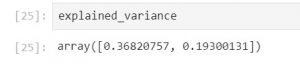
The output shows that the first principal component explains 36.8% variance of this dataset, and the second principal component explains 19.3 % variance of the dataset. Generally a good threshold is 50%. But 60% is more recommended.
In this code we are importing the LogisticRegression method from the sklearn.linear_model library. The fit method will basically train the Logistic Regression model on the training data. Therefore it will compute and get the weights (coefficients) of the Logistic Regression model for that particular set of training data composed of X_train and y_train.
# Fitting Logistic Regression to the Training set.

from sklearn.linear_model import LogisticRegression
classifier = LogisticRegression(random_state = 0)
classifier.fit(X_train, y_train)
Right after the code collects the weights/coefficients, we have a Logistic Regression model fully trained on our training data, and ready to predict new outcomes thanks to the predict method, which is demonstrated in the below script.
# Predicting the Test set results

y_pred = classifier.predict(X_test)
The output of y_pred would be as shown below.

Up until this point, we have done data cleaning, pre-processing and fed it into our machine learning model, which is our classification model (Logistic Regression). We want to understand the effectiveness of our model and that where the Confusion Matrix comes into play. A Confusion Matrix is a performance measurement for machine learning classification.
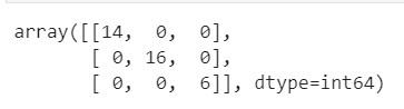
# Making the Confusion Matrix

from sklearn.metrics import confusion_matrix
cm = confusion_matrix(y_test, y_pred)
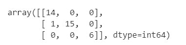
Printing the output of confusion matrix obtained by training the data set using the Logistic Regression Model after applying the 'PCA' dimensionality reduction technique.
Here are some definitions of a Confusion Matrix.
Accuracy: It gives us the overall accuracy of the model, meaning the fraction of the total samples that were correctly classified by the classifier. To calculate accuracy, use the following formula: (TP+TN)/(TP+TN+FP+FN) where
True Positive (TP): It refers to the number of predictions where the classifier correctly predicts the positive class as positive.
True Negative (TN): It refers to the number of predictions where the classifier correctly predicts the negative class as negative.
False Positive (FP): It refers to the number of predictions where the classifier incorrectly predicts the negative class as positive.
False Negative (FN): It refers to the number of predictions where the classifier incorrectly predicts the positive class as negative.
Therefore, for our above confusion matrix
- Total TP would be 14+15+6 =35
- Total TN would be (15+0+0+6)+(14+0+0+6)+(14+0+1+15) =71
- Total FP would be (0+0)+(1+0)+(0+0) =1
- Total FN would be (1+0)+(0+0)+(0+0) =1
Therefore Accuracy would be (71+35)/(71+35+1+1)=0.98 =98%
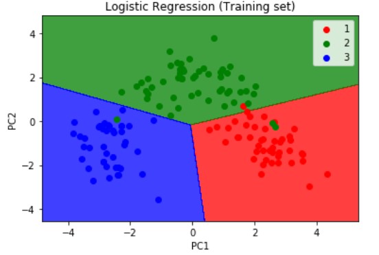
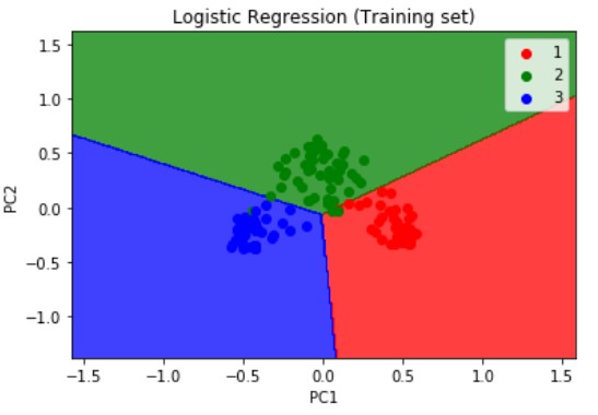
Next, we will visualize the results of the training set results using the below snippet of code. We are importing the method ListedColormap from matplotlib.colours module. Then we are assigning the X_train and y_train which are the independent and dependent variables form the training set which we have obtained after applying the PCA dimensionality reduction technique as explained above.
# Visualising the Training set results

from matplotlib.colors import ListedColormap

X_set, y_set = X_train, y_train
X1, X2 = np.meshgrid(np.arange(start = X_set[:, 0].min() - 1, stop = X_set[:, 0].max() + 1, step = 0.01),
                     np.arange(start = X_set[:, 1].min() - 1, stop = X_set[:, 1].max() + 1, step = 0.01))
plt.contourf(X1, X2, classifier.predict(np.array([X1.ravel(), X2.ravel()]).T).reshape(X1.shape),
             alpha = 0.75, cmap = ListedColormap(('red', 'green', 'blue')))
plt.xlim(X1.min(), X1.max())
plt.ylim(X2.min(), X2.max())
for i, j in enumerate(np.unique(y_set)):
    plt.scatter(X_set[y_set == j, 0], X_set[y_set == j, 1],
                c = ListedColormap(('red', 'green', 'blue'))(i), label = j)
plt.title('Logistic Regression (Training set)')
plt.xlabel('PC1')
plt.ylabel('PC2')
plt.legend()
plt.show()
The numpy. meshgrid function is used to create a rectangular grid out of two given one-dimensional arrays. In the meshgrid() method, you input two arguments. First argument is the range values of the x-coordinates in your grid. Second is the range values of the y-coordinates in your grid. So let’s say that these 1st and 2nd arguments are respectively [-1,+1] and [0,10], then you will get a grid where the values will go from [-1,+1] on the x-axis and [0,10] on the y-axis.
Next we are using the contourf method from matplotlib.pyplot module. Before using the contourf method, you need to build a grid. That’s what we do in the line just above when building X1 and X2. A contour plot is a graphical technique which portrays a 3-dimensional surface in two dimensions. The contourf() method takes several arguments. First, the range values of the x-coordinates of our grid, second, the range values of the y-coordinates of your grid, third, a fitting line (or curve) that will be plotted in this grid (we plot this fitting line using the predict function because this line are the continuous predictions of our model), then the rest are optional arguments like the colors to plot regions of different colors. The regions will be separated by this fitting line, that is in fact the contour line.
Within the plt function, we are using the ravel() method. The numpy module of Python provides a function called numpy.ravel, which is used to change a 2-dimensional array or a multi-dimensional array into a contiguous flattened array. Since, here we are dealing with the 3-class dataset we choose 3 colors to identify the 3 grades of beer, grade 1 2 and 3 being represented by red green and blue respectively. Next, we use the plt.scatter() method to do a scatter plt by iterating over the X_set and y_set arrays. Next, we supply a title to the chart and label the axis and provide it with the legend to describe the color coding used. Lastly, we display the plot using the plt.show()method.
The resulting output of the training set is as shown below
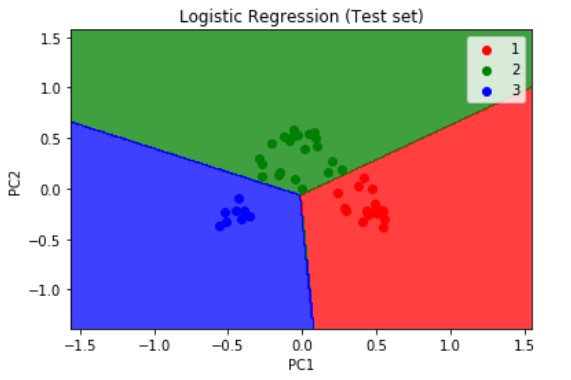
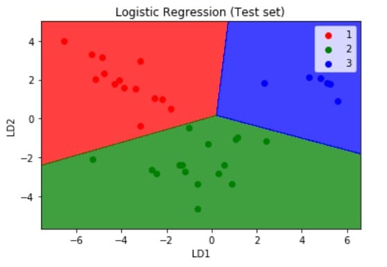
Similarly, we visualize the test set results but this time we pass the X_test and y_test which are the independent and dependent variables form the test set which we have obtained after applying the PCA dimensionality reduction technique. The resulting plot is as shown below.
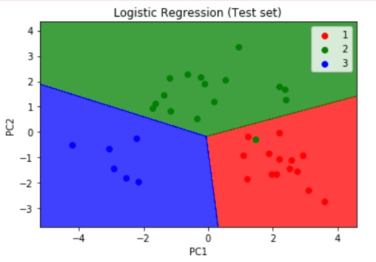
Logistic Regression is a linear model, a model suitable for a linearly separable dataset. We can see from the above visualizations of the training and test datasets that the classifier’s separator is a straight line. We can use Logistic Regression for as many independent variables as we want. However, we need to be aware that we will not be able to visualize the results in more than 3 dimensions.
Kernel - PCA
Next, on the same dataset we will visualize the training and test set results after applying the Kernel-PCA dimensionality reduction technique. Kernel PCA is used to convert non-linearly separable data into linearly separable data. A good trick that I use to know if my dataset is linearly separable or not is: I train a Logistic Regression model on the dataset first, and if I get a really good accuracy, then the dataset should be (almost) linearly separable.
It is a best practice, to always start with the PCA and if we get poor results, we can then try Kernel PCA technique.
In this snippet, we import the KernelPCA() method from the sklearn.decomposition module. The kernel argument plays the same role as the covariance matrix in linear PCA, therefore we can calculate its eigenvalues and eigenvectors and stack them up to the selected number of components we want to keep.
# Applying Kernel_pca

from sklearn.decomposition import KernelPCA
kpca = KernelPCA(n_components = 2, kernel = "rbf")
X_train = kpca.fit_transform(X_train)
X_test = kpca.transform(X_test)
The RBF Kernel (radial basis function) is a great kernel, and is the best option in general. But the best way to figure out what kernel you need to apply is to do some Parameter Tuning with Grid Search and k-Fold Cross Validation, which I will be discussing in the sequel to this article.
The rest of the code remains the same as was explained in the main PCA section of this article. We then apply the same machine learning linear classification model 'Logistic Regression' to the dataset. The resulting confusion matrix, and the visualizations of the training and test set which have been reduced using the Kernel-PCA technique are as shown below:
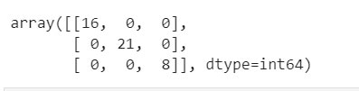
If we compare the confusion matrix obtained after applying the PCA and K-PCA techniques then we can find the True Positives have increased in the K-PCA method which is 45 versus the previous 35 (from PCA technique). If we calculate the accuracy for this model if obtain nearly 100%.
It is best practice, to use the Kernel PCA dimensionality reduction technique to convert non-linearly separable data into linearly separable data. We would not need to use the Kernel PCA with a non linear classifier like k-NN( K-Nearest Neighbors), k-SVM(Kernel - Support Vector Machine), Decision Trees, or Random Forests, since the data will be linearly separable after applying Kernel PCA, and therefore a linear classifier will be sufficient.
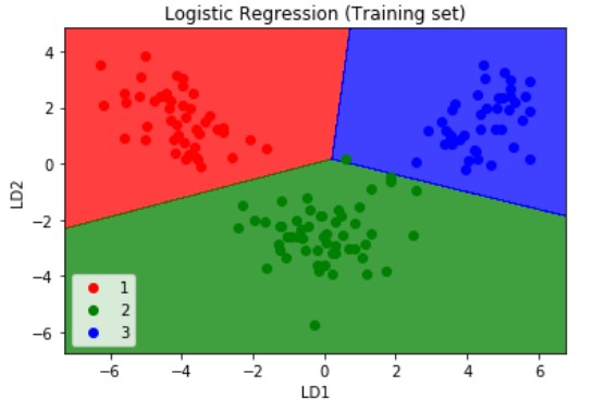
Linear Discriminant Analysis (LDA)
Lastly, on the same dataset we will visualize the training and test set results after applying the LDA dimensionality reduction technique. A simple way of viewing the difference between PCA and LDA is that PCA treats the entire data set as a whole while LDA attempts to model the differences between classes within the data. Also, PCA extracts some components that explain the most the variance, while LDA extracts some components that maximize class separability.
The snippet for applying the LDA dimensionality reduction technique would be:
# Applying the LDA

from sklearn.discriminant_analysis import LinearDiscriminantAnalysis as LDA
lda = LDA(n_components = 2)
X_train = lda.fit_transform(X_train,y_train)
X_test = lda.transform(X_test)
As observed in case of PCA, two independent variables are new independent variables that are not among our 13 original independent variables. These are totally new independent variables that were extracted through LDA, and that’s why we call LDA Feature Extraction, as opposed to Feature Selection where we keep some of your original independent variables.
The rest of the code remains the same as was explained in the main PCA and K-PCA sections of this article. We then apply the same machine learning linear classification model 'Logistic Regression' to the dataset. The resulting confusion matrix, and the visualizations of the training and test set which have been reduced using the LDA technique are as shown below:
If we compare the confusion matrix obtained after applying the PCA , K-PCA and the LDA techniques then we can find the True Positives have decreased in the LDA method which is 36 versus the previous 45 and 35 from the K-PCA and the PCA techniques respectively. If we calculate the accuracy for this model if obtain nearly 100%.
Conclusion
There is no best technique for dimensionality reduction and no mapping of techniques to problems/use cases. Instead, the best approach would be to use systematic analytical methods like the one we have demonstrated above using the PCA K-PCA and LDA techniques, calculating each of their the confusion matrix, accuracies and visualizing the results of the training and test data sets we are working with, to discover what dimensionality reduction techniques, when paired with our model of choice, result in the best performance on our dataset.
It is always a good practice to either normalize or standardize our data prior to using these methods if the input variables have differing scales or units.
Next Steps
Here, we have looked at how we can apply dimensionality reduction techniques to reduce the number of input variables in a dataset. Large numbers of input features can cause poor performance for machine learning algorithms. However, we can use these dimensionality reduction techniques to apply machine learning algorithms to better explain the classification or regression dataset.
In the sequel to this article we will be looking at:
- Model Selection & Performance Boosting Techniques like k-Fold Cross Validation and XGBoost.
- Performance Tuning techniques like Grid Search and how it can be used to improve the performance of our machine learning model.
- Watch out for an upcoming article on step by step code on how to apply various Regression, Classification, Clustering, Association Rule Learning, Reinforcement Learning, NLP and Deep Learning techniques using Python where we will look at some of the most popular techniques and how to evaluate thier performance.
- For more examples on sample dataset pre-processing steps to prepare the data for more deeper structured analysis read my article on 'Comparing Two Geospatial Series with Python' and 'Reading a Specific File from an S3 bucket Using Python'.
- To gain a holistic overview of how Diagnostic, Descriptive, Predictive and Prescriptive Analytics can be done using Geospatial data, read my recent paper, which has been published on advanced data analytics use cases pertaining to that.