

The annual survey has arrived and it's full of information to be analyzed, questioned and reworked. As a data professional I love insights into almost anything and the chance to get a better look at my industry is no exception. I began with the most obvious questions I could think of which were the following:
- What's the average salary?
- by industry
- by location
- by years of experience
- Does education matter
- Do certifications mean dollars
As I looked at the raw data it seemed it was going to be a bit tricky to get really useful answers at first so I immediately started to figure out what changes I wanted to make to the base data to help me get the answers that I really want.
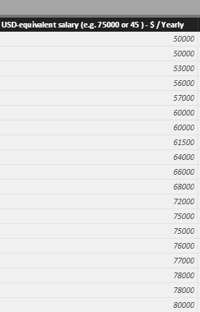
Step 1: salaries are in both USD annual and hourly equivalent. I standardized to USD equivalent on an annual basis.
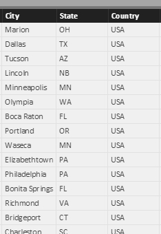
Step 2: I parsed the location data into city, state, country whenever possible. This was a manual task as I didn’t find a consistent way to parse it programmatically. (If you figure out a way I’m completely open to your suggestion) This was the one case where I was glad we didn’t have 10,000 responses.
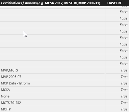
Step 3: I created a binary filter for the certifications. I felt that if the binary difference was significant then it would be worth digging into the data but that wasn’t the case at this point at least from my prospective.
Step 4: At this point it was time to create the visuals. I created the salary visualizations for average salary by location and then by industry. There were some outliers but instead of just discarding them I changed from mean to median in the measure. For disclosure, the mean is $86140 which is not all that significant but I left it as the median. I then added the saturation to give some idea of when we had enough data to be confident it wasn’t an outlier. With the small number of respondents and open ended responses the confidence isn’t particularly high in many locations and industries.
Here's the view of my visualizations:
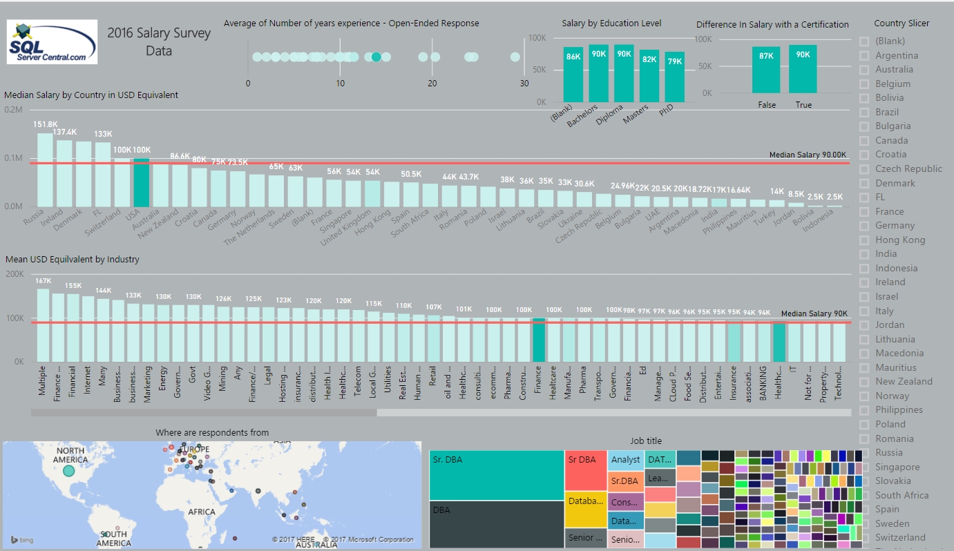
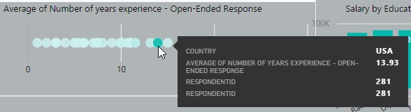
Moving on to 1c it was time to figure out where we were on years of experience. I ended up going with years of experience by country. The count of respondents can be found in the tool tip, and I used the saturation to give a confidence indicator using that metric.
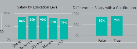
One of the interesting points of data was salary by education level. This wasn’t what I would have predicted without any data but it does appear that education does not trump experience in this survey. This was really the same with certifications. While they do appear to more than pay for themselves on a cost basis I’m not sure we have enough data to call this either way.
Improvements
What do I think would make this survey more awesome next year? First let me say it’s awesome that we have this data at all and for that I’m thankful. I admit I’m greedy for data and the only amount of data that would please me is more data. If you’ll allow me to write my wish list here it is:
As mentioned I like more when it comes to data so the more responses the better. Would this be 1000, 5000… that I’m not sure but 1000 would be a fantastic improvement in confidence.
Salaries in local units on an annual basis with the numeric part as an integer and a string for currency descriptor. It might be best for the analyst to do the conversions and that way there’s not a mathematical error or some confusion leading to an outlier value.
City, State, Country could be just as useful with state and country. If both were separate and mandatory that would be helpful. While it would be nice to compare salaries in NYC, Dallas, LA and Saratoga Springs, NY, if we reduced the specificity we might get more respondents from smaller markets without sacrificing the general comparison values.
Education would be easiest in the common hierarchy high school, bachelors, masters, doctorate.
Industry to me should be one central focus. For myself this might mean determining if I’m going to classify what I’m doing as finance or healthcare. Yes, it’s both but maybe my determination is significant in the overall results. It would be interesting to have a single value and determine if the industry average changes next year.
The last item I’d like to see would be company size in a general numeric format so we can bucket it and see if bigger is better when it comes to money. I’m not convinced that it’s the case and I’m leaning more towards the inverse being true.
This was my quick shot at this year’s salary survey. I’m interested in hearing feedback because that’s data and more is definitely better.