

A few years ago I went to a seminar from Edward Tufte that talked about information and how we can better present it to people to convey information and help make better decisions. I was fascinated by the talk, loved many of the examples, and then didn't get to do much with it. I found that it was hard to come up with ways to convey lots of information, and more importantly, it was time consuming to try and build incredibly dense visualizations.
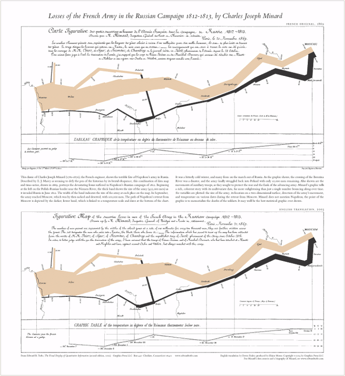
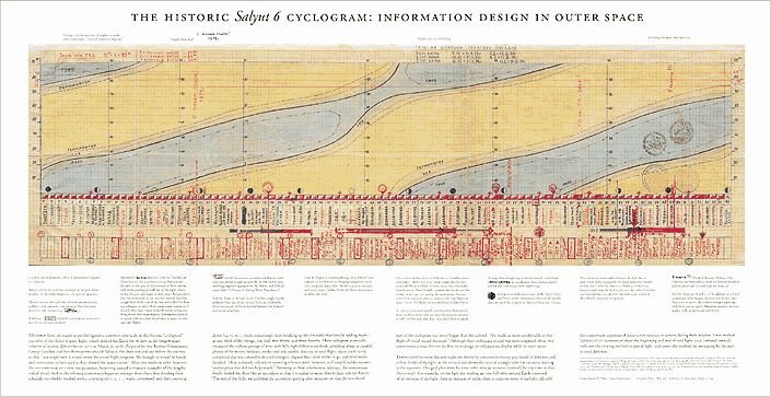
I thought this graphic of Napoleon's army and this one of the Salyut 6 flight were interesting, but I wasn't sure how they'd translate to any of the business world's I'd worked in. However, I know I've seen some very helpful infographics and visualizations over the years, and I'm sure you have as well. This week, I'm wondering:
What is an infographic (or visualization) that you found to be both visually pleasing and very useful?
It could be an animation, a static image, or something else. I know a couple of the videos I've seen were amazing. One of Europe's borders and another of nuclear detonations presented a lot of information in a very eye-catching way. I also enjoyed this one on traffic.

Let us know which ways of presenting information or visualizing data have been most noticeable by you.