This second post of 3 on SSRS 2016 looks at the new features for the SSRS portal and the paginated reports using the Community Technical Preview (CTP) 3.3.
Post 1 covered the basics of creating your first paginated report.
Post 3 will cover the new Mobile Reports and KPI features.
Portal Improvements
The portal has had a complete overhaul to make it HTML 5 and CSS3 compatable to support browsers other than IE. No more ActiveX! So far there are only a few new features. One of which is the ability for users to add reports to a Favorites tab for quick access. I guess this is better than using your browser’s bookmark functionality. Another is that it is now possible to export reports to Power Point.
It is now possible to name, enable and disable subscriptions from the portal.
As of CTP 3.3 this is only possible in the old portal.
Parameter positioning
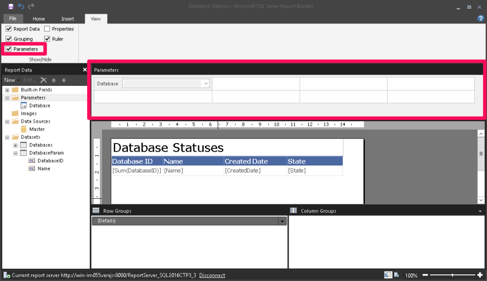
Anyone who has used SSRS in the past has probably been slightly frustrated with the lack of control for parameter positioning. It was possible to have some control by manipulating the ordering of the parameters, but for 2016 we have a new interface to define the positioning. It’s basically a grid onto which parameters, along with their labels, can be placed.
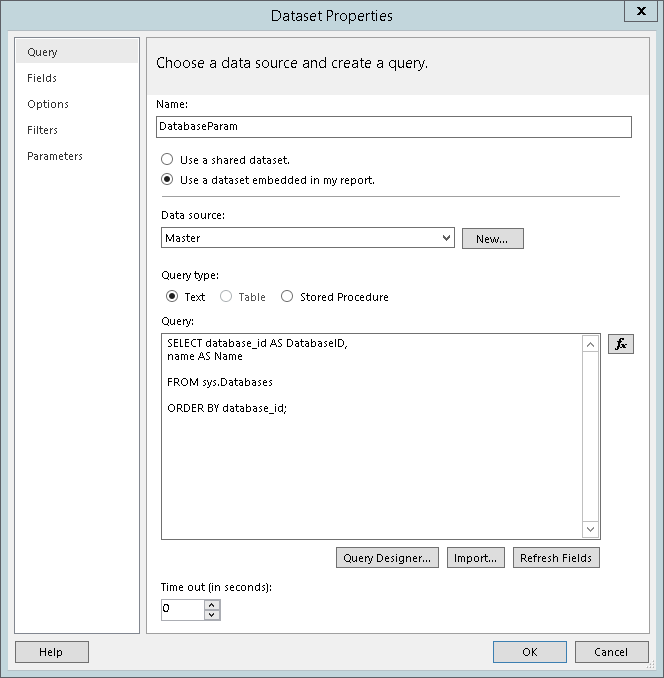
To see this new feature let’s add a parameter to filter the report by database. Add another data set to the report, created in the last post in this series, but this time use the query below.
SELECT database_id AS DatabaseID,
name AS Name

FROM sys.Databases

ORDER BY database_id;
This data set will populate the drop down of our parameter.
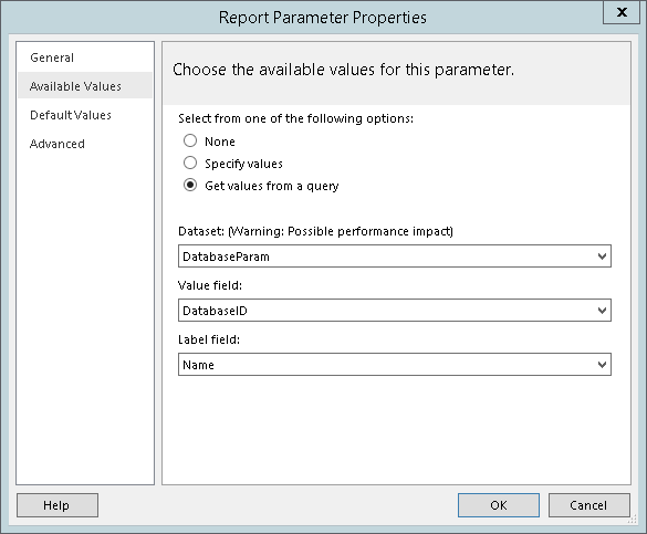
Right click parameters and select add a new parameter. Give it a name and move on to the Available Values section. We could leave this as it is, which would require the users to type the database they want to see the status of, but a drop down would be much better.
Then edit our Databases data set from the previous post to add the WHERE clause on the parameter value. This will filter the result set of the query by the parameter.
SELECT database_id AS DatabaseID,
name AS Name,
create_date AS CreatedDate,
state_desc AS [State]

FROM sys.Databases

WHERE database_id = @Database

ORDER BY database_id;
To position our new parameter tick Parameters in the View ribbon menu. This will open the Parameter grid on which you can drag the parameter into position.
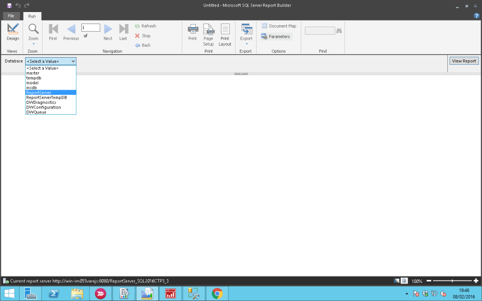
Run the report to test the new parameter.
Visualisations
There are two new visualisations for paginated reports in SSRS 2016.
To test these new visualisations, I will be creating a new report and using the data I imported in my previous post Importing open data sets in SQL Server as the data source. The query below will produce my data set.
;WITH cte_Top10Agencies
AS
(
  SELECTTOP 10
      Agency
      ,SUM([Likes Followers Visits Downloads]) AS Likes

  FROM[OpenDatasets].[dbo].[NYC_Social_Media_Usage]

  GROUP BY Agency

  ORDER BY [Likes] DESC
)

SELECTsmu.Agency
    ,[Platform]
    ,DATEPART(YEAR, [Date Sampled]) AS YearSampled
    ,DATENAME(MONTH, [Date Sampled]) AS MonthSampled
    ,SUM([Likes Followers Visits Downloads]) AS Likes

FROM[OpenDatasets].[dbo].[NYC_Social_Media_Usage] smu
JOINcte_Top10Agencies t10 ON smu.Agency = t10.Agency

GROUP BYsmu.Agency
      ,[Platform]
      ,DATEPART(YEAR, [Date Sampled])
      ,DATENAME(MONTH, [Date Sampled]);
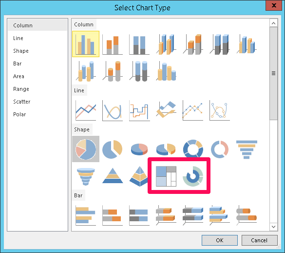
From the Insert ribbon menu click Chart and select Insert Chart. Drag out an area for the chart in the designer. The next step is to select a chart type. We will be concentrating on the new Sunburst and Treemap visualisations.
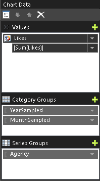
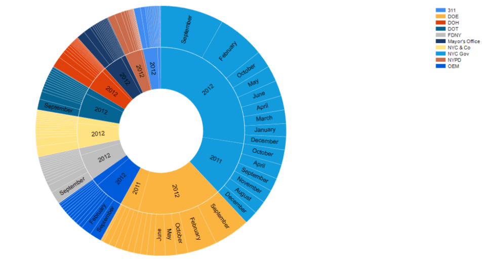
I want to count the social media ‘Likes’ each agency has grouped by month and then year.
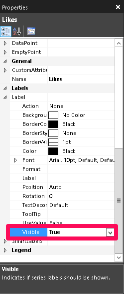
To make the data the chart is displaying easier to understand, I set the labels to be visible.
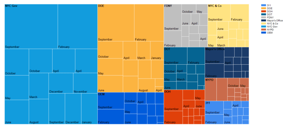
Tree Map
I couldn’t get the labels to display the year and the month while putting this post together. I think it is possible as I remember building custom label values, containing multiple fields, with expressions in previous versions of SSRS. Give me a shout if you have this working.
Sunburst
Right click the chart, select Change Chart Type and select the Sunburst visualisation. IMO this chart shows this particular data set in a much more useful way.
TL;DR
There are some nice additions here but for me there are only 2 reasons to upgrade to SSRS 2016:
- Reports render in HTML 5. Ever had your boss ask why the report you spent hours on doesn’t load in Safari?
- Datazen dashboards are stored and viewed from SSRS – no longer do you need to install and maintain the Datazen server.
Datazen is no more and these dashboards in SSRS are referred to as Mobile Reports, but more about that in the next post.
There are still some basic features I’d like to see in the paginated report designer like being able to format multiple text boxes at once.
So that covers the changes and additions to what was already in SSRS. In the next post I will be discussing the whole new world of Datazen Mobile Reports.
The post SSRS 2016 – Part 2 New Features for Paginated Reports appeared first on The Database Avenger.


