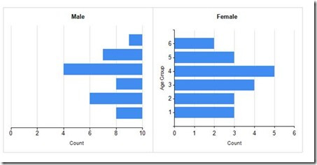
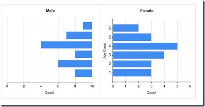
There are some pretty charts out there and most of them can be done in Reporting Services. There is one type of chart I had someone ask for that is not natively built in to SSRS. But with a little manipulation you can get the look you want. Here is an example of the chart I am talking about.
This is a mirror chart showing the genders spread across age groups. The female chart is a basic chart with no extra work done to it.
Here is a sample of the data on the table I am querying. This is just a table I manually filled.
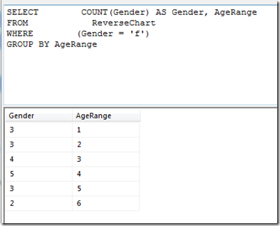
Here is the query and results I used for the Female dataset.
In the female dataset I am grouping by age range and getting a count of the gender column.
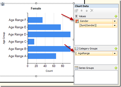
In the chart I set up the Gender as the value and the age range as the category.
The Male chart is does not turn out mirrored unless you do some trickery. Here are the steps you can take to get it mirrored.
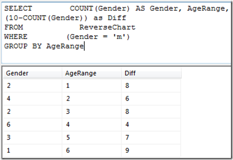
First, add another column to the query, as you can see in the below image.
This “Diff” column gives you a number that is the difference between the gender count and the number 10. In your data you might need to use a bigger number.
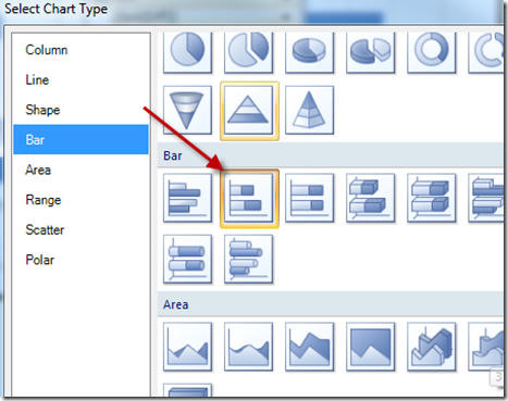
Next you create a stacked bar chart.
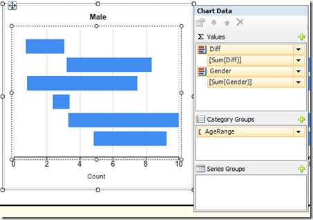
In this chart you set the values to be diff and gender in that order. You set the category to age range.
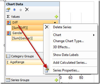
Now for the trickery part, Right click on the Diff series and select series properties.
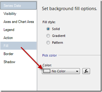
Click on the fill option on the left and set the color to no color.
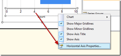
The last step is to set the horizontal axis properties. Right click on the horizontal axis and select the properties.
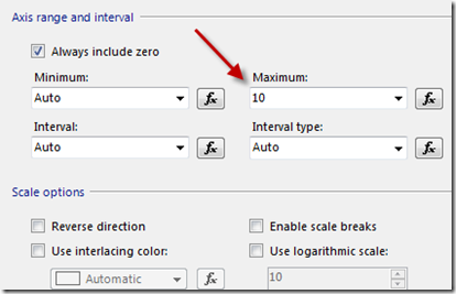
Set the maximum to 10. In your data you might need a bigger number.
Then remove the vertical axis from the male chart if you desire. It should look like the image below.
You might need to manipulate your charts a little more to get them to look just right.


