At some point I think that I am becoming a Microsoft Office specialist as opposed to a BI Architect. All of this work in Excel and now PowerPoint. Okay, done with the ramblings. As I have noted in a couple previous posts, I am working with a team on the Modern Apps Live! conference which is in Vegas next week. Well, this is another “lesson learned” that I wanted to pass along as a result of doing that work. (Hope to see you there.)
Using PowerPoint 2013
 So I had to create two types of data visualizations for this conference. Usually, I would use paper or white board to sketch it out and then proceed to make it a reality. Somewhere along the way, I heard that Microsoft uses PowerPoint to lay out UIs. Not sure if it is true or not, but it seemed easier and less expensive than Blend or Visio, so I thought I would give it a try.
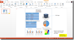
So, I first needed to create a summary report for a poll within the app that was created. I used the standard tools with in PowerPoint such as tables, charts, text boxes, and images to mock up my report. What I liked was I was able to add notations to the mockup for future reference.
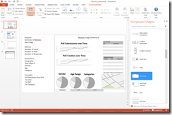
I had some frustration creating the charts as I wanted them to be representative. But overall not a bad experience. The next task I was taking on was working with the dashboards I was going to create in Excel 2013. I still wanted to lay it out so I knew what I would be trying to design. This was when I stumbled onto the Storyboarding menu.
I actually like using the shapes in this toolset better. Turns out this is available when you install Visual Studio Ultimate, Visual Studio Premium (my version), or Visual Studio Test Professional. More on that can be found on MSDN – Storyboard Using PowerPoint. This can be integrated into TFS and directly associated to work items. I am not a UX expert, but I like the ability to add tabs like I will have in Excel and there is even a SharePoint page background.
However, as you can see, even if you don’t have Storyboarding you can still effectively build up a PowerPoint slide to look like the report, dashboard, or even SharePoint page. I was not sure if I would be able to embrace this, but in the end I really like the simplicity and using PowerPoint allows for comments, versioning in SharePoint, and other mechanisms to support dashboard design.
I also wanted to pass along another blog post I found from Jason Zander on the Windows Azure team on the same subject: My Favorite Features: Creating Storyboards with PowerPoint. Hopefully this gives you another simple way to mock up reports and dashboards when you can’t find that User Experience Pro.


