

 |
| Our Guinea Pig Dashboard |
PowerBI is focused on creating interactive, analytical reports, from a lot of different data sources and with the ability to access them via mobile devices.
One of the cool options that allow your reports to be interactive, is the What If parameters: they allow you to visualize how your data could/should behave under different scenarios.
On this post, I will show you a super simple way to use a what if parameter.
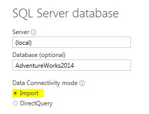
Note: This test was done using PowerBI desktop and the Import option in the data source selection.
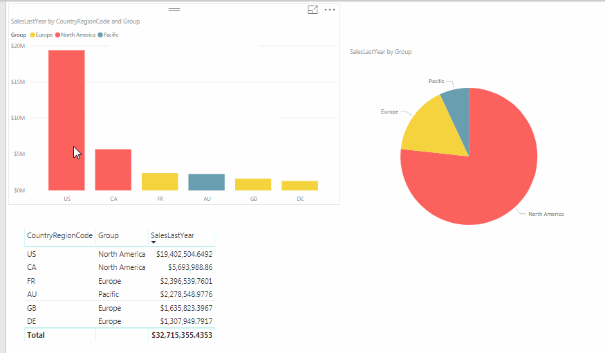
We will use a simple Dashboard representing sales by region in a specific year, as this:
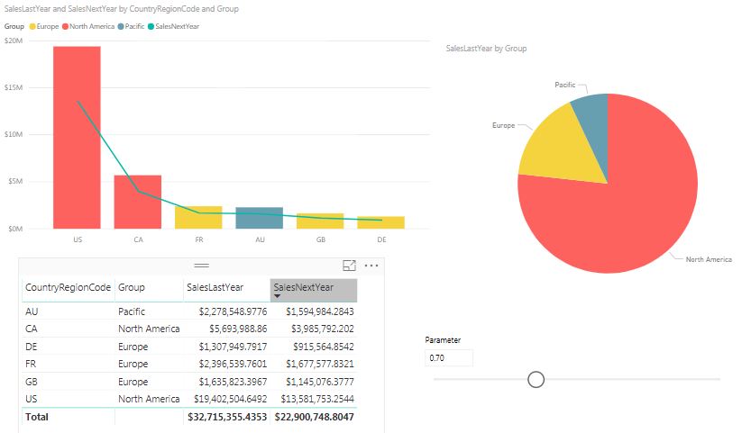
Let's say we want to plan next year sales, we want to add a line representing the next year target by region, for this example just as a value between 0 and 200% of this year sales.
Adding the What If Parameter
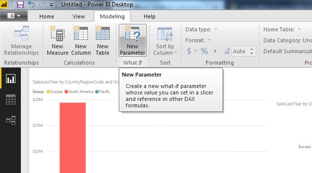
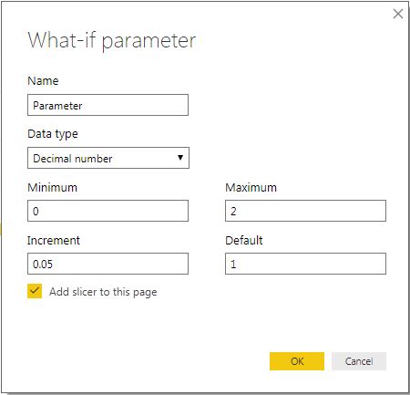
Click on the Modeling Tab and select the New Parameter option.
A new window will open, here you configure the values for your parameter.
For this example, we configure a decimal value between 0 and 2.
Leave the Add Slicer option checked to add the value selection box to your dashboard.
The parameter visualization is added, but as a multiple select option.
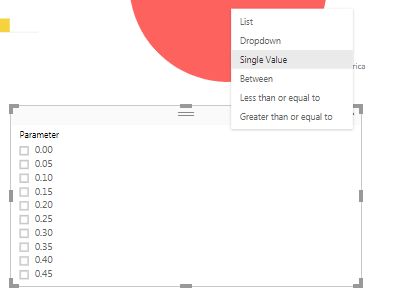
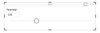
We change the type of slicer to Single value (you can select other option if you want).
Adding a new measure
We will demonstrate how the newly created parameter works using a measure, it will multiply the year sales by the value we select in the slicer.
Of course you can use the parameter in more complex formulas, that modify data values more in depth, that are not so obvious as our example, but for now, we will keep it simple.
We proceed to create a new measure on our data table, select the header of the table and select the New Measure option.
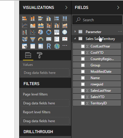
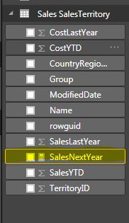
Then enter the formula you want to use, for our example the sum of the sales of the year, multiplied by our parameter, to simulate next year sales.

You can see how the measure is visualized as any other column in our table
Modify your visualizations
Now, just modify the dashboard by adding the new column to any visualization you want and save it.
Then you can change your slicer and the column will change its value in real time.
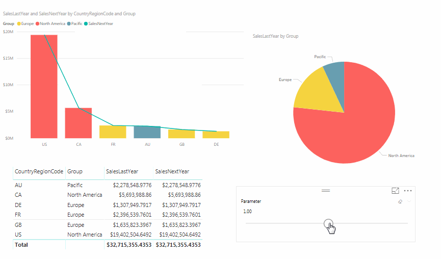 |
| A simple analytical report with a few clicks 🙂 |
Sources:
https://docs.microsoft.com/en-us/power-bi/desktop-what-if
https://docs.microsoft.com/en-us/power-bi/desktop-use-directquery
