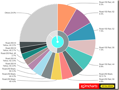
In this module you will learn how to use the Drill-Down Donut Chart. The Drill-Down Donut Chart allows you to visualize categorical data in an interactive drill-down chart.
Module 99 – Drill-Down Donut Chart
Downloads
- Power BI Custom Visual – Drill-Down Donut Chart
- Dataset – Product Hierarchy Sales.xlsx
- Completed Example – Module 99 – Drill-Down Donut Chart.pbix
Key Takeaways
- Visualize and explore category-based data using interactive drill-down and auto-grouping features.
- Get additional features and customization options with the Paid drill-down donut chart.
This Drill-Down Donut Chart has been drilled into a product hierarchy that has more than 15 categories so there is an “Other” section included.
Under the Format paintbrush section you would typically be able to modify this visual but the provider requires you to purchase before unlocking the features here.
You can still adjust the background color, add a border around the visual and lock the aspect ratio under the Format section.
Find Out More
You will always be able to find this video module and advanced viewing of future modules on the Pragmatic Works On Demand Training platform. Click here to learn more about this training platform that includes 30+ courses.


