In this module you will learn how to use the Scatter Chart by Akvelon. The Scatter Chart by Akvelon has similarities to the native Scatter Chart but with increased usability features like the rectangle selection feature.
Module 116 – Scatter Chart by Akvelon
Downloads
- Power BI Custom Visual – Scatter Chart by Akvelon
- Dataset – Employment by State.xlsx
- Completed Example – Module 116 – Scatter Chart by Akvelon.pbix
Key Takeaways
- This visual has similarities to the native Scatter Chart but with several enhancements.
- Allows you to select a range of values with a rectangle selection feature.
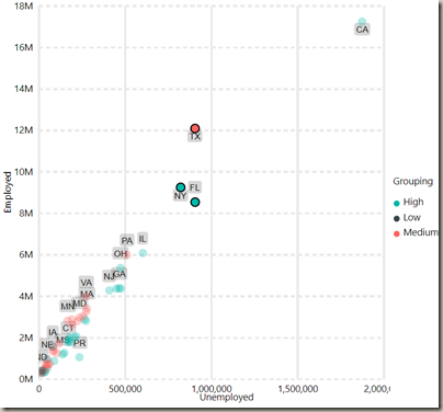
This Scatter Chart by Akevelon is showing unemployment by state.
Under the Format paintbrush you will find there are several customizations that you can enable for this visual.
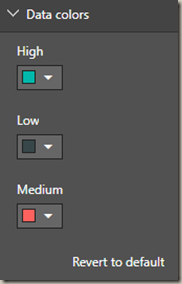
- Using the Data colors section you can change colors that are used for each value in the Legend field.
- Modifying the X and Y Axis properties allows you to adjust the appearance changes the appears of the vertical and horizontal axis labels.
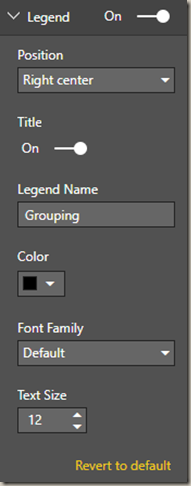
- Using the Legend properties allows you to modify the appearance and location of the legend.
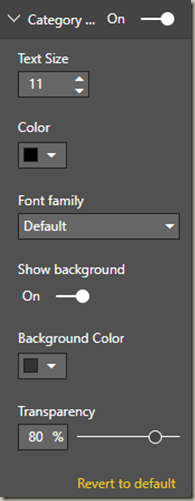
- Changing the Category labels section allows you to turn on labels next to each point and format those labels however you would like.
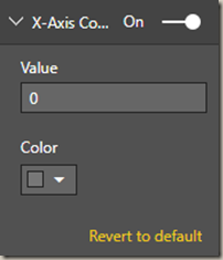
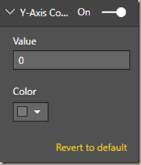
- The Scatter Chart also has an X and Y Constant line that can be added at specific locations on the chart.
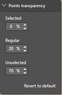
- Changing the Points transparency property allows you to determine if the points in the chart are transparent under different circumstances like when items are selected, unselected or under normal circumstances.
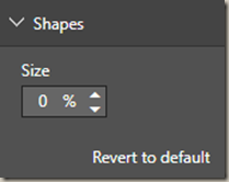
- If you would like to increase the size of each point then modify the Shapes property.
- Turning off the Fill point property will make the shapes appeared hollow rather than filled with color.
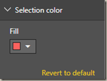
- Changing the Selection color will modify the appearance of the selection rectangle color.
You can also adjust the background color, add a border around the visual and lock the aspect ratio under the Format section.
Find Out More
You will always be able to find this video module and advanced viewing of future modules on the Pragmatic Works On Demand Training platform. Click here to learn more about this training platform that includes 40+ courses.
Catch up on all the Power BI Custom Visuals blog posts here.


