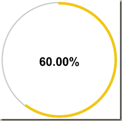
In this module you will learn how to use the Circle KPI Gauge. The Circle KPI Gauge displays a single measure value in a highly customizable circular gauge visual.
Module 115 – Circle KPI Gauge
Downloads
- Power BI Custom Visual – Circle KPI Gauge
- Dataset – Training Completed.xlsx
- Completed Example – Module 115 – Circle KPI Gauge.pbix
Key Takeaways
- You will likely need to use a slicer with this visual.
This Circle KPI Gauge displays the percentage of employees that have completed more than 5 hours of training.
Under the Format paintbrush you will find there are a few customizations that you can enable for this visual.
- Using the Circle Properties section you can adjust the formatting and thresholds of this visual.
You can also adjust the background color, add a border around the visual and lock the aspect ratio under the Format section.
Find Out More
You will always be able to find this video module and advanced viewing of future modules on the Pragmatic Works On Demand Training platform. Click here to learn more about this training platform that includes 40+ courses.
Catch up on all the Power BI Custom Visuals blog posts here.


