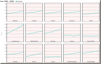
In this module you will learn how to use the Small Multiple Line Chart. The Small Multiple Line Chart allows you to display multiple mini line charts within a single visual that you can facet by an attribute value.
Module 113 – Small Multiple Line Chart
Downloads
- Power BI Custom Visual – Small Multiple Line Chart
- Dataset – Country Progress.xlsx
- Completed Example – Module 113 – Small Multiple Line Chart.pbix
Key Takeaways
- Allows for easy comparison of measures by attribute values.
- Creates a series of charts based on a provided attribute.
This Small Multiple Line Chart shows countries and their average income per person.
Under the Format paintbrush you will find there are several customizations that you can enable for this visual.
- Using the Small Multiples section you can adjust how many charts are shown per row and the formatting of the chart labels.
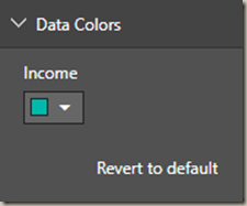
- Changing the Data Colors section allows you adjust the color of each measure on your line chart.
- Using the X-Axis section is turned off by default but allows you to show labels on the X-Axis of each column of charts.
- Using the Y-Axis section allows you to show labels on the Y-Axis of each column of charts.
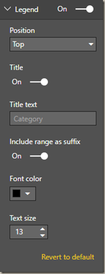
- Under the Legend section the position and formatting of the legend can be changed.
You can also adjust the background color, add a border around the visual and lock the aspect ratio under the Format section.
Find Out More
You will always be able to find this video module and advanced viewing of future modules on the Pragmatic Works On Demand Training platform. Click here to learn more about this training platform that includes 40+ courses.
Catch up on all the Power BI Custom Visuals blog posts here.


