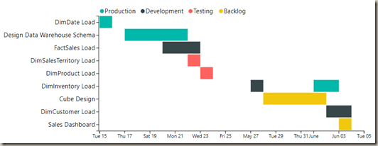
In this module you will learn how to use the as Timeline visual. The as Timeline is a Gantt chart style visual that allows you to find gaps and overlaps from dates and times.
Module 109 – as Timeline
Downloads
- Power BI Custom Visual – as Timeline
- Dataset – Project Status.xlsx
- Completed Example – Module 109 – as Timeline.pbix
Key Takeaways
- This is a Gantt chart style visual.
- Great for planning and tracking equipment or people to find gaps and overlaps in data.
This as Timeline visual is tracking different tasks in a project and what stage they are in.
Under the Format paintbrush you will find there are several customizations that you can enable for this visual.
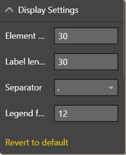
- Using the Display Setting section you can change several key settings like the legend and size of each task on the visual.
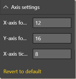
- The Axis settings section allows you to customize the number to tick marks on the x-axis and the font size as well.
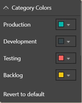
- Using the Category Colors section you can change the color used for each value in the Category field.
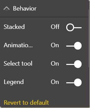
- Using the Behavior section you can modify several of the features that are interactive with the chart like animation and how the chart reacts when you click on items.
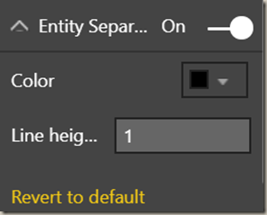
- Using the Entity Separator you can add lines between each entity on the visual.
You can also adjust the background color, add a border around the visual and lock the aspect ratio under the Format section.
Find Out More
You will always be able to find this video module and advanced viewing of future modules on the Pragmatic Works On Demand Training platform. Click here to learn more about this training platform that includes 35+ courses.
Catch up on all the Power BI Custom Visuals blog posts here.


