

I assume that sometimes we tend to work with more familiar chart types to analyze our data, like lines and vertical or horizontal charts; however box plot charts could be very well used to review how your data is distributed within your set of metric values; and besides, it looks different as well 🙂
About 3 months ago Microsoft made this type of visualization available in Power BI (Visual Awesomeness Unlocked – Box-and-Whisker Plots), so I decided to compare it with the same box plot chart that I can create using SQL Reporting Services.
My data comes from Berkely Earth (http://berkeleyearth.org/data/) that I had already used for one of my previous PowerMap visualization (Earth Surface Temperature on YouTube). And I took 4 years data of May monthly average temperature from all Canadian Geo stations (1997 - 2000) and showed them both in Power BI and SSRS.
Power BI:
Currently there are two version of the Box & Whisker charts: (1) created by Brad Sarsfield and (2) another created by Jan Pieter Posthuma.
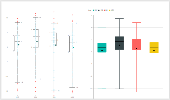
(1) Brad Sarsfield box and whisker chart
Pros:
- Customization for chart quantile value is available
- Outliers visualization
- Simple data set required Values/Group (values and groups those values are divided to)
Cons:
- Margins for quantiles are rounded to zero decimal places
(2) Jan Pieter Posthuma box and whisker chart
Pros:
- Boxes are colored
- Margins for quantiles are not rounded to zero decimal places
Cons:
- No customization for quantile value (it's preset to Min, 0.25, Mean, Median, 0.75, Max)
- Along with Values/Group settings for dataset, Samples has to be specified (which is basically an attribute for lowest granularity you want to analyze your data)
SSRS:

Pros:
- The only SSRS chart for box plot visualization
- More settings can be adjusted compared with similar Power BI visualization
Cons:
- Chart dataset has to be prepared in advance for all 6 data elements (Min, Low, Mean, Median, High, Max)
- The only SSRS chart for box plot visualization.
Conclusion:
I personally like Power BI Brad Sarsfield box & whiskers visualization with the way it looks and its customization level, however I also like that margin values for quantiles are not rounded to zero decimal places at Jan Pieter Posthuma visualization.
Thanks for reading this blog post, and happy data adventures!
