

So far I’ve worked on simple analytical techniques using one or two variables in a dataset. This article is a sort of a summary – about various techniques we can use for such datasets, depending on the type of variable in question. The techniques include – how to get summary statistics out as relevant, and how to plot the appropriate descriptive graph. There are fundamentally two types of variables –
1 Continues – variables which are not restricted in their value – such as height, weight, temperature etc.
2 Categorical – variables which can have specific values or a specific domain to which values belong.
The types of relationships we want to look at are
1 Categorical-Continues
2 Categorical-Categorical
3 Continues-Continues
1 Categorical and Continues Variable: For this purpose we will use one of R’s built in datasets, called Orange. This dataset has information on five types of orange trees, coded 1 to 5, with their circumference and age. The categorical variable here is the type of orange tree, for continues variable we can consider either circumference or age.
1 List the dataset. We can do this by simply typing Orange.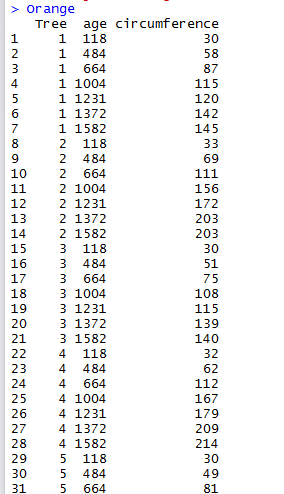
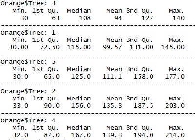
2 To get  the summary statistics on each type of tree -
by(Orange$circumference,Orange$Tree, summary)
3 Now we want to understand what this data is made of. What are the min and max values , which is the biggest tree and which is the smallest, what is the overlap in values and so on. The easiest way to do this is to get the box-and-whisker plot of this data
boxplot(circumference~Tree, data=Orange, main="Circumference of Orange Trees", xlab="Tree", ylab="Circumference", col=c("red","blue", "yellow","orange","darkgreen"))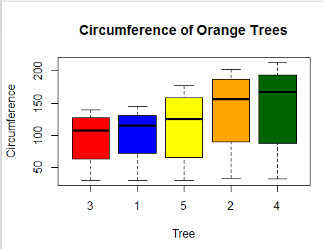
From the plot we can see that type 3 trees have the smallest circumference while type 4 have the largest, with type 2 close to type 4. We can also see that type 1 trees have the thinnest dispersion of circumference while type 4 has the highest, closely followed by type 2. We can also see that there are no significant outliers in this data.
2 Relationship between two categorical variables:
For this purpose I can use the built in dataset in R called ‘HairEyeColor’. This dataset has gender wise hair and eye color for several people. Gender, Hair color, Eye color are categorical variables. For simplicity’s sake I am only going with gender and eye color.
Let us say we want the following information from this dataset –
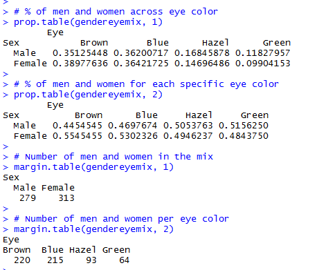
1 % of men and women across eye color (and the unpivot – % of men and women per eye color)
2 % of men and women across hair color (and the unpivot – % of men and women per eye color)
3 Count of men and women in the mix (total)
4 Count of men and women for each eye/hair color
The code that accomplishes all of this is as below:
# Flatten the data into gender/eye color

gendereyemix<-xtabs(Freq~Sex+Eye,data.frame(HairEyeColor))

# % of men and women across eye color

prop.table(gendereyemix, 1)

# % of men and women for each specific eye color

prop.table(gendereyemix, 2)

# Number of men and women in the mix

margin.table(gendereyemix, 1)

# Number of men and women per eye color

margin.table(gendereyemix, 2)
Results are as below:
We can accomplish the same using 3 variables in the mix for both prop.table and margin.table functions.
We can also run many tests of independence with them.
The appropriate chart for comparing categorical variable may be bar chart.
barplot(gendereyemix, main="Gender-Eye Color Distribution", xlab="Eye Color",col=c("darkblue","red"), legend = rownames(gendereyemix))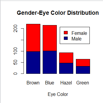
3 Relationship between 2 continues variables:
For this let us consider the airquality dataframe, and the two continues variables it has, windspeed and temperature. To begin with we can get a summary of windspeed for each temperature by
by(airquality$Wind, airquality$Temp, summary)
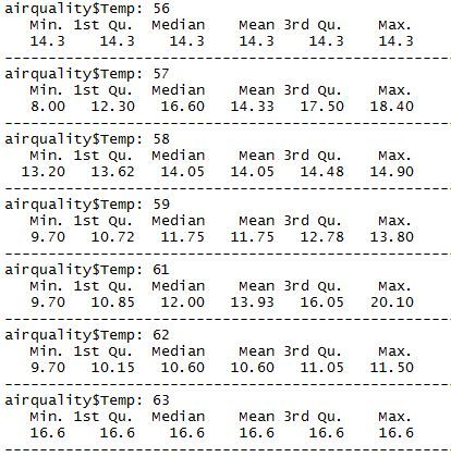
Although this gives a decent idea of airspeeds at each temperature, we have no idea if there is any specific correlation between the two. To understand if there is a correlation –
t.test(airquality$Wind, airquality$Temp, data=airquality)
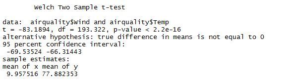
The p value is really small indicating that there may be a statistically significant correlation between airquality and temperature. We may want to draw a graph to understand what this correlation is – I tried a scatter plot
plot(airquality$Wind, airquality$Temp, main="Scatterplot of Wind versus Temperature",
+ xlab="Wind ", ylab="Temperature", pch=19)
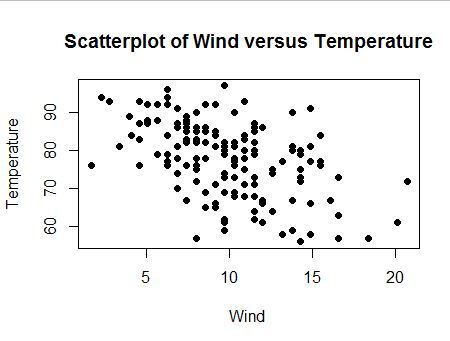
Now we add a line of best fit to the graph
lines(lowess(airquality$Wind,airquality$Temp), col="blue")
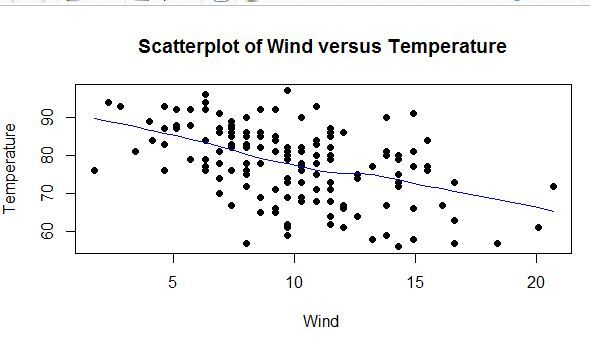
From this we can see that there is a correlation between temperature falling with increasing wind speed.
These are just a few examples of how to correlate variables. In many cases there may be a lot more than two variables in the mix and there are many strategies involved to study the correlation. But understand what types of variables they are, and what are best graphs to use for the correlation helps further our data analysis skills. Thanks for reading!

![]()
