 As I mentioned in my original post, Exploring Excel 2013 as Microsoft’s BI Client, I will be posting tips regularly about using Excel 2013. Much of the content will be a result of my daily interactions with business users and other BI devs. In order to not forget what I learn or discover, I write it down … here. I hope you too will discover something new you can use. Enjoy!
Using Color Scales
In the last tip we covered using conditional formatting with Data Bars. Next up is Color Scales.
What Are Color Scales?
Color Scales are a conditional formatting feature that can be applied to cells in Excel. Color scales “color” the cell based on the data that the formatting is applied to. The color scale feature works with pivot tables and standard cells in Excel. Our focus will be on using color scale with pivot tables.
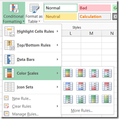
You will find the option to add data bars on the Conditional Formatting button on the HOME ribbon as shown below.
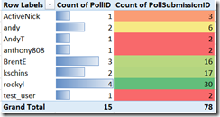
First starting with a single column, we can use use Quick Analysis or the Ribbon to apply our Color Scale rules. While the data bar used size to highlight the differences in the data, color scales will, obviously, use color. The most common color scale to use is to use Red for lower numbers to green for higher with yellow or white in the middle. Let’s apply that to our column of data.
This is particularly effective when working with percentages or other values where red can mean “bad”. Keep in mind that you can change the order of the color scaling so that a higher number can be red as well. You can also use two color scales when that is all that is needed. I have used two color scales in cases where only two values are present such as a Boolean value.
When setting up the formatting, you may notice a “box” in the corner. This can be used to tell Excel how to apply the formatting.
This works great when you pick the first cell in question then use this short cut to set the formatting based on how you want to apply the changes. The only rule type that applies in this scenario is the “Format all cells based on their values” which options are shown in the shortcut.
While a very simple visualization technique it can be to highlight differences in a compelling way.
Next tip will cover Icon Sets. See you then.


