

Preattentive attributes are visual properties that we notice without using conscious effort to do so. Preattentive processes take place within 200ms after exposure to a visual stimulus, and do not require sequential search. They are a very powerful tool in your data visualization tool box – they determine what your audience notices first when they look at your Power BI report.
Four preattentive visual properties have been defined:
- Color (intensity, hue)
- Form (orientation, line length, line width, size, shape, curvature, enclosure, added marks)
- Spatial Positioning (2-D position)
- Movement
Below is a short video I found that demonstrates preattentive attributes.
Preattentive Attributes in Power BI
Every chart you build in Power BI uses preattentive attributes, but you must make design choices to use them purposefully. Here are some quick examples.
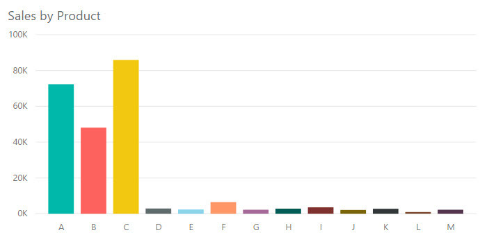
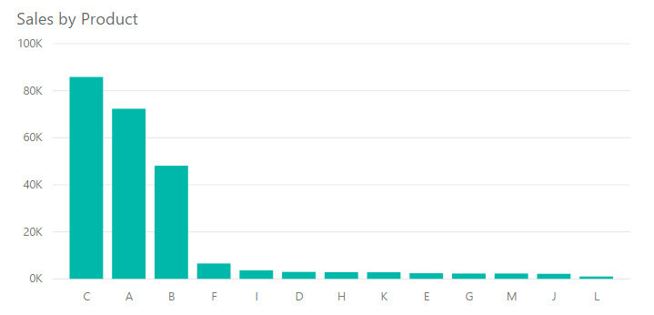
The chart on the top uses a different color for each bar and orders the bars alphabetically by product. The chart on the bottom uses a single color across all bars and orders the bars descending by sales amount. Notice how your eyes jump back and forth between the colors in the chart on the top. When you look at the bottom chart, your eyes more easily follow the length of the bars down and across the categories from largest to smallest.
Here’s another example.
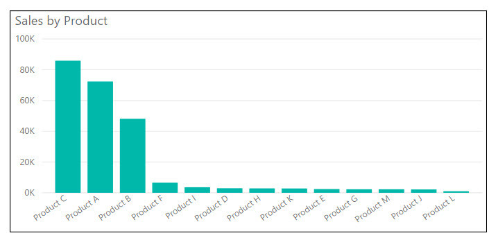
The vertical bar chart on the top has a dark black border. It’s probably the first thing you notice about the chart.
Once we remove the border, as shown in the chart in the middle, we notice that the chart category labels have a diagonal orientation. They stand out because nothing else in the chart is diagonal. It’s a bit distracting and difficult to read.
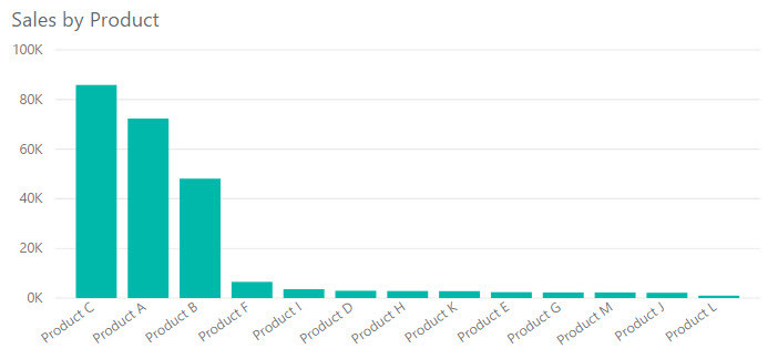
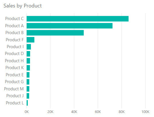
The horizontal bar chart shows the same information in the same order, but allows the category labels to remain horizontal. Now our eyes focus on the information encoded by the bars.
Click here to see these examples in Power BI.
What Does This Mean For Report Design?
We need to take advantage of the way we process information to create a faster and more natural way of acquiring information through our Power BI reports. Specifically, we can use preattentive attributes to highlight the most important parts of a visual and to create a visual hierarchy of information. Color is probably the most powerful preattentive attribute we have at our disposal, so we should use it strategically.
Here are some things you can do to take advantage of preattentive attributes in your Power BI reports:
- Reserve the use of bright colors for items that need attention from your users or those that should be examined first, and use less intense colors for other items on the page.
- Don’t use multiple colors for the sake of having several colors. For instance, a bar chart with only one field on the categorical axis generally doesn’t need to have separate colors for each bar.
- Don’t settle for rotated axis labels when they won’t fit horizontally. Abbreviate categories and numbers, or switch to a different chart type that supports longer labels if you need to do so.
- Start bar charts at 0 to allow your users to accurately evaluate length and differences between bars.
- Make sure visuals in a row are exactly aligned. If charts in a row are slightly misaligned by a few pixels, it can be distracting.
- Don’t let chart title be the brightest/boldest thing on your page. Let your data in your charts, KPIs, and cards draw the most attention. In many cases, you don’t need a background color on your chart titles.
- Avoid adding dark, intense chart borders. Try using whitespace to separate charts rather than adding borders.
There are times when chart borders and background colors on chart titles are appropriate. (I’m currently working on a report where I have a border around a group of charts to indicate that they are all related, but it is light gray rather than black.) But they definitely aren’t appropriate all the time, so I suggest your default be to avoid them and add them when necessary.
Sometimes it’s difficult in Power BI to find a chart that will accommodate even slightly long category labels, since the built-in visuals truncate the values on the axis with no setting to change that behavior. I ask that you lend your votes and comments to User Voice to help change that. You can vote here or here. Until that issue is resolved, you might try the Attribute Slicer custom visual. Although it has some formatting quirks of its own, it has a setting to define the portion of the chart that should be taken up by the bars versus the labels.
I have provided several guidelines that are not hard and fast rules. The goal of these guidelines is to help you use color, form, and position to guide your users through your report in an efficient manner, to help them process the information your report provides.
This post is part of a series. Go here to see the list of posts in the series.
