When creating a SSRS report, you want to add lines that display trends. Sparklines that were introduced in SQL Server 2008 R2 will allow you to do this easily. But wait there is more. You want to show trends for more than one data point. For example actual sales and target amount. And you want to conditionally format the data point. Show colors green or red depending upon if sales exceeds target.
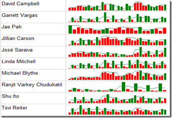
Below is how the Sparkline with multiple data points and conditional formatting applied to them will look like. Columns represent sales by month and line represents sales quota by month. Column is in green when sales exceeds the quota for a given month and red when sales fall below the quota.
Sparklines are simplified versions of charts that can be used to display trends. Different types of Sparkline charts include line, area, bar, etc.
Sean Boon (Blog) described how to build Sparkline reports in an earlier post. If you haven’t read that post yet I highly recommend you do so. I am going to use the same example that Sean used in his post but show a different functionality.
Create dataset:
After opening report server project and creating a data source, create a data set. Right click on shared datasets and choose add new dataset. Following is the query I am using for this example which runs against AdventureWorksDW2008R2 sample database.
SELECT T.CalendarYear,
T.CalendarQuarter,
T.MonthNumberOfYear,
SUM(S.ExtendedAmount)AS Sales ,
COALESCE(SUM(Q.SalesAmountQuota )/ COUNT(SalesAmountQuota),
SUM(Q.SalesAmountQuota )/ COUNT(SalesAmountQuota))/3 AS Quota ,
E.FirstName + ' ' + E.LastName AS Employee
FROM
FactResellerSales AS  S
LEFT OUTER JOIN dbo.dimDate T ON S.orderdatekey = DateKey
JOIN dbo.DimEmployee E
ON S.EmployeeKey = E.EmployeeKey
LEFT OUTER JOIN dbo.FactSalesQuota Q ON
S.EmployeeKey= Q.EmployeeKey AND
T.CalendarYear = Q.CalendarYear AND
T.CalendarQuarter = Q.CalendarQuarter
WHERE S.EmployeeKey IN
(SELECT TOP 10 EmployeeKey FROM FactResellerSales GROUP BY factResellerSales.EmployeeKey ORDER BY SUM(ExtendedAmount) DESC)
GROUP BY T.CalendarYear ,T.CalendarQuarter,T.MonthNumberOfYear, E.FirstName, E.LastName, E.EmployeeKey
ORDER BY Employee, 1
Insert table:
We want to insert a table grouped on Employee so one row for each employee is shown. Sparklines will later be added to this table.
- Drag and drop table report item from the toolbox to report body.
- Drag Employee field from dataset and place it in the details row.
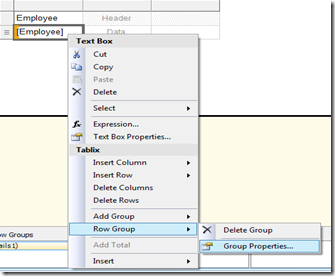
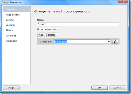
- Right click on the employee text box and insert a row group by choosing row group, group properties. In the group properties window choose Employee from the drop down for group on property.
Insert Sparkline:
We will configure a Sparkline with two data points, apply conditional formatting, and add Sparkline to the above table.
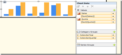
- Drag and drop Sparkline from toolbox on to the report body. Select column as the Sparkline type and click ok.
- Add sales, Quota from dataset to values and CalendarYear, CalendarQuarter to category groups.
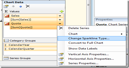
- Click on Quota from values and choose change Sparkline type. From select Sparkline type page, choose smooth line and click ok.
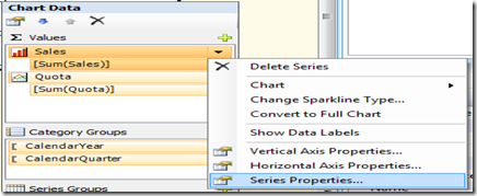
- Click on Sales from values and choose series properties.
- From the series properties page, choose fill and type the following expression.=iif(Fields!Sales.Value<Fields!Quota.Value,
“red”,”green”)
Finally drag and drop Sparkline to a cell next to Employee in the table we created earlier.
Leave a comment with any questions.
~Sam.


