In this article I’m going to demonstrate how to create a basic tabular report incorporating a sparkline chart and line chart in Reporting Services (SSRS) 2014. The AdventureWorksDW2014 sample database is used as the data source and I'm running Reporting Services in Native Mode. The report will be optimized for online interactive viewing.
To begin with, in SSDT I'll create a new Report Server Project called “SSRS GoTo”and add a new Shared data source called “ResellerData”. I'll use my server information but you can use 'Local' for Server Name or your instance name. Then select the AdventureWorksDW2014 database. I’ll only illustrate this minimally as I am assuming these basic startup steps people will have practiced enough to be comfortable with.
Now that the shared data source is created, I can add a new report to the project. In Solution Explorer right click the Reports folder and click Add, New Item. I have a blank canvass to build the report from. In the Report Data pane ,right click Data Sources and Add New Data source. Again, name the Data Source,“ResellerData”. Select Use shared data source reference and choose ResellerData from the list, then click OK. So now I have created a reference for this report to the shared data source created previously.
I need the report to return specific data from tables, not all the data; so the next step is to create a dataset. Right click Datasets in the Report Data pane, and click Add Dataset. Name the dataset, “dsResellerSales”, then select “Use a dataset embedded in my report”. See Fig. 1 for the dataset properties.
Under Data source, select “ResellerData”. Since I am going to use a stored procedure to gather the data rather than write a query in the query designer, click the stored procedure button under Query type. Select usp_GetResellerSales and click OK. The stored procedure contains a query parameter to filter by Year, Reporting services automatically creates the report parameter and maps it to the query parameter in the query.
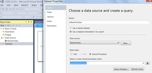
Fig.1 – Dataset Properties
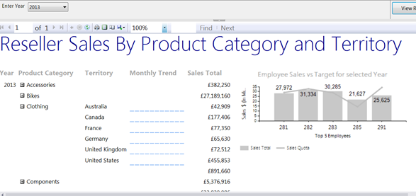
Below is a screenshot of the report (Fig. 2) I am going to create. It is a basic tabular report using three datasets, which I will discuss below. What follows are the general steps involved in creating the report.
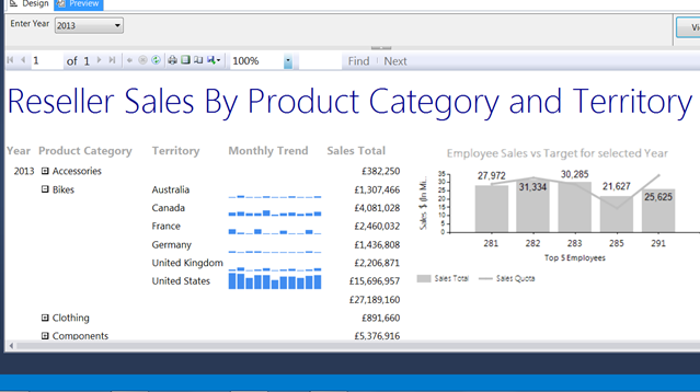
Fig.2 – Sample report
First, click the Design tab, and right click on a blank area, then choose “Insert Table”. Add Year, Category Name and Territory onto the Row Groups pane. Label the fourth column Monthly Trend, then drag SalesTotaldataset field across onto the table in the fifth column. Change the CategoryName column label to Product Category, then preview. The report should look like Fig. 3.
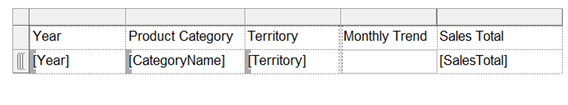
Fig.3 Table with added RowGroups and Columns
SSRS has created the @Year report parameter automatically and linked it to the query parameter in the dataset. Each time the report is run, the user will have to enter a year to filter the report as shown in Fig. 4.
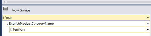
Fig.4 – Row grouping
To save time it is easier to add a default value or provide a list of available values for the user to choose from, which is what I will do now. In the Report Data pane right click Datasets folder. Choose Add Dataset. Under Name type in a name, I’ll call it years. Select “Choose a dataset embedded in my report”. Under Data source select the ResellerData datasource. Under Query type select Text, and under Query type the following SQL query to display a list of distinct years from the FactResellerSales table. This is shown in Fig. 5.
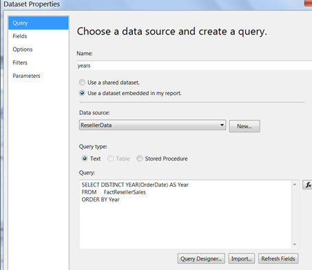
Fig.5 – Dataset Properties for the years parameter.
The report will always show the up-to-date years to be included. The data returned is from the Year field and will be labeled Year. The label can differ from the Value field but is commonly the same (show in Fig. 6).
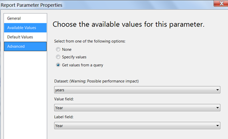
Fig.6 – Parameter properties configured to come from the ‘years’ dataset
The SalesTotal column shows one row per individual monthly total for each Territory. Instead, I want to see only one row aggregated by SUM (Fig. 7).
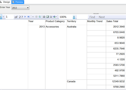
Fig.7 – The SalesTotal column group
Under the Row Groups pane right click the Details and select Delete group, and choose Delete group only (Fig. 8).
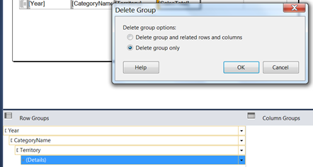
Fig.8 – Deleting the group
This will change the grouping structure only and not the table itself. Now the report displays Total Sales for each Territory per Product Category (Fig. 9). The numbers need formatting, which I’ll do later.
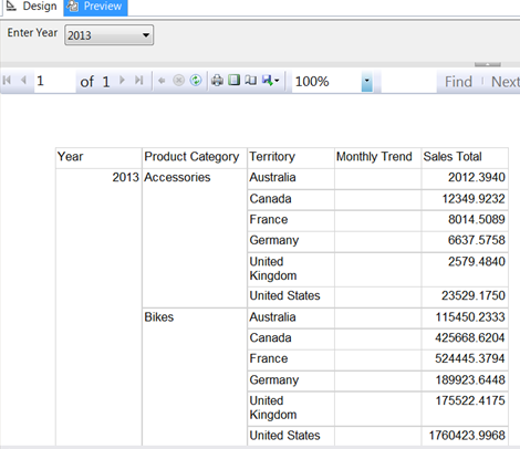
Fig.9 – Sales Total grouped
Now the report displays only one row per Territory per Category and looks good. However, upon closer inspection, the figure for each Territory is not as it seems. As the image shows, 2013 Accessories Sales in Australia was $2012.3940. This is not the true aggregation for Accessories in Australia. In fact, this figure is for only the first month’s sales for that particular Year, Category, Territory combination. The report is not aggregating the data correctly.
Because I removed the details group, SSRS is just taking the first value in that scope instead of the SUM of all rows (as per Figure 9, we can see there are ten rows in this scope). Since the SalesTotal field isn’t wrapped in any aggregate function like SUM, it’s just showing the first value, which happens to be the value $2012.3940. Highlight the SalesTotal field, right click, and select Summarize By, then SUM, as seen in Fig. 10.
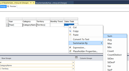
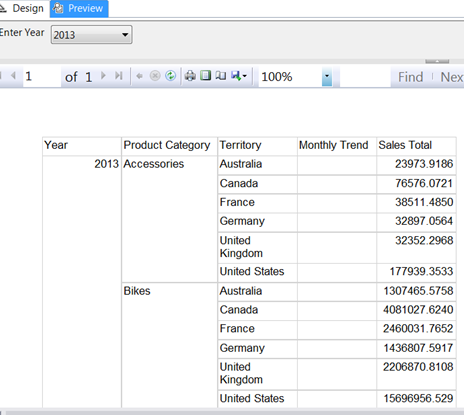
Fig.11 – New report with figures correctly summed.
Now that the data is displaying correctly, I want to add some Group totals.
Right click the Year field and click “Add Total”. Right click the Territory field and select “Add Total”. To ensure the report shows SalesTotals for the whole year and each Product Category further broken down byTerritory. Select the Label text boxes named ‘Total’ that were created as a result of adding the totals and delete them (as shown in Fig. 12).
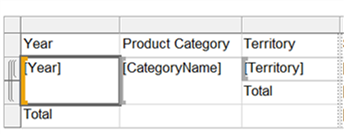
Fig.12 – The two Total labels are optional, to delete them will improve the look of this report.
Basically, delete the Total labels because when the report is rendered they display regardless of whether there may be data. The report looks better just showing the Group headings and the numeric data here without the two labels as these are auto-generated
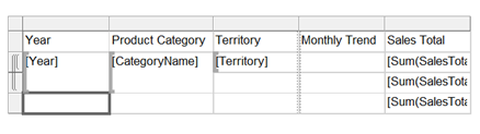
Fig.13 The report design is now less cluttered and more readable.
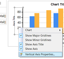
When the report is previewed I want to initially hide the Territory and Monthly Trend columns and only display them when an individual Product Category is selected. This is called drill-down functionality using visibility properties. So to achieve this, right click Territory Row Group and select “Group Properties”. Configure as shown in Fig. 14, then click OK.
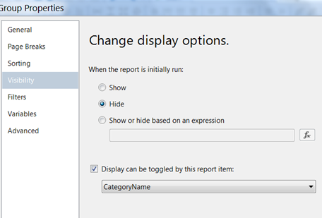
Fig.14 – Group Properties dialog
Here is the preview.

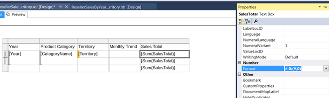
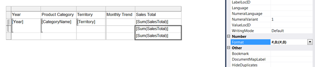
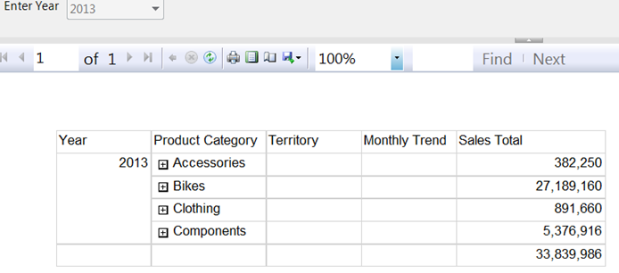
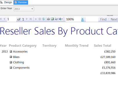
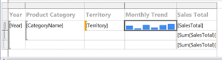
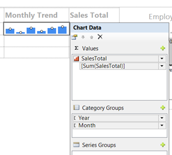
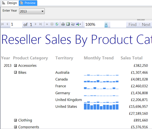
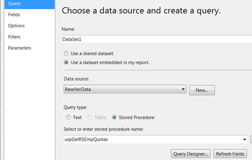
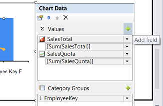
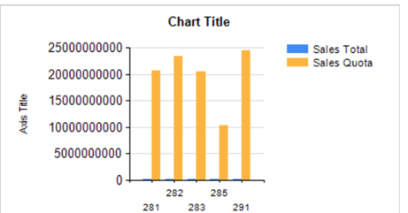
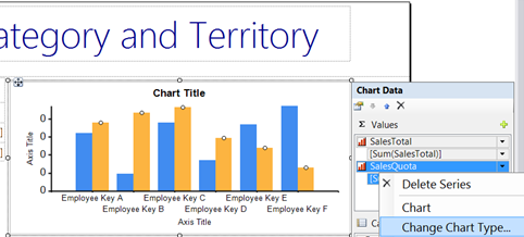
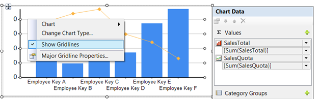
Fig.31 – Changing the chart type for SalesQuota
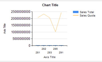
Fig.32 The chart looks better but still the SalesTotal values are not instantly meaningful.
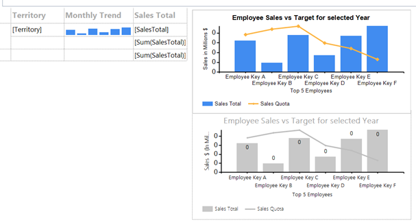
Again, right click SalesQuota in the Chart data pane and select Series properties. On the Axis and Chart Area page change the Vertical Axis to Secondary.
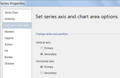
Fig.33 Changing SalesQuota to be positioned on the Secondary Vertical axis