I ran across an interesting post from Rita Fainshtein that looked at the different types of graphs for a set of data. I thought that was interesting, so I ran my own experiment. I found for my data, a line graph was better, but let me know what you think.
My data set was simple, a few players across a few events and their number of kills. I coach volleyball and I’m always trying to present stats in a useful way. Here was the small set I picked.
Nothing fancy, but this is similar to what was in the article. From here, I asked EXcel to insert a chart from the Recommended Charts and picked the first one. This is what I saw:
This isn’t bad, though it’s hard to compare across events. I see how A did for all these events, but if I want to see if she was better or worse than K, I’m guessing on some of the lines.
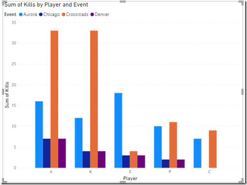
Next, I opened Power BI. I added my data set and then dragged a value to the visualizations. The default chart I got was similar to Excel. Not a great visual. It’s Ok, but suffers from similar problems.
I moved the player and the event from the axis to the legend, because that’s more appropriate for this dataset.
I changed the type to the first stacked chart I saw, and got this, which I think isn’t useful at all. There isn’t a way to measure 100% in this case, so normalizing all data in this way is very unhelpful.
I switched to a normal stacked chart, which is OK, but for Crossroads, is A or K better? Does E outperform A in Aurora? Very hard to tell.
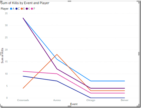
Next I tried a line chart. This I think is the best for my analysis. I can see the events across the bottom and the colors for the players make it easy for me to compare them with each other. I am not color blind, so this works for me.
I can also compare the players individually across events by following the lines. I can see them all trending in similar ways, which is expected. If the team does well, everyone does better. If not, then not. I also see the outlier where E outperformed A.
Summary
The line graph worked best for me. However, the data I am looking at lends itself to a comparison that looks good here. The stacked bar chart isn’t as clean when drawing conclusions, but that’s because I’m looking at the different segments across items, not necessarily with segments for the same item. Of course, I think that would be hard as well.
Ultimately the data you are analyzing and how the analysis is used will affect what you think is better. Work with the people who use your visual to make a decision and let them help guide you for the best visual.
In this case, A loves seeing she’s ahead almost all the time.


