With the CTP release of SQL Server 2016 and the much anticipated integration of Revolution R, it seems like a good opportunity to look at possible ways we can use R and exploratory analytics alongside SQL Server. There is a huge amount of potential to transform the way we work and the way we interact with data through the use of analytics and languages like R. Where T-SQL is a powerful tool for the aggregation and summarisation of data, R let's us dig deeper and investigate the underlying patterns within the data. Even simple exploratory techniques using R can help to identify common patterns, outliers and anomalies or simplify the way we represent the data we have. In this post we will pull data from the SQL Server DMVs and use R for some simple clustering and dimensionality reduction to identify performance hotspots in the database.
The Problem: Large-Scale Performance Investigations
Over time, DBAs who specialise in performance tend to develop a core methodology for investigating performance issues that will help guide them through the complexities towards the root issues. However for junior, and even intermediate, DBAs, the monumental task of diagnosing performance faults on an unknown system can be daunting. Thankfully SQL Server maintains a wealth of diagnostic information that we can leverage to expose performance hotspots within a database with some very simple analysis done in R.
There are a myriad of reasons for poor database performance from hardware issues, to application issues and even occassionally problems with the database itself. For the analysis detailed in this post, we will focus on exploring performance hotspots within the database itself. Of course we assume that some amount of initial work has been done already - obvious questions such as:
- when did these issues begin, and how frequently do they occur?
- what are the symptoms (i.e. what are users really complaining about)?
- have there been any significant changes in the environment recently?
- and so on...
But for this analysis let us assume that there are no external problems, and that there is a genuine issue with either the database design or query design that is causing systemwide slowdowns. In the analysis below we will look at how to leverage the diagnostic data in SQL Server DMVs to expose database hotspots and quickly direct further investigation towards the source of the problems.
The Data
Specifically, we will focus on the use of sys.dm_db_index_operational_stats, sys.indexes and sys.sysindexes to extract data about the ways that tables are used, accessed and queried. An example script to extract usage patterns is given below:
select
    object_name(ops.object_id)          as [Object Name]
    , sum(ops.range_scan_count)         as [Range Scans]
    , sum(ops.singleton_lookup_count)   as [Singleton Lookups]
    , sum(ops.row_lock_count)           as [Row Locks]
    , sum(ops.row_lock_wait_in_ms)      as [Row Lock Waits (ms)]
    , sum(ops.page_lock_count)          as [Page Locks]
    , sum(ops.page_lock_wait_in_ms)     as [Page Lock Waits (ms)]
    , sum(ops.page_io_latch_wait_in_ms) as [Page IO Latch Wait (ms)]
from sys.dm_db_index_operational_stats(null,null,NULL,NULL) as ops
  inner join sys.indexes as idx on idx.object_id = ops.object_id and idx.index_id = ops.index_id
  inner join sys.sysindexes as sysidx on idx.object_id = sysidx.id
where ops.object_id > 100
group by ops.object_id
order by [RowCount] desc
This script provides some interesting measures relating to how data is being accessed. You could imagine extending this script to include table size, categories such as index types (b-tree vs. heaps or primary indexes vs. covering indexes) or any other information that you think might help distinguish 'normal operation' from 'hotspots'. The table below shows a sample set of the results from this query:
| Object Name | Range Scans | Singleton Lookups | Row Locks | Row Lock Waits (ms) | Page Locks | Page Lock Waits (ms) | Page IO Latch Waits |
| table_A | -0.0041368041 | 0.0374425646 | 0.0915080042 | 0.3964855227 | 0.0552646556 | 1 | -0.0077082861 |
| table_B | 1 | 0.2407333081 | 0.022548561 | 0.2601980934 | 0.0905261775 | 0.3178562216 | 0.0134218563 |
| ... | ... | ... | ... | ... | ... | ... | ... |
Using SQL, we have the option to order the data on any column, or combination of columns that we choose. For example, we could look at the 'worst' tables by Range Scans, or the 'worst' tables by Page IO Latch Waits. It is unlikely though that the 'worst' tables in one dimension will also be the 'worst' tables in all other dimensions. Another option is to analyse this data in R to:
- speed up the investigative process by quickly identifying bottlenecks
- ideally, reduce the pressure on senior DBAs by providing a tool to help other team members diagnose the source of performance hotspots
Identifying Hotspots using R
Our goal is to extract useful information from the data above. To do this, we will use Principal Components Analysis (PCA) to visualise outliers and clustering to identify patterns. First, we need to access the data. We can read in a CSV file, or connect directly to a database (using an RODBC connection). This could become even more powerful with the future integration of SQL Server and Revolution R. For now, let's assume that the data has been saved into a CSV file and that we are working in RStudio.
# read the data
data <- read.csv("hotspots_data.csv)
tables <- data[, 1]
data <- data[, -1]
Above we have read in the data and additionally: i) extracted the first column as the table names, ii) dropped the table names from the dataset so that we can work with the numerical data itself.
PCA is a common tool for dimensionality reduction, and is useful for visualising high dimension datasets. PCA extracts independent dimensions that capture the variation in the original data, so it will be particularly useful for comparing the different patterns in our dataset. In R:
# pca
pca <- prcomp(data)
summary(pca)
The summary() function returns the following information:
| PC1 | PC2 | PC3 | PC4 | PC5 | PC6 | PC7 | |
| Standard Deviation | 0.1676 | 0.1459 | 0.1315 | 0.1063 | 0.02156 | 4.781e-19 | 7.389e-36 |
| Proporttion of Variance | 0.3581 | 0.2715 | 0.2205 | 0.1440 | 0.00593 | 0.000e+00 | 0.000e+00 |
| Cummulative Proportion | 0.3581 | 0.6296 | 0.8501 | 0.9941 | 1.00000 | 1.000e+00 | 1.000e+00 |
We can see that R calculated 7 new principal components and from the Cummulative Proportions we note that the first 3 principal components describe 85 % of the variation in the original data which is very good. To visualise the data we will create a data frame and use R's GGPLOT2 library:
# load GGPLOT library(ggplot2) plot.data <- data.frame(pca$x[, 1:2]) g <- ggplot(plot.data, aes(x=PC1, y=PC2)) + geom_point(colour=alpha("steelblue", 0.5), size=3) + geom_text(label=1:102, colour="darkgrey", hjust=1.5) + theme_bw() print(g)
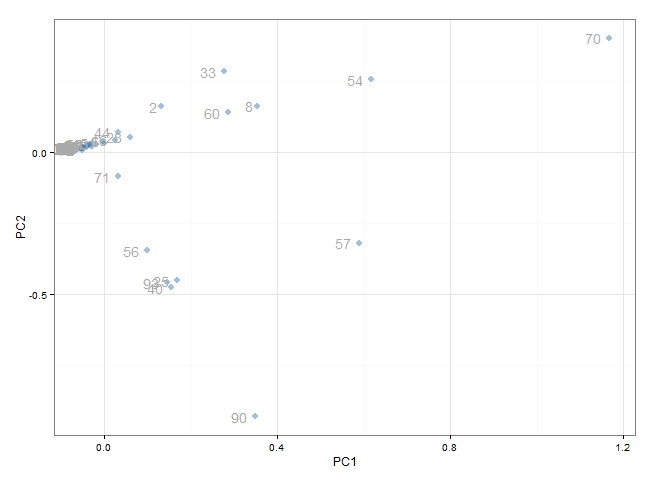
At a quick glance this appears to be effective. We can see that the majority of points are clustered around the origin. These represent the tables which 'behave normally'. What we are more interested in are the points which have scattered out from the others - these are the tables which 'behave abnormally' and are most likely to be the source of performance problems. In particular, we would be very interested in table 70, 54, 57, 90, 33, 60 and 8 and possibly the group of tables clustered around table 57.
It would be even better if we were able to identify the behaviour patterns of these tables. First of all, it would be a good idea to change the data labels to be the actual table names (we haven't done this here for privacy). Then, typically we would use an interactive plot to display the original DMV data on click or on hover. R's ggvis library is particularly useful, but there are also libraries using for javascript and google charts.
Another option is to use clustering to identify common groups of tables. Below, we use KMeans clustering to identify 6 table clusters and replot these:
# kmeans
clusters <- kmeans(data, 6)
plot.data$clusters <- factor(clusters$cluster)
g <- ggplot(plot.data, aes(x=PC1, y=PC2, colour=clusters)) +
        geom_point(size=3) +
        geom_text(label=1:102, colour="darkgrey", hjust=1.5) +
        theme_bw()
print(g)
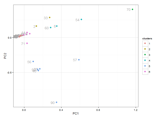
From the plot above we can see:
- table 70 is unique (belonging to cluster 3)
- cluster 4 which includes tables 60, 8 ad 54 all behave similarly
- cluster 5 includes 6 tables all of which behave similarly
- we are not particularly interested in cluster 1 or cluster 6
Once again, an interactive plot which displayed the original data would be helpful to explore the common patterns. But an alternative strategy would be to look at the cluster centers, which provide an "average" representation of each cluster.
  # cluster centers (i.e. "average behaviour")
  behaviours <- data.frame(clusters$centers)
  behaviours$cluster <- 1:6
  behavious <- melt(behaviours, "cluster")
  g2 <- ggplot(b2, aes(x=variable, y=value)) +
              geom_bar(stat="identity", fill="steelblue") +
              facet_wrap(~cluster) +
              theme_bw() +
              theme(axis.text.x = element_text(angle = 90))
  print(g2)
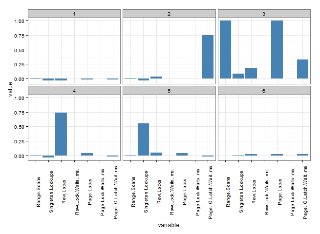
Finally, we have some really useful information to help with further investigation. Based on the PCA plot and the profiles above, we would be able to suggest to the investigating DBA:
- Cluster 3 (table 70) is a real mess. There are a huge number of Range Scans, Page Locks and Page IO Latch Waits. Experience would suggest that table 70 will be heavily implicated in table scans either through poor query design or poor indexing. Table 70 requires some serious attention.
- Cluster 4 (tables: 8, 54, 60), is dominated by Row Locks. Experience suggests that queries might be reading a lot of rows, and attention to indexing or filtering queries might be advised.
- Cluster 5 (tables: 25, 40, 56, 57, 90, 93) all exhibit high levels of Singleton Lookups. Experience suggests that these tables are lacking suitable covering indexes.
- All of the tables in clusters 1 and 6 are unlikely to be the major source of performance bottlenecks, and therefore we can probably disregard them at this stage.
Conclusions
The promise of in-database analytics and the integration of SQL Server 2016 with Revolution R is incredibly exciting. The potential to not only perform in-database analytics (customer segmentation, predictve analyitcs etc.) but to also transform the way that we interact with data and transform the way we operate (for example the way that we conduct performance investigations) is enormous.
Of course, this analysis can not replace the expertise of a senior DBA or developer in determining the right way to fix these problems. But more often than not, we have found this method has quickly identified the sources of bottlenecks, and provided an initial hypothesis about what might be happening in queries which read data from these tables. More importantly, these simple steps can be used by any team member to help reduce the burden on senior DBAs and quickly direct investigations towards the root issues.