

I'm a strong advocate of interactive, visual exploration of data - an area of analytics currently undergoing a boom thanks to tools like PowerBI and Tableau. Making data accessible and easy to understand seems to underpin the success of PowerBI / Tableau / Qlikview etc., and with such great tools already out there, where does R fit into the picture? In this post we will take a journey through the Pittsburgh Bridges dataset to identify the features of the dataset which are most important. We will begin with basic data summaries (e.g. counts), highlight the limitations of these simple measures, and then use a simple association study to quickly and intuitively visualise the key features. I'm also going to try something new (well, new for me), I have created a basic app using R and Shiny. You can follow along and explore the dataset on shinyapps.io (https://nickb.shinyapps.io/PatternRecognition_PittsburghBridges/).
About Pittsburgh Bridges
The Pittsburgh Bridges dataset is available via the UCI Machine Learning Repository. The dataset is made up of 108 bridges from around Pittsburgh and includes information about the bridge specifications (for example, Length, Purpose, Number of lanes...) as well as information about 5 engineering design decisions made for each bridge (TorD, Material, Span, Rel, Type). Intuitively, there should be a consistent pattern between the project specifications and the design decisions. We are going to try to uncover the key patterns / relationships.
Data Preparation
If you would like to follow along, then head to shinyapps.io (https://nickb.shinyapps.io/PatternRecognition_PittsburghBridges) and begin on the Data Input tab. Begin by selecting the full dataset in the left hand menu, under View Options choose raw and keep missing values. You should get the following view of the Pittsburgh Bridges data:
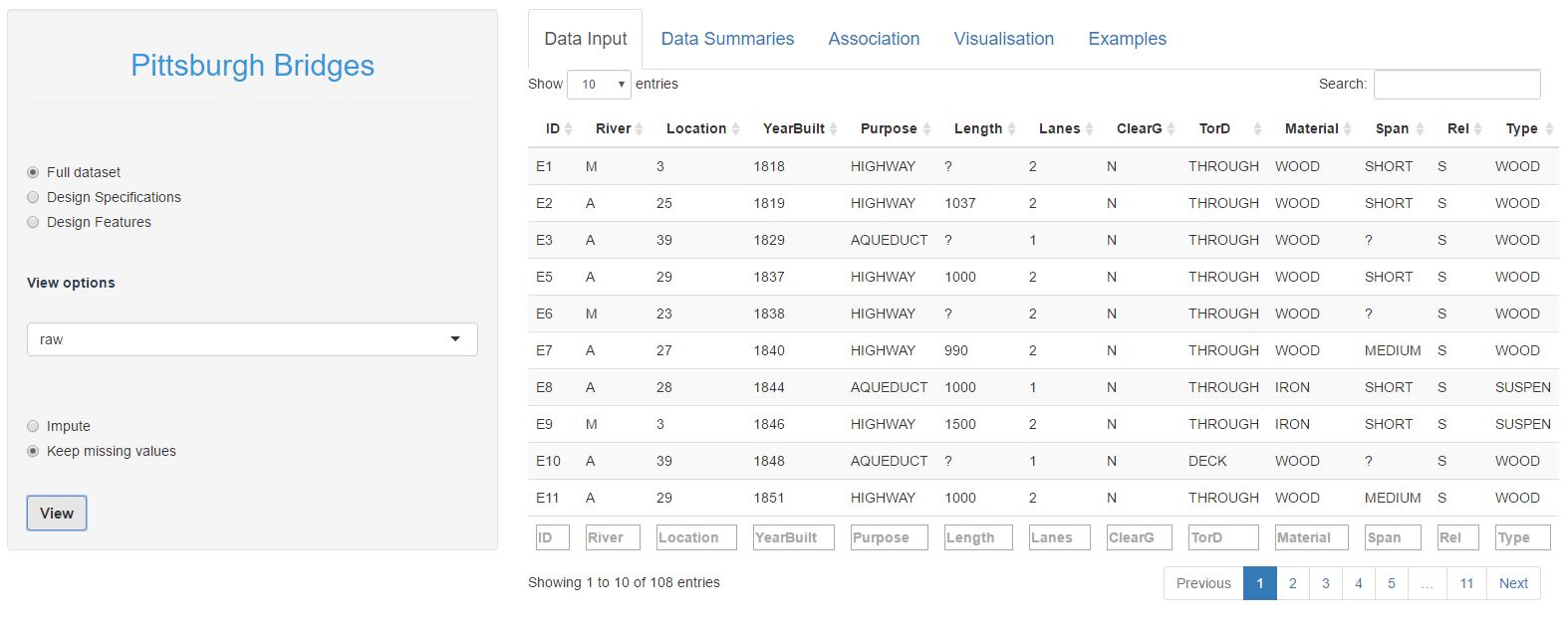
The first 8 columns represent the bridge specifications, the last 5 columns the design decisions. You can explore the dataset by clicking different columns to order by that column, or filtering on specific values in the text boxes at the bottom of the columns. For example, if you order by YearBuilt and scan through the table you will notice that the bridge material changes over time from predominantly wooden bridges through to steel bridges in later years. If you filter the dataset to look only at bridges made of wood, you will notice that wooden bridges tend to not clear the ground and be relatively narrow (1 or 2 lanes).
You would have also noticed that there are quite a few missing values (marked by a '?'). Missing values aren't an issue in the design decision columns, but we need to fill in the missing values in the specification columns before we go any further. If you're following along, do the following:
- Select design specifications in the left hand menu
- Change the view option to "numeric"
- Select Impute
- Click on View
For those who are interested, underneath the hood we are using a very basic machine learning model (k nearest neighbours) to fill in the missing values. In very simple terms, each bridge is mapped onto a grid and missing values are filled in as an average of the nearest 4 bridges, e.g. where Length is missing, the average Length of the 4 nearest bridges is used.
You might also note that there are 3 views of the dataset: raw, numeric and one-hot encoded. Raw and numeric are self-explanatory (the conversion to numerical values simply replaces the category names with a corresponding integer). One-hot encoding expands the dataset for example, the ClearG column is expanded out to 3 columns (one for each category: ClearGG, ClearGN, ClearG?) and we use 0/1 encoding to indicate whether a bridge belongs to each category or not. Typical BI dashboards can get by without this additional data wrangling, but to do more interesting statistics, we need to do a little more work behind the scenes.
Quick tips
If you're following along on shinyapps.io, it is important that you impute the missing values, as later steps rely on this. Additional data wrangling is a hidden evil in all analytical work that is often glossed over by shiny marketing material, but is an unfortunate reality 🙁
Data Summaries
Alright, with the initial data prep out of the way we can begin to explore the dataset. The Data Summary tab provides a means to explore the data in a typical BI-dashboard type of way (counts, averages etc.). If you're following along on shinyapps.io, you will notice that there are a few summary methods to choose from (count, mean, median, range). Because we are largely dealing with categorical data, count summaries are probably the most appropriate to use. Here's an example of the number of bridges in each ClearG category, broken down by material:
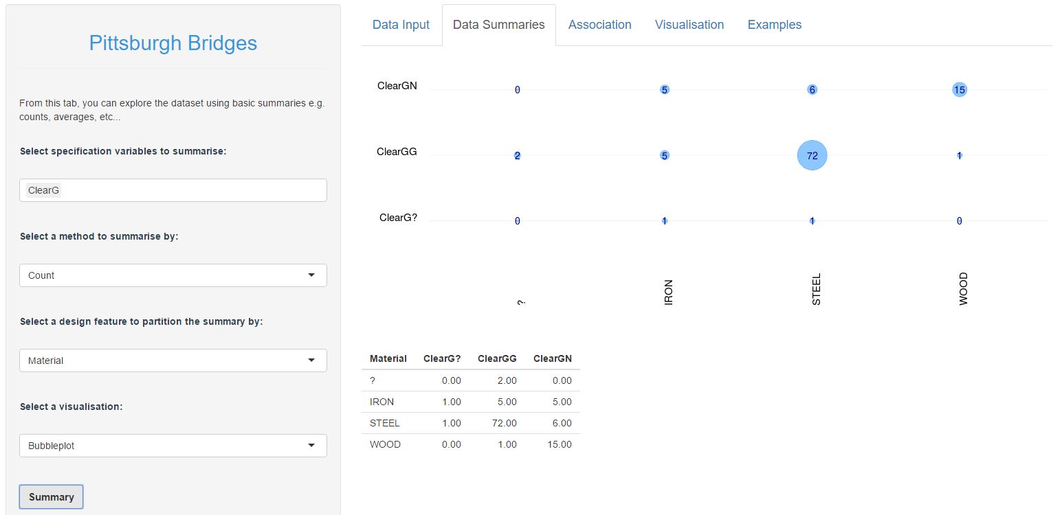
We can see here that Wooden bridges tend not to clear the ground (15 out of 16 wooden bridges), there is roughly a 50/50 split in Iron bridges, and bridges that do clear the ground are far more likely to be made of Steel. There are also two bridges where the Material is unknown, but both of which have ground clearance. I think this is genuinely interesting, and it helps to being to try to get a sense of what is going on in this dataset.
Here is another example, which compares the number of lanes with the TorD (drive through or drive over a deck) design decision:
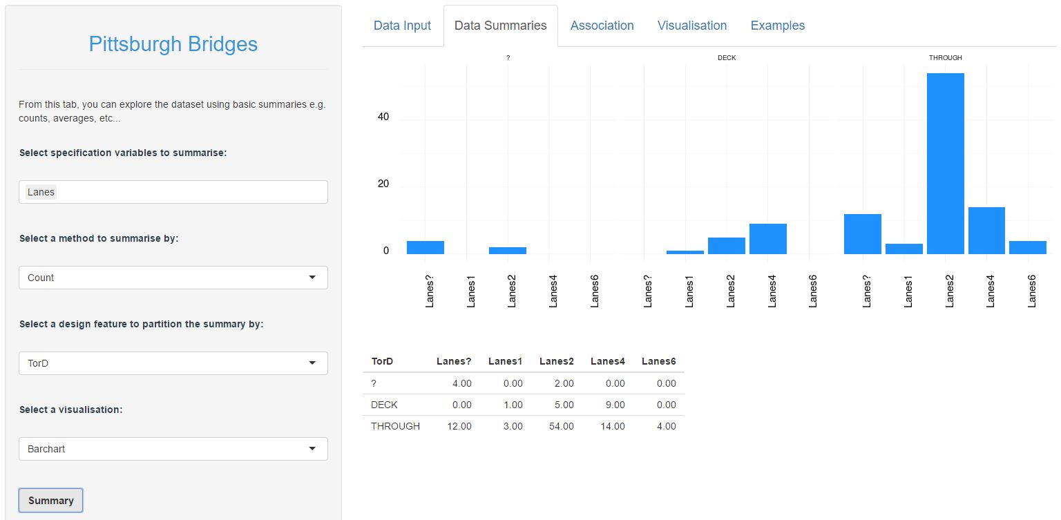
Again, the breakdown or number of lanes by TorD is obviously different between DECK and THROUGH bridges. It looks like there is genuinely something interesting here. And so we could carry on and continue to explore all the various combinations of specifications and design decisions (there are 35 combinations to explore). I'm no going to expand on this here, but if you are following along then you might like to try a few more examples such as:
- a bubbleplot of River vs. Span. What do you see?
- a barchart of Purpose vs. Rel. Are there differences in the breakdown of Purpose over different categories of Rel?
- change the summary method to median and create a bubblechart of YearBuilt vs. Type. Do you notice a pattern over time?
For simple datasets and very basic comparisons, this kind of dashboard summary is quite useful. However, even in a relatively small dataset as this, the process quickly becomes tedious and it becomes increasingly difficult to juggle all of the comparisons in our head. The question then: is there a simpler, more intuitive and quicker way to identify key patterns?
Association Study
Let's backtrack for a second here and clarify the question we are asking. We are interested in discovering any consistent patterns between the bridge specifications and the design decisions. In practicle terms, this means that we want to find sepcifications which occur more frequently with some design desicions and not others. Statistically, we are looking for associations between specifications and design decisions.
Conceptually, the idea of 'association' is incredibly basic: do we observe more of something in one group than we do in another? For example, if we observe different groups of friends, are there differences in the behaviours between groups? Take the table below for example:
| Smoke | Not smoke | % smoke | |
| Male | 25 | 68 | 37 % |
| Female | 17 | 50 | 34 % |
From the table above, we can see that there are more men who smoke than women. However, the relative percentage of smokers is roughly the same in both men and women (note that this data is completely made up). So we would conclude that there is no association between gender and smoking, based on these data. And this is the key difference between basic count summaries (like the bubblecharts previously) and the statistical notion of association: we are interested in knowing if there is a significant difference between groups or to put it another way: is the difference that we observe, more than we would expect to observe by chance?
This is the exact question which a Chi-squared test of association will help us answer. If you're interested in the theory behind association, I would encourage you to lookup 'association' and 'pearson's chi-square test', there are heaps of resources which will give a better explanation than I can 🙂 Let's instead focus on how to implement this in R.
As an example, let's test for association between ClearG and the bridge type. In R, first we will create a count table between the two:
> crosstab <- table(bridges$specs$raw$ClearG, bridges$design$raw$Type)
> crosstab
? ARCH CANTILEV CONT-T NIL SIMPLE-T SUSPEN WOOD
? 0 0 0 0 0 1 1 0
G 2 12 10 6 1 41 7 1
N 0 1 1 4 0 2 3 15
>
And then we can simply use the chi-square function:
> chisq.test(crosstab)
Pearson's Chi-squared test
data: crosstab
X-squared = 61.48, df = 14, p-value = 6.443e-08
Warning message:
In chisq.test(crosstab) : Chi-squared approximation may be incorrect
>
We get a ridiculously low pvalue. This means that observed data (ClearG vs. Type) is unlikely to have occured purely by chance. Technically, this means that there is very little evidence of no association, which is subtely different from evidence that there is association. But for practicle purpose, we will interpret this as strong evidence that there is an interesting pattern here.
Performing a basic association test is that easy and so I have wrapped this test into a loop to test all 35 combinations of specifications with decisions. If you are following along on shinyapps.io, then head to the Association tab, ensure that Chi-sq test is selected and hit the Calculate button (no need to change the design feature selection, this is ignored if you have Chi-sq test selected). Here is the resulting visualisation:
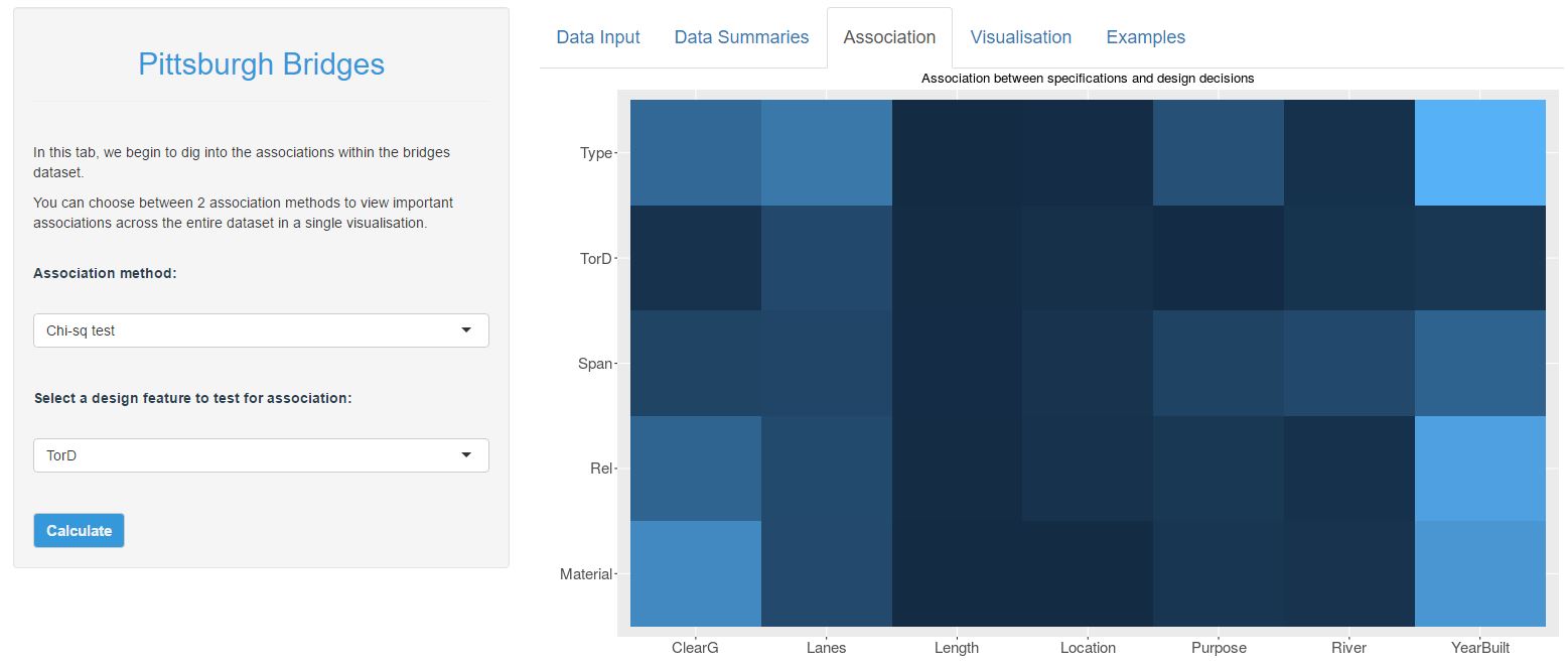
The heatmap above shows the strength of evidence that there is an association between each specification with each design decision. Dark blue inidicates that there is no interesting pattern, and light blue indicates that there is an interesting pattern. Therefore, we can clearly see that there is a strong association between the YearBuilt and nearly all of the design decisions. There are also strong associations between ClearG with Type and Material as well as between Lanes and Type. There may also be something interesting between Purpose and Type. Perhaps also there is an association between Span and (Purpose, River, YearBuilt), though it would seem that the evidence isn't as strong here.
I'd encourage you to take a little time to explore this chart, and then go back to the basic data summary tab and try to compare your conclusions. Do your conclusions from the bubblecharts and barcharts marry up with the heatmap above? Can you find examples where there appears to be a pattern in the bubblecharts / barcharts but for which there is no statistical evidence? (hint: explore the TorD feature)
This is a visualisation that I like. The key features of the Pittsburgh Bridges dataset are immediately obvious to see - not only that, but we can also get a feel for how strong these features are, or how important they might be. Perhaps just as important is that underpinning this visualisation is a robust statistical method that we can be sure identifies the interactions which are not meaningful. This is an important point, particularly if you are trying to identify key areas to explore further or invest time / energy / resources into.
Conclusion
I am a huge fan of basic exploratory visualisation, especially interactive visualisation of data. As part of this, I genuinely believe that there is a place for typical BI-dahsboards, particularly when looking at simple patterns. But once you start exploring more complex datasets with multiple comparisons to juggle, there is a need for more intuitive interfaces, methods and visualisations. This, for me, is where R fits into the landscape. R has brings the power of robust statistics along with the flexibility to craft simple and intuitive visualisations.
Before leaving this post, I will stress that the chi-sq test isn't the end of the story for the Pittsburgh Bridges dataset. Whilst the chi-sq test does a good job of highlighting the most important relationships, it isn't actually capturing them all. This is because we are only making simple comparisons (one specification vs. one design feature) and we haven't considered more interesting combinations of features. In a future post I will expand on this further. In the meantime, you can look ahead and play with the Visualisation tab on shinyapps.io, which begins to delve into more interesting features of the Pittsburgh Bridges dataset.
Tips for using the app on shinyapps.io
My apologies, there are still a couple of bugs that I need to iron out in the shiny app. Everytime you load the app, there are a couple of things you must do before any of the other features will work:
- impute missing values in the specifications dataset (follow the instructions in the data preparation section)
- create at least one basic summary visualisation. For some reason (yet to figure this out...), none of the other visualisations will show up until after you have created a bubblechart or a barchart.
I will try to iron these bugs out. In the meantime, follow the couple of quick steps above everytime you first load the app.
