Create AT&T Network Hierarchy Diagrams using SQL Server Data
-
Comments posted to this topic are about the item Create AT&T Network Hierarchy Diagrams using SQL Server Data
-
Gnome mapping in wet lab environments
I assume genomes were mapped, not gnomes...
-
Is that how you spell it? I've no idea about chemistry but love some of the R packages their community are developing!
-
Hi there,
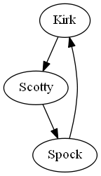
In your opinion what would be the advantage of this R approach compared to, say, direct graph visualization with GraphViz dot command, example:
digraph STG
{
"Kirk" -> "Scotty"
"Scotty" -> "Spock"
"Spock" -> "Kirk"
}
-
I think the advantage is in situations where nodes have multiple edges. In the article there is a CTE that generates a network hierarchy, each node has three edges to other nodes. I suspect GraphViz can manage this too but many applications and packages can’t.
-
Thanks for your comment Paul.
-
Had some trouble getting this to work in RStudio, wouldn't install the packages as in the commented section. This worked though:
source("https://bioconductor.org/biocLite.R")
biocLite()
biocLite("graph")
#biocLite("graphNEL") <- didn't work, fails but apparently wasn't needed, code runs w/out it
biocLite("Rgraphviz")Nice post, thanks for the tips on graph viz tools.
-
Thanks for the feedback, I’ll update the comments section in the next release with this.
Viewing 8 posts - 1 through 8 (of 8 total)
You must be logged in to reply to this topic. Login to reply