

I wrote about the violin plot custom visual by Daniel Marsh-Patrick back in February. I thought it was a good visual then, but version 1.3 has recently been released with some nice enhancements.
First, the violin plot is now a certified custom visual. This means that it has been tested by the Power BI team to ensure it meets certain requirements, one of which is that the visual does not access external services or resources. You can be confident your data isn’t being sent externally when you use the violin plot.
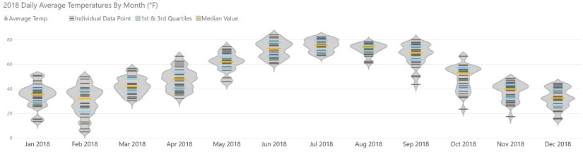
As for the functional enhancements, a new legend has been added. This is a great addition to make the chart clearer and more easily read, especially for audiences that may not be familiar with how the violin plot works. The customizable legend calls out what markers are used for mean, median, and quartiles.
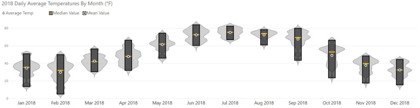
Another good enhancement is the new column option for the combo plot. It allows you to have your plot show as a range column chart where the bar spans from the minimum value to the maximum value for each category. I chose to show only the mean and median in the example below, but you can also add quartiles.
The barcode plot also has a nice enhancement in the tooltip. Now when you hover over a bar, you can see the number of samples with the highlighted value.

You can check out Daniel’s blog post to see the full list of enhancements for this release. Tweet me if you make something cool and shareable with the violin plot in Power BI.