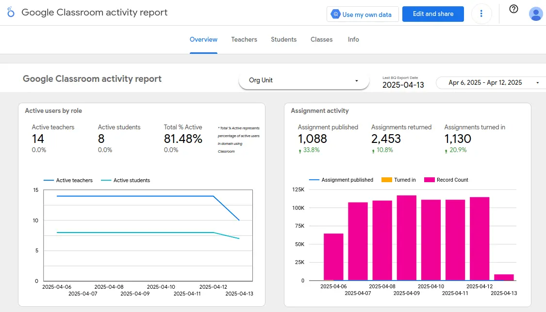
Let's build a real data dashboard. This guide will walk you through the entire process using free tools like BigQuery and Looker Studio, even if you’re just getting your feet wet with SQL.
If you're aiming for a career in data analysis, you can't get around learning SQL. It’s the language you use to pull information from databases and turn raw numbers into actual insights. But coming up with your first few project ideas can be a real roadblock. That’s what this guide is for. You're about to build a complete data dashboard from scratch using Google's free BigQuery and Looker Studio platforms, letting you analyze real crime data from the city of Chicago.
And if you want to build a stronger foundation first, I found the SQL for Data Analysis track to be a fantastic resource. It's a complete learning path that takes you from basic queries all the way to complex reporting and window functions. The interactive courses help you learn by doing, which is exactly what you need to feel confident enough to tackle projects like this one.
The Tools for the Job
We'll use two main tools to get this dashboard built, and both work right in your browser.
BigQuery
BigQuery is a powerful data warehouse from Google. Think of it as a massive database designed to handle huge amounts of data and answer analytical questions fast. For a beginner, it's perfect because there's nothing to install. Google’s free tier is generous, so you’re unlikely to spend a dime while you’re learning. It also gives you access to a library of free public datasets on topics ranging from crime to public health.
Looker Studio
Looker Studio is Google's free business intelligence tool. It lets you transform data into interactive and shareable dashboards. It’s intuitive and visual, allowing you to create professional-looking reports with drag-and-drop charts. Plus, it can connect directly to BigQuery, which makes our job a whole lot easier.

The Chicago Crimes Dataset
For this project, we'll be using the Chicago Crimes dataset, which is available for free in BigQuery. The City of Chicago publishes this data, and it's updated every week, so you’ll be working with real, current information. The dataset has one table, called bigquery-public-data.chicago_crime.crime, and each row represents a single reported crime.
Here are some of the key columns we'll be working with:
date: The date and time the crime occurred.block: The approximate address of the incident.primary_type: The main category of the crime (e.g.,THEFT,BATTERY).description: A more specific description of the crime.location_description: The type of place where the crime happened (e.g.,STREET,PARKING LOT).arrest: A true/false value indicating if an arrest was made.domestic: A true/false value indicating if the incident was domestic-related.latitude,longitude: The geographic coordinates, which you can use for mapping.year: The year the crime occurred.
Asking the Right Questions
A good dashboard starts with good questions. You can come up with your own, but to get us started, I focused on these:
- How many total crimes were reported in a given period?
- How many arrests were made during that same time?
- What are the top 5 most common types of crimes?
- What are the top 5 crime types that resulted in an arrest?
Before we start writing the queries, let's get a feel for the data.
Exploring the Dataset in BigQuery
First, you need to get familiar with the data you're working with.
- Open the BigQuery console at console.cloud.google.com/bigquery.
- In the panel on the left, find
bigquery-public-data, expand it, findchicago_crime, and click on the crime table. - Click the SQL query button at the top to open the editor.
- Run this simple query to see the first 10 rows:
SELECT * FROM `bigquery-public-data.chicago_crime.crime` LIMIT 10;
From here, you can start to play around. Filter by different dates, group by crime types, or check how many arrests were made. This is how you'd start exploring any new dataset. (Just remember to wrap the full table name in backticks.)
Building the Queries for Your Dashboard
Now, let's write the SQL that will power our dashboard. I'm focusing on data from 2024 to keep it simple, but you can easily change the year.
Total Reported Crimes
This query simply counts all the crimes reported in 2024.
SELECT COUNT(*)
FROM `bigquery-public-data.chicago_crime.crime`
WHERE year = 2024;
Total Arrests
This is similar to the last query, but we add a filter to only count rows where an arrest was made.
SELECT COUNT(*)
FROM `bigquery-public-data.chicago_crime.crime`
WHERE year = 2024
  AND arrest IS TRUE;
Top 5 Crime Types
This query groups all the 2024 crimes by their primary type, counts them, and then gives us the top 5 most frequent.
SELECT
  primary_type,
  COUNT(*)
FROM `bigquery-public-data.chicago_crime.crime`
WHERE year = 2024
GROUP BY primary_type
ORDER BY COUNT(*) DESC
LIMIT 5;
Top 5 Arrest Types
This query finds the top 5 crime types in 2024 that most often led to an arrest.
SELECT
  primary_type,
  COUNT(*)
FROM `bigquery-public-data.chicago_crime.crime`
WHERE year = 2024
  AND arrest IS TRUE
GROUP BY primary_type
ORDER BY COUNT(*) DESC
LIMIT 5;
Connecting Looker Studio to BigQuery
Now that we have our queries, we'll use Looker Studio to visualize the results.
- Open Looker Studio and create a new blank report.
- In the Add data to report panel, choose BigQuery.
- Select Custom Query and pick your billing project (if you're using the free sandbox, you won't be charged).
- Paste your first SQL query into the text box and click Add.

You can repeat this process to add all four of our queries as separate data sources for the dashboard.
Creating Your Dashboard in Looker Studio
This is where your dashboard comes to life.
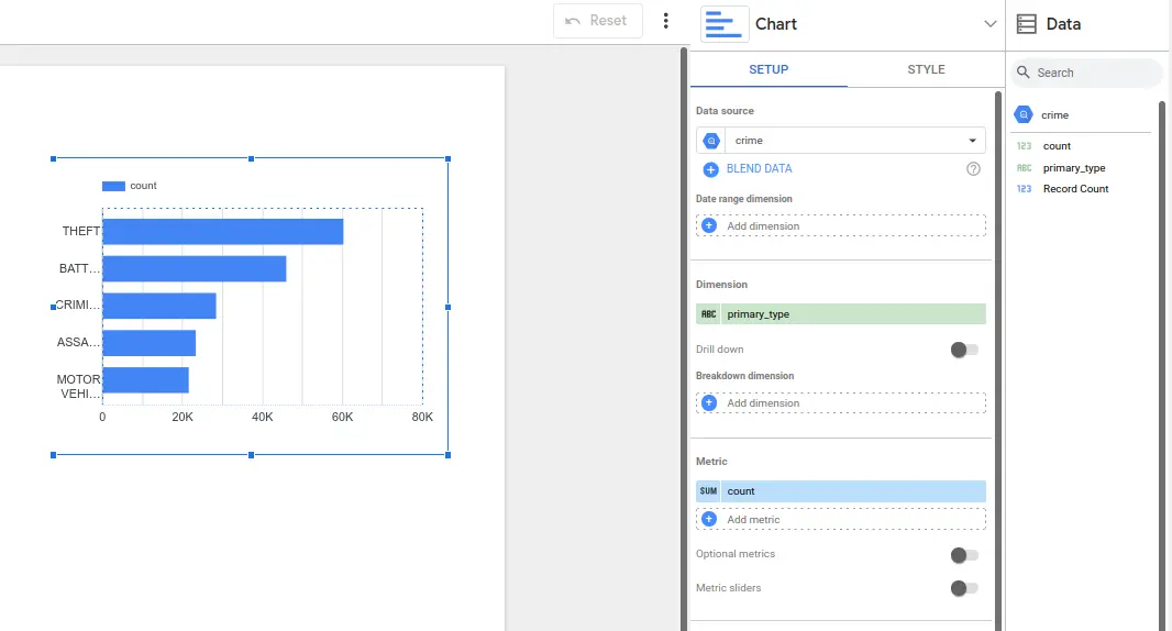
1. Click the Add a chart button and choose a chart type, like a bar chart or scorecard.

2. Looker Studio's chart editor has two main tabs:
- The SETUP tab is where you pick your data source and tell the chart what data to show (dimensions and metrics).
- The STYLE tab is where you customize the look, like fonts, colors, and titles.
For example, you can create a bar chart to show your top 5 crime types and use scorecards to display the total number of crimes and arrests. You can also add line charts for trends or even maps to visualize locations. Arrange everything to create a clear and compelling story.

The final dashboard should look like this:

Taking Your SQL Skills Further
If you had fun building this dashboard, don't stop now. Find other datasets and try building more dashboards on your own. The more you practice, the better you'll get at asking good questions and finding the answers in the data.
If you're ready to take your skills to the next level, I'd once again recommend the SQL for Data Analysis track. It's a great hands-on path that will teach you to think like a data analyst. You'll move beyond the basics and learn to write advanced queries, find trends, segment data, and prepare reports. The interactive exercises are what make it so effective—you learn by doing, not just by reading. Before you know it, you'll be building dashboards that answer real, important questions.
The post From Zero to Dashboard: A SQL Project for Total Beginners appeared first on RealSQLGuy.

