

 |
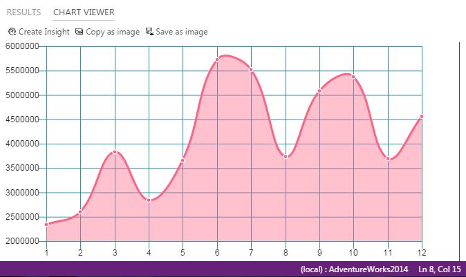
| Sample chart for quick insights |
SQL Server Operations Studio will be a new tool for managing SQL Server, Azure SQL Database, and Azure SQL Data Warehouse, this tool is not meant to replace SSMS, and is focused more to Database Developers than for Database Administrators.
On this post I want to share with you an option to create quick charts from the results window.
View data as chart
Open SQL Server Operations Studio and select a new query (Ctrl + N)
Once you have your new query window and you are connected to your server, write your query (just note that since this is a quick function, it won't work properly for complex charts)
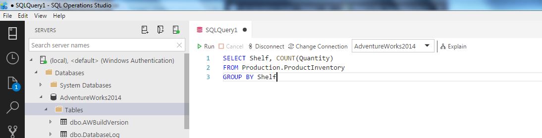
Run your query clicking the run button or hitting F5 (Ctrl +F5 for selected text) and once the results are displayed, select the View as Chart option in the right of the results window
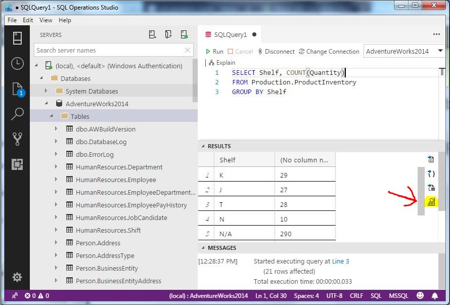
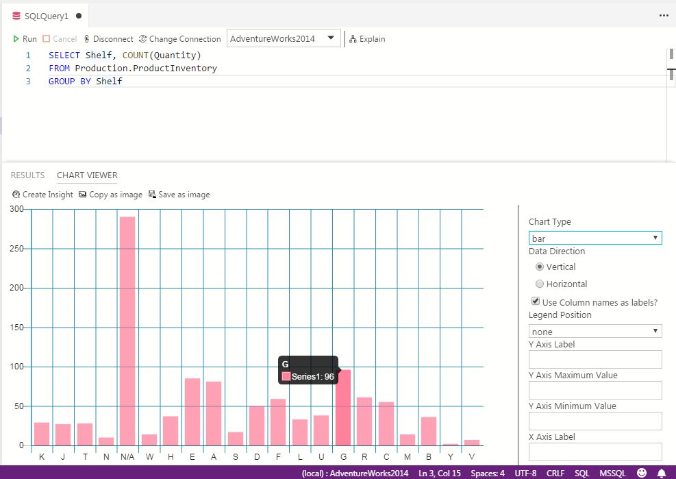
When you click this option, an horizontal bar chart will open by default, but you can change the chart type on the right side
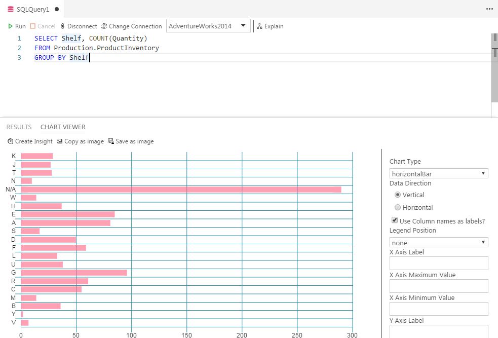
Also if you hover the mouse over a point, it will display the value.
You can save the chart also if you want or create an Insight template with the options above the chart.
And that's all. As you can see, the customization options are very limited, but the product is still in preview, so new features can come in newer releases.
If you haven't download the SQL Server Operations Studio, you can do it from Microsoft Site here
More info:
