

UPDATE: I also published a blog post using a DAX only approach. Check it out here.
Recently someone had a question if it was possible to change the color of a shape depending on the value of a measure. Imagine for example a dashboard with the picture of a database server. If up-time is good (availability >= 95%), the server would color green, if it was bad it would color red. This is not so hard to do in Visio (I saw it once in a SharePoint 2013 business intelligence course several years back), but the requirement was to do it in Power BI Desktop.
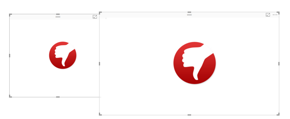
In Reporting Services, we would use expressions on the properties of the shape to get it done. However, Power BI currently doesn’t have expressions to set, so we have to think a bit out of the box here. My idea was to have a measure that calculates the up-time of the server and depending on the result, it would change the URL to a image. This means you need to have images of all the different possible states of your shape. In this blog post I’ll use the following two shapes:
thumbs up if availability >= 95%

thumbs down if availability is lower than 95%

I loaded the following test data into Power BI Desktop:
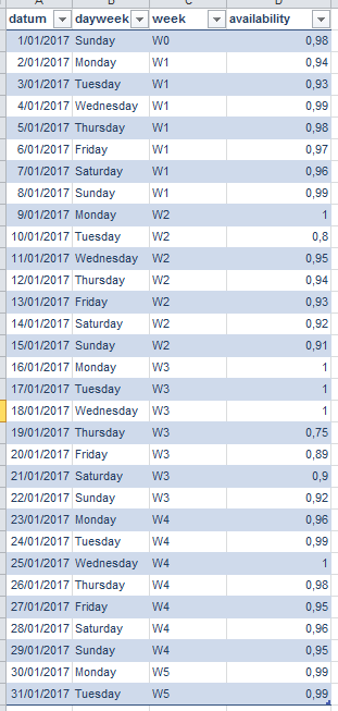
I added some extra fields so I have some to slice and dice in the report. In Power Query, I also added the weekday number using an out-of-the-box transformation.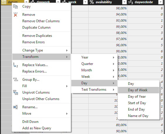
On my system this returns 0 for Mondays and 6 for Sundays (this might depend on your locale). I’m fine with this, because Mondays are the start of the week (otherwise they wouldn’t call Saturday and Sunday the weekend, gottit USA?). I will use this weekday number column to properly sort my dayweek column.
Unfortunately it’s currently not possible to load images with Power Query into the model, something that is possible in PowerPivot or in Tabular models. So we have to read them from disk, or from a URL.
The actual measure is straight forward:
ImageURL = IF(AVERAGE(ServerAvailability[availability]) >= 0.95,"D:/Tmp/Images/thumbsup.png","D:/Tmp/Images/thumbsdown.png")
You can insert images into Power BI Desktop, but these are static images. If you want them to dynamically change, you need the Image Viewer custom visual. Unfortunately, it doesn’t support measures, only columns. Since we want dynamic changes, fixed column values are not going to work. Someone proposed a work around on the Power BI forums, but this only works if you have a fixed set of attributes you want to slice on (for example, 4 categories). I want a totally flexible solution (e.g. each month we have a couple of new weeks to slice on), so again, not possible.
The only solution I could think of that would still work: using R visuals. It took me a while to find the right plotting method (one that doesn’t clutter the plot so there are too many white areas and one that preservers the original size). I tried rasterImage and the imager package, but both had too much white space:
Finally I settled with the ggplot2 package and the qplot function.
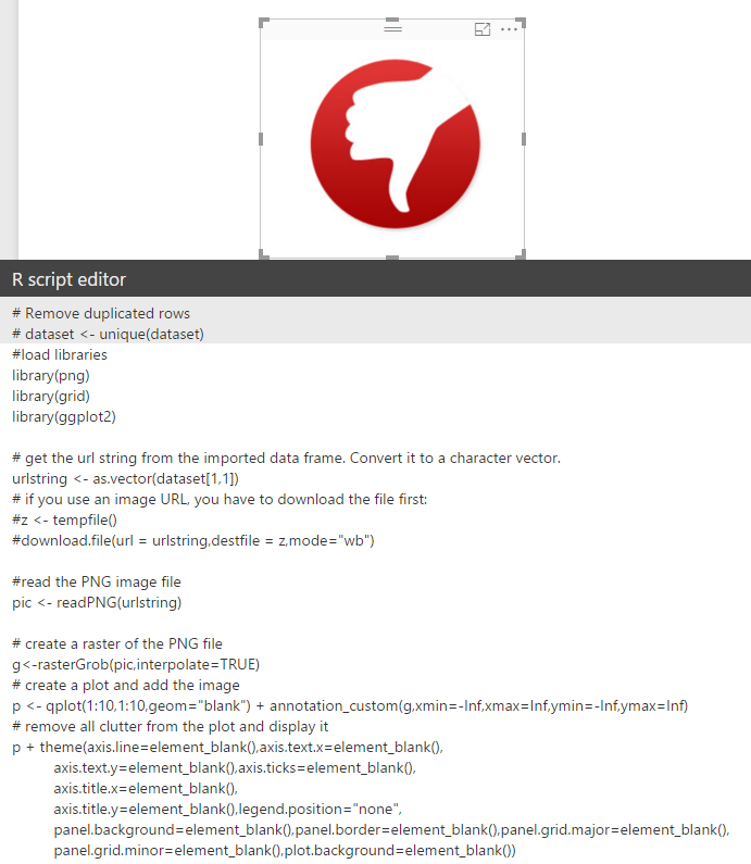
The full R script is as follows:
#load libraries
library(png)
library(grid)
library(ggplot2)
# get the url string from the imported data frame. Convert it to a character vector.
urlstring <- as.vector(dataset[1,1])
# if you use an image URL, you have to download the file first:
#z <- tempfile()
#download.file(url = urlstring,destfile = z,mode="wb")
#read the PNG image file
pic <- readPNG(urlstring)
# create a raster of the PNG file
g<-rasterGrob(pic,interpolate=TRUE)
# create a plot and add the image
p <- qplot(1:10,1:10,geom="blank") + annotation_custom(g,xmin=-Inf,xmax=Inf,ymin=-Inf,ymax=Inf)
# remove all clutter from the plot and display it
p + theme(axis.line=element_blank(),axis.text.x=element_blank(),
          axis.text.y=element_blank(),axis.ticks=element_blank(),
          axis.title.x=element_blank(),
          axis.title.y=element_blank(),legend.position="none",
          panel.background=element_blank(),panel.border=element_blank(),panel.grid.major=element_blank(),
          panel.grid.minor=element_blank(),plot.background=element_blank())
This gives the following result:
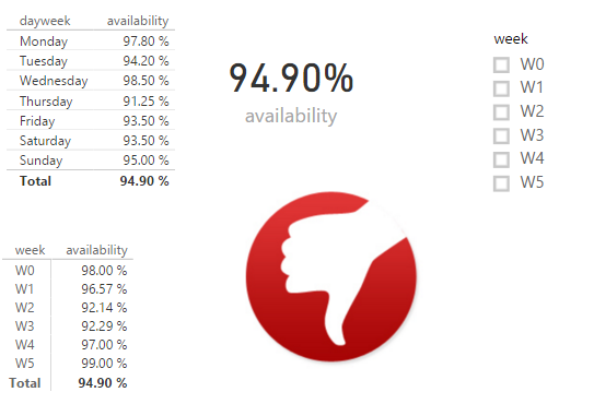
Now I can add other elements to the report and test my solution. When nothing is selected, the grand total average is 94.90%, which results in a thumb down image.
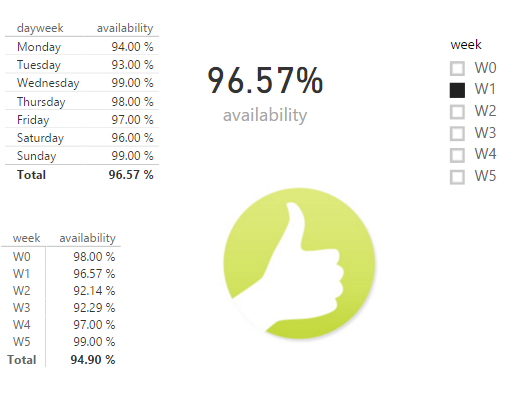
If I change the week slicer to week 1, the measure rises above 95% and we get a thumbs up.
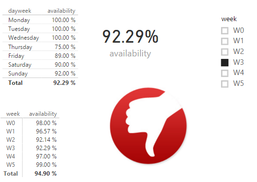
If we select week 3, we get a thumbs down:
You could also add a slicer on day of the week, and that would work as well. Note that there is a small delay once we change the slicer, since the image has to be loaded from disk first. You could make the solution work with image URLs as well, in that case you have to modify the measure of course but also you have to explicitly download the image file in the R script (which you can see in the comments). You might have also noticed I used forward slashes in the image file names; this is typical in the R language where the backslash is a reserved character.
You can do all sorts of cool stuff with this solution, but to be honest, it’s quite the work around. You need to use R scripts, which means having an R distribution installed on all the machines that are going to view this report in Power BI Desktop, and have all the necessary packages installed. I’d rather have the Image Viewer visual accept text measures (I’ve send a note to the developers) or that Power BI Desktop includes out-of-the-box functionality to change properties of shapes and images.
