

The Gestalt principles of visual perception describe how humans tend to organize visual elements into groups or unified wholes to help us make sense of visual stimuli. Basically, we perceive the visual world as complete objects rather than a bunch of independent elements.
For instance, you probably see a triangle in the white space in the first image below. And in the second image, you probably see a rectangle.


Your brain is simplifying visual elements into what it commonly finds them to be (the triangle and rectangle).
There are 8 Gestalt principles that are particularly relevant to data visualization:
- Proximity: We perceive objects that are close to each other as being in the same group
- Similarity: We perceive visually similar (by color, shape, etc.) as being in the same group.
- Closure: We perceive objects as being whole even when they are not complete (such as the rectangle above).
- Symmetry: We tend to perceive objects as being symmetrical and pivoting around a center point.
- Common Fate: Objects are perceived as lines that move along the smoothest path
- Continuity: We perceive objects that are aligned with each other as being in a single group or object, creating a single path or shape rather than multiple distinct paths or shapes.
- Good Gestalt/Prägnanz: We like to find simple patterns. We perceive objects as related if they form a pattern that is regular, simple, and orderly.
- Past Experience: We categorize visual stimuli based upon our past experience. If objects are usually perceived close together in time or space, we tend to see them as being related. This is how we recognize letters and words.
Here’s a 20-second video I found that illustrates many of these principles.
None of the Gestalt principles work in isolation – you’ll usually find multiple principles at work simultaneously.
Gestalt Principles in Power BI
Gestalt principles can help us highlight patterns and reduce noise in data visualization. They can also help us create a visual hierarchy and employ symmetry in our designs for a more pleasing user experience.
Some Gestalt principles are very similar to our understanding of preattentive attributes. This is demonstrated in the set of 3 charts below.
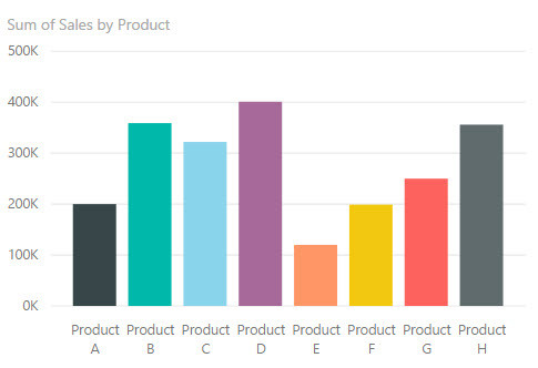
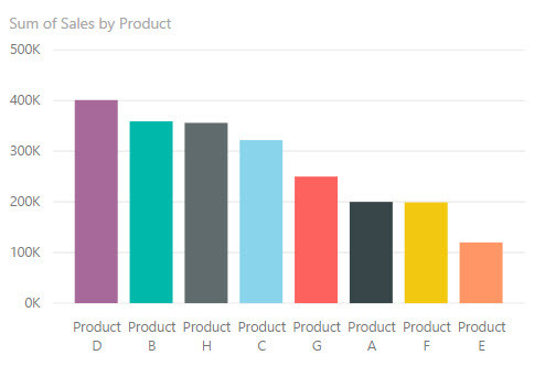
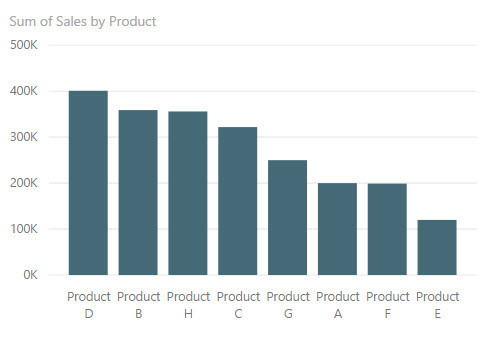
In the top chart, bars are ordered alphabetically by product name. In the middle chart, we changed the bar order to be descending by sales amount. This satisfies our need for the trend to make a smooth descending path as seen in the Gestalt Principle of Continuity. In the third chart, we have changed the color of the bars to all be the same. The color of the bars didn’t have any special meaning, and the entire chart used the same categorical axis and measure. This follows the Gestalt Principle of Similarity. Instead of seeing individual bars, we now see them more as a group of bars.
Here’s another example.

In the top chart, try comparing sales for each product within a quarter. Which product had the highest sales in Q3? This should be fairly easy. Now try using the top chart to compare the sales for Product B over time. It’s a bit more difficult because you have to pick out the blue bar in each cluster.
Now try using the bottom graph to examine sales for Product B over time. It should be much easier because the bars for each quarter are close together.
You can see these charts on PowerBI.com here.
What Does This Mean For Report Design?
Here are some things you can do to take advantage of Gestalt Principles in your Power BI reports:
- Check your placement of charts on the report page. Are charts that are closer to one another actually more related than other charts that are not as close together? Are you leaving enough white space between visuals so that we can tell where one visual ends and the next begins?
- Be sure to group things appropriately for the most common analysis to be performed, such as with the clustered bar chart example above. Proximity of objects within a graph is important.
- In simple bar charts with one category and one measure, use only one color on the bars, unless you are purposefully trying to highlight a trend, grouping, or data point.
- Make sure your colors have consistent meaning. If you are using light blue to show sales in one chart, try not to use that same light blue to show expenses in another chart on the same page, unless all your charts on the page or in that section use that color for a specific reason. (Note: It’s possible to make a nice Power BI report with only two colors. I’m not suggesting you use multiple colors all the time. But if it makes sense to use multiple colors, make sure your colors have consistent meanings because those colors imply grouping.)
- Order bars/columns by descending or ascending value when not trying to show trend over time.
- Use low saturation or neutral hue colors as backgrounds in charts so data points stand out more than the background.
- Be careful with network graphs. In these graphs, proximity does not necessarily indicate similarity, and spatial position does not always have a meaning. It’s just an algorithm determining where to place objects within the chart. Check for any false conclusions that may be drawn by these properties and change your chart or add explanatory text to help users understand what information you are trying to convey.
More Information
You can find more information about Gestalt Principles at the following links:
- Gestalt Principles for Information Design
- How To Make Data Visualization Better With Gestalt Laws
- Gestalt Principles for Data Visualization
This post is part of a series. Go here to see the list of posts in the series.
