In this article, I will show an example to demonstrate some interesting techniques using the Matrix visual. This was inspired by a friend, Albert Herd, who asked for some help in our Malta user group to solve a problem.
The data used in the example is the list of numbers drawn on the Maltese lotto. Each record is one number from a drawing, and each drawing has five records which are the five numbers from each drawing. You can download a zip file containing a csv file with the source data, a pbix file with the data already imported to start creating the visuals, and the completed solution.
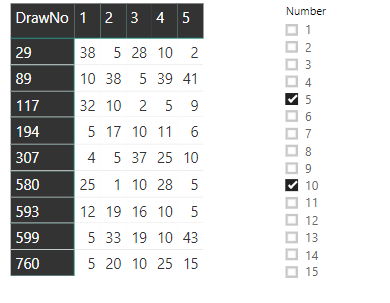
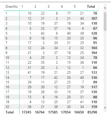
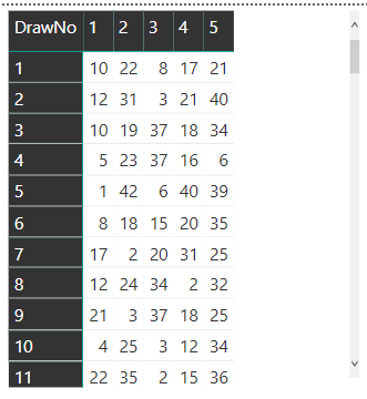
By using the Matrix visualization, the numbers for each drawing can be displayed as a single line as shown in this figure.

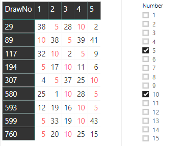
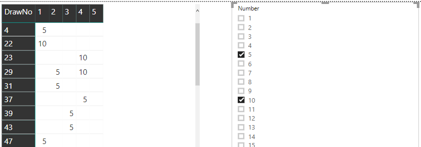
The goal is to add a slicer that filters the rows based on the number or numbers chosen. For example, if you select 5 and 10, the rows that contain those numbers will be displayed:
It’s also possible to add conditional formatting so that the selected numbers light up in the colour of your choice.
Accomplishing this is not as straightforward as it might seem. Continue reading to learn more.
The Data
Each record in the table is one number drawn on a specific lotto drawing. Each drawing has 5 numbers, so each drawing has 5 records in the table. The table is called Lotto, and the fields most important for this example are these:
DrawNo: The number of the drawing
DrawOrder: The order of the drawn number
Number: The drawn number
Starting with a new Power BI dashboard and import the csv file. As an alternative, you can also start with the MatrixSimpleStart.pbix file provided in the zip file.
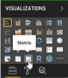
Creating the Matrix
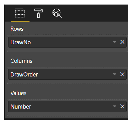
The Matrix visual has three fields to be configured: the field used for the rows, the field used for the columns, and the field used for the values. Each line of the visual should show a single drawing with the five numbers. Due to that, the field for the rows will be the DrawNo, aggregating the drawings on each row.
Each drawing has five records, the five drawn numbers, so how do you show five records on each line? The content of the field you choose as a column field will be used as the title of the columns. The best choice is easy: DrawOrder. Each row shows the DrawNo. Each column has the DrawOrder as a title and will show the drawn Number as a value in the column.
Once you have the file MatrixSampleStart.pbix opened or the csv file imported, follow a simple sequence of steps to configure the Matrix visual. You’ll be working in Report view.
-
- In the Fields Pane, drag the three fields, DrawNo, DrawOrder, and Number to the correct slots.
Once you have the fields in the correct spots, the Matrix will resemble this image:
-
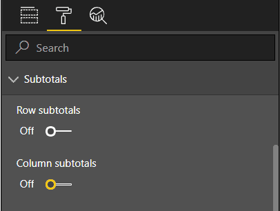
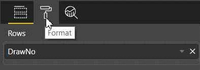
- In the Visualizations Pane, with the matrix selected, click the Format button and disable the subtotals for rows and columns as they are not needed.

-
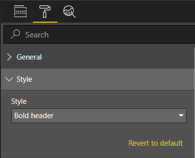
- While still in the Format tab, under the Style option, change the style of the matrix. You can choose any available style; I suggest Bold Header.
- Still in the Format tab, change the font size under these three different options: Row Headers, Column Headers, and Values. I like to use 12 as font size.
The completed Matrix should look like this:
Creating a Slicer and Filtering the Matrix
The matrix contains numbers from lotto drawings, so a good option for a slicer is to filter the drawn numbers, showing only the drawings with the selected drawn numbers.
There are three possible approaches to create a slicer:
- Create a slicer based on the original table fields (Lotto)
- Create a slicer based on a new calculated table by using a DAX expression to create the new table from the original one
- Create a slicer based on a What-If parameter
NOTE: DAX is an expression language used in tabular models, such as the model in Power BI, to allow creating calculations over the model.
The first two options keep a relationship with the original table (Lotto). Although this relationship is not important for the result at all, it causes a small bug. The slicer needs to be inserted in the page before the matrix. If the slicer is inserted after the matrix, some of the slicer configurations will not be available. The slicer needs to be inserted first.
Creating a Slicer from the Same Table
The easiest way to add a slicer is from a field in the table. Unfortunately, it doesn’t quite provide the solution in this case. Follow these steps to see how to add a slicer based on the table:
-
- Drop the matrix
- In the Fields Pane, select the Number field in the Lotto table
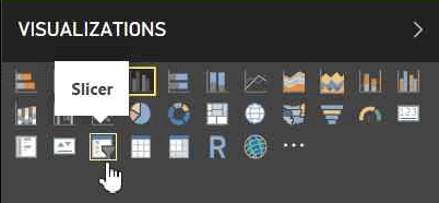
- In the Visualizations Pane, change the visual to Slicer
-
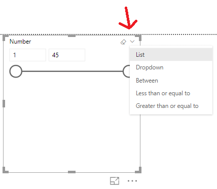
- In the slicer type option, inside the slicer, change the slicer format to List
-
- In the Visualizations Pane, with the slicer selected, click the Format button. In the Selection Control options, disable the Single Select option, allowing multiple numbers selection
- Repeat the steps in the “Create the Matrix” section to recreate the matrix.
To test this solution, select two numbers, such as 5 and 10, in the slicer and look at the result in the matrix. You will notice two problems:
- The draws are filtered to show only the selected numbers instead of all the numbers of the selected draws. That’s not the best result for this solution.
- The multiple selections act as an OR, not an AND. Draws with only one of the two selected numbers appear.
Fixing the Selection
In order to fix the selection, a different approach for this problem is needed. The filter is automatically made by the model and visual engine in Power BI, showing only the selected numbers. In order to show all the numbers of the selected draws, you will need to break the automatic filter and create a DAX formula that will control which draws need to appear.
This leads back to the decision about how to build the slicer: Building the slicer directly from the draws table (Lotto) creates a relationship that can’t be broken. That’s the only slicer option that will not work. If you choose to build the slicer from a calculated table or What-If parameter, the relationship to the source table (Lotto) can be controlled, avoiding the filtering.
Once the matrix is not directly filtered by the slicer, you can create a DAX formula to filter the drawings. The expression will need to compare the numbers on the current drawing row to the selected numbers on the slicer, identifying if the row should be displayed or not.
First, you’ll see the two additional ways to create the slicer, both using a helper table. You can choose either method.
Creating the Slicer – Calculated Table
You can create this table using a very simple DAX expression. On the top menu, Modeling tab, you’ll find a button called New Table. After clicking this button, a space expands where you can introduce the DAX expression for this table.
Call the table Selector. The expression is very simple:
|
1 |
Selector = VALUES (Lotto[Number] ) |
![]()
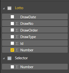
The newly created table, Selector, will have no relationship with the original one. Although it was created from the Lotto rows, the only effect will be the strange visual behaviour that requires the slicer to be created before the matrix.
Choosing this option for the Selector table, you will need to execute the following steps:
- Drop the slicer
- Drop the matrix
- Create the slicer again using the steps from the “Creating a Slicer from the Same Table” section but use the Number field from the Selector table
- Create the matrix again
Note that at this point, the slicer will not filter the data. Continue reading to learn how to get it to work filtering the matrix.
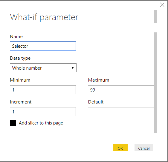
Creating the Slicer from the What-if Parameter
Instead of creating the Selector table based on the Lotto table, you can create a What-if parameter. This is a new table with no relationship to the Lotto table.
If you created the Selector based on the table in the previous section, delete it before following these steps.
-
- Delete the matrix
- On the top menu, Modeling tab, click the Create Parameter button to bring up the What-if Parameter window.
- Change the Name to Selector and specify a table of values from 1 to 99.
- Click OK once the properties have been filled in
The DAX formula generated behind the scenes is:
|
1 |
Selector = GENERATESERIES ( 1, 99, 1 ) |
You’ll see the new measure in the Fields pane:
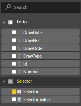
As you will notice on the image above, there is one small difference on this option: the field created inside the Selector table is also called Selector instead of Number as on the previous option.
In order to make both options the same, you can rename the Selector field to Number. It’s optional, but if you don’t, the following expressions will need to use Selector[Selector] to refer to this field instead of Selector[Number].
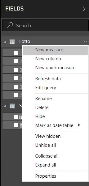
The steps to rename this field:
- In the Fields pane, under the Selector table, next to the Selector field, click the ‘…’ (More Options) button
- Click the Rename menu item in the context menu that will appear
- Change the field name to Number
Follow these steps to complete the slicer
- Repeat the formatting (steps 4 and 5 in the “Creating a Slicer from the Same Table”) to format the new slicer that will be automatically added to the report.
- Recreate the matrix as shown in the “Creating the Matrix” section
If you chose this method for the slicer, continue to learn how to get it to work filtering the matrix.
Measures vs. Calculated Columns
Before going forward, it’s interesting to understand why to create measures and not calculated columns. Both measures and calculated columns accept DAX expressions. However, they have some differences. While the calculated column expression is evaluated in the row context, row by row, measures are used on aggregations.
Another significant difference, usually the easiest one to help with the decision, is when the calculation is made. The calculated column expressions are evaluated when the table is processed, and the result is stored within the Power BI file. This means they can’t rely on any interaction with the visuals, because they are calculated before.
This makes the decision easy: you need measures that will react to the selection on the slicer as the user make it. The fact these measures will be calculated on each line of the matrix, which in fact is an aggregation of five records, is just an additional reason.
Creating the Measures for Filtering
To filter the rows according to the selected numbers, you will need to create one measure to identify if each row has the selected numbers on the slicer. It’s a boolean measure which should result in true or false, but here comes the first trick: Power BI doesn’t deal very well with boolean measures used for filtering, so you need to create it as a numeric measure resulting in 1 or 0.
Another concern about this formula is to display all the rows when there is no selection in the slicer. In this case, the measure should return 1 for all the rows, showing everything.
This measure will be calculated for each row of the matrix, and each row of the matrix has a set of five numbers. The slicer, on the other hand, also will have a set of numbers selected and you don’t know how many. If the drawing numbers in the row contain all the numbers of the slicer, the result should be 1 (show the line), otherwise 0.
A DAX expression allows you to create variables inside the expression, and you can put this to good use to solve this problem. Here is the beginning of the expression:
|
1 2 3 4 5 6 |
LineFilter = VAR tab = VALUES (Selector[Number] ) VAR tab2 = VALUES ( Lotto[Number] ) VAR common = INTERSECT ( tab, tab2 ) VAR rowsCommon = COUNTROWS ( common ) VAR rowsSelected = COUNTROWS ( tab ) |
It’s essential to consider the context used to process this expression. The Values function over the Selector table will return only the numbers selected on the slicer or all the numbers, while the Values function over the Lotto table will return only the numbers for the current drawing line, since the expression will be analysed for each line of the matrix.
On the final part of the expression, if the rowsCommon variable is equal to the rowsSelected variable, it means all numbers selected on the slicer are on this drawing, and the result will be 1. Otherwise, it will be 0. However, you need also to consider if the slicer is not filtered at all. For this, you have the ISFILTERED DAX function.
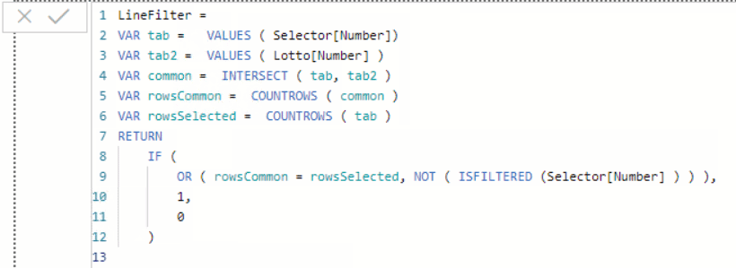
The full DAX expression is:
|
1 2 3 4 5 6 7 8 9 10 11 12 13 |
LineFilter = VAR tab = VALUES ( Selector[Number] ) VAR tab2 = VALUES ( Lotto[Number] ) VAR common = INTERSECT ( tab, tab2 ) VAR rowsCommon = COUNTROWS ( common ) VAR rowsSelected = COUNTROWS ( tab ) RETURN IF ( OR ( rowsCommon = rowsSelected, NOT ( ISFILTERED ( Selector[Number] ) ) ); 1, 0 ) |
The steps to use this expression are the following:
-
- In the Fields pane, Click the ‘…’ (More Options) button close to the Lotto table
- Click the New Measure menu option in the context menu that will appear
-
- Paste the entire expression, including the measure name, in the formula bar
-
- Drag the newly created measure to the filter area of the matrix configuration
- Change the comparison expression Show items when the value to is
- Fill the value expression with 1
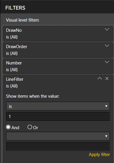
- Click
ApplyFilter
After completing these steps, the filter will be working. When you select multiple numbers on the slicer, you will see only the draws that contain all the selected numbers.

Conditional Formatting
The conditional format is the “cherry on top” of this solution. You can not only filter the drawings, but you can also highlight the numbers selected on the slicer within each line with a different colour.
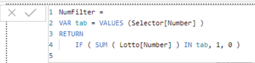
The numbers selected in the slicer should appear in red or whatever colour you select. This is too complex for the conditional formatting. Due to that, you need a new measure that tells you, for each number in the drawing, if it’s selected or not.
Since this measure will be used only for conditional filtering, it will be processed for each number and not sets of numbers. However, since it’s a measure, you still need to apply an aggregation function to the Number field, a simple SUM will do the job.
The final measure will look like this:
|
1 2 3 4 |
NumFilter = VAR tab = VALUES (Selector[Number] ) RETURN IF ( SUM ( Lotto[Number] ) IN tab, 1, 0 ) |
The steps to complete the conditional formatting are:
-
- In the Fields pane, Click the ‘…’ (More Options) button close to the Lotto table
- Click the New Measure menu option in the context menu that will appear
- Paste the entire expression, including the measure name, in the formula bar
-
- Select the matrix visual on the main pane
- In the Visualizations pane, with the matrix selected, click the Format button
-
- In the Visualizations pane, open Conditional formatting
- Under the Conditional Formatting element, enable Font color option
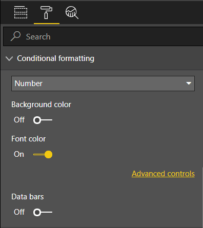
-
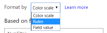
- Click on the Advanced Controls link that will appear below the Font color option
- In the Font color window, on the Format by dropdown box, select Rules
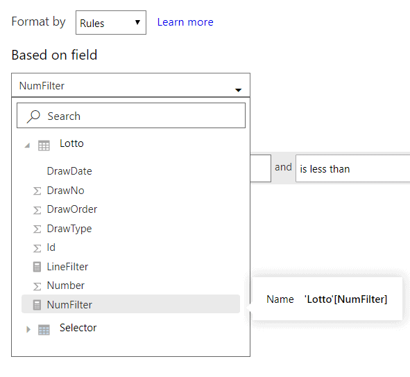
-
- On the Based on field dropdown box, select the measure, NumFilter
-
- On the If value dropdown box select the is option
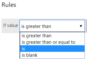
- Type 1 in the textbox besides the previous dropdown
- Select Red in the color picker, if not selected already
- Click Ok
Once you have followed the steps, you should see the selected numbers light up in red or the colour that you selected.

Summary
Using some interesting DAX expressions, each line of a matrix could be filtered according to a slicer. In addition, the numbers selected could be highlighted. Of course, this is a very specific example, but I’m sure you can adapt the expressions shown here to your challenges using the Matrix visual.
Load comments