In this article I will demonstrate a couple of hands-on ways to do a data analysis using a combination of SQL Server and R in order to get some useful knowledge about customers that can be almost immediately applied to informing business decisions. I will describe a cohort analysis as a way of analyzing the value of a customer to a business, and then dive into a slightly more complex segmentation called RFM (Recency, Frequency and Monetary).
RFM has been a very popular marketing tool for at least 10 years. It provides categories or ratings that are based on how long ago that a customer made a purchase, how often they purchase, and the amount that they spend.
Keep in mind that these analyses are more widely useful than just for direct retail marketing, in that the broad principles can be applied to almost any dataset of customer behavior that require reports that are simple for business people to understand.
Setting up the data
For the purpose of this article, and to allow the reader to easily try the examples out, we will use MS SQL Server as a data storage engine, the AdventureWorksDW2012 database and the [dbo].[FactInternetSales] table. The rest of the analysis and the graphical representation will be done in R.
We will create the following view:
|
1 2 3 4 5 6 7 8 9 10 11 12 13 14 15 16 17 18 19 20 21 22 23 24 25 |
USE [AdventureWorksDW2012]; GO DROP VIEW [dbo].[vCustomer_Data]; GO CREATE VIEW [dbo].[vCustomer_Data] AS WITH CTE AS ( SELECT fis.[CustomerKey] , SUM(CONVERT(INT, [SalesAmount])) AS OrderValue , CONVERT(DATE, [OrderDate]) AS OrderDate FROM [AdventureWorksDW2012].[dbo].[FactInternetSales] fis JOIN [dbo].[DimCustomer] dc ON fis.[CustomerKey] = dc.[CustomerKey] WHERE [CurrencyKey] = 100 GROUP BY fis.CustomerKey , OrderDate , dc.DateFirstPurchase ) SELECT * FROM CTE WHERE CTE.OrderDate BETWEEN '2007-01-01' AND '2008-03-31'; GO |
Note: for learning purposes I have restricted the data to 15 months. In reality, you’d probably need to follow up longer timespans depending on the purpose of the analysis.
The data looks similar to this:
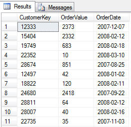
This is a very common data set, which can be found in almost any transactional system. Here we have the following features:
- Some uniquely-identified entity (whether it is an individual customer, event type or other), in this case CustomerKey
- Some indicator of when the event occurred (it could be a timestamp, but not always), in this case OrderDate
- Some value related to the unique entity and the particular event occurrence, in this case OrderValue
In this case our dataset contains a fourth column – DateFirstPurchase, however in this case it is not really a feature of the dataset, but it is merely a derived value.
Now that we have the data ready, let’s try and extract some valuable knowledge from it. Let’s do a preliminary exploration of the data by doing a cohort analysis, to see if there are any patterns in our customers’ behavior.
Cohort analysis
Cohort analysis is a broad topic, and it has many variations. Let’s first give some basic definitions:
- Cohort – this is a group of people or events who share a common characteristic over time
- Cohort analysis – this is the study of activity / behavior of a particular cohort or a group of them over time (or other iteration).
In metacode, a cohort analysis is similar to this: ‘take a dataset which has uniquely identified entity (customer in this case), define unique cohorts by which the items can be grouped (in this case we will use the year and month of first purchase), and follow the behavior of the cohorts over time (in this case the sum of the OrderValue for each cohort per timeslice)’.
It may seem a bit complex at first sight: However it is straightforward in practice. In this case we are asking the questions:
- ‘How do our users behave as they get further away from their first purchase date?’
- ‘Do they keep buying equally a lot as they did in the first month of their activity, or do they phase out as time passes?’
- ‘Is there a pattern when we compare the first purchase months of different cohorts?’
Let’s load the libraries first:
|
1 2 3 4 5 |
library(dplyr)/span> library(reshape2) library(ggplot2) library(RODBC) |
Then we will connect to SQL Server and load the data from the view we created into memory:
|
1 2 3 4 |
cn <- odbcDriverConnect(connection="Driver={SQL Server};server=localhost;database=AdventureWorksDW2012;trusted_connection=yes;") orders <- sqlFetch(cn, 'vCustomer_Data', colnames=FALSE, rows_at_time=1000) |
Then we have to convert and format the OrderDate variable:
|
1 |
orders$OrderDate <- as.Date(orders$OrderDate, format='%Y-%m-%d') |
After this, we will create a new dataset in memory. This dataset will have additional features that we’ll need for our graphical representation later on:
|
1 2 3 4 5 6 7 |
cohort <- orders %>% arrange(CustomerKey, OrderDate) %>% group_by(CustomerKey) %>% mutate(FPD = min(OrderDate), CohortMonthly = paste0('Cohort-', format(FPD, format='%Y-%m')), LifetimeMonth = ifelse(OrderDate==FPD, 1, ceiling(as.numeric(OrderDate-FPD)/30))) %>% ungroup() |
Here is what the code does:
- Takes the orders dataset and arranges it by CustomerKey and OrderDate (this is to make sure the data is in chronological order per user)
- Groups it by Customerkey, since we need data on cohort level
- Creates three new variables (columns) in our dataset: FPD (first purchase date), CohortMonthly and LifetimeMonth.
Next we need to format the LifetimeMonth variable a bit more:
|
1 2 3 |
cohort$LifetimeMonth <- formatC(cohort$LifetimeMonth, width=2, format='d', flag='0') cohort$LifetimeMonth <- paste('M', cohort$LifetimeMonth, sep='') |
The new dataset looks like this:
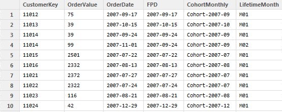
The next step is to combine and summarize the cohorts:
|
1 2 3 4 5 |
comb.cohorts <- cohort %>% group_by(CohortMonthly, LifetimeMonth) %>% summarise(Revenue = sum(OrderValue), NumberOfCustomers = n_distinct(CustomerKey)) |
In this step we already lose the individual data per user and instead summarize it by cohort and timeframe.
Now our data is ready for exploration and for creating a visualization:
|
1 |
ggplot(comb.cohorts, aes(x=LifetimeMonth, y=NumberOfCustomers, group=CohortMonthly, color=CohortMonthly)) + geom_line() |
Based on our data the graph looks like this:
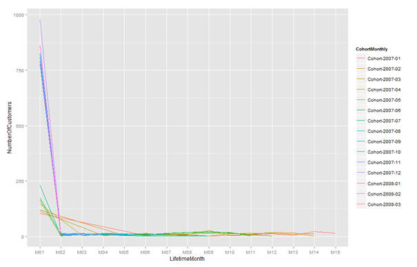
Here is the analysis we can do by looking at this graph: on the Y axis we have the Number of Customers per month and per cohort, and on the X axis we have the cohort months. This means that in this case all first purchase months are aligned at the point M01, and then they are followed up further by M02 to M15.
Something very obvious is immediately noticeable: there are a few cohorts with a significantly stronger first month with over 750 customers making their first purchase in a specific month. By looking at the data, we establish that the periods between 2007-08 and 2007-12 are extremely strong, but they drop very fast by their second month. Then we have the other group of cohorts, which have about 100 customers purchasing the first month, but they purchase relatively a lot in their second and third months, before they phase out. Then we can see another fact which is quite interesting to explore further: there is a group of cohorts which get a slight increase in the purchases in their 8th and 9th months.
All this leads to intriguing business development questions: why are certain months significantly stronger than others and what can we do to increase the customer retention? Why do some customers return in their 8th and 9th months? Did we have a successful marketing campaign then, or was it just the holiday shopping season?
This type of analysis is very effective from a business development perspective. There are several reasons for this:
- The data knowledge extraction can go really fast, once the data is brought into memory
- There is no need for heavy duty relational database modelling. In conventional SSAS and SSRS this step takes a very long time, partly due to the fact that the data is persisted on disks and partially because the physical data model has to be rebuilt quite often to match the questions asked.
- The iterations between business questions and answers are very short, and thus a great amount of work can be performed in a very short time, since the dataset is in memory and all it takes is a skilled data analyst and a savvy business development specialist to get together and iterate through all questions the data raises
This analysis, however, is a bit limited because it shows only one side of the customers’ behavior; either the number of customers who purchased and their retention, or the revenue per cohort. Even though this is very useful and gives great insights, this type of analysis is still one-dimensional. In other words, we cannot clearly explore the dependency between number of customers and their purchase value. After all, we might have 100 customers purchasing for £1 each, vs 10 customers purchasing for £100 each. We would certainly be interested to target these two groups differently.
This is why there is a different approach: RFM segmentation. Let’s look into this next.
RFM segmentation
RFM segmentation is a technique used to get to know the customers better and to be able to divide them into groups which will make marketing targeting more effective and cost-efficient.
RFM stands for Recency, Frequency and Monetary and it does exactly this – gives these three dimensions to our customer base based on their transactions (how recently they purchased, how frequently they purchased and how much money they spent).
The premise is that customers who have bought more recently, purchased more often and have spent more money are more likely to respond to a marketing offering, than customers who have purchased less recently, not so often and for very little money. RFM analysis can be used to segment and label the customers (active, churning, churned, never activated) and thus the proper marketing campaign can be directed to the right group of customers.
Defining the terms
The RFM segmentation is very specific and is dictated by the business model, however it is easily customizable. In general terms, the definitions look like this:
- Recency – represents the “freshness” of customer activity. Naturally, we would like to identify active and inactive customers. The basic definition for this attribute is the number of days since their last order or interaction.
- Frequency – how often the customer buys. By default this could be the total number of orders in the last year or during the whole of customer’s lifetime.
- Monetary value indicates how much the customer is spending. In many cases this is just the sum of all the order values.
Above is the general definition, however, and depending on the business model the definitions have to be fine-tuned. For example, the model will look slightly different for a company which sells insurances, since the sales are usually based on half or yearly basis. In the online gaming industry, for example, the recency and frequency might be measured in minutes or even seconds and heavy aggregations might be needed, and averages might be used instead of sum values.
Sample data:
For the purpose of this segmentation we will be using the following view:
|
1 2 3 4 5 6 7 8 9 10 11 12 13 14 15 16 17 18 19 20 21 22 23 |
USE [AdventureWorksDW2012]; GO DROP VIEW [dbo].[vRFM_Data]; GO CREATE VIEW [dbo].[vRFM_Data] AS WITH CTE AS ( SELECT [CustomerKey] , CONVERT(INT,[SalesAmount]) AS OrderValue , CONVERT(DATE, [OrderDate]) AS OrderDate , SalesOrderNumber , ProductKey FROM [AdventureWorksDW2012].[dbo].[FactInternetSales] WHERE [CurrencyKey] = 100 ) SELECT * FROM CTE WHERE CTE.OrderDate BETWEEN '2007-01-01' AND '2008-03-31'; GO |
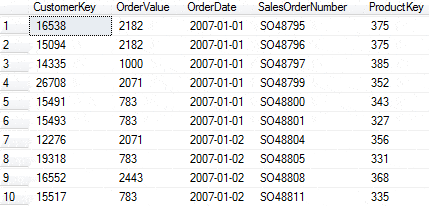
The data looks similar to this:
We can load the data into R with the following code:
|
1 2 3 4 5 6 |
library(lubridate) library(data.table) library(RODBC) cn <- odbcDriverConnect(connection="Driver={SQL Server};server=localhost;database=AdventureWorksDW2012;trusted_connection=yes;") raw_data <- sqlFetch(cn, 'vRFM_Data', colnames=FALSE, rows_at_time=1000) |
Then we have to format the OrderDate:
|
1 |
raw_data$OrderDate <- as.Date(raw_data$OrderDate, format='%Y-%m-%d') |
… and then we need a variable which represents the point of view we would like to have on the data:
|
1 |
NOW <- as.Date("2008-04-05", "%Y-%m-%d") |
Note: The point of view is important, since we can use it as a reference point and perform several segmentations at different points of view and compare the results. For example, this can be very useful if we wanted to determine the delta of customer behavior before and after a marketing promotion. In this case we would have one segmentation with a point of view before the promotion and one with a point of view well after the promotion and then the results can be compared and the customer scores can be outlined to determine which customers have changed their behavior in a positive way (i.e. the campaign has been successful) and which customers need more attention (additional targeting).
Then we calculate the Recency, the Frequency and the Monetary values for each customer:
|
1 2 3 |
R_table <- aggregate(OrderDate ~ CustomerKey, raw_data, FUN=max) R_table$R <- as.numeric(NOW - R_table$OrderDate) F_table <- aggregate(SalesOrderNumber ~ CustomerKey, raw_data, FUN=length) M_table <- aggregate(OrderValue ~ CustomerKey, raw_data, FUN=sum) |
Then we merge the datasets, remove the unnecessary column and rename the columns:
|
1 2 3 4 |
RFM_table <- merge(R_table,F_table,by.x="CustomerKey", by.y="CustomerKey") RFM_table <- merge(RFM_table,M_table, by.x="CustomerKey", by.y="CustomerKey") RFM_table$OrderDate <- NULL names(RFM_table) <- c("CustomerKey", "R", "F", "M") |
Finally, we need to assign each customer to the proper segment by using quantiles:
|
1 2 3 4 |
RFM_table$Rsegment <- findInterval(RFM_table$R, quantile(RFM_table$R, c(0.0, 0.25, 0.50, 0.75, 1.0))) RFM_table$Fsegment <- findInterval(RFM_table$F, quantile(RFM_table$F, c(0.0, 0.25, 0.50, 0.75, 1.0))) RFM_table$Msegment <- findInterval(RFM_table$M, quantile(RFM_table$M, c(0.0, 0.25, 0.50, 0.75, 1.0))) |
The result looks like this:
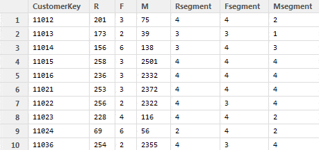
By looking at the result we can see the customer behavior and how they differ: customer 11024, for example, has bought something 69 days ago, 6 items in total for the customer lifetime and the total purchase amount is $56. This customer is recent, even though not a big spender. Customer 11036, however, has bought only 2 items for a large sum of $2355, but very long ago: 254 days.
This suggests that the first user needs to be targeted in a way that they stay as a customer and spend larger amounts (maybe some discount code or specific promotion might interest them) and the second user needs to be encouraged to come back and spend more.
Even though this is a simplified example of a RFM segmentation, it shows that it is very powerful tool in following up on customer behavior and channelling it in the right way. Furthermore, the RFM segmentation can be used to represent the customer base in a three dimensional space from a specific point of view and to give an insight of how the customers behave in certain situations: promotions, holidays, peak and downtime.
Conclusions
In this article we have seen the power of analytics and how easy it is to do massive analysis of customer behavior with the help of SQL Server as a storage engine and R as an analytical processing engine. There is one thing I hinted earlier, which is very important: The quicker you can answer business questions reliably once the data has been extracted, the more value you get out of data. You can get a great competitive advantage by quickly iterating a solution with your business colleagues rather than by taking a long time developing a slick data modelling solution that provides an answer to the wrong question. By rapid iterations with a tool such as R, you can quickly make sure that you are answering the question that the business really meant to ask.
As an extra read on the topic of Quick ‘trial and error’ iterations I would recommend the story of Paul McCready and how he approached the problem of creating a man-powered airplane when people had been failing for 10 years before him. Although the problem seemed to be ‘how can a man power a flight’, the real problem that blocked progress was that there was no process for quickly testing ideas out, and rejecting them. Once that problem was fixed, a man was soon able to fly, by pedal power alone, across the English Channel. Sometimes, in IT, we are often too eager to take problems at face value. (You Are Solving The Wrong Problem)
Load comments