
Microsoft’s Power BI Desktop provides a powerful tool for creating visualizations based on data from SQL Server and other sources. Importing SQL Server data into Power BI Desktop is a simple, straightforward process, and once you have the data you need, you can easily transform it and create rich visualizations. You can then publish the visualizations as reports to the Power BI service, where you can provide them to a wide range of users.
In most cases, the SQL Server data you import into Power BI Desktop will come from a database’s user tables or views, perhaps concatenated, converted, or transformed in some other way during the import process. However, a much less discussed use case is to import SQL Server metadata and system information into Power BI Desktop. For example, you can pull in data about table space usage or the types of indexes implemented across a database and then create visualizations based on that information.
In fact, any data you can retrieve from SQL Server is available for use in Power BI Desktop. You need only decide what type of information you want to visualize and who you’re visualizing that information for. After you’ve gotten the data you want into Power BI Desktop, you can then use the various tools available for transforming the data and creating reports for your targeted users.
In this article, I demonstrate how to retrieve metadata and system information from a local instance of SQL Server 2016 and the AdventureWorks2014 database. The examples I include are meant only as a way to demonstrate the various approaches you can take to visualizing this type of data in Power BI Desktop. Ultimately, you will need to determine what information might be the most useful to visualize in your particular circumstances, taking into account the people who will be viewing that information.
This article assumes that you have a basic understanding of how to use Power BI Desktop. If you’re new to Power BI and Power BI Desktop, you might want to review the other articles I’ve written on the topic:
- Working with SQL Server data in Power BI Desktop
- Power Query Formula Language in Power BI Desktop
- More Power BI to your Elbow
- Importing Excel Data into Power BI Desktop
You can also refer to Microsoft documentation for more specifics about Power BI and Power BI Desktop. With that in mind, let’s start by looking at how to import SQL Server metadata and system data into Power BI Desktop.
Importing SQL Server data into Power BI Desktop
When you import data from SQL Server into Power BI Desktop, you specify the instance, database, and data you want to retrieve. You can retrieve individual tables and views directly, or you can define T-SQL queries to retrieve exactly the data you need.
Writing queries provides greater flexibility because you can declare variables, define temporary tables, execute stored procedures, call functions, and use other T-SQL elements. To demonstrate how this works, we’ll base our first example on the following T-SQL script, which uses the sp_spaceused system store procedure to retrieve space usage information about each user table in the AdventureWorks2014 database:
|
1 2 3 4 5 6 7 8 9 10 11 12 13 14 15 16 17 18 19 20 21 22 23 24 25 26 27 28 29 30 31 32 33 |
SELECT IDENTITY(INT, 1, 1) TableID, s.name SchemaName, t.name TableName, (s.name + '.' + t.name) FullName INTO #tables FROM sys.tables t INNER JOIN sys.schemas s ON t.schema_id = s.schema_id WHERE s.name <> 'dbo' ORDER BY s.name, t.name; DECLARE @count INT = (SELECT COUNT(*) FROM #tables); DECLARE @i INT = 1; DECLARE @FullName NVARCHAR(128) = ''; DECLARE @results TABLE( TableName NVARCHAR(128), NumRows CHAR(20), ReservedSpace VARCHAR(18), DataSpace VARCHAR(18), IndexSpace VARCHAR(18), UnusedSpace VARCHAR(18)); WHILE (@count >= @i) BEGIN SET @FullName = (SELECT FullName FROM #tables WHERE TableID = @i); INSERT @results EXEC sp_spaceused @FullName; SET @i = @i + 1; END SELECT t.SchemaName, t.TableName, r.NumRows, r.ReservedSpace, r.DataSpace, r.IndexSpace, r.UnusedSpace FROM @results r INNER JOIN #tables t ON r.TableName = t.FullName; |
The script takes a number of steps in order to return usage information about each table:
- Creates the #tables temporary table to hold the schema and table names, along with a unique identifier for each row.
- Declares the @count variable to hold the number of rows from the temporary table.
- Declares the @i variable that will be used as the index value to loop through the temporary table.
- Declares the @FullName variable that will be used to hold the schema/table name pair when looping through the temporary table.
- Declares the @results table variable to hold the returned values from the sp_spaceused system store procedure.
- Constructs a WHILE loop to iterate through the temporary table and run the sp_spaceused system store procedure against each table.
- Uses a SELECT statement to join the temporary table with the @results variable to return the data we’ll import.
There are other approaches you can take to get this information, such as using cursors or the undocumented stored procedure sp_msforeachtable, but the T-SQL script we have here gives us what we need for this article.
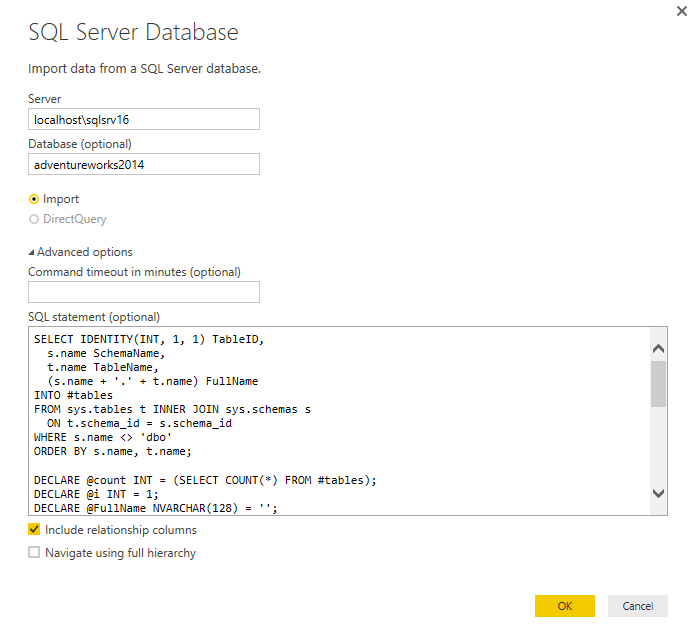
We can now use this script when creating a connection to the SQL Server database. To create the connection, click the Get Data down arrow on the Home ribbon, and then click SQL Server. When the SQL Server Database dialog box appears, specify the SQL Server instance, target database, and T-SQL script, as shown in the following figure. (You must click Advanced options for the SQL statement box to appear.)
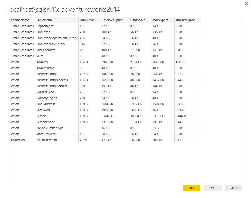
When you click OK, a new window should appear, displaying a sample of the data returned by the T-SQL script, as shown in the following figure.
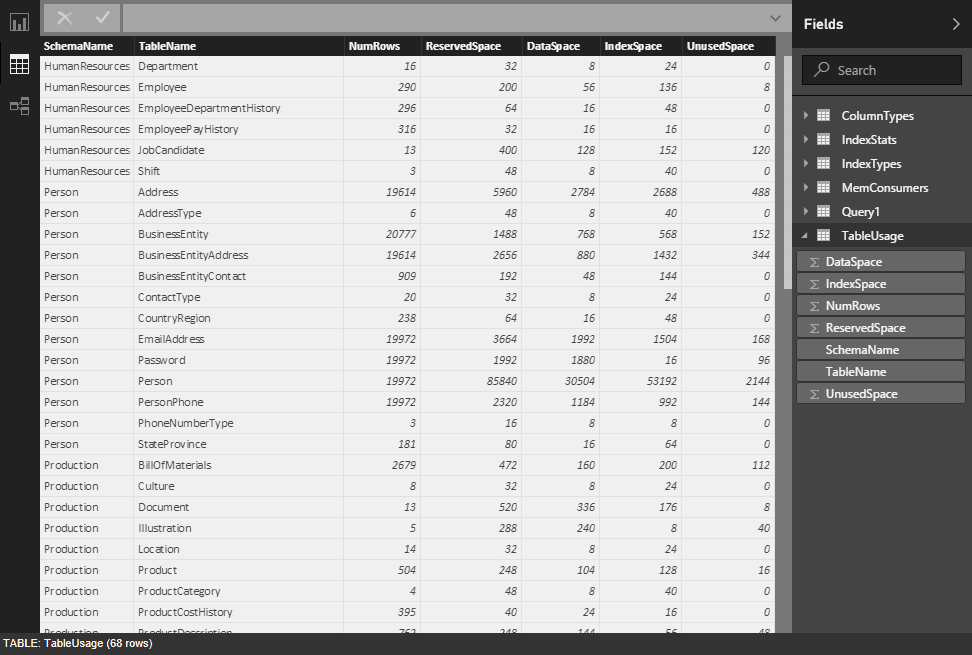
If the data looks like what you would expect, click Load. Power BI Desktop will import the data and make the query available in the query window. The following figure shows the query as it appears when you first import the data.
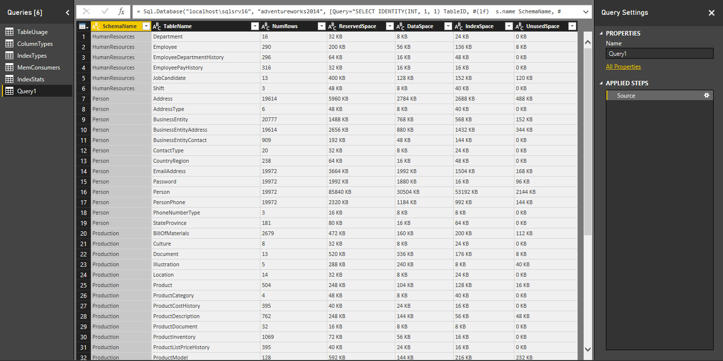
The results might be difficult to view here, but if you import the data into your own instance of Power BI Desktop, you’ll see that the columns specific to data usage amounts are string values that provide the amounts in kilobytes, with the KB included.
To be able to work with the data more effectively, I removed the KB and the space that preceded it from each column, then converted the columns to a numerical value. I also renamed the query to TableUsage, as shown in the following figure.
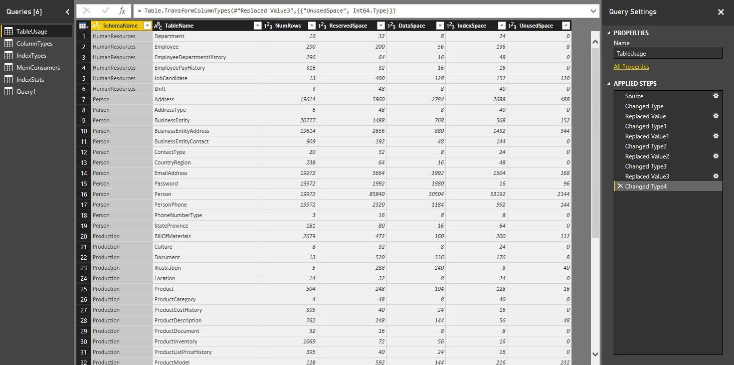
Notice that the Applied Steps section of the Query Settings pane now shows each transformation related to removing the KB and converting the fields. There are, of course, numerous other changes and transformations we can make, such as filtering data, changing the field names, adding calculated columns, or taking any number of other steps, but what we’ve done here will suffice for now.
After modifying the query, be sure to apply and save your changes. If you go to the Data tab, you should find the table associated with your query, as shown in the following figure.
That’s all there is to importing SQL Server metadata and system information into Power BI Desktop. The key is in writing a query that returns the information necessary to create various types of visualizations.
Visualizing table usage statistics
Once we have the data in Power BI Desktop, we can go to the Report tab and begin adding visualizations. Often a good place to start is with a Matrix visualization, which allows us to display hierarchical data in a readable format, as shown in the following figure.
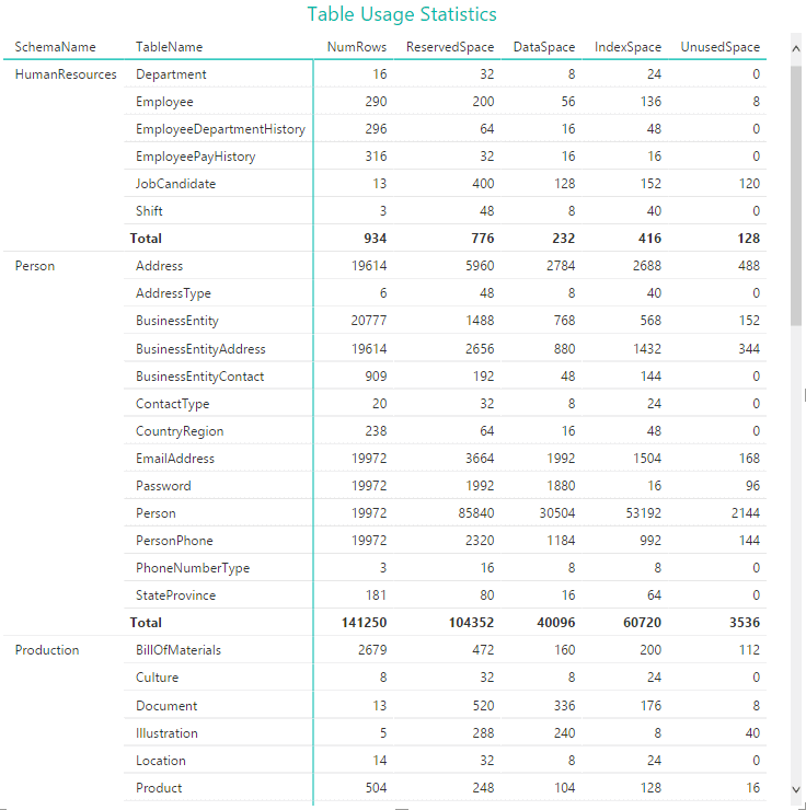
When I set up the visualization, I first added the SchemaName field as a row, and then added the TableName field as a row. This allowed me to preserve the data hierarchy. I then added the remaining fields as values (measures). From these values, Power BI Desktop was able to render the data and provide the aggregated totals. I then specified a style for the matrix, changed the title, and modified its format.
For this article, I won’t be going into the specifics of formatting the visualizations, but know that you can take advantage of the assortment of options available to each visualization. I encourage you to play around with the formatting and labelling so each visualization looks exactly the way you want it.
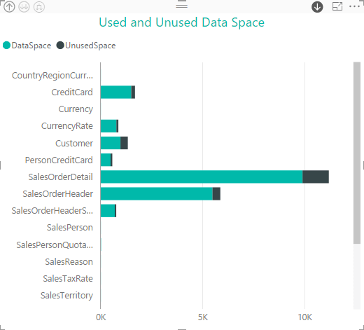
Now let’s add a Stacked Bar Chart visualization. To preserve the hierarchy, I added the SchemaName field as an axis, and then added the TableName field as an axis. Next, I added the DataSpace and UnusedSpace fields as values (measures). The first measure provides data about how much space has been used, and the second indicates how much of the allocated space is unused, as shown in the following figure.
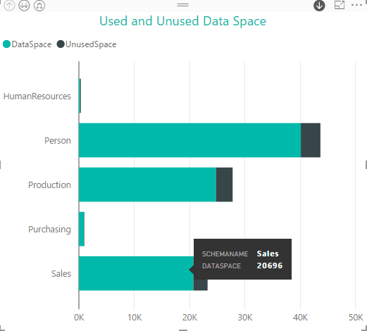
The visualization shows space usage information for five schemas, with each bar indicating the amount of space used and the amount unused. When taken together, we get the total amount of allocated space.
If we hover over a section of a schema’s bar, a pop-up message appears, providing specifics about the underlying data. In this case, the pop-up message shows that the Sales schema is using 20,696 KB of space.
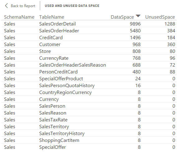
To view more detailed information, right-click the schema’s bar, and then click See Records. A new window appears, providing details about each table in the schema, as shown in the following figure.
Because we added both SchemaName and TableName as axis fields, Power BI Desktop automatically detects the hierarchy and provides tools within the visualization for drilling down into the data. For example, if you select the down arrow in the upper right corner and then click the Sales bar, the visualization will display data specific to that schema, with a bar for each table, as the following figure shows.
Now let’s try the Area Chart visualization, only this time, we’ll use the ReservedSpace and DataSpace fields as our measures. This provides another way to visualize how much of the allocated space for each table is being used. Once again, we start with schema view at the top of the hierarchy, as shown in the following figure.
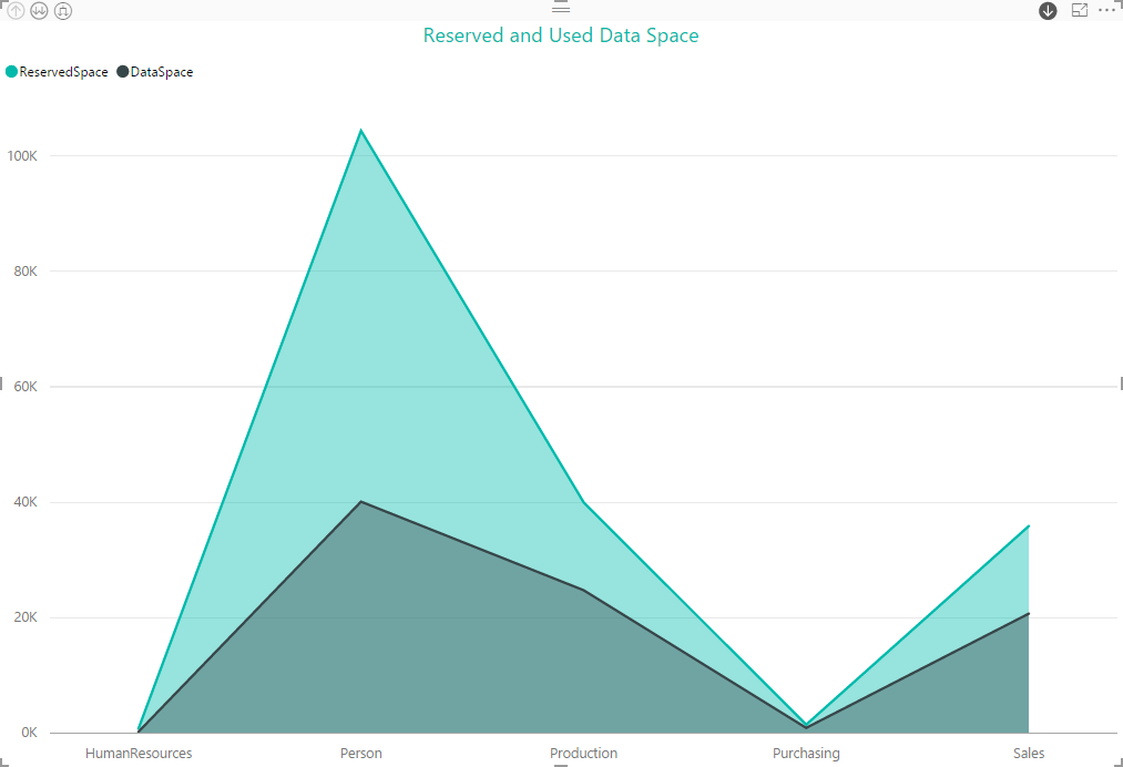
As you can see, the Person schema has been allocated much more space than it is using, so let’s dig down into that schema, where we can quickly see that it is the Person table that’s the big player here, as the following figure shows.

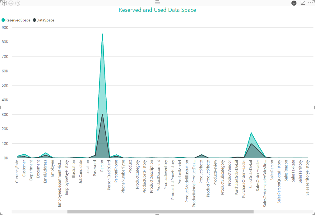
The nice part about the drilling capabilities in Power BI is that we can drill down into individual components, as we did above, or drill down for the entire data set. In other words, we can see all tables in all schemas at one time, as shown in the following figure.
With this and other types of visualizations, we can quickly see information about our databases in a format that is easily accessible and understood by a wide range of users. Of course, it will be up to you to determine what data might be of value to which users. For example, a DBA might want a quick way to apprise developers of database usage patterns, without having to get into the nitty gritty of what’s going on inside of SQL Server. In such cases, a picture can be worth a thousand words.
Visualizing column data
We are not, of course, limited to just visualizing usage patterns. For example, we might want to pull column information into the mix, using a query such as the following:
|
1 2 3 4 5 6 7 8 9 10 11 12 |
SELECT s.name SchemaName, t.name TableName, c.name AS ColumnName, dt.name AS DataType FROM sys.schemas s JOIN sys.tables t ON s.schema_id = t.schema_id JOIN sys.columns c ON t.object_id = c.object_id JOIN sys.types dt ON c.user_type_id = dt.user_type_id WHERE s.name <> 'dbo' ORDER BY SchemaName, TableName, ColumnName; |
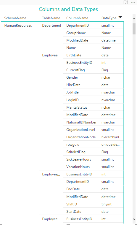
All we’re doing here is grabbing the names of the schemas, tables, columns, and data types in the AdventureWorks2014 database. Once we get the data into Power BI Desktop, we can again start with a Matrix visualization to provide users with easy access to the entire data set. As you can see in the following figure, Power BI Desktop again takes care of our hierarchy, starting with the schema, then tables, and finally columns and data types.
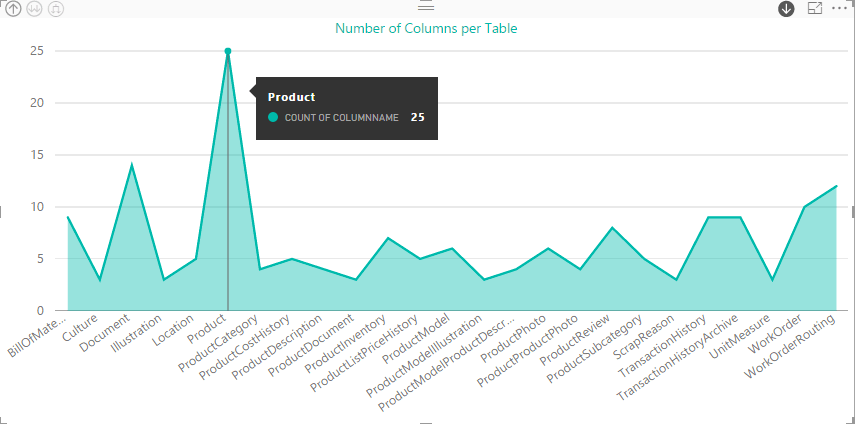
Suppose we now want to visualize the number of columns per table, even though our table appears to include no field that can serve as a measure. We can start with a Stacked Bar Chart visualization and then add ColumnName as a value field. Power BI Desktop treats the value as a row count to create the measure, giving us results similar to those shown in the following figure.
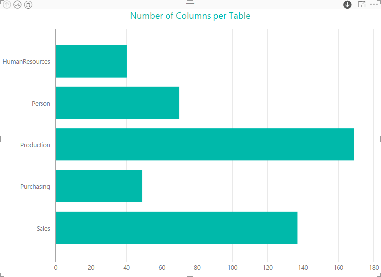
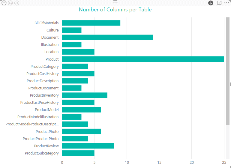
At the top of the hierarchy, we have the number of columns per schema, but as we saw earlier, we can drill down into individual schemas or view all tables together. For example, the following figure shows the tables in the Production schema, with each bar indicating the number of columns.
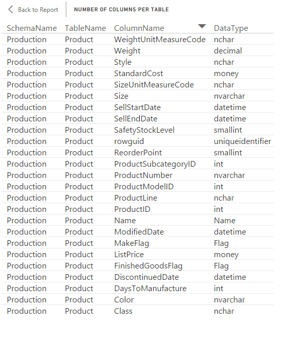
You can also view details about a specific table by right-clicking the table’s bar and then clicking See Records. For example, the following table shows details about the Product table.
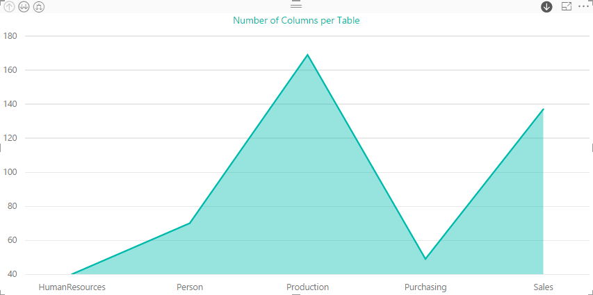
Power BI Desktop provides a wide selection of visualizations for rendering different types of data, so feel free to experiment. It’s very simple to switch from one visualization to the next, as long as it’s consistent with the type of data you’re trying to display. Often it just takes a single click to make the switch. For example, you can easily change a Stacked Bar Chart visualization to a Stacked Area Chart visualization, as shown in the following figure.
If we were to drill down into the Production schema in this visualization, we would see the following information. In this case, details about the Product table are displayed.
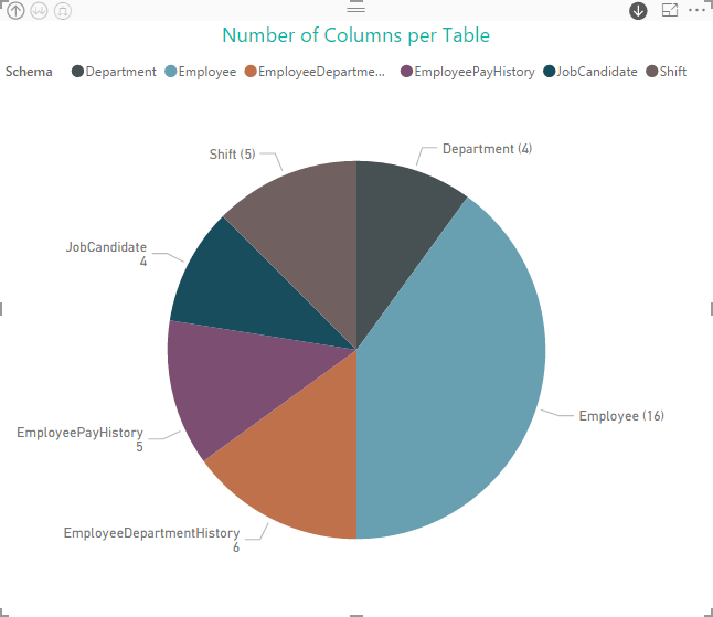
You might even want to use the Pie Chart visualization to display column information, as shown in the following figure.
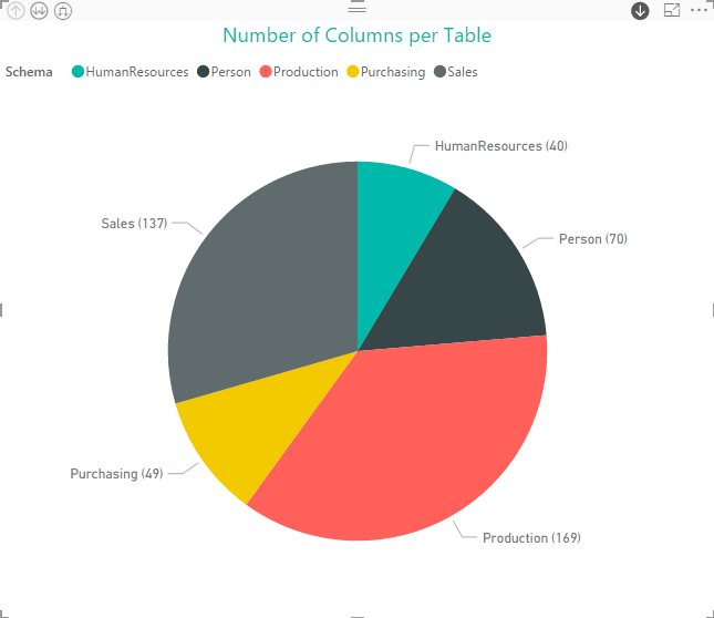
As with the other visualizations, we can drill down into to the next layer of the hierarchy. For example, if we drill down into the HumanResources schema, we get the following view of the tables and column counts.
You might not be particularly interested in displaying the number of columns in each table and schema, but these examples should give you a good idea of the different ways you can render the same information with relatively little effort. It’s up to you to figure out which type of data might be useful in your situation.
Visualizing index data
Imagine this scenario. You’re asked to look at a company’s SQL Server database to try to figure out why they’re running into performance issues. The company is a small start-up with a handful of developers with no SQL Server expertise but with lots of ideas of how a database works. When you look at the database, you quickly discover that it has been indexed into oblivion, with some tables configured with as many as 30 indexes.
Indexes are notoriously over-utilized or in some other ways misused. You might find that visualizing information about a database’s indexes to be a useful tool for providing regular updates to interested individuals about what’s going on with the system. For example, you could start with a query such as the following to import index-related data into Power BI Desktop:
|
1 2 3 4 5 6 7 8 9 10 11 |
SELECT s.name SchemaName, t.name TableName, i.type_desc IndexType, COUNT(i.type) TotalIndexes FROM sys.schemas s JOIN sys.tables t ON s.schema_id = t.schema_id JOIN sys.indexes i ON t.object_id = i.object_id WHERE s.name <> 'dbo' GROUP BY s.name, t.name, i.type_desc ORDER BY SchemaName, TableName, IndexType; |
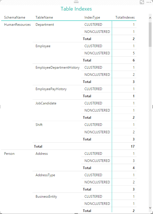
All we’re doing here is finding the number of indexes in each table, based on index type. If we were to add a Matrix visualization based on this data, it would look similar to the following figure.
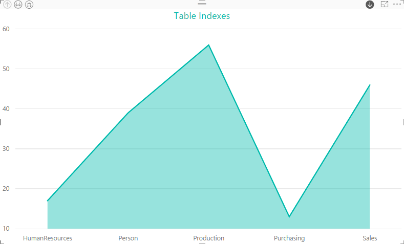
We might then add a Stacked Bar Chart visualization that gives us our index count, specifying SchemaName, TableName, and IndexType as our axis fields in order to preserve our hierarchy. The following figure shows the visualization at the top level of the hierarchy, with the index count for each schema.
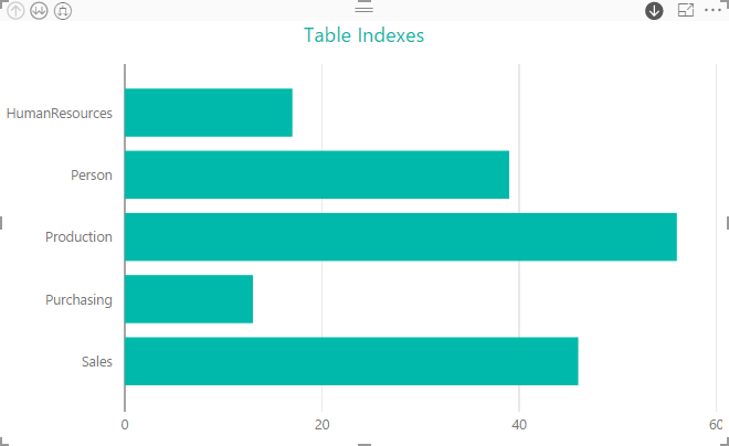
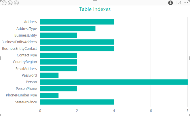
If we were to now drill down into the Person schema, we would find that the Person table has double the indexes as other tables in that schema.
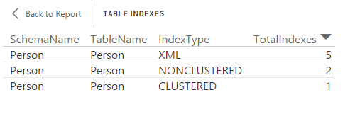
As we’ve seen earlier, we can view details about the Person table by right-clicking the bar associated with that table and then clicking See Records, giving us the information shown in the following figure.
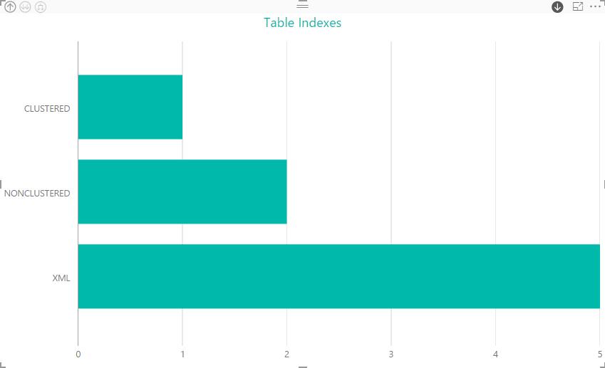
Another way we can visualize this information is to drill down into the Person table within the visualization, giving us the following view of the indexes.
If we want to instead use a Stacked Area Chart to view the data, the schema level would look similar to that shown in the following figure.
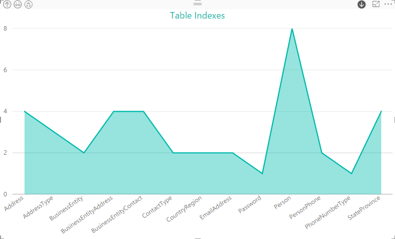
Drilling into the Person schema gives is the following visualization, which shows the Person table as the clear winner in terms of the number of indexes.
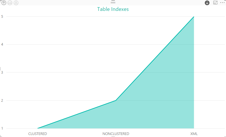
And, of course, we can drill down one more layer to the indexes themselves, giving us a full picture of the indexes defined on the Person table.
There is a wide range of information you can retrieve about indexes in SQL Server and a variety of ways you can visualize that information in Power BI Desktop. Again, it depends on your specific needs and the people who will be viewing this information.
Visualizing server state data
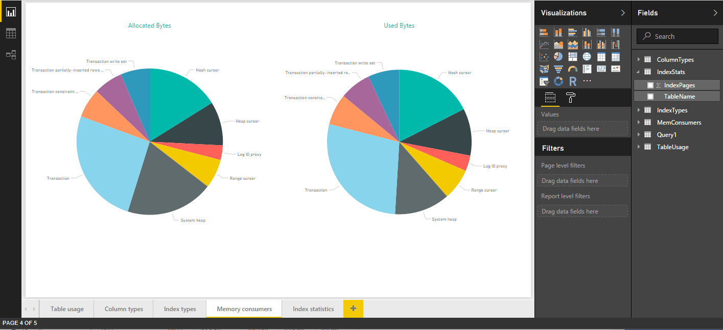
Any information that you can retrieve from a SQL Server is fair game for visualizing in Power BI Desktop. For example, you might turn to dynamic management views to retrieve data, such as the sys.dm_xtp_system_memory_consumers view, which returns information about database-level memory consumers. The following SELECT statement uses the view to import the number of allocated bytes and used bytes per consumer:
|
1 2 3 4 5 |
SELECT memory_consumer_desc MemConsumer, allocated_bytes AllocatedBytes, used_bytes UsedBytes FROM sys.dm_xtp_system_memory_consumers WHERE allocated_bytes > 0; |
One way we can render this information is to add two Pie Chart visualizations and display them side-by-side, as shown in the following figure.
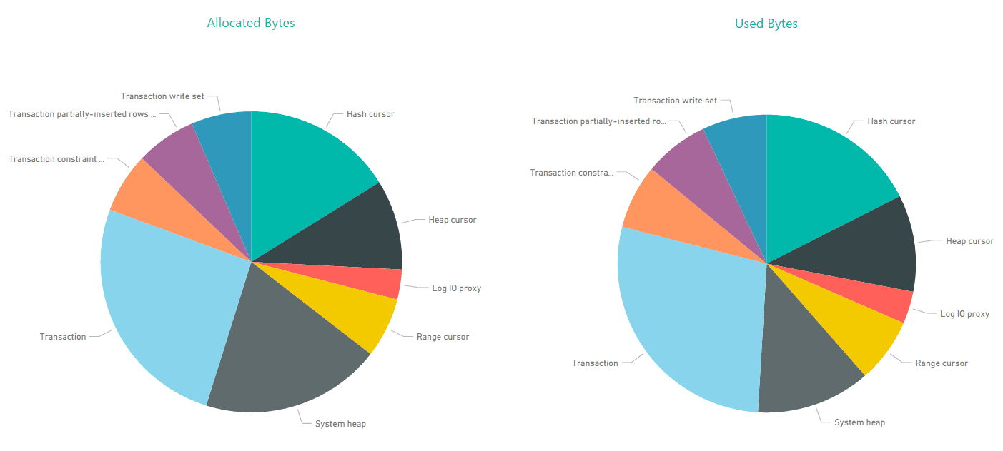
The visualization on the left displays the allocated bytes for each consumer, and the visualization on the right displays the used bytes, giving us quick insight into where there might be noticeable differences, such as with the System heap consumer.
We can also use dynamic management views against a specific database. For example, the following SELECT statement targets the AdventureWorks2014 database:
|
1 2 3 |
SELECT OBJECT_NAME(object_id) TableName, fulltext_index_page_count IndexPages FROM sys.dm_db_fts_index_physical_stats; |
The sys.dm_db_fts_index_physical_stats returns information about the full-text and sematic indexes in each table. In this case, the result set includes only a few rows, which we can easily render using a Pie Chart visualization and a Matrix visualization, as shown in the following figure.
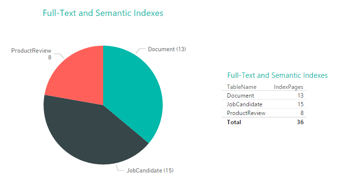
As you can see, the visualizations provide a quick way to view the index-related data, which you can refresh at any time to ensure that the visualizations are displaying the most current information.
Visualizing SQL Server data
SQL Server provides a wide range of system views for getting at the SQL Server data you need. Through those views, you can retrieve different types of metadata and system information from which you can create multi-page reports rich in visualizations and information. For example, the following figure shows the report page that includes the visualizations based on the memory consumer data.
After you import the SQL Server data into Power BI Desktop and create your reports, you can publish them to the Power BI service in order to make the visualizations available to other users. You can also share the Power BI Desktop files, but keep in mind that Power BI Desktop is meant primarily as a development tool, rather than an end-user consumption tool.
Creating visualizations based on SQL Server metadata and system information might not be useful in every situation, but in circumstances when you need a way to quickly share or monitor critical information that can be easily digested by various types of users, you might find Power BI Desktop to be a useful tool to add to your arsenal. It’s painless to install, simple to learn, and best of all, free. All you need is a little imagination to figure out the many ways to visualize the extensive amount of information available in your SQL Server instances.