
- The SQL Server 2016 Query Store – Part 1: Overview and Architecture
- The SQL Server 2016 Query Store – Part 2: Built-In Reporting
- The SQL Server 2016 Query Store – Part 3: Accessing Query Store Information Using DMVs
- The SQL Server 2016 Query Store – Part 4: Forcing Execution Plans Using the Query Store
- The SQL Server 2016 Query Store – Part 5: Analyzing Query Store Performance
With the release of the first Community Technology Preview (CTP) of SQL Server 2016 we were finally able to play around with one of the most anticipated new features, the Query Store. In this series of articles we will take a look at every aspect of the Query Store, how it can give you valuable performance insights and even increase query performance!
In the first article in this series about the Query Store we gave a general introduction and discussed the architecture and options related to the Query Store. In this second article we are taking a closer look at the built-in reporting that is available out-of-the-box when you enable the Query Store on a database.
Query Store Built-in Reporting
After you have enabled the Query Store on a database, a new Query Store folder will appear within SQL Server Management Studio (SSMS). It will appear in the Object Explorer pane, underneath your database; as shown in Figure 4.
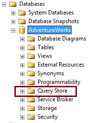
Figure 4 Query Store folder
When you open the ‘Query Store’ folder, you will be able to access the built-in Query Store reports; shown in Figure 5.
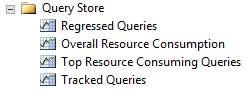
Figure 5 Built-in Query Store reports
In the current technology preview of SQL Server 2016, there are four reports within this folder.
- Regressed Queries . A ‘regressed query’ is one that received a worse Execution Plan then it had before. This report shows all the queries that have had their Execution Plan regressed over time. We will go into further detail about Plan Regression in a later article, ‘The SQL Server 2016 Query Store: Forcing Execution Plans’.
- Overall Resource Consumption . This shows a summary of the query runtime statistics during a specific time interval. All the query-runtime statistics of those queries that have been executed within the specific time interval are aggregated to give you an overview of the query performance.
- Top Resource Consuming Queries . This shows the most expensive queries (based on custom selection criteria) that were executed during a specific time interval.
- Tracked Queries . This shows the runtime statistics for query execution, and allows you to inspect the various Execution Plans of a specific query.
At the time of writing this article, it isn’t possible to configure or build custom reporting. However, the built-in reports cover a large part of the information that we, as performance analyzers, require. All of the reports give us easy access to a variety of query performance metrics in a quick and configurable overview. These metrics weren’t easily available to developers or DBAs. It used to be quite a complex and time-consuming task to gather the useful information that is now easily accessible through the Query Store reports, so it makes the task of improving the performance of queries so much less tiresome.
To get this sort of report without Query Store we would have to:
- Capture information from various DMVs and store them in a custom database/table
- Compare the performance metric against a baseline of previously captured data
- Calculate the difference in performance
- Format the information inside Excel and create graphs
Yes; analysing query performance takes a lot of time, not only in detecting if there is a problem but also in the formatting of data and creating visualizations that are so important for communicating to other departments or management.
If we use the Query Store reports instead, we can completely skip these steps. The Query Store not only does a large part of the analysis for us, but also directly visualizes it in easily-understood graphs.
Let’s take a detailed look at the reports available to us.
Regressed Queries Reports
The first thing you see when you open the ‘Regressed Queries’ Report is a window that is divided into several panes; as shown in Figure 6.
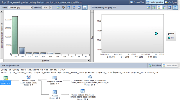
Figure 6 Regressed Queries Report
Almost every pane inside the built-in Query Store reports can be customized to fit your requirements. For instance, if you would rather see all the raw data instead of the graph, then you can change this window to display only the query text and some additional runtime information. This can be useful for those times that you are interested in a more thorough analysis since the raw data provides more depth, while a graph can help you quickly identify abnormal performance.
Let’s take a look at the default layout of the ‘Regressed Queries’ Report and the options we have to configure it.
First of all, the two buttons on the top right “Portrait View” and “Landscape View” determine how the various windows are aligned inside SQL Server Management Studio. Figure 6 is an example of the (default) Landscape View, while Figure 7 below shows the layout in Portrait.
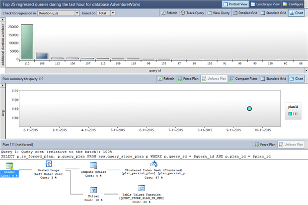
Figure 7 Portrait View layout
By default, the Landscape View is used so, for these articles, all the screenshots will be shown in the Landscape View where appropriate.
Let’s take another look at the different panes inside the ‘Regressed Queries’ report window, but this time with textboxes added to describe what information is being shown in the pane.
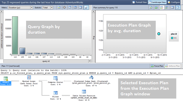
Figure 8 Regressed Queries Report
In the top-left window you will see a bar graph of the various queries that have regressed over time. Right now they are ordered on the “additional duration workload” which expresses the extra time that it took to execute the query before the regression. You can click one of the bars to update the other windows with information about the specific query.
At the top of the Query Graph window, we have some additional selection boxes that we can use to change the metrics inside the graph. In the case of this graph we can select on Duration, CPU Time, Logical Reads, Logical Writes, Memory Consumption and Physical Reads. Next to the metric selection we can also choose how the values of the metric are calculated. By default this is set to Total but we can also return values calculated as Avg (Average), Max (Maximum), Min (Minimum) and Std Dev (Standard Deviation).
The buttons next to metric selection boxes can be used to change the way this window displays its information or performs a specific action. Figure 9 shows a close-up of these buttons.

Figure 9 Query Graph Display Buttons
From left-to-right: the first button allows us to directly refresh this window, updating it with new information. The second button, which looks like a target, will open a ‘Tracked Queries’ report and uses the selected query as input for the report. The third button opens a new tab in SSMS and displays the query text inside the new tab. The final tree buttons change the way that data is displayed inside this window. By using these buttons, you can switch between a result grid, with either limited or additional query runtime information, or the graph that you can see in figures 6, 7 and 8.
You can change the axis of the graph simply by clicking on the bars beneath or on the side. This way you can build the graph around the metrics you are interested in the most. This customization option is available for almost all the graphs inside the built-in Query Store reports.
The top-right window displays the various Execution Plans compiled for this specific query. In this case there was only one Execution Plan (with an ID of 111). Execution Plans are displayed as a circle inside the graph, the higher the position of the Execution Plan inside the graph the higher the average query execution duration was when using the Execution Plan. Again we have some buttons at the top of the window that have different functions.

Figure 10 Execution Plans Graph Buttons
From left-to-right: the first button refreshes the Execution Plan Graph. The second button allows us to force the selected Execution Plan (inside the graph) to be use when this specific query is specified. We will discuss Execution Plan forcing in more detail in part 4 of this article series, ‘The SQL Server 2016 Query Store: Forcing Execution Plans using the Query Store’. The third button “unforces” an Execution Plan if it was forced for the specific query. The fourth button opens a new window where you can compare the Execution Plans shown in the graph for the specific query. The final two buttons change the display of the window, either showing the graph or returning the results in a grid.
The bottom window displays the Estimated Execution Plan of the plan you selected in the top-right window. The ‘force’ and ‘unforce‘ Execution Plan buttons are also visible in this pane so you can directly force on unforce the selected Execution Plan.
The final button is the Configure button at the top-right of the report. Clicking this button allows you configure the metrics that go into the report. Figure 11 shows the various options available for the ‘Regressed Queries Report’.
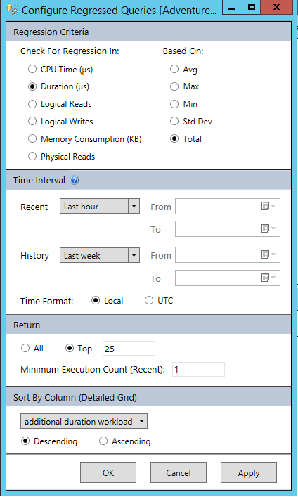
Figure 11 Regressed Queries Report configuration
Overall Resource Consumption Report
The ‘Overall Resource Consumption Report’ shows, as the name suggests, the performance of your query workload against the database. By default it will show four graphs: total query duration, number of query executions, CPU time and logical reads. By using the ‘ Configure ‘ button at the top right of the report we can select additional graphs or change the time and aggregation interval as shown in Figure 12 below.
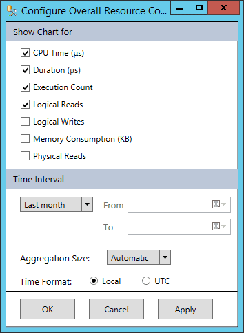
Figure 12 Overall Resource Consumption Report configuration
This report tells you what impact your query workload had on your server during a specific time interval or when you want to compare workload performance against historic measurements.
As with the Regressed Queries Report, we can also choose to view the results in a grid instead of graphs if you prefer to see the numbers.
Figure 13 shows the results of the report in a grid, with a custom time interval to show only 2 and 3 November, aggregated on the hour.
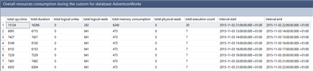
Figure 13 grid results of the Overall Resource Consumption report
Unlike the Regressed Queries Report there isn’t a whole lot else to configure in this report.
Top Resource Consuming Queries Report
The ‘Top Resource Consuming Queries’ report shares the same report layout and buttons as the ‘Regressed Queries’ report. It shows the most expensive queries against your database in terms of CPU memory or IO, showing various metrics either graphically or with the data.
In the past we would frequently use DMVs such as sys.dm_exec_query_stats to find this information. Thankfully, the Query Store allows us easier access to this runtime information without the need to write complex queries against DMVs to grab the query text and Execution Plans.
Tracked Queries Report
The final built-in Query Store report is the ‘Tracked Queries’ report. You can open this report from the ‘Regressed Queries’ or ‘Top Resource Consuming Queries’ report by selecting a query and clicking the Track Query button shown in Figure 9 earlier. You can also manually open this report and enter a query ID yourself.
The Tracked Queries report shows you the performance of a specific query and the associated Execution Plans. It works in much the same way as the ‘Regressed Queries’ and ‘Top Resource Consuming Queries’ report but the ‘Tracked Queries’ report will return information only for one specific query. Again we are able to force, or unforce, a specific Execution Plan from this report and select specific performance metrics or time intervals using the Configure button. A new button is introduced, shown in Figure 14, in this report called ‘Auto-Update’ that, when enabled, automatically refreshes the report based on an interval that is configurable.

Figure 14 Tracked Queries Report buttons
The ‘Tracked Queries’ report can be used when you are interested in the performance of a specific query, either historically or including current executions.
Summary
In this article we took a detailed look at the various built-in reports that become available when you enable the Query Store on a database. By using these reports, you get a wealth of information on how your query workload is performing, either aggregated for the entire query workload or for a single query. By using these reports, we can also force (or unforce) Execution Plans for specific queries, compare different Execution Plans for the same query and baseline our query workload performance against historic measurements.
This concludes the second article in the Query Store article series. The third article in the series ‘ The SQL Server 2016 Query Store: Accessing Query Store information using DMVs where we will take a look at the various new DMVs introduced with the Query Store.