
The series so far:
- SQL Server Machine Learning Services – Part 1: Python Basics
- SQL Server Machine Learning Services – Part 2: Python Data Frames
- SQL Server Machine Learning Services – Part 3: Plotting Data with Python
- SQL Server Machine Learning Services – Part 4: Finding Data Anomalies with Python
- SQL Server Machine Learning Services – Part 5: Generating multiple plots in Python
- SQL Server Machine Learning Services – Part 6: Merging Data Frames in Python
With the release of SQL Server 2017, Microsoft changed the name of R Services to Machine Learning Services (MLS) and added support for Python. As with the R language, you can use Python to perform advanced analytics against SQL Server data within the context of a SQL Server database. Also like R, if the basic Python language elements are not enough to carry out specific operations, you can import modules into your script that offer additional tools for working with data.
One of the most useful modules is the matplotlib library, which provides an extensive codebase for plotting data and creating rich, customized visualizations. You can use matplotlib components to generate a wide range of graphics, including bar charts, pie charts, scatter plots, histograms, and many others. For example, you can generate a series of line charts that aggregate inventory or sales data in your SQL Server database and then save those charts to .png or .pdf files.
This article includes several examples that demonstrate how to create matplotlib visualizations and save them to .pdf files, using data from the AdventureWorks2017 sample database. The article assumes that you know how to use the sp_execute_external_script stored procedure to run Python scripts in SQL Server. If you’re not familiar with the stored procedure, you should review the first two articles in this series before continuing with this one.
Generating a basic bar chart
The matplotlib module provides an extensive set of tools for creating visualizations and saving them to files. Unfortunately, the matplotlib documentation does not achieve the same level of quality as its code. The information can be confusing and inadequate in places, making it difficult to understand certain aspects of plotting data and how to create the various graphics, especially when you’re just getting started.
Because of this, you might have better luck learning about matplotlib by seeing it in action. For example, the following T-SQL code generates a horizontal bar chart based on aggregated data from the AdventureWorks2017 database. Be sure to modify the file path in the script for your environment or create the c:\datafiles folder before running the code:
|
1 2 3 4 5 6 7 8 9 10 11 12 13 14 15 16 17 18 19 20 21 22 23 24 25 26 27 28 29 30 31 32 |
Use AdventureWorks2017; GO DECLARE @pscript NVARCHAR(MAX); SET @pscript = N' # import matplotlib modules import matplotlib matplotlib.use("PDF") import matplotlib.pyplot as plt # define df data frame df = InputDataSet.groupby("Territories").sum() # create bar chart object pt = df.plot.barh() # save bar chart to PDF file plt.savefig("c:\\datafiles\\TerritorySales01.pdf", bbox_inches="tight", pad_inches=.5)'; DECLARE @sqlscript NVARCHAR(MAX); SET @sqlscript = N' SELECT t.Name AS Territories, CAST(h.Subtotal AS FLOAT) AS Sales FROM Sales.SalesOrderHeader h INNER JOIN Sales.SalesTerritory t ON h.TerritoryID = t.TerritoryID WHERE YEAR(h.OrderDate) = 2013;'; EXEC sp_execute_external_script @language = N'Python', @script = @pscript, @input_data_1 = @sqlscript; GO |
If you’ve come this far in the series, most of these elements should look very familiar to you. The example starts by defining a Python script and assigning it the @pscript variable. Next, the code defines a T-SQL query and saves that to the @sqlscript variable. The two variables are then passed to the sp_execute_external_script stored procedure so the data returned by the T-SQL query can be used within the Python script. If you have any questions about the general statement structure or about running the stored procedure, refer to the first article in this series.
With that in mind, let’s dig into the Python script itself, starting with the first import statement and its related use function:
|
1 2 |
import matplotlib matplotlib.use("PDF") |
The import statement calls the matplotlib module. The second statement then uses the module to call the use function, which sets the backend to PDF. A backend provides the structure necessary to support a specific output type. Because PDF is specified here, you can output your charts to .pdf files.
The next step is to import the pyplot plotting framework that is included in the matplotlib package:
|
1 |
import matplotlib.pyplot as plt |
Because the import statement assigns the plt alias to the framework, you can use that alias to reference pyplot elements in your Python script. Note that you should run this import statement after you set up the PDF backend. Otherwise, the use function call will have no effect because a backend is already selected.
With the modules in place, you can then set up your data frame. For this example, you need only use pandas groupby function to aggregate the SQL Server data available through the InputDataSet variable:
|
1 |
df = InputDataSet.groupby("Territories").sum() |
The groupby function is used here just like it is in the first two articles in this series, except that it does not set the as_index parameter to False. As a result, the Territories column will be added to the outputted data frame as an index, rather than a numeric index being auto-generated. I’ve taken this approach to demonstrate how indexes can be used when plotting data, as you’ll see later in the article.
After you’ve set up the df dataframe, you can create a bar chart by calling the plot.barh function on the data frame:
|
1 |
pt = df.plot.barh() |
The plot.barh function generates a figure that contains a horizontal bar chart, which is then saved to the pt variable. (As we progress through the examples in this article, you’ll see how the pt variable can be used to format different components of the chart.) If you want to create a visualization other than a horizontal bar chart, you would call a different function, specifying the data frame and plot root. For example, to generate a histogram, you would use df.plot.hist(). The only exception to this convention is the basic line chart, which requires only df.plot().
Once you’ve created the bar chart, you can use the savefig function available to the pyplot framework to save the chart to a .pdf file:
|
1 2 |
plt.savefig("c:\\datafiles\\TerritorySales01.pdf", bbox_inches="tight", pad_inches=.5)'; |
When calling the function, you start by passing in the path to the target file. The example here targets the datafiles folder on the local C: drive, but you can specify any location. (Be sure to update the code accordingly if you run these examples.)
The function’s second parameter (bbox_inches) and third parameter (pad_inches) work together to control the amount of white space (bounding box) around the image. The bbox_inches parameter can be set to tight or None (the default), or it can be set to the actual bounding box dimensions in inches. For this example, you can use the tight setting, which removes the extra white space from around the graphic. The pad_inches parameter then adds a specified amount of white space around the image (in this case, .5 inches). The pad_inches parameter applies only when the bbox_inches parameter is set to tight. Using these two parameters together provides a simple way to define the bounding box, without having to calculate exact measurements.
The Python script generates the chart shown in the following figure.
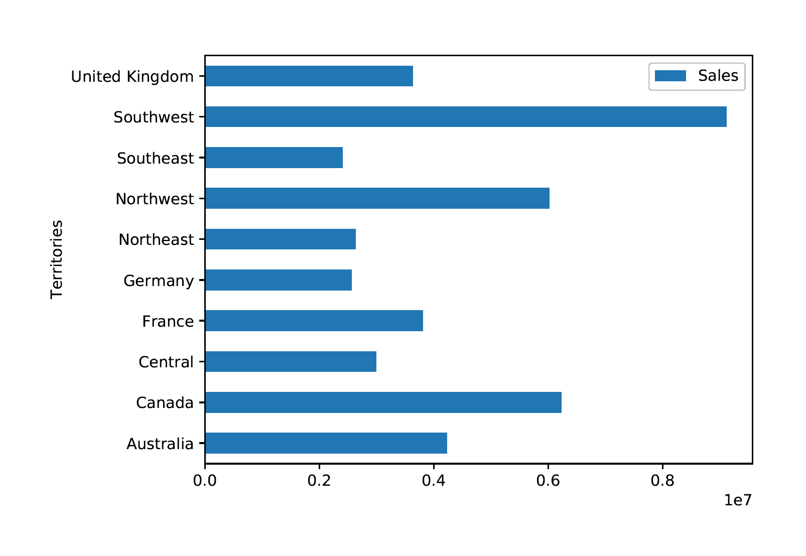
The figure shows a horizontal chart that uses the default formatting. The territories are listed on the Y-axis, and the sales amounts are listed on the X-axis (in scientific notation). The bars indicate the total amount of sales per territory.
Formatting the chart’s components
The matplotlib module includes a wide range of options for adjusting how a chart is rendered. You can add labels, change their format, control how the legend is displayed, set the colors of the text and chart elements, and configure other components. For example, you can modify the chart above by changing the size and color of the bars, adding a title and grid, and removing the legend, as shown in the following Python script:
|
1 2 3 4 5 6 7 8 9 10 11 12 13 14 15 16 17 18 19 20 21 22 23 24 25 26 27 28 29 30 31 32 33 34 35 |
DECLARE @pscript NVARCHAR(MAX); SET @pscript = N' # import matplotlib modules import matplotlib matplotlib.use("PDF") import matplotlib.pyplot as plt # define df data frame df = InputDataSet.groupby("Territories").sum() # create bar chart object pt = df.plot.barh(color="blue", alpha=.8, width=.4) # configure title, legend, and grid pt.set_title(label="Sales by Territory", y=1.04, family="fantasy", fontsize=14, weight=500, color="navy") pt.legend().set_visible(False) pt.grid(color="slategray", alpha=.5, linestyle="dotted", linewidth=.5) # save bar chart to PDF file plt.savefig("c:\\datafiles\\TerritorySales02.pdf", bbox_inches="tight", pad_inches=.5)'; DECLARE @sqlscript NVARCHAR(MAX); SET @sqlscript = N' SELECT t.Name AS Territories, CAST(h.Subtotal AS FLOAT) AS Sales FROM Sales.SalesOrderHeader h INNER JOIN Sales.SalesTerritory t ON h.TerritoryID = t.TerritoryID WHERE YEAR(h.OrderDate) = 2013;'; EXEC sp_execute_external_script @language = N'Python', @script = @pscript, @input_data_1 = @sqlscript; GO |
The Python script builds on the preceding example by first modifying the plot.barh function to include several parameters that change the color and width of the bars:
|
1 |
pt = df.plot.barh(color="blue", alpha=.8, width=.4) |
The color parameter should be obvious. You need only specify one of the many supported colors. You can access color samples at Matplotlib Examples, where you can also access examples of other language elements.
The alpha parameter sets the bar transparency. The parameter takes any float value between 0.0 (transparent) and 1.0 (opaque). The final parameter, width, sets the bar width in inches.
When creating a chart, you have multiple options for formatting its components. As you’ve just seen with plot.barh, you can provide parameter values when calling the chart function. Each function supports a number of parameters, so be sure to refer to the matplotlib documentation as necessary.
You can also use other functions available in the matplotlib module for formatting graphic components. For example, the next statement in the Python script calls the set_title function on the pt variable to create a chart title:
|
1 2 |
pt.set_title(label="Sales by Territory", y=1.04, family="fantasy", fontsize=14, weight=500, color="navy") |
The label parameter provides the text for the title. The y parameter refers to the title’s Y coordinate, relative to the chart itself. A value of 1 means the label will sit directly on top of the chart. For this example, I’ve bumped it up a bit (1.04) so the title sits a little higher. You can play with this and pick the setting that you think is best.
The next parameter in the set_title function is family, which specifies the font family to use for the title. I picked fantasy just for fun, but you can specify any supported font you want, such as Times New Roman. The fontsize parameter provides the font’s point size, and the weight parameter determines how light or bold the font is. The parameter takes a numeric value between 0 (lightest) to 1000 (boldest). It also supports such keywords as light, normal, semibold, or bold. The color parameter then sets the font’s color to navy blue.
If you refer back to the previous figure, you’ll see that the chart includes a legend. Because there’s only one category of data, Sales, the legend is not necessary. You can remove the legend by including the following statement in your script:
|
1 |
pt.legend().set_visible(False) |
As you can see, you need only call the pt variable, followed by the legend function, and then by the set-visible function, passing in a value of False.
The next statement in the Python script uses the grid function to add a light-gray grid to the chart to make it easier to track totals:
|
1 |
pt.grid(color="slategray", alpha=.5, linestyle="dotted", linewidth=.5) |
The function’s parameters and values should be self-evident. The function adds a grid that is slate-gray with 50% transparency. In addition, the grid lines are dotted and have a width of only a half point. The Python script generates the chart shown in the following figure.
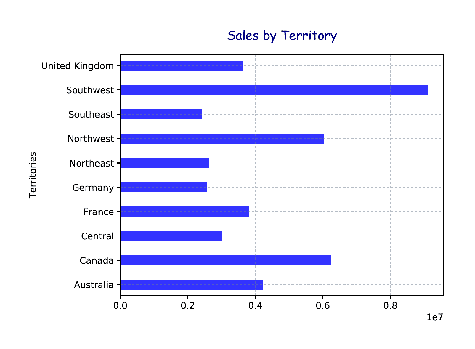
The chart now includes a title and grid, but no legend. In addition, the graph bars are narrower than before and a darker blue color. For your charts, you can use whatever fonts and colors you want. The important point, of course, is to make the data itself as clear and easy to understand as possible.
Formatting the Y-axis labels
In the previous chart, the Y-axis labels are listed in alphabetical order from the bottom up, but you can easily reverse the order. You can also format the axis and tick labels, as shown in the following example:
|
1 2 3 4 5 6 7 8 9 10 11 12 13 14 15 16 17 18 19 20 21 22 23 24 25 26 27 28 29 30 31 32 33 34 35 36 37 38 39 40 |
DECLARE @pscript NVARCHAR(MAX); SET @pscript = N' # import matplotlib modules import matplotlib matplotlib.use("PDF") import matplotlib.pyplot as plt # define df data frame df = InputDataSet.groupby("Territories").sum() # create bar chart object pt = df.plot.barh(color="blue", alpha=.8, width=.4) # configure title, legend, and grid pt.set_title(label="Sales by Territory", y=1.04, family="fantasy", fontsize=14, weight=500, color="navy") pt.legend().set_visible(False) pt.grid(color="slategray", alpha=.5, linestyle="dotted", linewidth=.5) # format Y axis pt.invert_yaxis() pt.set_ylabel("Regional Territories", fontsize=12, color="navy") pt.set_yticklabels(labels=df.index, fontsize=9, color="navy") # save bar chart to PDF file plt.savefig("c:\\datafiles\\TerritorySales03.pdf", bbox_inches="tight", pad_inches=.5)'; DECLARE @sqlscript NVARCHAR(MAX); SET @sqlscript = N' SELECT t.Name AS Territories, CAST(h.Subtotal AS FLOAT) AS Sales FROM Sales.SalesOrderHeader h INNER JOIN Sales.SalesTerritory t ON h.TerritoryID = t.TerritoryID WHERE YEAR(h.OrderDate) = 2013;'; EXEC sp_execute_external_script @language = N'Python', @script = @pscript, @input_data_1 = @sqlscript; GO |
The Python script includes a new section of code that contains several statements specific to the Y-axis. The first of these statements calls the invert_yaxis function to reverse the order of the Territories values:
|
1 |
pt.invert_yaxis() |
You don’t need to pass in any parameters when calling the function. You need only specify the pt variable to ensure that the changes are applied to that specific chart.
The next statement in the Python script uses the set_ylabel function to rename the Y-axis label and specify a font size and color:
|
1 |
pt.set_ylabel("Regional Territories", fontsize=12, color="navy") |
You can also adjust the tick labels by using the set_yticklabels function:
|
1 |
pt.set_yticklabels(labels=df.index, fontsize=9, color="navy") |
Notice that the labels parameter takes a value of df.index. You must use the data frame’s index to get the Territories names because the groupby function does not set the as_index parameter to False. As a result, the unique Territories values are used as the index, so you must reference that index when you specify values for the tick labels. The following figure shows the changes to the chart’s Y-axis.
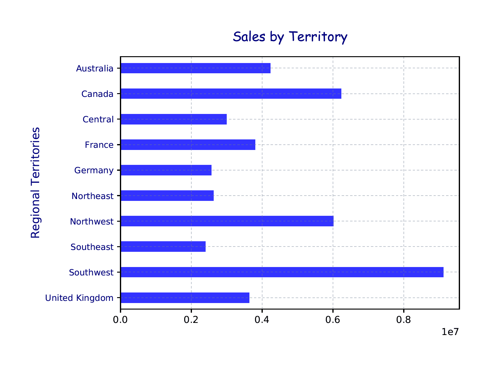
Now the territories are listed in alphabetical order from the top down and use a smaller font and different color. The axis label has also been renamed and reformatted with a different font size and color.
Formatting the X-axis labels
The final step for this chart is to format the labels associated with the X-axis. For that, you can add a section that is specific to that axis:
|
1 2 3 4 5 6 7 8 9 10 11 12 13 14 15 16 17 18 19 20 21 22 23 24 25 26 27 28 29 30 31 32 33 34 35 36 37 38 39 40 41 42 43 44 45 46 |
DECLARE @pscript NVARCHAR(MAX); SET @pscript = N' # import matplotlib modules import matplotlib matplotlib.use("PDF") import matplotlib.pyplot as plt # define df data frame df = InputDataSet.groupby("Territories").sum() # create bar chart object pt = df.plot.barh(color="blue", alpha=.8, width=.4) # configure title, legend, and grid pt.set_title(label="Sales by Territory", y=1.04, family="fantasy", fontsize=14, weight=500, color="navy") pt.legend().set_visible(False) pt.grid(color="slategray", alpha=.5, linestyle="dotted", linewidth=.5) # format Y axis pt.invert_yaxis() pt.set_ylabel("Regional Territories", fontsize=12, color="navy") pt.set_yticklabels(labels=df.index, fontsize=9, color="navy") # format X axis pt.set_xlabel("Total Sales", labelpad=10, fontsize=12, color="navy") pt.set_xticklabels(labels=df["Sales"], fontsize=9, color="navy") pt.get_xaxis().set_major_formatter(matplotlib.ticker.FuncFormatter (lambda x, p: format(int(x), ","))) # save bar chart to PDF file plt.savefig("c:\\datafiles\\TerritorySales04.pdf", bbox_inches="tight", pad_inches=.5)'; DECLARE @sqlscript NVARCHAR(MAX); SET @sqlscript = N' SELECT t.Name AS Territories, CAST(h.Subtotal AS FLOAT) AS Sales FROM Sales.SalesOrderHeader h INNER JOIN Sales.SalesTerritory t ON h.TerritoryID = t.TerritoryID WHERE YEAR(h.OrderDate) = 2013;'; EXEC sp_execute_external_script @language = N'Python', @script = @pscript, @input_data_1 = @sqlscript; GO |
The first statement in the X-axis section uses the set_xlabel function to format the axis label and add more space between it and the bottom of the chart:
|
1 |
pt.set_xlabel("Total Sales", labelpad=10, fontsize=12, color="navy") |
Most of the function’s parameters should look familiar to you. The function sets the label text to Total Sales, the font size to 12 points, and the font color to navy blue. What’s new here is the labelpad parameter, which specifies the number of points to put between the label and the X-axis. You can adjust the number of points as necessary, choosing whatever is best for your circumstances.
After formatting the axis label, you can use the set_xticklabel function to format the tick labels:
|
1 |
pt.set_xticklabels(labels=df["Sales"], fontsize=9, color="navy") |
When you formatted the Y-axis labels, you used the data frame’s index for the tick values. For the X-axis tick labels, you use the Sales column, whose values provide the bases for the tick labels. The actual labels depend on the type of data and how the ticks are spaced. In this case, the ticks will be spaced in increments of 2 million.
The final X-axis statement calls the get_xaxis function, followed by the set_major_formatter function:
|
1 2 |
pt.get_xaxis().set_major_formatter(matplotlib.ticker.FuncFormatter (lambda x, p: format(int(x), ","))) |
The goal here is to add comma separators to tick labels. The get_xaxis function returns an XAxis instance, which is used to call the set_major_formatter function. The set_major_formatter function is used to format the major X-axis labels (as opposed to the minor labels). In this case, the function takes the matplotlib.ticker.FuncFormatter function as an argument, making it possible to run a lambda function against the tick values.
As you’ll recall from the second article in this series, a lambda function is simply an anonymous, unnamed function. In this case, the lambda function runs the format function against each tick value, adding comma separators as necessary. The following figure shows the chart generated by the updated Python script.
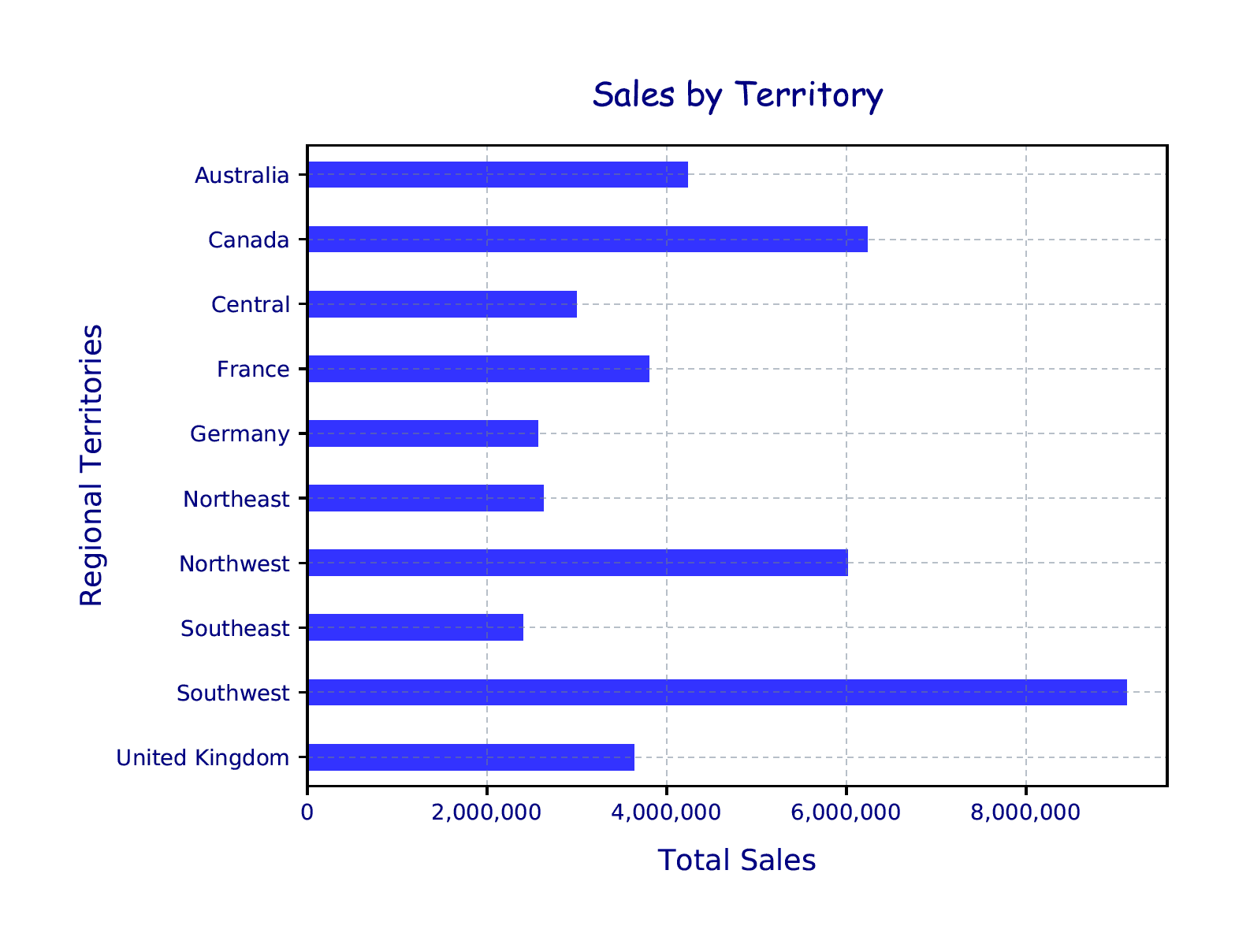
The X-axis now includes the Total Sales label, just below the bottom of the chart. In addition, the X-axis tick labels are incremented at every 2 million and formatted to be consistent with the Y-axis labels. Notice that the tick values no longer appear as scientific notation. The set_xticklabels function takes care of that.
Generating a line chart
Now that you’ve gotten a taste of how to use the matplotlib language elements to create a chart, let’s mix things up a bit. This time around, we’ll create a basic line chart, using the same SQL Server data as in the previous examples:
|
1 2 3 4 5 6 7 8 9 10 11 12 13 14 15 16 17 18 19 20 21 22 23 24 25 26 27 28 29 30 31 32 33 34 35 36 37 38 39 40 41 42 43 44 45 46 |
DECLARE @pscript NVARCHAR(MAX); SET @pscript = N' # import matplotlib modules import matplotlib matplotlib.use("PDF") import matplotlib.pyplot as plt # define df data frame df = InputDataSet.groupby("Territories").sum() # create line chart object pt = df.plot(color="blue", alpha=.8, linewidth=2) # configure title, legend, and grid pt.set_title(label="Sales by Territory", y=1.04, family="fantasy", fontsize=14, weight=500, color="navy") pt.legend().set_visible(False) pt.grid(color="slategray", alpha=.5, linestyle="dotted", linewidth=.5) # format Y axis pt.set_ylabel("Total Sales", labelpad=20, fontsize=12, color="navy") pt.set_yticklabels(labels=df["Sales"], fontsize=9, color="navy") pt.get_yaxis().set_major_formatter(matplotlib.ticker.FuncFormatter (lambda x, p: format(int(x), ","))) # format X axis pt.set_xlabel("Regional Territories", labelpad=20, fontsize=12, color="navy") pt.set_xticklabels(labels=df.index, fontsize=9, color="navy", rotation=45, horizontalalignment="right") # save line chart to PDF file plt.savefig("c:\\datafiles\\TerritorySales05.pdf", bbox_inches="tight", pad_inches=.8)'; DECLARE @sqlscript NVARCHAR(MAX); SET @sqlscript = N' SELECT t.Name AS Territories, CAST(h.Subtotal AS FLOAT) AS Sales FROM Sales.SalesOrderHeader h INNER JOIN Sales.SalesTerritory t ON h.TerritoryID = t.TerritoryID WHERE YEAR(h.OrderDate) = 2013;'; EXEC sp_execute_external_script @language = N'Python', @script = @pscript, @input_data_1 = @sqlscript; GO |
The first statement worth noting in the Python script is the plot definition:
|
1 |
pt = df.plot(color="blue", alpha=.8, linewidth=2) |
Because you’re creating a line chart, you need to specify only the plot function, without the additional attribute (e.g., plot.barh). For this example, the function takes three parameters, which specify the color of the plot lines, their transparency, and their width.
The next part of the Python script defines the title and grid and removes the legend, just like the previous examples, so we don’t need to go into that again. This is followed by the statements that format the Y-axis labels:
|
1 2 3 4 |
pt.set_ylabel("Total Sales", labelpad=20, fontsize=12, color="navy") pt.set_yticklabels(labels=df["Sales"], fontsize=9, color="navy") pt.get_yaxis().set_major_formatter(matplotlib.ticker.FuncFormatter (lambda x, p: format(int(x), ","))) |
You’ve seen all these settings before, but rearranged to format the Y-axis labels and add comma separators to the sales totals.
Most of the X-axis settings are also similar to what you saw in the earlier examples:
|
1 2 3 |
pt.set_xlabel("Regional Territories", labelpad=20, fontsize=12, color="navy") pt.set_xticklabels(labels=df.index, fontsize=9, color="navy", rotation=45, horizontalalignment="right") |
The only new elements are the last two parameters passed into the set_xticklabels function. The rotation parameter specifies that the tick labels should be rotated 45 degrees, and the horizontalalignment parameter ensures that the labels line up with the tick marks correctly. The Python script now generates the chart shown in the following figure.
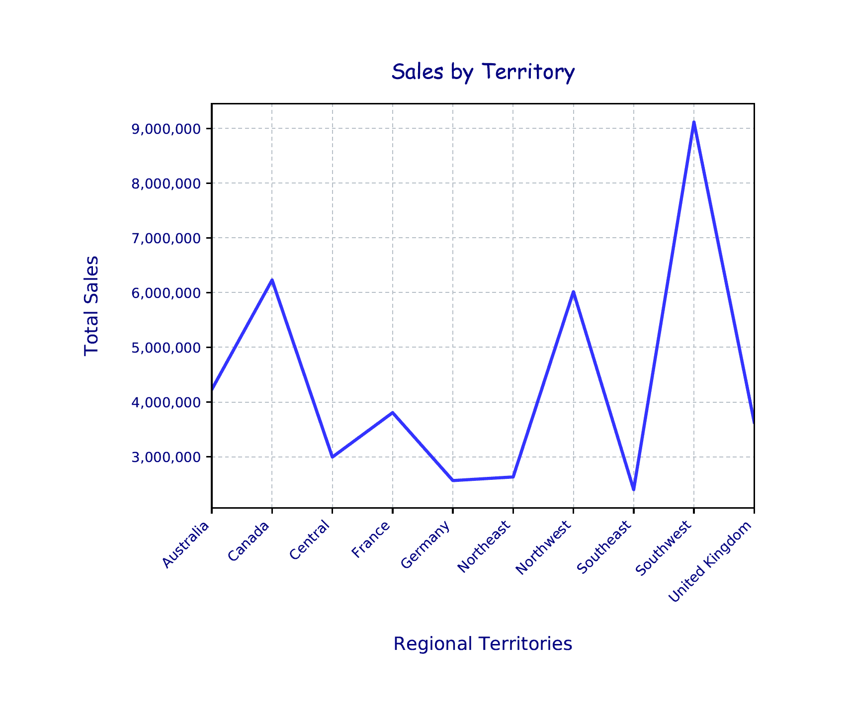
Here we have the same data as before, but presented in a much different way, with the labels and lines formatted specific to our needs. When choosing a chart type and determining how to format it, you should base your decisions on how to present the data in the most effective way possible.
Adding multiple subplots to a line chart
In the previous examples, the data was based on two types of data: territories and sales. There might be times, however, when you want to visualize more complex relationships, such as being able to view the amount of sales per territory per month. One way you can do this is to add multiple subplots (layers) to a chart in order to compare different groups of data. For example, the following Python script creates a series of line subplots that are merged into one chart:
|
1 2 3 4 5 6 7 8 9 10 11 12 13 14 15 16 17 18 19 20 21 22 23 24 25 26 27 28 29 30 31 32 33 34 35 36 37 38 39 40 41 42 43 44 45 46 47 48 49 50 51 52 53 54 55 56 57 58 59 60 |
DECLARE @pscript NVARCHAR(MAX); SET @pscript = N' # import matplotlib, calendar, numpy modules import matplotlib matplotlib.use("PDF") import matplotlib.pyplot as plt import calendar as cl import numpy as np # define the df data frame df = InputDataSet.groupby(["Territories", "OrderMonths"], as_index=False).sum() df.columns = ["Territories", "OrderMonths", "TotalSales"] df["OrderMonths"] = df["OrderMonths"].apply(lambda x: cl.month_abbr[x]) # create territory-based line chart ax1 = plt.subplot() ts = list(df["Territories"].unique()) pt = None if len(ts) > 0: for t in ts: pt = df.loc[df["Territories"] == t].plot(x="OrderMonths", y="TotalSales", ax=ax1, label=t, alpha=.8, linewidth=2) else: print("The list of territories is empty.") quit() # configure title, legend, and grid pt.set_title(label="Sales by Territory", y=1.04, family="fantasy", fontsize=14, weight=500, color="navy") pt.legend(loc=7, bbox_to_anchor=(1.4, .5)) pt.grid(color="slategray", alpha=.5, linestyle="dotted", linewidth=.5) # format Y axis pt.set_ylabel("Total Sales", labelpad=20, fontsize=12, color="navy") pt.set_yticklabels(labels=df["TotalSales"], fontsize=9, color="navy") pt.get_yaxis().set_major_formatter(matplotlib.ticker.FuncFormatter (lambda x, p: format(int(x), ","))) # format X axis pt.set_xlabel("Sales per Month", labelpad=20, fontsize=12, color="navy") pt.set_xticks(np.arange(12)) pt.set_xticklabels(labels=df["OrderMonths"], fontsize=9, color="navy") # save line chart to PDF file plt.savefig("c:\\datafiles\\TerritorySales06.pdf", bbox_inches="tight", pad_inches=.8)'; DECLARE @sqlscript NVARCHAR(MAX); SET @sqlscript = N' SELECT t.Name AS Territories, MONTH(h.OrderDate) AS OrderMonths, CAST(h.Subtotal AS FLOAT) AS Sales FROM Sales.SalesOrderHeader h INNER JOIN Sales.SalesTerritory t ON h.TerritoryID = t.TerritoryID WHERE YEAR(h.OrderDate) = 2013;'; EXEC sp_execute_external_script @language = N'Python', @script = @pscript, @input_data_1 = @sqlscript; GO |
This first item worth noting is that the T-SQL script now returns the numeric month values for the dates in the OrderDate column. As for the Python script, it starts just like the previous examples, by importing the matplotlib modules, but then adds two more modules: calendar and numpy:
|
1 2 |
import calendar as cl import numpy as np |
The calendar module provides tools for working with date values, and the numpy module provides tools for scientific computing. The Python script includes two statements that leverage these modules. The first is when defining the df data frame:
|
1 2 3 |
df = InputDataSet.groupby(["Territories", "OrderMonths"], as_index=False).sum() df.columns = ["Territories", "OrderMonths", "TotalSales"] df["OrderMonths"] = df["OrderMonths"].apply(lambda x: cl.month_abbr[x]) |
Unlike the previous examples, the initial statement uses the groupby function to group the data based on both the Territories and OrderMonths columns. In addition, the function call also includes the as_index parameter and sets its value to False. As a result, Territories and OrderMonths will be added to the data frame as columns, rather than being part of the index.
The second statement specifies a name for each column in the data frame, and the third statement changes the OrderMonths integer values to their month abbreviations, using the month_abbr function from the calendar module. (For more information about the elements within these three statements, refer back to the second article in this series.)
With the data frame in place, you’re ready to define your chart. The goal here is to create a chart that includes a plot line for each territory, which requires that you define a subplot for each territory. To do so, start by using the subplot function available to the pyplot framework to create an AxesSubplot object:
|
1 |
ax1 = plt.subplot() |
You will use the ax1 object in a for loop to create the subplots. But first, you must create a list of unique values from the Territories column and assign the list to the ts variable:
|
1 |
ts = list(df["Territories"].unique()) |
The next step is to define the pt variable with a value of None so we can pass the variable into and out of the for loop:
|
1 |
pt = None |
With these three variables defined, you can create an if…else statement block that includes a for loop for iterating through the list of territories:
|
1 2 3 4 5 6 7 |
if len(ts) > 0: for t in ts: pt = df.loc[df["Territories"] == t].plot(x="OrderMonths", y="TotalSales", ax=ax1, label=t, alpha=.8, linewidth=2) else: print("The list of territories is empty.") quit() |
The if…else statement block verifies whether the ts variable contains values. If it does, the for loop iterates through each territory (t in ts). For each iteration, the statement filters the data frame so it includes only the sales data for that territory (df.loc[df[“Territories”] == t]).
The for loop statement then calls the plot function to build the territory’s subplot. The first two parameters passed into the plot function specify that the OrderMonths values be used for the X-axis and the TotalSales values be used for the Y-axis.
The next parameter, ax, is set to the ax1 variable, which tells the Python engine to use the ax1 object to create the subplot. The label property then assigns the current territory name (t) to the subplot, which will be used for the legend entry associated with this territory. The alpha and linewidth properties set the transparency and line width, as you’ve seen before.
If the if…else condition determines that the ts variable does not contain values, the statements in the else section run, in which case a message is returned to the console and the script quits executing.
Note that Python uses indentation to control the logic flow within statement blocks, rather than brackets or other elements, so be sure not to add tabs arbitrarily to the beginning of your statements.
The next section in the Python script formats the title, legend, and grid:
|
1 2 3 4 |
pt.set_title(label="Sales by Territory", y=1.04, family="fantasy", fontsize=14, weight=500, color="navy") pt.legend(loc=7, bbox_to_anchor=(1.4, .5)) pt.grid(color="slategray", alpha=.5, linestyle="dotted", linewidth=.5) |
The main difference from previous examples is that this time you don’t remove the legend. Instead, you use the legend function to move the legend off to the right side. The function takes two parameters. The loc parameter provides the legend’s general position. The supported values range from 0 to 10, with 7 locating the legend to the right side of the chart, in the center. To move the legend off the chart completely, you must also include the bbox_to_anchor parameter, which defines the location of the legend’s bounding box, relative to the loc setting. You’ll likely have to play with these settings from one chart to the next to get the position just right.
The rest of the Python script is similar to the previous examples, except for one statement related to the X-axis:
|
1 |
pt.set_xticks(np.arange(12)) |
The statement calls the set_xticks function, which defines where the ticks appear along the X-axis. In this case, the function takes as its argument the arange function available through the numpy module. The arange function returns evenly spaced values within a given interval. Because the X-axis is based on sales months, a value of 12 is passed into the function to indicate that a tick should be included for each month. Otherwise, the axis displays only six ticks, one for every other month.
The Python script generates the chart shown in the following figure.
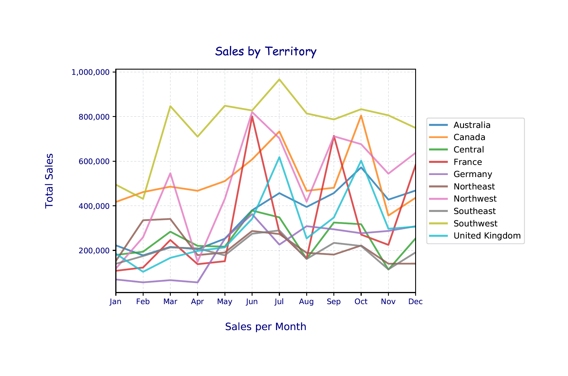
The chart now includes a plot line for each territory. The legend, which is to the right of the chart, maps back to the plot lines, based on the color automatically assigned to each territory.
Visualizing SQL Server data
The matplotlib module supports many more types of visualizations than what we covered here, and for each visualization, you have a high degree of control over how those visualizations are formatted. Of course, Microsoft also offers such tools as Power BI and SQL Server Reporting Services for creating visualizations, but MLS and Python make it simple to generate graphics as part of your analytics, without needing to add another layer of complexity to your projects. Once you understand the basics of how to plot data in MLS and Python, you have a powerful set of tools for both analyzing and visualizing SQL Server data.