
Part 2: Design by Sketching
Ultimately, we are deluding ourselves if we think that the products that we design are the “things” that we sell, rather than the individual, social and cultural experience that they engender, and the value and impact that they have. Design that ignores this is not worthy of the name
Bill Buxton, Principal Researcher, Microsoft Research
James! We’ve
been robbed
For a moment, I thought I had walked into the wrong office: All the computers, monitors, keyboards and mice were gone. I surveyed, with some alarm, the empty desks of our entire project team on the Wednesday morning. Bart then arrived, nodded good morning as usual, took off his scarf, removed his coat, sat down and swore. “James! We’ve been robbed”.
James – Bart’s boss – simply smiled and shrugged. This was no robbery. It was an inside job. And, knowing James, things could only get worse.
This was going to be a really long day …
The Computer Detox
At the 10am project meeting, James nervously explained that our computers had been removed so as to get us involved in the design process for ANTS Profiler 4, the new version of our code profiling tool. James had just read a book, always a dangerous sign. James wanted to try out some ideas in Bill Buxton’s “Sketching User Experiences” and we were his guinea pigs.
Our very first question was, of course, “how long will this last?” James’s replied “as long as it takes”. This did not go down well. The dust had barely settled when James then introduced the next surprise – sketch pads, pencils, erasers and colouring pens for everyone. There was silence in the room. We looked at our sketch pads in disdain.
The first task of the day was to discuss what the major tasks and issues users were facing when using ANTS Profiler 3. We wrote these on the large white board. The next step was to sketch out some possible solutions, but first we set out some rules:
- This wasn’t an art class. We wouldn’t draw – we would sketch. A sketch is, by definition, rough and unfinished. That’s the whole point – it can be thrown away in an instant. Nobody on our team (myself included) can draw. Everybody can sketch. Even James.
- We also had an unwritten “no criticism” policy in terms of the quality of the sketch or of the idea. We could comment on the ideas behind the sketch but the quality of the draftsmanship was off limits. It just doesn’t matter. Precision is not the aim.
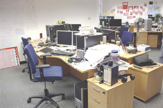
Figure 1a. Before the computer and equipment detox
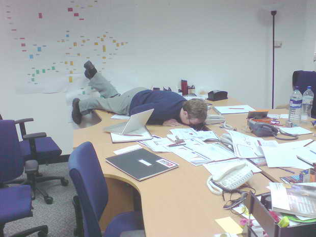
Figure 1b. After the computer detox. The large black Sketch book with the drawings and materials spread out for all to see (and Andrew sneaking his personal laptop in)
To sketch or not to sketch?
We paused, waiting for someone else to make a fool of themselves. At length, one person ‘crossed the line’, and drew a line on paper. Everyone quickly followed.
Although the designer has the final responsibility for the polish of the final design, in the same way that it’s the job of a developer to implement that design and of a tester to check its robustness and stability, everybody must share the initial stage of generating ideas. At this stage any team member, irrespective of role, can have that single moment of insight which lifts your project to a different level. This was something which happened in our own project and which decided the path that our application eventually took.
The Timeline emerges
He said that
we could
collect and
display the
data in any
way we wanted.
My initial sketches had assumed that the new profiler would adhere to the typical ‘snapshot’ metaphor. According to this metaphor, the end user presses the ‘snapshot’ button in the code profiler at interesting points as he profiles application, and then compares the snapshots. For example, he might take a snapshot before the application does a complex calculation, and one after. If the method foo() has been called 100 times by the first snapshot and 1000 times in the second snapshot then it’s been called 900 times in between. I thought this was an immutable convention for the way of collecting data. However, one of the software engineers, Andrew Hunter, challenged this assumption. He said that we could collect and display the data in any way we wanted.
For me, this was a startling revelation. I had no idea this was possible. We could show any results that the user wanted, for any given time range, in real time. There was no need for snapshots.
Andrew quickly sketched out the concept of a timeline:
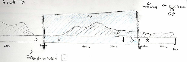
Figure 2. The initial sketch by Andrew that indicated selecting regions of interest on a timeline to help filter information
We sat around as the idea was sketched out before us and he explained how it could potentially work. It was a novel approach, but tied in with everything that we had observed in the research phase. Best of all, nobody had ever built a time line into a code profiler. This rapid prototyping and immediate communication to every member of the team was really important. It took just two minutes to do, and could be easily extended by all of us.
We could all now sketch out the logic of the potential workflows. We identified the limitations, adapted our sketches and tried again. Best of all, we made these changes with a couple of strokes of the pencil. We could rapidly think through alternatives to the layout and communicate them. We no longer felt the awkwardness of sitting around with sketch pads and pencils. I was beginning to enjoy it.
Suddenly the tide shifted as we expanded on the idea for this particular component. Would it need to zoom and how would this be done? What about resizing a region of time?
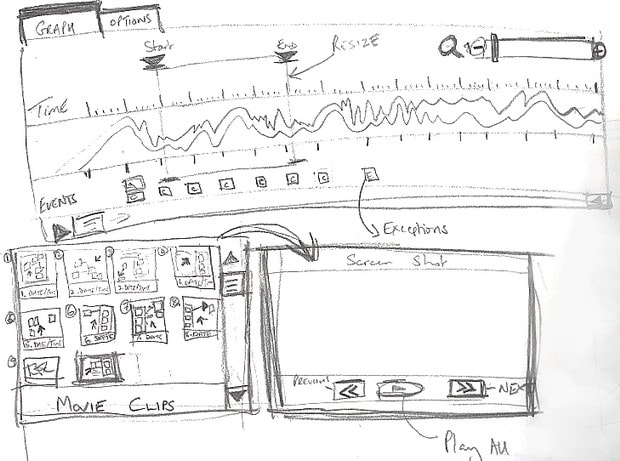
Figure 3. Expanding and exploring crazy ideas based on the concept within minutes
We explored some wild ideas, such as putting picture thumbnails of the UI at key points in the timeline so people could tell what was happening on their application as its performance was being monitored. We even sketched out video clips annotating the timeline. Did it make it into the product? No way. Do we care? Certainly not, after all it only took 1 minute to put these ideas down on paper before moving on to the next idea.
We all felt the initial timeline idea was good but how might this concept look and work within the product as a whole? Where would it fit? How would it interact with other components on screen? This sparked more sketches, including this one from Bart:
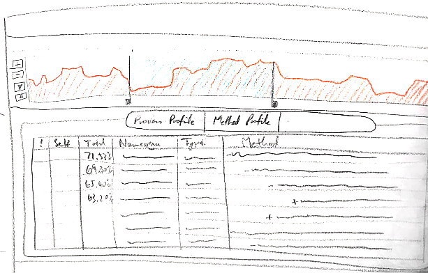
Figure 4. The timeline component within the larger application
After many iterations and higher fidelity prototypes and user testing, we implemented the timeline component as shown below. It certainly looks more polished but is still easily recognisable from that very first rough sketch 6 months previously.
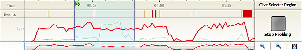
Figure 5. The implemented timeline component as it currently stands
Grabbing a pencil
I learnt a couple of memorable lessons from this experience.
- It’s easy to generate and explore new ideas when everyone is sitting around a table with a pencil and sketchbook to hand.
- You don’t have to second guess what someone is thinking. We often just said “Don’t try and tell me – show me.” Two minutes later you had the idea on paper, concrete and unambiguous.
More developers should realise that their skills extend way beyond that of the keyboard. The other day I heard someone say that it would be better if more developers sat on their fingers for a bit before starting a project. I disagree. They should take their hands out from under their backsides and grab a pencil.
Progress with the Tree-view
We improved the initial tree view sketch shown above, in figure 4, by adding performance indicators. These would become a significant part of the product. Again, we kept the details to the minimum we needed to communicate the idea.
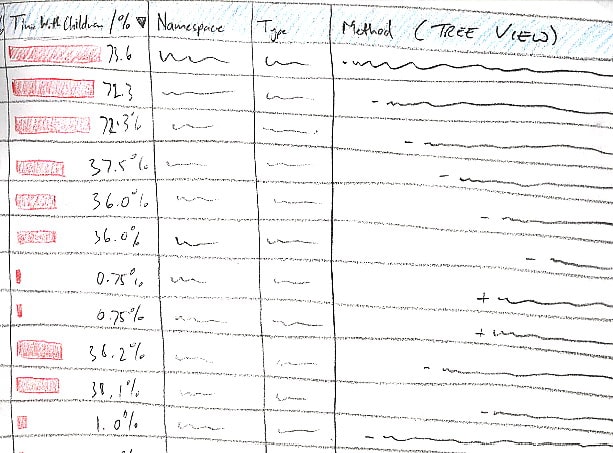
Figure 6. Expanding new features in the treeview
In minutes, we did work that would have taken hours with Photoshop. Sketching is the great leveller for design work Anybody can pick up a pencil and put an idea down on paper. No team member is left behind; they can all contribute.
Below is the tree view in its current form. There are striking similarities between the initial sketches and the final implementation with the red performance bars.
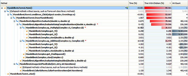
Figure 7. The tree view as it currently stands
Give us a Call Graph
The Call graph started life as a rough sketch, shown in figure 8. You’ll notice the table-like structure just above the graph itself. This ‘Hierarchy’ was soon dropped, but I barely remember it because it was just one of many potential ideas that emerged. This view was drawn in 2 minutes as an adjunct to the call graph; as the ideas evolved, the need for the Hierarchy quickly diminished and it was removed. The sketching process served its purpose well in this instance. We wasted no time developing a feature we would eventually scrap. There was none of the sadness that one sees when a working prototype gets axed. Whilst a design which has been meticulously engineered can be tough to give up on – a simple sketch isn’t.
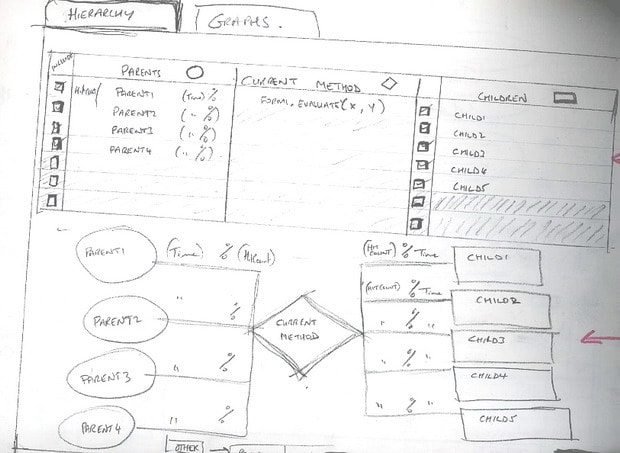
Figure 8. The very first attempt at a call graph with horizontal orientation
The item in a sketch would be annotated with notes to communicate to the team members any other ideas which might not be immediately apparent from the static sketch. So one could describe what happened, the possible behaviours in other words, when an item was clicked on. This would be annotated to help fill in the workflow processes for other members of the team. The image below is littered with notes to help describe each individual object. The space in the sketches also allows fellow team members to make more annotations or highlight flaws. The use of colour can also help with this communication of ideas.
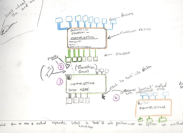
Figure 9. One of the later iterations of the call graph
The call graph component in our current project however was definitely the most difficult to sketch. It went through more iterations during the implementation phase than any other component. The finished design can be seen below.
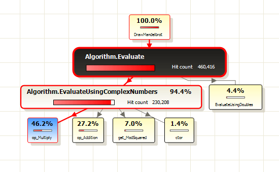
Figure 10. The call graph feature as it currently stands
Improving the design process
There were times when it would have helped to be able to use a computer to demonstrate a point, or to research an aspect, or clinch an argument. Sometimes, also, it would have been easier to visualise the product from screenshots. Perhaps the ban on computers was too draconian.
When we used the sketching process, we may have settled upon an idea too soon before we’d explored all the other possibilities. It helped us to discuss and investigate one particular concept very broadly, but I can’t help wondering from time to time if we on the process distracted us from considering alternatives.
We didn’t show the initial designs to any users: instead, we decided on the best design for ourselves and expanded it from there. Because we’d already discussed our initial design work with users, so as to understand why he or she preferred certain design elements, we already had enough information to progress to the higher fidelity prototype.
Back to the Present
Last week, almost seven months after our first steps into this approach, we have returned to the design stage for a completely new project. The computers remained where they were, but we kicked off the day by brain storming and sketching using the research that we had collected from the previous few weeks. Our whole team was there; testers, technical authors, user experience, developers and the division manager. We broke up into mini-groups through the day, rotating members of the groups as various ideas were discussed and sketched out. There wasn’t any reluctance in taking part in this day. Perhaps they felt more confident that their computers were still going to be there when they got back from their desks.
We now have a collection of sketches plastered over the walls from every member of the team. They are still sketched and roughly annotated, but that’s fine, we all know what the sketch represents. We can all refer to it, merely by glancing upwards.
Summary
I sometimes wonder whether the simple act of sketching, as a way of generating ideas, is being lost . People often seem to jump straight to using design packages such as Visio and move smartly straight to the prototype phase without the preliminary group discussions and free exchange of ideas. Sketching is a very different process from prototyping with different objectives.
For us, the process of trying out the ideas in Bill Buxton’s book “Sketching User Experiences” has been a rewarding experience in that it has resulted in a tool that meets the requirements of the users in an innovative way.. Sketches are faster and cheaper than prototypes to produce, and can be as diverse as you like in order to help with the generation of ideas. A prototype is more involved and costlier to fix when problems crop up.
I’d love to hear how other companies have adapted this sort of approach; involving all their team members in the design process, and evolving the design process by sketching. Which approaches have you tried that worked, and which haven’t? Did your project teams support the experiment? What would you change in your processes if you could?
For those reading who have never tried sketching your ideas – what are you waiting for?
References
- Bill Buxton’s Website
- Screenshots of the ANTS Application (beta)
- Software Tool design: The Three Rs
- Bart’s blog announcing the release of ANTS Beta
Since this article was written, ANTS 4 Performance profiler has now been released and is available for download from here