In the first article in this series about Report Builder 3.0, I introduced you to Report Builder and showed you how to create a report that included a table. The table displayed sales data retrieved from the AdventureWorks2012 database via a data source and dataset you added to your report. However, the table in the final report was very basic and not particularly readable. Fortunately, Report Builder includes many features that let you format the various elements within your reports.
In this article, the second in the series, you’ll learn some of the ways you can format your report elements so your reports are more readable and users can easily access the information they need. If you want to try out the examples on your own system, you’ll need to first create the basic report that we created in the first article. For those of you new to Report Builder, you should review that article to learn how to add a table to the report. If you’re already familiar with how to build a basic report, you can use the following list of specifications to set up your report environment:
- A data source that connects to the AdventureWorks2012 database on a local instance of SQL Server 2012. Another version of SQL Server or the database should be okay.
- A dataset that uses the data source to retrieve data from the Sales.vSalesPerson view. The dataset is configured with the following query to retrieve the data:
|
1 2 3 4 5 6 7 8 9 10 11 12 13 14 15 16 17 |
SELECT BusinessEntityID, FirstName, LastName, JobTitle, City, StateProvinceName, CountryRegionName, TerritoryName, TerritoryGroup, SalesQuota, SalesYTD, SalesLastYear FROM Sales.vSalesPerson WHERE TerritoryGroup IS NOT NULL; |
- A Table data region that contains data from the following fields in the dataset (in the specified order):
- FirstName
- LastName
- TerritoryGroup
- SalesQuota
- SalesYTD
After you’ve added these elements, your report should look similar to the one shown in Figure 1. Notice that the ReportData window shows the AdventureWorks data source, the AnnualSales dataset, and the dataset’s fields. Also notice that the design surface contains the actual table, with the specified fields inserted.
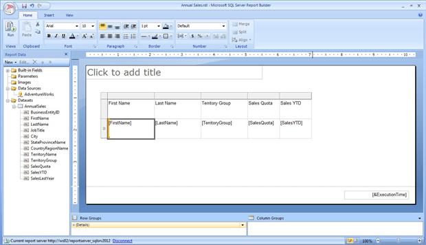
Figure 1: Creating a basic report that contains a table
That’s all you need to get started with formatting your report. So let’s dig into some of the Report Builder features you can take advantage of in order to enhance your report’s looks and usability.
Formatting Your Table
The first step we’re going to take is to add a border around each cell so that the entire table is enclosed in borders. The easiest way to do this is to add the borders all at once, which means you must select all the cells. One way you can do it is to select the top-left cell (First Name), hold down the Shift key, and then click the bottom-right cell ([SalesYTD]). All the cells should now be enclosed in a single rectangle with a thick gray border, as shown in Figure 2.
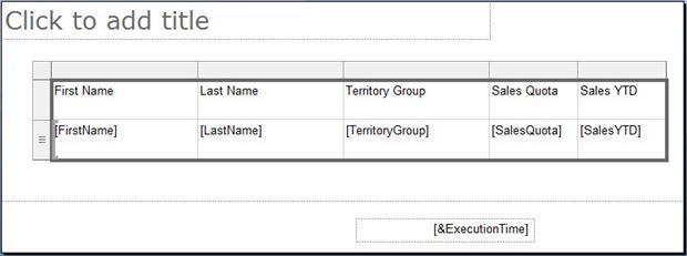
Figure 2: Selecting the table cells that should have borders
Next, in the Border section of the Home ribbon, click the BorderSide down arrow, and then click All, as shown in Figure 3. (Note that, if the All border is already selected for the BorderSide option, you need only click the icon.)
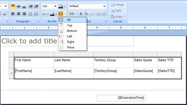
Figure 3: Selecting the border type for your selected table cells
When you click the border option, borders are added around each cell, as shown in Figure 4. You can verify this by clicking the Run button to view what the table looks like with borders.
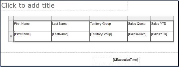
Figure 4: The table cells enclosed in borders
As you might recall from the first article, when you click the Run button, you can preview what the report will look like when it’s been rendered on a user’s computer. In fact, you should regularly use the Run button to check what your table and report are looking like as you format the various report elements. That way, if you add an element that doesn’t work, you can undo it right there, rather than having to unravel dependencies later in your report development process.
Now let’s look at how we can configure the table’s header row to make it stand out from the rest of the report. Because we’ll format each cell in the header the same way, we can select the entire row of cells to make our changes. Once the row is selected, click the Center button in the Paragraph section on the Home ribbon. Then, in the Font section, click the Bold button. Your header row should now look similar to the one shown in Figure 5.
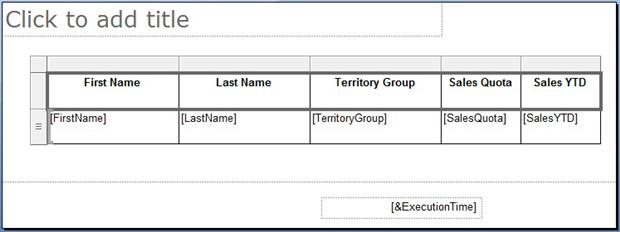
Figure 5: Configuring the table’s header row
Next we’ll add color to the header row. With the cells still selected, click the Shading down arrow in the Border section. You’ll be presented with a collection of colors from which to choose, as shown in Figure 6.
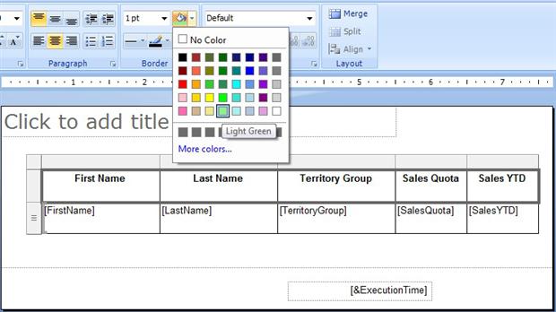
Figure 6: Adding color to the table’s header row
For this exercise, I selected LightGreen; however, you can select any color you want. You can even click the Morecolors link to choose from numerous other shades. Once you’ve selected a color, the table’s selected rows receive that color, as shown in Figure 7.
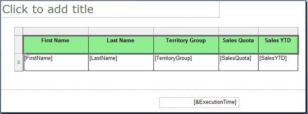
Figure 7: The table’s header row after it’s been formatted
Next, we’re going to modify how the numerical values in the Sales Quota and Sales YTD columns are displayed. Select the second row of the last two columns (cells [SalesQuota] and [SalesYTD]). In the Number section of the Home ribbon, click the CurrencySymbol button to display the values in those cells as currency.
The next step is to center the text horizontally. Select all the cells in the table as you did when creating borders. Then, in the Paragraph section, click the Middle button so your text sits in the middle of your cells.
Finally, resize the two rows to the height you prefer for displaying your table’s rows of data. For this report, I preferred rows with a smaller height, but you can set the height to whatever you think is best for your table. Also set your column widths to the desired size.
To change the row heights or column widths, you must use the selectors displayed to the left of the rows and above the columns. Notice in Figure 7 the gray blocks next to and above the table. These are your selectors. Use them to adjust the cell sizes. (You might have to play around with the selectors a bit to get a feel for how to use them to adjust your cells.) Figure 8 shows what my table looked like after I adjusted my rows and columns. Your table might look slightly different from this.
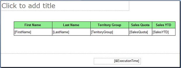
Figure 8: Resizing the rows in the table
That’s all there is to configuring your table. You can, of course, make other changes, such as modifying the font or changing the border sizes and colors. Your best bet for learning how to format a table is to try out the various options and then see how they look when you view the report. The more you play with them, the more you’ll learn.
Formatting Your Report
Without a doubt, the table is the centerpiece of our report, and it’s important to make it look right. However, you can-and should-format other report elements as well. So let’s look at some of the ways you can do that.
The first step we’ll take is to add a title to our report, which in this case is “Annual Sales.” To add the title, click the area at the top of the design surface that reads Click to add title, and then type Annual Sales. Next, in the Paragraph section of the Home ribbon, click the Center button to center the text. Then reposition the title’s text box as necessary so it’s centered above the report, as shown in Figure 9.
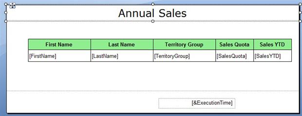
Figure 9: Adding a title to your report
You can then change the font used for the title. One way to do that is to adjust the settings in the Font section of the home ribbon. Or, if you want to have more direct control over your font, click the tiny arrow in the bottom-right corner of the Font section. This launches the TextBoxProperties dialog box. You can take this approach only if the text box itself is selected, rather than the text. You can tell if the text box is selected by the small squares at the corners and midsections (refer back to Figure 9).
When the TextBoxProperties dialog box appears, go to the Font page if you’re not already there. From the Font page, you can configure the font, as shown in Figure 10.
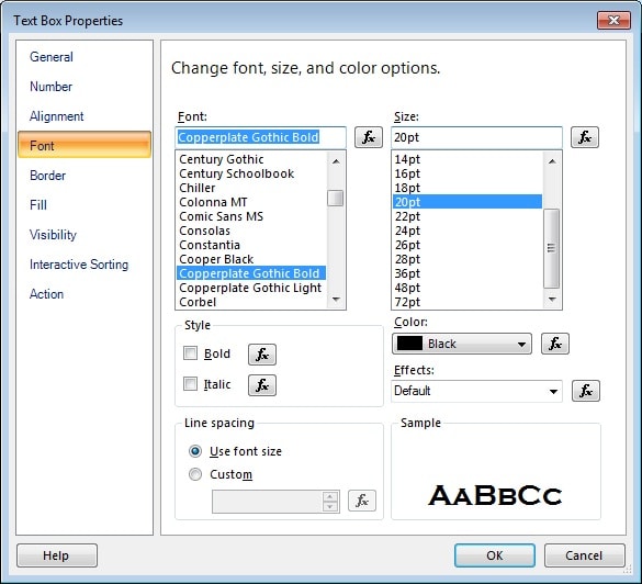
Figure 10: Selecting a font for your report’s title
In this case, I’ve selected CopperplateGothicBold for the Font option, but left all the other options with their default values. However, you can configure the text with whatever font settings you think best suit your report.
Once you’ve configured the font, click OK to close the TextBoxProperties dialog box. If necessary, reposition or resize the text box to adjust for the new font settings. Your title should now look similar to the one shown in Figure 11.
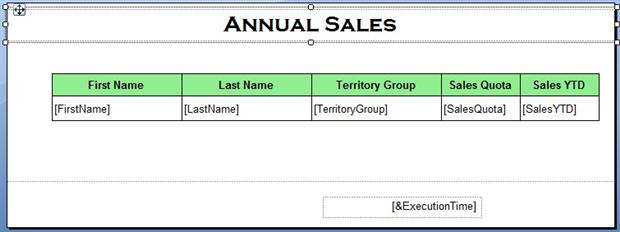
Figure 11: The reformatted title at the top of the report
At this point, you can resize your design surface and reposition report elements as necessary. To move a report element, such as a table or text box, make sure the element is selected and then use the cross-arrows to move the box around. For example, Figure 12 shows the footer’s text box. Notice that I’ve moved it to the right so it lines up to the end of the table.
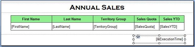
Figure 12: Resizing your report and repositioning report objects
In addition to moving the footer text box, I also resized the design surface and the footer area. In addition, I moved the table up toward the title. Again, the best way to learn how to move report items around is to play with them, repositioning and resizing as necessary. And whenever you make a change, view the report to see how your changes work. Experimentation is your best friends in this case.
Another feature of Report Builder is the ability to add such graphic elements as lines and rectangles and figures. For instance, I decided to add a line to the footer, just above the footer’s text box. To add a line, go to the Insert tab. In the ReportItems section, click the Line icon. Then move your cursor to the spot where you want to start the line, click and hold down your left mouse button, and drag your cursor to the point you want to end the line. For instance, if you refer to Figure 13, you’ll see that I added a line above the footer text box.
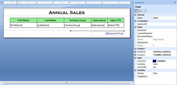
Figure 13: Formatting the report’s footer
You might have noticed that I changed the color of the line from black to dark blue. To make this change, you have to access the line’s property. First, make sure that the line is selected. (Small boxes hang off of either end.) Go to the View tab and select the Properties check box. This opens the Properties window, which you can see in Figure 13. In the Style section, change the setting in the LineColor property from Black to DarkBlue or whatever color option you want to select. You can then close the Properties window.
Next, I modified the text in the footer. I again selected the text box and opened the Text Box Properties dialog box. I then changed the Style setting to Italic and the Color setting to Dark Blue.
Up till now, I’ve said nothing about the footer text itself, which you’ve no doubt noticed reads &ExecutionTime. This is actually a placeholder that points to the ExecutionTime built-in field. Report Builder supports a number of built-in fields that you can use to provide values dynamically to your report. In this case, the ExecutionTime field provides that date and time that you run your report.
You can display additional or different information in the footer by adding a text box or modifying the text in the default text box. For this example, we’ll modify the existing text. To do so, double-click the &ExecutionTime placeholder to open the PlaceholderProperties dialog box, shown in Figure 14.
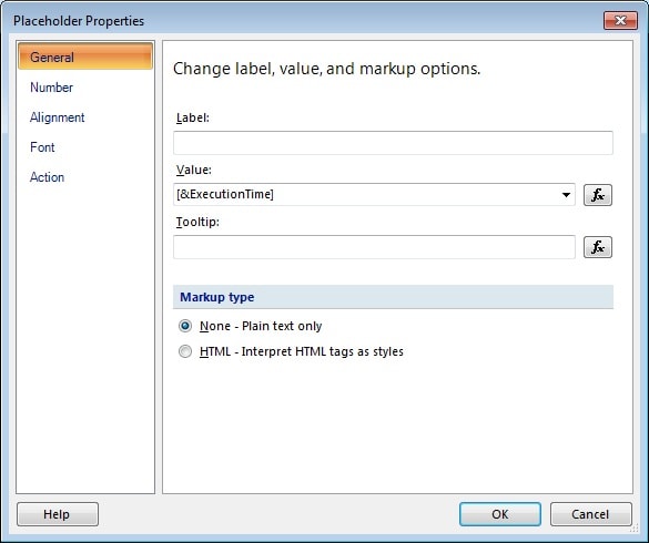
Figure 14: Accessing the properties of the footer’s text
Notice that &ExecutionTime is displayed in the Value text box. You can either modify the default value directly within the text box, or you can click the expression builder button to the right of the text box to open the Expression dialog box, shown in Figure 15. (The expression builder button is the one whose label looks like fx.) For our example, we’ll use the Expression dialog box to modify the text value.
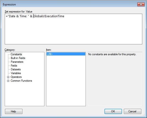
Figure 15: Modifying the footer’s text
When you first open the Expression dialog box, it shows an expression in the Set expression for: Value text box. That expression, =Globals!ExecutionTime, is the actual underlying expression that the &ExecutionTime placeholder points to. All Report Builder expressions begin with an equal sign followed by the body of the expression, which is this case is Globals!ExecutionTime. The Globals part of the expression is used because the ExecutionTime field is part of the Global scope and is available to any component in your report. The exclamation point is used to separate the scope from the actual field name.
If you refer back to Figure 15, you’ll see that I’ve modified the default expression by adding the string value Date & Time: (enclosed in double quotes, with an ending space). I’ve also included the concatenation operator (&) to concatenate my string value with the ExecutionTime built-in field.
You can, of course, do far more with your expression. I’ll be covering Report Builder expressions in more detail later in this series. But for not, this is the only change you need to make to your expression. So click OK to close the Expression dialog box. When you’re returned to the Placeholder Properties dialog box, you’ll see that the value in the Value text box has been changed to <<Expr>> to indicate that an expression has been defined. Now click OK to close the Placeholder Properties dialog box. When you’re returned to the design surface, you’ll see that the footer text now reads <<Expr>>, as shown in Figure 16.
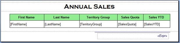
Figure 16: The report’s updated footer
There are many other ways in which you can modify your report elements, but what we’ve done so far should give you a sense of the possibilities. So let’s look at one more way to enhance your report.
Adding an Indicator to Your Report
Report Builder includes a number of visualizations that let you display information that makes it easy to understand and compare data. For example, we can add an indicator to our table that provides a quick overview of the data. An indicator is a small gauge that displays the state of a single data value. It acts as a key performance indicator that lets you quickly assess a value in one of your columns.
To add an indicator, right-click the Sales YTD column, point to Insert Column, and then click Right. A new column is added to the table. Resize the design surface and column to accommodate a small icon for the indicator. Next, right-click the data (bottom) portion of the new column, point to Insert, and then click Indicator. When the Select Indicator Type dialog box appears, select the three flags, and then click OK. A flag indicator is added to the new column, as shown in Figure 17.
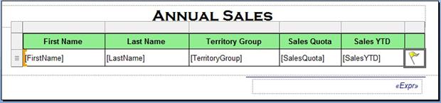
Figure 17: Adding an indicator to your report
After you add the indicator, right-click it in the indicator, and then click Indicator Properties. When the Indicator properties dialog box appears, go to the ValuesandStates page, as shown in Figure 18. On this page, you configure how you want your indicator to read based on the values of the identified column.
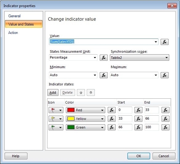
Figure 18: Configuring your indicator’s properties
For our example, we’ll base our indicator on the SalesYTD column. In the Value drop-down list, select [Sum(SalesYTD)]. Our indicator will now be based on the total amount of sales listed in that column.
By default, the indicator bases which color is displayed on percentages. Any individual SalesYTD value that falls within the bottom third of the total values receives a red indicator. A value that falls in the middle third receives a yellow indicator. And a value that falls in the top third receives a green indicator. For the purposes of our exercise, the default values works fine, so click OK to close the Indicator properties dialog box.
The last step you might want to do is to add a text box to your report that explains the flag indicator colors. For example, Figure 19 shows a text box I added at the bottom of the table. Notice that it provides a brief explanation of the flag colors.
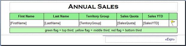
Figure 19: Adding a text box to the bottom of your report
To add a text box, resize your design surface and footer as necessary. Then go to the Insert ribbon and, in the ReportItems section, click Text Box. Position your cursor on the design surface where you want to start your text box, click and hold the left mouse button, and then drag the cursor to the position you want to end your text box. Then add the necessary text and background color.
This is also a good time to do any final resizing and repositioning of your report items to make sure they display the information the way you want it displayed. When you have everything where you want it, click the View button to review your report. It should now look similar to the one shown in Figure 20.
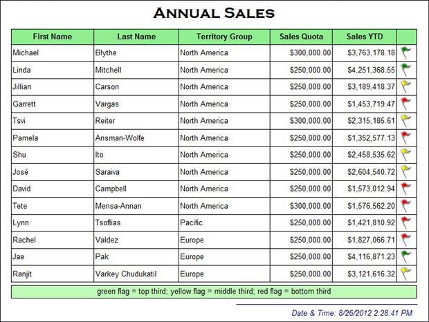
Figure 20: Viewing your formatted report
As you can see, all the elements we’ve added and formatted are now displayed. Notice that the report includes a title and an additional column for the flag indicator. And the flags themselves are colored according to the value in the SalesYTD column. The report also includes a text box at the bottom of the table that contains information about the flags. In addition, the footer displays the Date & Time: label along with the actual timestamp.
Moving Ahead with Report Builder
Not surprisingly, there are many more steps you can take to format and enhance your report. You can add graphics and use expressions more extensively. And, as the flag indicator shows, you can add visualizations that make it easier for viewers to understand the information being displayed. In the next article and the articles to follow, we’ll dig deeper into data visualizations so you can see the wide range of options you have for displaying data. The key to any report is to make sure your report viewers can access the information they need as quickly and efficiently as possible. And visualizations can be an effective way of doing that. In the meantime, as was stressed earlier in this article, the best way to become comfortable with formatting your reports is to experiment with the various options. This article has given you a good place to start, but the rest is up to you.

Load comments